S / LAB10为Mantab集团位于马来西亚吉隆坡的新办事处创造了大胆的设计。包括对现有平房的全面内部改造——团队在为马来西亚吉隆坡的这家当地房地产开发公司确定最终设计方案时,需要设计一个能够应对东南亚气候和本土化的办公室/工作空间。该公司不仅需要为其不断壮大的团队提供一个工作空间,还需要一系列的空间来招待和招待他们的客户。因此,现有的单体,多层住宅被改造成一个有魅力的企业中心,将商务与休闲无缝结合。
S/LAB10 created the bold design for the Mantab Group’s new offices located in Kuala Lumpur, Malaysia.Comprising a complete internal overhaul of an existing bungalow—the team was required to re-examine the office/workspace typology in a Southeast Asian climate and locality for a local property development company in Kuala Lumpur Malaysia in producing the final design scheme. The firm required not just a workspace for its growing team, but also a series of spaces for hosting and entertaining their clients. As such, the existing single unit, multi-story former residence was transformed into a gleaming corporate hub for a private entity that seamlessly integrates business and leisure.
Mantab Workplace特别引人注目的是它闪闪发光的造型大胆的外观。在安静的郊区街道上若隐若现,金铜合金立面从建筑的一层升起,隐蔽地保护着内部。哑光和高抛光金铜合金的三角面表面看起来是随意的,但其实是根据公司的名称和品牌设计出来的。从马来语翻译过来,“mantab”意味着坚固; 不可动摇的诚信。设计师将企业名字的含义与钻石的坚硬联系起来,钻石每一个切面都不相同,却有着无可挑剔的刚硬之美。同时受到本地折叠铁百叶窗的启发,其金铜合金包层折叠板是铰接和可操作的。无论是半关闭的角度与内部向外窥视其郊区的范围,还是完全关闭的隐私和遮挡热带光,外立面是引人注目的和迷人的,它引发了好奇心,留下许多游客在猜测什么在里面。
What stands out in particular in Mantab Workplace is its gleaming bold façade. Looming over the quiet suburban street, the gold-copper alloy façade rises up from the building’s ground level in shielding its interior furtively. The triangulated facets of the matte- and highly polished finishing of gold-copper alloy are seemingly arbitrary–but in essence are conceptually extrapolated from the corporation’s name and brand. Translated from Malay language, “mantab” means solidity; an unshakeable integrity. The designers likened this to the hardiness of a diamond—with no single facet on the jewel alike, yet abound with impeccably hardy beauty. Inspired as well by the Malaysian shophouse vernacular of folding iron shutters, the gold-copper alloy clad folding panels are hinged and operable. Whether angled half-shut with its interiors peeking out to its suburban extents, or closed in entirety for privacy and to keep out the glare of tropical light out—the façade is eye-catching and captivating, with the allure of it leaving many a visitor guessing what lies within.
设计要求非常特殊:在建筑内部设计一系列的空间,满足从商业到社交的不同用途。因此,S/LAB10的任务是改变和挑战办公空间的标准。新设计的方案包括公司三位主管的办公室、一个展览空间和许多用来接待客户的休闲区域。设计团队试图设计一个不仅能满足上述要求,并且功能实用、具有视觉冲击力的综合性设计方案。项目保留了建筑原有的基本结构(这个结构非常有助于处理场地自然陡峭的斜坡)。这是一个精巧整合了体量,对比性表面、材料、肌理以及用途和复杂细节设计的空间。在现有结构框架中,表面及体量元素的处理手法,在充满力量及感官刺激的空间体验和贯穿始终的设计语言中,达到了极致。自信、醒目的建筑表现形式和对客户而言充满识别性的布置,被谨慎地容纳到现有建筑之中。
The design brief was unusual: to create a series of spaces within the building to suit a variety of purposes that ranged from business to social. Thus, S/LAB10 was tasked to revise and challenge the norms of an office typology. The new program was to include offices for the company’s three directors as well a display gallery and numerous leisure spaces for hosting clients. The team sought to fulfill the client’s requirements by delivering a design that not only re-worked the aforementioned, but also resulted in a comprehensive design scheme that was both visually striking and practical in its function. The project inherits the house’s basic structure (which proved advantageous in dealing with the site’s naturally steep incline). In place, is a dexterous play of cantilevering volumes, contrasting surfaces, materials and texture, as well as the considered use and design of intricate details throughout. The consolidation of the building’s existing structural framework with a bold play of surface and volumetric elements culminates in a strong, sensual spatial experience and language throughout. And subsequently, a confident, bold architectural presence and visual identity for the client prudently set within the existing building’s typology.
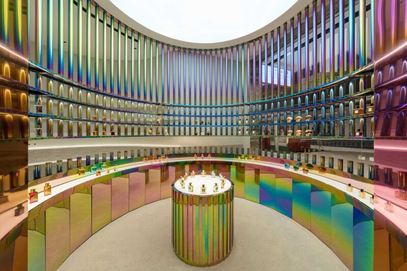
在满足业主特殊而复杂要求的过程中,S/LAB10团队意识到项目的关键性挑战是设计一个简单的空间方案,但能够满足复杂的要求。对比是设计师在达成设计要求时所采用的关键设计策略。这是一个大胆有序的对比主题,或者如设计师所说,是一种“有意识的非匹配性”,这一策略贯穿了整个空间设计,如在空间体量处理,颜色、纹理、材料的对比,特别是在定制的细部构造中。设计师在空间划分、设计策略和元素方面都进行了细致地思考。典型的例子是二层空间(使用了白色环氧树脂地板)中央的会议室,会议室四周用厚重的翡翠绿色窗帘围合,在不使用会议室时,窗帘完全打开,形成一个中心开放的灵活空间。空间边界处一对细长框架的半透明拱形屏风,进一步开放了空间。这些半透明屏风设计独特、细节精致,柔和霓虹色的面板安装在纤细的黑色钢框中,可以作为展示架。从不同的方向看,屏风可以产生不同的效果,增加了空间趣味性和层次感,有时,半透明屏风层层重叠,色彩和轮廓与后部材料及装饰融为一体,产生一种独特的景象。
In fulfilling the client’s unique hybrid brief, the team at S/LAB10 recognized the brief’s key challenge: delivering a spatial scheme that was simple in nature, but suitably addressed the brief’s complex demands. Contrasts was a key design strategy employed by the designers in approaching this brief. A strong theme of bold yet methodical contrasts, or as the designers put it: “intentional mismatches”, is evident throughout, as articulated in the design’s volumetric handling of spaces as well as the contrasting play of colors, textures, materials and, in particular, its complementary custom detailing. The division of spaces are carefully considered, as were the design strategies and elements involved in this. One such example is the centrally positioned conference room on the white epoxy-floored first level. The room is surrounded by heavy but lush emerald-green privacy drapes. Left open when not in use, the curtains provide a flexible use of space that opens up the heart of the level rather than further segmenting it. On its borders are a pair of slender-framed, arched translucent screens that further aid in framing the open space. Uniquely designed and detailed for the scheme, these translucent panels of varying soft neon hues are encased in a thin black steel frame that double up as feature display shelves and add visual interest and depth to the space when viewed from different orientation derive different outcome, at times stacking of multi-layer colors or silhouette of translucent color foreground merged with the background surrounding materials and finishes.
建筑上部两层空间使用了可移动的明亮金色铜窗框。关闭后,宽阔的金色铜窗框隐藏在高高的玻璃幕中,为后方的休息厅腾出空间。在这个空间的左侧是一个轻盈的木制体量,作为主入口标志并平衡整个立面。这个突出结构采用当地再生木材制造,在尺度上与立面形成对比并产生一种戏剧效果。设计师说:“我们想创造一个沉浸式的空间,提高人们进入空间的感知和体验。”两层高的舒适休息厅上方,是玻璃结构的主管办公室。在自然光线的照射下,办公室和休息厅都笼罩着一层柔和、温暖的光芒。沿着建筑的西南边缘,设计师在二层设计了一个室外绿色露台,名为“竹露台”。借助这种设计,自然和户外为精致的室内增添了微妙的特质。设计师通过创造性探索各种复杂的体块、空间布局以及多种手工定制的细部,成功塑造了一系列既具有私密性又具有开放性的工作和休闲空间,人们可以自然轻松地从一个空间进入到另一个空间。
In another instance, the top two floors of the building are prominently cast in operable bright gold-copper alloy panes. Once shut, the broad gold-copper panes make way for a spaciously appointed lounge beyond, concealed behind tall curtain glass panels. To the left of this is a slighter single timber-clad volume—this marks the main entrance and balances the entirety of the façade’s composition. Contrasting in size and clad with locally sourced recycled timber, the protrusion was designed for dramatic effect. “We wanted to create an immersive volume in which to heighten one’s sense and experience of space to highlight their entry into the building,” the designers note. Hovering over the ensconced double-height lounge space are the glass-encased directors’ offices. Generously washed with natural light, the offices and lounge are cast in a soft, warm glow. Along the south-western edge of the building here, the designers have incorporated an outdoor green terrace—dubbed the “bamboo terrace”—on the first floor. In doing so, nature and the outdoors are a subtle feature that complements the scheme’s sleek corporate interior. By creatively exploring various complex configurations of volume and space with their respective custom crafted details, the designers have successfully composed a series of work and leisure spaces, both private and open, that flow effortlessly from one to the other.
完整项目信息
项目名称:Mantab Group Offices
项目位置:马来西亚吉隆坡
项目类型:办公空间/商务休闲风
完成时间:2019
设计公司:S/LAB10
设计团队:Jason Sim, Hao Wang, Fion Hsu & Liz Siew
摄影:Heartpatrick


