LOFT中国感谢来自集韵空间设计的商业项目案例分享:
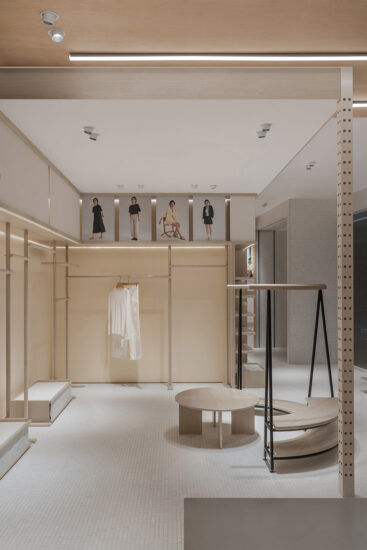
这个项目的地理位置在西安曲江W酒店裙楼的商业综合体一层,酒店的定位是“Lifestye”激发灵感、创造潮流、大胆创新的体验、吸引年轻时尚人士。我们在项目确定之初就考虑到这部分女性消费人群会是我们的主要目标客群,所以我们从店铺设计上也力求创新与时尚打造出符合品牌的国际女装买手店。
The location of this project is on the first floor of the commercial complex of the W Hotel in Qujiang, Xi’an. The location of the hotel is “Lifestye” to inspire, create trends, bold and innovative experiences, and attract young fashion people. At the beginning of the project, we considered that this part of the female consumer group will be our main target group, so we also strive to innovate and fashion from the store design to create a brand-friendly international women’s clothing store.
原有的空间结构是一个长方形。依据店铺的功能比例将空间划分成三段,分为前厅、中场、后场。将前厅与后场两个空间墙体进行45度斜切打破了原有呆板格局。门头立面的拱形橱窗与前厅斜切的钢网隔墙拱门形成呼应,同时前厅斜切的钢网隔墙左右两个拱门的设计,自然划分出了一进一出销售动线。
The original spatial structure is a rectangle. According to the functional proportion of the store, the space is divided into three sections, which are divided into the front hall, the middle field and the back field. The 45-degree chamfering of the two space walls in the front and back yards broke the original rigid pattern. The arched window on the façade of the door is echoed by the sloping steel mesh partition arch in the front hall. At the same time, the design of the two arches on the left and right sides of the sloping steel mesh partition in the front hall naturally divides one into one sales line.
店铺的进深有20米采光受到影响,因此外立面采用玻璃砖作为隔墙引入自然光线。磨砂与透明的玻璃砖相互拼接,夜晚拱形橱窗四周发散出渐变色的灯光。顶面采用裸顶喷黑提升室内的高度。
The depth of the store is affected by 20 meters of light, so the façade uses glass bricks as a partition to introduce natural light. The matte and the transparent glass bricks are spliced together, and the gradual color of the lights is scattered around the arched window at night. The top surface is raised with a bare top to increase the height of the room.
完整项目信息
项目名称:幻彩世界-Rynsa
项目地址:西安曲江W酒店
项目面积:150㎡
完工时间:2018年10月
设计风格:现代风格
设计:集韵空间设计
主创:韩佳
摄影师:任东
Project Name: Symphony World – Rynsa
Project Address: W Hotel Xi’an Qujiang
Project area: 150m2
Design: set rhyme space design
Main creation: Han Jia
Photographer: Ren Dong
Completion time: October 2018
Design style: modern style


