LOFT中国感谢来自Towodesign堂晤设计的餐饮项目案例分享:
一场关于奶酪的食色空间洗礼 A “Cheesy” Feast Appealing to all Senses
Tim Burton镜头里的《查理与巧克力工厂》,曾带给我们味蕾刺激下的想象力旅行。色泽淡黄、充满孔洞的奶酪,有着不逊于巧克力的温润醇香。当Towodesign堂晤设计将它作为甜品工房的概念主打时,食物、视觉与情感混糅产生的化学作用,酝酿成个性化空间设计的奇幻体验。
In the movie Charlie and the Chocolate Factory directed by Tim Burton, we witnessed a journey of imagination full of tasty stimulations. Cheese, with its tiny holes and color of yellow, is comparable to the rich and mellow flavor of chocolate. By choosing this delicacy as the main concept to design “The Dessert KITCHEN”, Towodesign produced chemical reactions among food, visual impression and emotion, and created a unique space that provides fantasy experiences.
∇ 奶酪之门
店面只能是招牌、外立面或橱窗? Shopfront: Signboard? Façade? or Show Window?
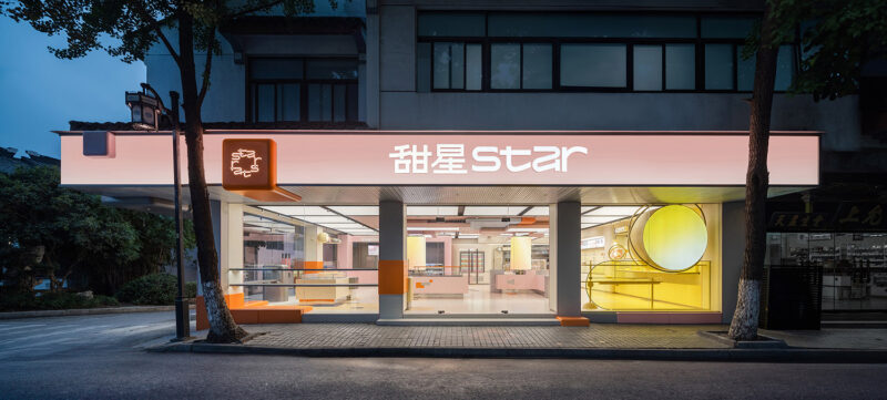
这家甜品工房位于商场的下沉广场,靠近主入口。从商业引流的角度考量,需要一个具有充分聚合力的视觉点。一张足够大的桌子成为了Towodesign的创意起点,从外摆区一直向店面蔓延,甚至爬升到店铺的门以及logo所在位置。
The dessert shop is located in the sunken square of a mall, close to its main entrance. From a commercial perspective, it’s necessary to give the store a striking visual impression to attract customers. A large yellow table extends from the outside eating area to the interior, and even up to the shopfront where the logo is set.
桌子表面开出了奶酪般的圆形洞窟,食客们化身为流动的空间元素,让一个个圆洞呈现时满时缺的趣味模样。仿佛海绵宝宝变成了大奶酪,这个外摆区以雕塑式的存在感,为商场地下广场制造出最大的惊喜。而基于功能考量的设计动作,也鼓励着相邻而坐的人们进行更多的交流与互动。
The surface of the table is characterized by holes, similar to those of cheese. Customers are flowing elements in this area, making the holes variable, sometimes full, sometimes empty. It’s as if SpongeBob was turned into a huge cheese. The outside eating area, like a sculpture, has a strong sense of existence, becoming a visual highlight on the underground square of the mall. The openings of the table were designed based on functionality, which also encourage people sitting next to each other to interact and chat.
不仅填补胃的空虚,还能是生活的洗礼 Satisfaction not only for the Stomach, but also for Life
对于店铺的室内部分,Towodesign从食物赋予人们生命能量这一原点出发,围绕甜品教堂的概念进行空间仪式感的营造。于是,教堂里高耸的穹顶元素被应用其中,并遵循场地的梯形平面而呈现出分段渐变的拱顶。考虑到空调出风口隐蔽与视觉层次,穹顶使用了栅格来强化曲线节奏。
Starting from the fact that people gain life energy from food, Towodesign intended to create a dessert heaven with a church-like interior structure, full of a sense of “ritualism”. Elements of towering domes of churches were applied to the ceiling, which consists of several vaults in line with the trapezoidal plane of the site. Considering the concealment of the air conditioning vent and creation of a visual hierarchy, the ceiling presents a grid-like appearance, which also strengths the rhythm of curves.
∇ 甜品教堂
白色栅格搭配墙面的黄色涂料背景,让向食物致敬的这场空间洗礼,在秩序与亲和之间达成恰到好处的平衡。下午茶时间的一场生活仪式,便在这静谧与甜蜜交融的教堂意象空间中展开。吧台延续了店面大奶酪雕塑的元素,形成内外呼应,配以圆弧形元素的餐饮家具,使得食客们的奇思遐想在眼睛和味蕾的互动中尽兴到底。
The white grid well matches with the yellow backdrop wall, showing a proper balance between order and affinity. Teatime is like a ritual in life, which can be enjoyed in this imaginative church-like space of peace and sweetness. The bar counter also features the elements of cheese, echoing the structural eating area outside. The interior furniture presents round or curved shapes, adding flexibility to the space and enabling the customers to enjoy the feast of visual and gustatory entertainment.
∇ 平面图
∇ 平面纵览图
∇ 奶酪之门概念图GIF
∇ 室内甜品教堂概念图GIF
完整项目信息
项目名称:成都仁和新城甜品工房
项目地点:成都仁和新城-1F
项目类型:甜品店
项目面积:69平方米
设计公司:Towodesign堂晤设计(www.towodesign.com)
主持设计师:何牧
设计团队:任伟,郑力源
完工时间:2018年11月
主要材料:金属,水磨石,拉丝不锈钢
摄影:Towodesign堂晤设计
Project name: THE DESSERT KITCHEN
Location: B1, REN HE TOWN MALL, Chengdu, China
Category: dessert store
Area: 69 m2
Design firm: Towodesign (www.towodesign.com)
Chief designer: He Mu
Design team: Ren Wei, Zheng Liyuan
Completion time: November 2018
Main materials: metal, terrazzo, brushed stainless steel
Photography: Towodesign


