Snøhetta为位于奥斯陆的时尚品牌Holzweiler设计了实体和线上零售空间,整个空间具有柔和的色调和网格元素。
Snøhetta has designed both physical and digital retail spaces for Oslo-based fashion label Holzweiler, featuring a muted colour palette and gridded elements.
Holzweiler热衷于为其客户提供在线和商店零售体验,因此要求Snøhetta设计一个展厅和旗舰店,同时也要创建一个与之相匹配的网站。
Holzweiler was keen to offer its customers a similar retail experience both online and in store, so asked Snøhetta to design a showroom and flagship store, but also to create a website to match.
团队为Holzweiler设计的展厅、旗舰店和在线销售渠道的目标是创造一个完美的客户体验,使品牌和人们更紧密地联系在一起。一切都采用了简约美学。
The aim with the showroom, the flagship store and the online sales channel that we have designed for Holzweiler has been to create a seamless and holistic customer experience that brings the brand and people closer together.A pared-back aesthetic was adopted for everything.
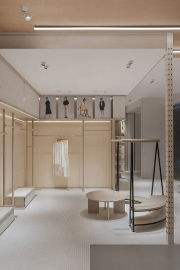
在网站上,它采用了网格显示的形式,参考了该品牌的标志性方格围巾。在陈列室和商店里,这被转化为网格化的货架元素,与弯曲的服装展示相搭配,旨在唤起品牌的手工艺做法。其他细节包括混凝土地板和橡木桌子。
On the website, this takes the form of a grid display, which references the brand’s signature chequered scarves.In the showroom and store, this is translate into gridded shelving elements, which are paired with curvy garment displays, designed to evoke the brand’s handicraft approach. Other details include concrete floors and oak tables.
空间以米色羊毛窗帘为特色,窗帘与安装在天花板上的网格状系统相连。在向该品牌标志性的围巾致敬的同时,也打开了空间,或者变成一系列更私密的房间。展厅的其余部分由Snohetta设计,旨在唤起“现代工厂”的感觉,温暖但同时又有工业感。
The space features beige wool curtains, which are attached to a grid-like system mounted on the ceiling. While nodding to the brand’s trademark scarves, this also allows the space be opened out or made into a series of more intimate rooms.The rest of the showroom was designed by Snohetta to evoke “a modern-day factory” with a “warm yet at the same time industrial feel”.
混凝土柱和地板构成一系列起伏的橡木服装展示柜背景,旁边是橡木家具和大理石桌子,以及点缀其间的拱形镜子。展厅还包括该品牌的设计工作室,它通过大玻璃窗与主房间在视觉上相连,并具有由镜子和创意板组成灵活存储空间。
Concrete columns and floors form the backdrop to an array of undulating oak garment displays,alongside oak and marble tables, and arch-like mirrors that are dotted throughout.The showroom also includes a design studio for the brand. It is visually connected to the main room through large glass windows, and features a flexible storage system made from mirrors and idea boards.
在Prinsens门那边,Snøhetta设想的旗舰店是一个更“明确的零售空间”。客人可以通过白色纸墙围绕的弯曲通道欢迎客人,该通道通向商店。
Over at Prinsens Gate, the flagship store was envisioned by Snøhetta as a more “clear-cut retail space”.Guests are welcomed by a curving passage enclosed by white paper walls, which opens out to the shop.
完整项目信息
项目名称:Holzweiler
项目位置:挪威奥斯陆
项目类型:商业空间/服装品牌店
完成时间:2018
设计公司:Snøhetta


