LOFT中国感谢来自月介空间的办公项目案例分享:
设计的魅力是常常试图打破边界与固有局限性,让空间出现更多的可能性与趣味性,使置身于空间的人尝试不同的体验。人与空间产生对话,营造出不同的空间感受,这也许就是设计师的价值所在。
The charm of design is an attempt to break the boundaries and inherent limitations, create more possibilities and interesting space, and people involves in space having different experiences.What’s the value designers is to have a dialogue between people and space, further to construct the different spatial feelings.
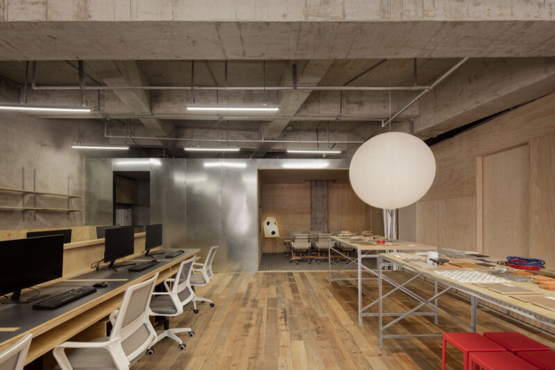
本案为一家景观设计公司的办公室,它需要一个开放、灵活,能激发更多创造力的空间。如何在有限的的空间里满足工作生活的不同需要是本案的难点。因此,我们希望整个空间是流动通透的,可以相互渗透延伸的趣味办公环境。
This case is the office of a landscape design company, which requires an open, flexible space that inspires more creativity. The difficulty of this case is how to balance the different requirements between work and life in limited space. Hence, we prospect it is mobile and transparent, which could be a mutual penetration, extension, and interesting official environment.
设计运用简单的材料和语言强调极简概念。空间上摒弃了繁冗、聒噪的装饰铺陈,白色墙面与天花、灰色或白色地砖、浅木色阅读区的色彩搭配与材质选择,让空间静默而内敛,空间变得清爽大方。线性光的使用强调的了空间的结构,同时带来一种穿越的未来感,给空间以蓄势待发的张力和延伸感。
The design conception applies simple materials and language to emphasize minimalism. The project abandones all complex and noisy elaborate decorations,the color matching and material selection of white walls and ceilings, gray or white floor tiles and light wood reading areas make the space quiet and restrained. The space becomes refreshing and generous. A linear-light protrudes spatial structure, comes into a sense of the future crossing, attaches the space with potential tension and extension.
作为半私密空间的综合功能区为半打开界面,且选用了黑色作为主色,使其区别于其他空间。在界定不同空间功能的同时,让空间可以相互渗透,缓和空间边界,且保证沟通方式的多元。金色的取景框让人的活动在黑色环境中更能凸显出来,强调了空间的性质,空间变得自由且开放。人置身不同的空间状态,镜框下呈现不同的场景,在不同功能空间都可以相互交流、攀谈,穿越空间的交互与对话。
The integrated function area as a semi-private space is a semi-open interface, and black is selected as the main color to distinguish it from other spaces. While defining different spatial functions, the space can penetrate into each other, alleviate the space boundary, and ensure the diversity of communication methods. The golden frame makes people’s activities more prominent under the black background, emphasizes the nature of space, and the space becomes free and opened. People can communicate in different spatial states and different scenes presented through the frame, which is the interaction and dialogue across space.
吧台和休闲书吧及开放阳台空间不仅解决了工作共享问题,同时塑造了人际关系与社交网络,让人与空间的关系变得富有弹性和延展性。以吧台为界,通过地面铺装的差异,将公共办公区与半私密综合功能区区分,而空间却是互渗相通,并没有强硬的空间划分。
The bar, the leisure reading area, and the open balcony space not only solve the problem of work sharing, but also create interpersonal relationships and social networks, make the relationship between folks and space more flexible and malleable. Taking the bar as the boundary, the public office area is distinguished from the semi-private integrated function area by the difference of the ground pavement, while the office area and the semi-private integrated function area are interpenetrated and there is no tough space division.
而休闲书吧和总监办公区则形成一个修长的异型木盒空间,从颜色、材料、高度界定空间。木色相对温暖的色调拉近了人与人的距离感,创造更舒适的沟通环境。空间的交融让办公不再冰冷,它或私密或开放,可静止可流动,功能更加复合,能激发创造力与想象力。
The leisure reading area and the director’s office area converge into a a slender form, special-shaped wooden box space,which defines space from color, material and height. The relatively warm color of wood color makes people more closer and creates a more comfortable communication environment.The blending of space makes the office no longer cold. It is either private or open, static or flowable , and more complex functions. It can stimulate creativity and imagination .
作为相对私密的会议室和总理办公室,我们更倾向于更简练的手法,长条简洁的办公桌对应顶上长条灯线让空间更加舒张。
As a relatively private meeting room and manager’s office, we prefer a more concise approach. The long and simple desks correspond to the long strips on the top to make the space more relaxing.
设计旨在营造更多元有趣的办公场所,使用者置身其中产生各种行为和灵感的碰撞,办公不再单调乏味,变为生动趣味的场景和片段。
The design aims to create more interesting and diverse office space, in which users will have a variety of behaviors and inspirational collisions. the office is no longer monotonous, but becomes a vivid and interesting scenes and fragments.
∇ 功能分区 functional division
∇ 空间原理 Space principle
∇ 平面图 plan
完整项目信息
项目名称:阔地景观办公室
设计公司:月介空间
联系邮箱:mpluslab@126.com
完成年份:16/2019-05/2019
建筑面积:200平方米
项目地址:东莞市南城区天安数码城
摄影师:黄卫健
主创设计:黄卫健 陈秀瑶
客户:东莞阔地景观设计工作室
主要材料:不锈钢 木材 瓷砖 玻璃
project name: KD Landscape Studio
design: M+LAB
contact e-mail:mpluslab@126.com
completion Year:16/2019-05/2019
floor area: 200m²
project location: Tianan Cyber Park,Nancheng District,Dongguang,Guangdong, China
photographers: Weijian Huang
design:Weijian Huang/Xiuyao Chen
customers:KD Landscape Studio
materials:stainless steel wood ceramic tile glass


