随着电子商务市场的快速成长,在各地拓展开发着以各种各样行业为目标的大型借贷型物流设施,比如以网络通贩公司及货运公司为主的厂家等等。迄今为止,拓展开发出了不计其数的物流房地产的业主,从重视效率,以物为中心的设施配备的思路转舵,发起“以人为本”的理念。新型开发的大型设施“KLÜBB ELIA”便是打造了以人为先,向着舒适愉悦的工作环境整备迈进的专业品牌。我们此次经手了第5栋设施“ESR久喜DC”的托儿所、商店、休息室以及大厅的设计工作。
Large-scale rental distribution facilities are being developed all around Japan to meet growing demand caused by the exploding e-commerce market from a variety of businesses, including e-commerce and shipping companies. Our client, who has developed distribution facilities for many different clients, operates under the philosphy of Human Centric Design, shifting away from creating facilities centered on efficiency and goods. Their newly developed large-scale facilities offer advanced comfortable working environments, designed for people, branded as “KLÜBB Area.” We designed the nursery, shop, break lounge, and entrance hall of ESR Kuki DC, the fifth building.
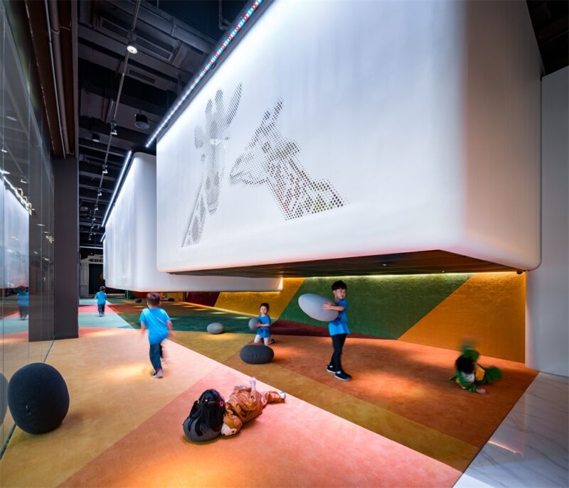
儿童时代将所见的云的形状想象成动物或者其它各种各样有趣的东西。休息室拨动使用者心弦的,形状多变的镂空形墙壁,宛如图书馆的书架一般的排列开来,我们将它们取名为“cut out wall”。人们懂得观察对象的远近移动而产生的视觉差,透过cut out wall的复数连续的漏孔所见的事物产生变换时,即发生视觉差时,使用者便可感知自己在移动。相比之下,行走穿梭时身边景物一成不变的硕大场所且相对封闭的物流设施,这种灵活多变回归以人为本的建造,更多考量的是人们感受到舒心与舒适。这种视觉差的建造,也以连续镂空的矩形的形式运用到了大厅的设计当中。
When we were children, we saw animals and many other things in the clouds. The break lounge is partitioned by “cut out walls,” arranged like bookshelves in a library, with irregular holes reminiscent of those childhood memories. People perceive distance by judging the disparity of what they are observing when it moves. When the figure seen through the series of holes in the cut out walls moves, in other words, when disparity occurs, the viewers feel as if they themselves are moving. In the context of a spacious yet closed-off distribution center, where the view never changes no matter how long one walks, these kind of mechanisms bring us back to human scale, prompting feelings of relief and comfort. We included this disparity mechanism in the design of the entrance hall by repeating a series of small holes as well.
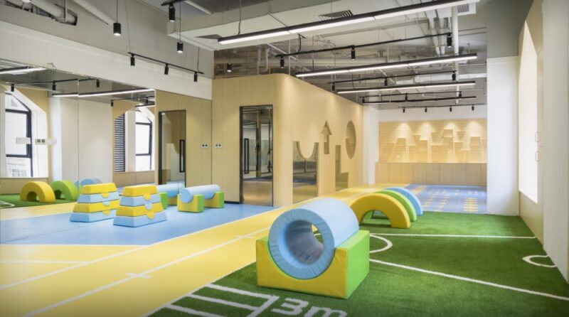
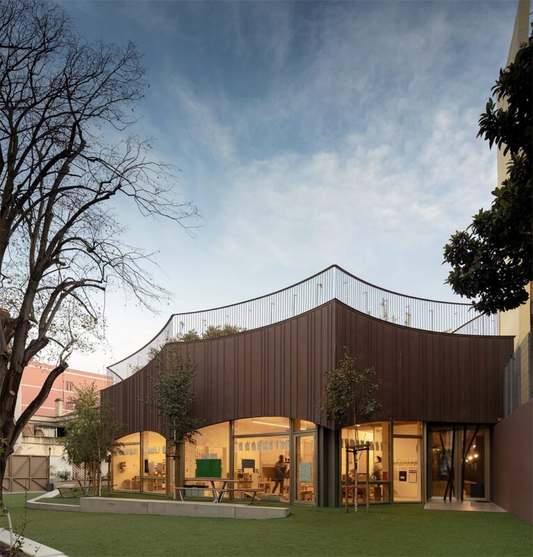
因托儿所位于日照不算好的东北侧一楼,故将庭院里最大限度吸收自然光照的倾斜壁面的反射光倒入室内。早晨短暂照进来直射光打在倾斜壁面的光影,随着时间推移而产生视觉变换。庭院的地面以及铺满人工草坪的倾斜壁面勾起想人们要攀登的冲动。室内起伏的设计也会促使人多运动。这些既可以激发孩子们的好奇心,也可以培养加强冒险精神与身体素质。
Because the nursery is located on the first floor of the north building, where sunlight is not readily available, we attempted to let in as much natural light as possible by making a slanted wall on the terrace to reflect light into the interior. During the few hours of light in the morning, the direct light creates shadows on the wall, depicting the passage of time. The continuance of the floor of the terrace to the astroturf slanted wall invites us to run up it. Similarly, the rolling shapes of the interior design also function as a physical mechanism to invite movement and appeal to their sense of curiosity and foster their sense of adventure and physical ability.
完整项目信息
项目名称:ESR Kuki DC KLÜBB area
项目位置:日本崎玉县
项目类型:商业空间/托儿所
完成时间:2018.11
建筑面积:145,990㎡/托儿所122.65㎡ 社交室353.34㎡
设计公司:熊谷组(设计本体) TAKATO TAMAGAMI ARCHITECTURAL DESIGN(托儿所、休息室、商店、入口处) Architectural Design Office 【hyphen】(协作设计)
摄影:吉村昌也


