LOFT中国感谢来自巨汇设计有限公司的商业项目案例分享:
西安地处中国中心,千年建都史累积成久远深邃的文化体系,如今作为教育重地更承载着中华文明的复兴与文化自信。这样的地域背景赋予西安天然的文创项目孵化力,开创文商结合趋势之先河。
Located at the center of China, Xi’an has been the capital of multiple dynasties for over 1,000 years and formed a profound cultural system. And it is now bearing the mission for the renaissance of the Chinese civilization and cultural confidence as an important place for education. Such background endows the city with the capability to incubate cultural and creative projects and pioneer in the culture and commerce integration.
本案即是一座书店主题的商业综合体,以文化+商业的策略性设计,构建多元业态的生活美学体验。其中高18米、长240米的艺术书墙概念堪称创举,为西安乃至中国带来城市商业空间的全新提案。
The project is a bookstore-themed commercial complex, which offers lifestyle aesthetic experience with multiple business forms via a “culture + commerce” design strategy. The 18m-high and 240m-long artistic book walls in it are striking and pioneering, bringing a brand-new image of urban commercial space to Xi’an and even China.
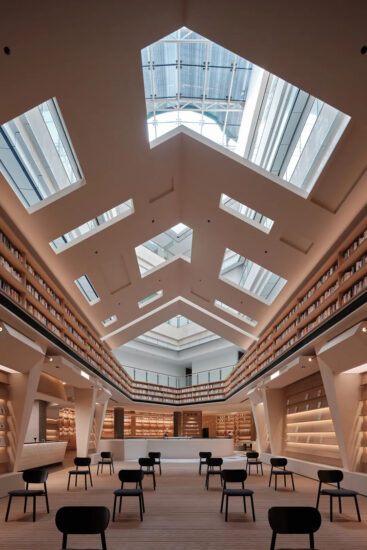
∇ 二楼书店阅读区视角 Reading area of the bookstore on 2F
∇ 二楼挑空区南面视角 South view of 2F’s void area
因应场地特质,化平庸为优势Turning commonness into advantage by making use of site characteristics
项目坐落在西安北郊的工业区,并非人潮商圈的核心地,常规的复合式经营显然不足以吸引客流。来自宝岛台湾的巨汇设计接手这座已闲置三年的毛坯建筑体,并发掘出未经修饰的原始建筑结构在天光之下展现的力与美。
The project is situated at an industrial area in the northern suburbs of Xi’an, which doesn’t enjoy large human flow volume and prosperous commerce. Therefore, the conventional compound operation mode is clearly inadequate to attract customers. As Gonverge Interior Design took over the project, the roughcast architecture had been idle for 3 years. By making use of site conditions, the designers strove to present the strength and beauty of the original undecorated architectural structure, with natural light brought in.
基于南北坐向的狭长场地和四层采光挑空区域,巨汇以五感设计为主轴,展开项目定位策划、商业设计及空间设计。挑空区原本的建筑空间优势得以保留,塑造出强烈的空间体验感。狭长的格局特质被强化,并顺势转化为仪式感的动线体验。
Based on the long and narrow site in south-north direction and the four-storey-high daylighting void area, Gonverge Interior Design carried out project orientation planning as well as commercial and spatial design with five-sensory experience as the main axis. The designers kept the advantage of the original void area, with a view to producing a strong experiential sense of space. Besides, they strengthened and highlighted the features of the slender and long site, and created a smooth circulation with a sense of formality.
∇ 三楼儿童区视角 Kids’ book area on 3F
百米书墙构筑商场标识唯一性 Long book walls: unique identifier of the mall
在主持设计师程瀚陞看来,要超越地域地段的限制,必须靠文化来使人汇集,因为文化本身没有距离,能够容纳全民参与进而实现最大引流。商场因此化身为以艺术与文学为核心的知识殿堂,将书的主题贯穿于整个空间。
According to Han-Sheng Cheng, the chief designer, it’s imperative to depend on culture to go beyond geographical restrictions and gather people, because culture itself does not have geographical distance and can attract the participation of all people, thus maximizing the flow of customers. Based on such idea, the mall was designed to be a hall of knowledge, with art and literature as the core and the theme of “book” running through the entire space.
一楼到四楼,南面延伸至北面,在漫洒的天光映衬下,巨汇设计置入了两道量体书墙,层高18米、全长240米的尺度为全中国之最,使喧闹的商业空间却有着殿堂般仪式性的感动与震撼。
Gonverge Interior Design embedded two book walls under the diffused natural light, which are erected from 1F to 4F and stretch from south to north. With a height of 18m and total length of 240m ranking top in China, the book walls give the busy commercial space a sense of rituality, which is striking and magnificent, just like a hall.
∇ 三楼挑空东面视角 East view of 3F’s void area
∇ 三楼挑空区北面视角 North view of 3F’s void area
以人为本,借由五感传递价值 People-oriented and delivering value through five senses
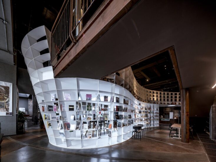
承载数十万册图书的书墙,以钢结构和透明玻璃为材质,除了视觉穿越,也让光线自由漫射在挑空区域,与空间实体交迭出各种形式的语汇。阅读者穿梭在书墙与挑空之间,成为这殿堂景象的一部分。
With hundreds of thousands of books placed in, the two large walls are constructed with steel structures and transparent glass, which enables people to see through and also allows the light randomly diffuse to the void area to interact with the spatial entities in various forms. Readers can walk between the book walls and void area, which becomes a unique scene in this hall.
近4万平方米的空间内涵盖艺术、人文、生活三大元素,将场景化阅读与商业空间完美融合,营造出一个沉浸式阅读情境。以美感为立基的情怀分享,也使这里成为文创和设计师品牌进驻展示创意和理念的最佳平台。
The nearly 40,000m2space combines the elements of art, culture and lifestyle, perfectly integrates scene-based reading and commercial functions, and creates an immersive reading environment. It’s a place enables sharing of feelings based on aesthetic, making it the best platform for cultural, creative and designer brands to display their creativity and ideas.
∇ 三楼挑空区南面视角 South view of 3F’s void area
∇ 三楼挑空区西面视角 West view of 3F’s void area
∇ 书店主收银服务台 The bookstore’s main cashier counter
∇ 一楼挑空区北面视角North view of 1F’s void area
∇ 一层平面分区图 1F plan
∇ 二层平面分区图 2F plan
∇ 三层平面分区图 3F plan
∇ 四层平面分区图 4F plan
∇ 二层东南区服务台单元详图 Detailed diagram of the 2F cashier counter
∇ 猫道楼梯详图 Detailed diagram of catwalk stairs
∇ 书墙立面图 Elevation of book walls
∇ 一层南北扶梯下服务台区 Diagram of 1F service counter area under the south-north escalator
完整项目信息
项目名称:蓝海风・漫巷
室内设计公司:巨汇设计有限公司(https://www.gonvergedesign.com/)
空间创作与商业企划总导演:程瀚陞
设计师:吕欣璇、陈新强
项目地点:中国・西安
项目类型:文化商业综合体(购物中心+书店)
项目面积:36,000 m2
完工时间:2018.12
摄影师:金伟琦
Project name: LAFONCE・MAXONE
Interior design: Gonverge Interior Design (https://www.gonvergedesign.com/)
Spatial Design & Commercial Planning Director: Han-Sheng Cheng
Designers: Hsin-Hsuan Lu, Xin-Qiang Chen
Location: Xi’an, China
Project category: cultural & commercial complex (shopping mall + bookstore)
Area: 36,000 m2
Completion time: December 2018
Photographer: Weiqi Jin


