LOFT中国感谢来自共向设计的商业项目案例分享:
房子
那是一座四层高的厂房,毫无建筑性可言,通常而言我们称之为房子,而非建筑,因后者总在某程度上带点去功能化后摄人的特质,当然这些特质可以被称之为艺术,文化,哲学……,或者那些还未被开拓的概念。总而言之,展厅就坐落在这平平无奇的房子的一层。然而我却被这些所启发和感动,因为如果这是由建筑师设计出来的建筑,便低调不起来了,因为他总会在上面留下自己美丽的痕迹,当然我不评价“美丽”这词的褒贬。
The project is a furniture showroom, situated on the first floor of a factory building in Shenzhen, China. The building, not designed by architects, is very ordinary and has a low profile, without any special features other than functionality. In general, architects usually tend to incorporate various non-architectural elements into the buildings they designed, such as artistic and cultural elements, which can bring out either positive or negative effects.
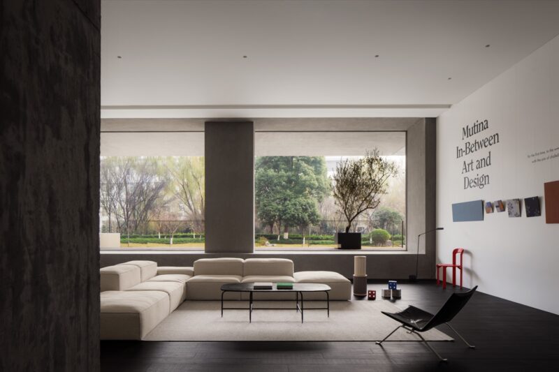
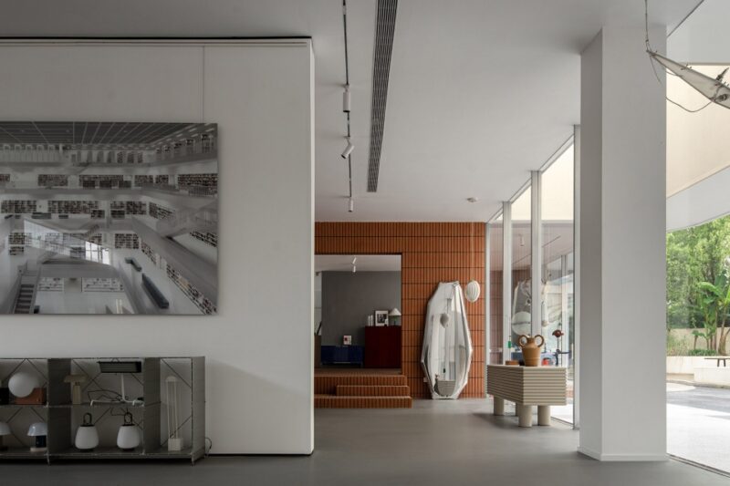
也许就是因为它只是个房子,所有事情都变得简单而清晰,有时在设计的过程中你需要这些特质,而不是总要把事情弄出个龙与凤。这些简单而清晰的特质指的是建筑语汇中最基本的要素,开间,进深,梁柱,窗洞,门洞,秩序等等。就是这些要素,塑造出改造后的模样,当面向空间中那一排柱子的时候,一条有趣的廊道便知道它日后的诞生;当面向那一排千篇一律的窗洞时,那一排富有秩序的“光盒子”才在日后成为独特的室内外的媒介;当面向柱廊两侧的开放空间时,那种感情才由目前的互不相干变成日后的水乳交融。
However, the ordinariness of this factory building greatly touched and inspired us as approaching the interior design. We respected and made the best of basic elements in the original architectural space, including beams, columns, window and door openings, etc., to reshape it. For instance, the row of columns was tactfully utilized to form an interesting corridor, and the orderly window openings were transformed into “light boxes” that connect the inside and outside space.
容器
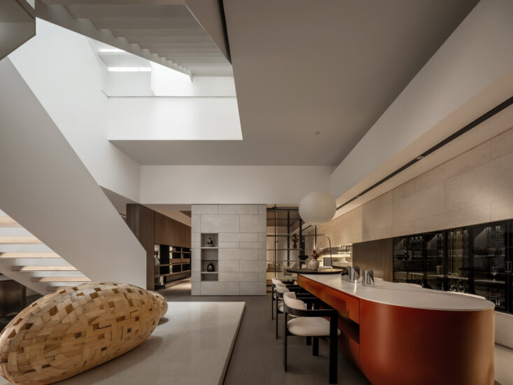
在探寻基地的情况后,空间告诉我它想要成为的样子,对,就是容器。它无意刻意为谁服务,也不想成为主角,它只想安静地处在一个平稳祥和的状态,只有这样,它才能发挥它最大的能量来供给互相争宠的家具们和来往的心灵无处安放的客人。
After visiting the site, we decided to make it be what it’s supposed to be: a container. With a tranquil and peaceful ambience, the space is not the “protagonist” but plays a supporting role of serving for the displayed furniture and visitors.
我问它为何想如此低调,它的回答让我心碎却同时又充满慈爱,我想这也是这个时代我们最缺失的部分,它说,只有观众才是主角,其他都是配角。配角所要做的就是调动一切手段来刺激观众的情绪,当然这些手段像风,看不见却能感受。
It needs to be capable of stimulating visitors’ emotions in an invisible but perceptible manner.
转换
也许只有中国古代的文人雅士才从真正意义上看懂古典园林,只因他们对造园的审美趣味和营造标准,试想在当今时代,又有谁能够对待一草一木,一石一水有如此动人的描述和审美的要求,只要翻开那些典籍,在庭院里的鱼林草石,都像人一般有着详细的美丑标准。一块石头在具体的场景中适合以何种形态和何种质地呈现,都有着深刻的标准。
In Chinese classical gardens, forms and arrangement of details, such as a tree, a stone and water, all follow strict aesthetic standards.
我所关注的并非这些,而是潜藏在这些背后的时间与空间的线条。你可以在漫步在古巷当中,而不经意发现园林的入口,步入其中,方知其奥妙,只有在空间非常狭小的地方,才能发现其背后的真谛,那是时间与空间的路径。起承转合,开合围敞,一条停泊在湖边的廊子,挑拨着湖面与另一侧的亭子的情感;廊子的尽头,开始着另一个空间维度,在同一时空中,观察到两个不同的空间维度,像是在跨越时空的奥妙,抽离灵肉的觉悟。
Besides, another important feature of Chinese gardens is the skillful utilization of lines and transitions of space. If people step into a traditional garden, all the scenes cannot be seen at a glance. Nevertheless, twisting circulation routes and unexpected transitions of space help lead them to explore it, and present a series of perfectly composed and framed glimpses of scenery, such as a view of a pond, of a tree, of a rock, of a corridor, or of a pavilion, etc. Though seemingly disorderly, Chinese gardens are awash with order.
线条如同容器,一条无形之道,却指引着来往客人的心灵。园林和展厅是一体的,他们有着同样的想法,始与终归于一点,过程则是潜藏在背后的线条所贯穿,其中包含多种的复杂性和矛盾性。
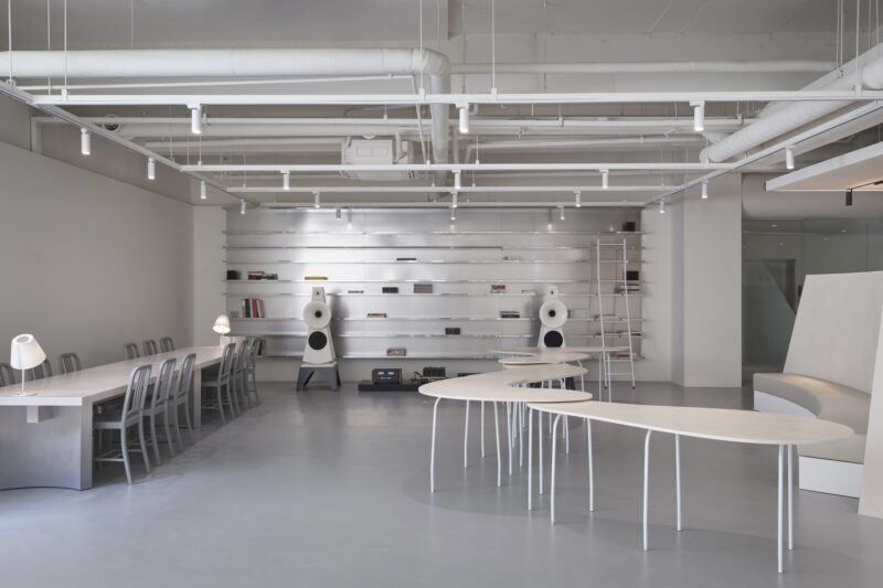
We think gardens and showrooms are very similar, both focusing on guiding people to explore the space and discover unexpected surprises. For this reason, we drew on the design of Chinese classical gardens, and worked to add subtle circulation routes to the interior, which link different areas in a unique way.
物质是有限的,也是客观的。感知是无限的,也是主观的。旨在秩序的置入和组织的重组,呈现一个短暂的时段,在主体的参与中,一系列的转换泛起情绪的波澜,无法平静当中,不断探寻和开拓,最终疲乏,情绪波动平息,随意停歇,观望,然而真正的探寻才开始,是在意识中的回放和定格,在迷惑中的突破与同步。一切归功于秩序的伟大和时间的渗透。
Through incorporation of order into the space and reorganization of interior structures, we intended to create immersive and varying experiences for visitors. A series of transitions of space present different scenes, provide an interesting journey of exploration, and evoke change of emotions. It’s a pure space, and what make it unique are the subtle order and lines.
∇ 平面图
完整项目信息
项目名称:华意空间展厅
项目地点:深圳市龙岗区浪背第六工业区18号
设计面积:1178㎡
竣工时间:2019年4月
硬装设计:共向设计
软装设计:共向美学
主要材料:灰色石材、肌理涂料、木饰面、木地板、黑钢
企业网址:www.cdd-china.com
项目摄影:张超


