LOFT中国感谢来自杨钧设计事务所的住宅项目案例分享:
这是一套位于中国美院对面的顶层大宅,在房子里可以俯瞰整个美院全景。因此也产生了房子与艺术的对话。
This is a big over storey mansion on the opposite site of China Academy of Art. You could have a bird’s eye view of the whole academy. Therefore there is the communication between architecture and art.
在入门处设计师打破了传统的换衣区,一根皮质的衣杆,一把皮质的坐凳,对面就是鞋柜,处理手法干净利落,打破常规,简约中彰显品质,玄关和过道背景也是处理独特,设计师从折纸中提取灵感,让装置艺术取代背景墙,用铁板做折面,让光从不同角度透射出来,无论在哪个角度看就像是在欣赏一幅艺术作品。
An unorthodox design at the entrance can be seen as a breakthrough of traditional changing area. A Leather clothes pole, a leather stool, a set of shoe cabinet right in front, all design techniques are nice and neat, unconventional, simple and yet of high quality. The design of hallway and aisle background is also unique. Inspired by paper folding, background wall is replaced by an iron installation art . Through the surface of folding iron plate ,allowing the light to be transmitted from different angles. It is therefore like a piece of art that can be admired from every aspect.
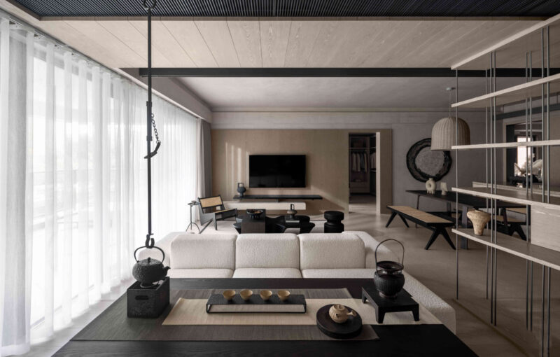
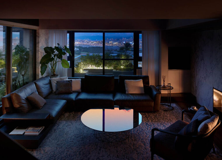
客厅的顶面大胆采用了深灰的涂料,与地面呼应,设计重心就是为了突出整面的书架和壁炉,在这个空间,你可以随手挑一本书籍,配一壶暖茶,或取一堆柴火,围炉而坐,在整个高级灰的空间里享受那份安宁。水磨石,铜制踢脚,裸露的混泥土,这些常见朴实的材质通过设计处理,与抽象笔墨的作品结合,使空间现代时尚又不失东方,这也是设计师在整个作品中所贯穿表达的。在光的运用上,设计中埋下一个伏笔,当傍晚太阳西下时,阳光通过设计的一面格栅洒进时,客厅会出现斑斓的光斑,地毯上,茶几或沙发上,会出现不同的折射,给人一种惊喜和愉悦,设计之外也许就是这个意思。
Dark grey paint was boldly used on the living room ceiling as to match the floor. This design focuses to accentuate the whole book shelves and fire place. And there you could pick any book, with a teapot of warm tea or a pile of fire wood, sitting next to the fire place and enjoying the peace in the room. Waterstones, copper made skirting, exposed concrete, all these earthy elements are orchestrated to unite obscure ink work, in order to express the idea of modern art and Oriental charm. And this has always been a consistent way of the designer to interpret his work. In the use of light, a hidden element needs to be revealed when the sun sets. The sunray gets through the rack radiated from within and projects gorgeously kaleidoscope-like lights on the mat, tea table and sofa in the living room. The light is reflected with different angles, giving you surprise and happiness, which is predicted from the design but also beyond.
敞开式的厨房设计,把餐厅和厨房融为一体,也是为了能有更好的互动空间,黑白灰的配色 ,干练整洁,餐厅和休闲区用酒精壁炉做隔断,背景做投影,设计师认为优雅的就餐环境就应该需要这些,皮质编织的餐垫搭配玻璃桌面,也是一种传统与现代的碰撞,不露痕迹的表达了设计的内心。
The open kitchen design combines dining room and kitchen to make them better interacted. The color scheme of black, white and grey is simple and clean. Dining room and function room are separated by alcohol fireplace. Background was composed by projection, which meets the concept of the designer that dining place is supposed to be elegant like this. Leather weaved table mat on the glass table can be seen as a harmonious combination between modern and traditional art, inexplicitly expressing the spirit of the design.
休闲区整体设计随意不做作,水磨石的地台配上真皮坐垫和毛垫,设计感超强的落地灯,极简的装饰墙柜,墙面则选择了一幅艺术家的抽象作品,让这个灰度空间里不再显得沉闷,整个以软装为主的空间,就是想给人带来自由,放松,惬意。在这里可以发呆,或看一场电影,当朋友聚会时,可以切换成红酒吧模式,微醺,畅谈理想等。
The design of function area is casual and unpretentious. There are water stone platform with real leather and wool mat, stylish floor light, simple decorating wall cabinet and a hanging of abstract painting on the wall, which makes the grey room vivid. Soft decoration is the main theme as to express the concept of freedom, relaxation and satisfaction. You can day dream, watch a movie or even switch it to a wine bar environment, so you could have some social drinking and talk dreams freely with your friends.
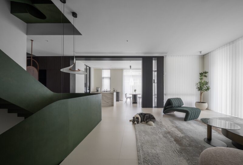
休闲区的对面一侧利用空间高度设计了一个隔层,楼上做为儿子房,而楼下空间设计更多的体现对建筑的理解,从而产生内建筑,作为一个模糊空间,此刻设计师更像是一位建筑师,尽量把空间概念化,斜面楼梯的设计像是一个雕塑,没有过多的去装饰,楼梯口通过一把红色陀螺椅盘活了整个空间,更多是想把这些空间留给主人,可以是艺术品展示区,也可以是健身空间,在一个家里面如果有空间可以这样浪费,足以体现主人的包容和对艺术的追求。
The opposite side of the function area uses a spatial height to design a compartment, upstairs as a child room, and the downstairs space design focuses more on the understanding of the building, resulting in interior construction, as an undefined space. Meanwhile the designer is more like an architect, trying his best to conceptualize the space, the design of the slant staircase is like a sculpture without too much to decorate. There is a red gyroscope at the stairs entrance vitalizing the whole space, and leaving it to the owner. It can be an art display area, it can be also a fitness area. It reflects the owner’s tolerance and the pursuit of art, if the design allows such indulgence in space.
公卫比较狭长,没有采光,在设计中选用了一米长的台盆配双龙头,并定制铜边大面镜子,增强空间感,其他墙面则选用带有水墨的进口墙布,让其卫生间不会那么单一。
Public restroom is relatively narrow, less lighting, in the design of the selection of a meter long basin with double faucet, and customized copper side of the mirror, enhance the sense of space. The other walls are covered with ink print wall cloths, which are picked form overseas, making the bathroom versatile.
主卧空间比较大,床头采用凌空设计,自带床背的皮质设计体现一种简洁的品质,在床与落地玻璃之间的蕨类植物,设计师也是精挑细选,半弧枝干慢慢轻垂,显得特别写意,人与自然的关系如此亲近。主卫也是选用山水纹理的理石,配上皮质铜镜,大叶的绿植,冷峻中带有一丝清新,在窗边设计了一个矮踏,洗完澡可以休憩,当你眼看窗外会发现种植了很多仙人掌,这也是设计师想给主人意外的惊喜,细心之处就在于此。
The space of Master bedroom is relatively larger, the bed with a volley design, comes with the back of the leather made design, which reflects a simple but high quality. In-between the bed and floor glass window, there is a ferns selected by the designer. Branches of the ferns hang freely and joyfully. The connection between human and nature has never been so close. The main bathroom is furnished with marble of landscape texture, coupled with the leather-feel bronze mirror. Plants with big green leaves are cold with a trace of freshness. A step is designed by the side of the window, so you could rest after taking a bath. When you look out the window you will find a lot of cactus, which is an idea that the designer would like to surprise the owner, and all of these show the spirit of attention to details.
儿子房的整体设计也是延续了整个房子的色调,高级灰,特别之处就是在局部运用了明黄色作为点缀,体现年轻人的一种活力,颜色直击人心,另外在墙纸运用上也是花了点小心思,通过大小不同的二种三角形变化着整个空间,静谧中带有点跳跃,十分符合年轻人的一种氛围。
The overall design of the child room is the continuation of the hue of the whole house. Supreme grey, to stand out, is the partially use of the bright yellow as a decoration, reflecting the vitality of young people and the color has a blunt force. On the other hand, the wallpaper is also designed with care, through the different sizes of the two kinds of triangles filling up the whole space, quiet and yet vivid, demonstrating a vibe to cater the taste of young generation.
主要项目信息
项目名称:杭州象山国际私宅
建筑面积:700m2
设计机构:杨钧设计事务所
设计师:杨钧 吴志华 鲁婷
摄影师:刘宇杰
Project Name: Hangzhou Xiangshan International Private Villa
Area of Structure: 700㎡
Design agency: Yang Jun Design Office Inc.
Designer: Yang Jun / Wu Zhihua / Lu Ting
Photographer: Liu Yujie



评论(2)
客厅顶面是一个失败之处,说是大胆,还不如说是掩饰,少点马屁吧。
客厅顶面深灰色,地面灰色,在不开灯的情况下,有点头重脚轻,你不说我都没发现。