LOFT中国感谢来自SHURUI术锐设计的商业项目案例分享:
有性格的空间 | 亦柔亦刚
Character space | Soft and firm
如何塑造一个高级趣味的服装陈列空间,找到与品牌相契合的气质。SHURUI术锐设计不仅考虑视觉,更希望呈现其独到想象力,通过解构重组带来空间的冲突创造,打造当下沉浸式消费场景。
How to create a high-interest clothing display space and find the temperament that matches the brand.SHURUI’s sharp design not only considers vision, but also hopes to present its unique imagination. It creates space conflicts through deconstruction and reorganization, and creates an immersive consumption scene.
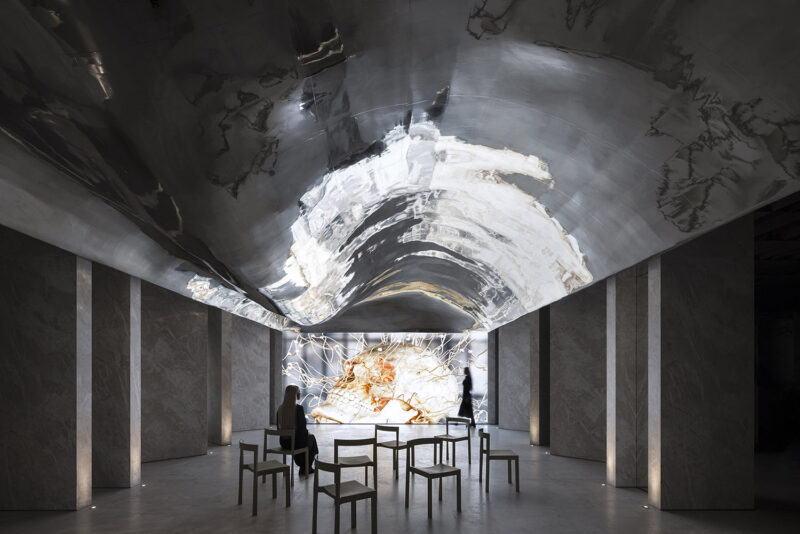
开敞的入口空间结合情景陈列装置,大体量的圆筒不锈钢以强势姿态贯穿两侧,在线性灯条的结合下产生强烈的视觉撞击,形成空间张力,让人不禁想一探究竟。
The open entrance space is combined with the scene display device. The large volume of cylindrical stainless steel penetrates the two sides with a strong posture. Under the combination of linear light bars, a strong visual impact is generated, which creates a space tension, which makes people think about it.
咖啡色是优雅沉稳温和,绿色是独立新生。情绪在优雅的空间中柔和晕染开来,当代独立新女性在娓娓道来的故事中绽放新生。
Brown is elegant and gentle, and green is an independent freshman. Emotions are softly smudged in an elegant space, and contemporary independent new women are reborn in the story of the martyrdom.
橱窗处动静结合,展示品牌动态走秀视频吸人眼球,用基本的几何图形表达碰撞,体块之间的叠加与组合营造出舞台效果,仿佛置身艺术馆。
The combination of static and dynamic at the window displays the brand’s dynamic catwalk video, attracting eyeballs with basic geometric figures, and the superposition and combination between the blocks creates a stage effect, as if you are in an art gallery.
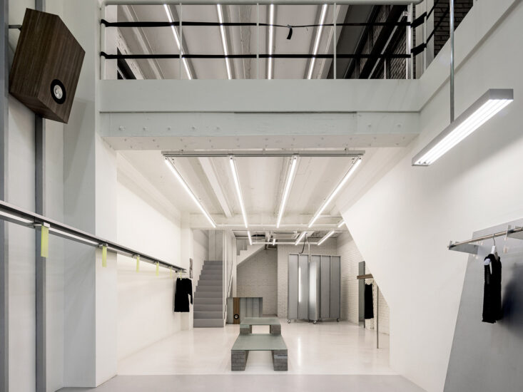
我们利用两道纵向延伸的隔墙造型,将空间划分为前厅零售区和后厅订货区,打破常规逻辑,高效完成前后区的客人交互,神秘同时又不乏流通性。
We use two longitudinally extending partition walls to divide the space into the front office retail area and the back hall ordering area, breaking the conventional logic and efficiently completing the guest interaction in the front and rear areas, with mystery and lack of liquidity.
方圆之中 | 几何线条
Among the squares | Geometric lines
SHURUI术锐设计基于时尚触角,探索人与空间的关联,在钢筋水泥城市一隅设有柔软的过度,把时装陈列变成融入生活的艺术品,给人想象和回味的余地。
Based on the fashion tentacles, SHURUI is designed to explore the connection between people and space. In the reinforced concrete city, there is a soft excess, turning the fashion display into a living art, giving people a room for imagination and aftertaste.
整体融入现代与时髦的气质,翡翠绿水磨石打破黑色的沉闷,地面用拼花石材铺贴和人字拼实木地板形成不同的视觉艺术观感。
同时,线性黑色拉丝不锈钢道具在整个画面里,更彰显服装本色。
Incorporating modern and fashionable temperament, the emerald green terrazzo breaks the black dullness, and the ground uses a mosaic stone paving and a herringbone parquet to form a different visual art look.At the same time, the linear black brushed stainless steel props show the true color of the clothing in the whole picture.
用空间的语言设计明暗、线面对话,将几何单体混合杂糅排列组合出新的可能。墙面设计水波造型,辅以灰绿色肌理艺术漆,通过射灯创造出涟漪的效果,让整个空间打破所有框架和定义,自如自由自成其韵。
Use the language of the space to design the light and dark, the line-side dialogue, and arrange the geometric monomer mixing and mixing to create new possibilities.The wall design water wave shape, supplemented by gray-green texture art paint, creates a ripple effect through the spotlights, allowing the entire space to break all the frames and definitions, freely and freely.
虚实相承 | 解构平衡感
True and false | Deconstructing balance
有秩序却又灵活可变的线条,围合出一个神秘感的空间,以建筑的节奏韵律在这个自然之城诉说着新生命。
The orderly but flexible lines enclose a mysterious space, telling the new life in this natural city with the rhythm of the building.
在浅灰色顶部和灰咖色PE墙布的印衬下,从形态到材料,线与线的交织,面与面的碰撞,光影于空间的游离,平静之中沁出的细腻的情绪。
Under the print of the light gray top and gray coffee PE wall covering, from the shape to the material, the line and the line interweave, the face-to-surface collision, the light and shadow in the space, the delicate emotions in the calm.
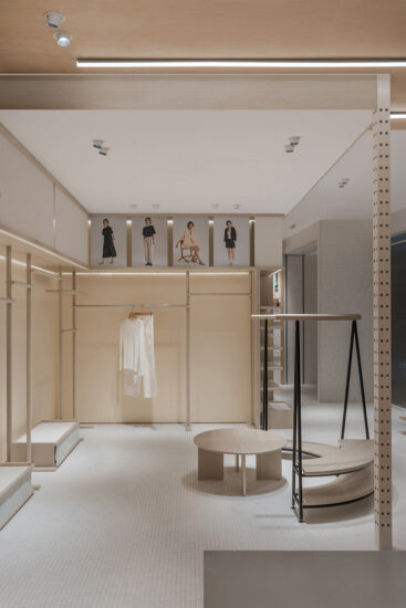
几何元素的石材拼花以及线条感货架加深了空间干净利落的锐气形象,又加入无处不在的圆润曲线与之抗衡,仿佛一位外在英气而内里柔和的女性,有了盔甲,也有了软肋。柔和的弧形立面释放出服装“面料”与生俱来的卷曲与自由,并利用光线作为空间的引导,传递难以言说的丰富触感。
The stone mosaic of the geometric elements and the sense of the lines of the lines deepen the clean and sharp image of the space, and join the ubiquitous round curve to compete with it. It seems that a woman who is externally British and soft inside has armor and weakness.The soft curved façade unleashes the inherent curl and freedom of the fabric “fabric” and uses light as a guide to space, delivering an indescribably rich touch.
∇ 爆炸分析图
∇ 平面图
完整项目信息
项目:GIFANTY
地址:中国.海宁
面积:95㎡
时间:2019.9
设计公司:SHURUI术锐设计
设计团队:郑杰、曾中明 、陶丽莎 、李镔
主要材料:艺术涂料 、水磨石、PE墙布、大理石、实木地板
摄影:瀚默视觉 张家宁
施工:麦合装饰
货架系统:京玺道具
照明设计:极成照明
联系:2980908710@qq.com
Project:GIFANTY
Address:Haining ,China
Area:95㎡
Time:2019.9
Design Company: SHURUI , Design
Design team: jason,Calvin, lisha, Libin
Main materials: Art paint, Terracotta, PE wall cloth, marble, solid wood floor
Photography: Hummer Vision Zhangjianing
Construction: McCoy Decoration
Shelf System: Jing Yu props
Lighting Design: Extreme Lighting
Contact: 2980908710@qq.com


