LOFT中国感谢来自MOC DESIGN OFFICE的教育空间项目案例分享:
MOC DESIGN OFFICE受客户委托完成了位于深圳前海的温莎双语幼儿园的设计。
温莎双语幼儿园是知名的德威英国国际学校的姊妹学校,是中国目前唯一一家引入并全面执行英国早期教育体系(EYFS)的幼儿园。
MOC DESIGN OFFICE is hired to design the Windsor Bilingual Kindergarten in Qianhai, Shenzhen.
Windsor Bilingual Kindergarten is the sister school of the renown Dulwich College. It is currently the only kindergarten that introduces and thoroughly implements the British Early Years Foundation Stage (EYFS) in China.
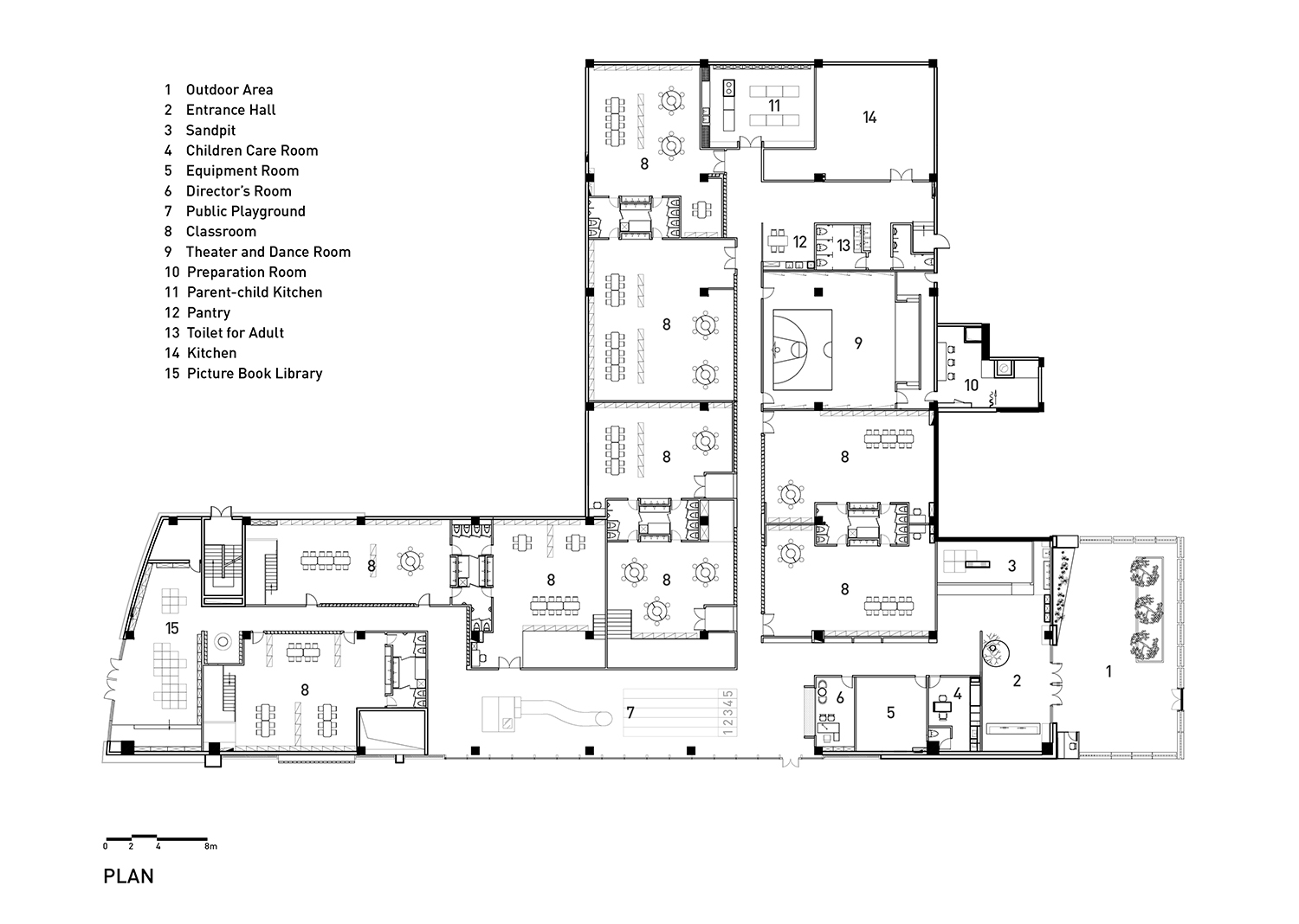
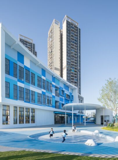
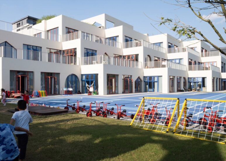
这是一所位于商业中心的幼儿园,位于深圳前海壹方中心相对僻静的街区内。由于项目场地户外面积有限,如何在现有场地条件下实现整体的功能需求成为设计考量的重点。
The kindergarten locates in the CBD, within a quiet block of Unicenter Qianhai, Shenzhen. Due to the limited outdoor area, the design focus is to achieve the overall functional needs under the current conditions.
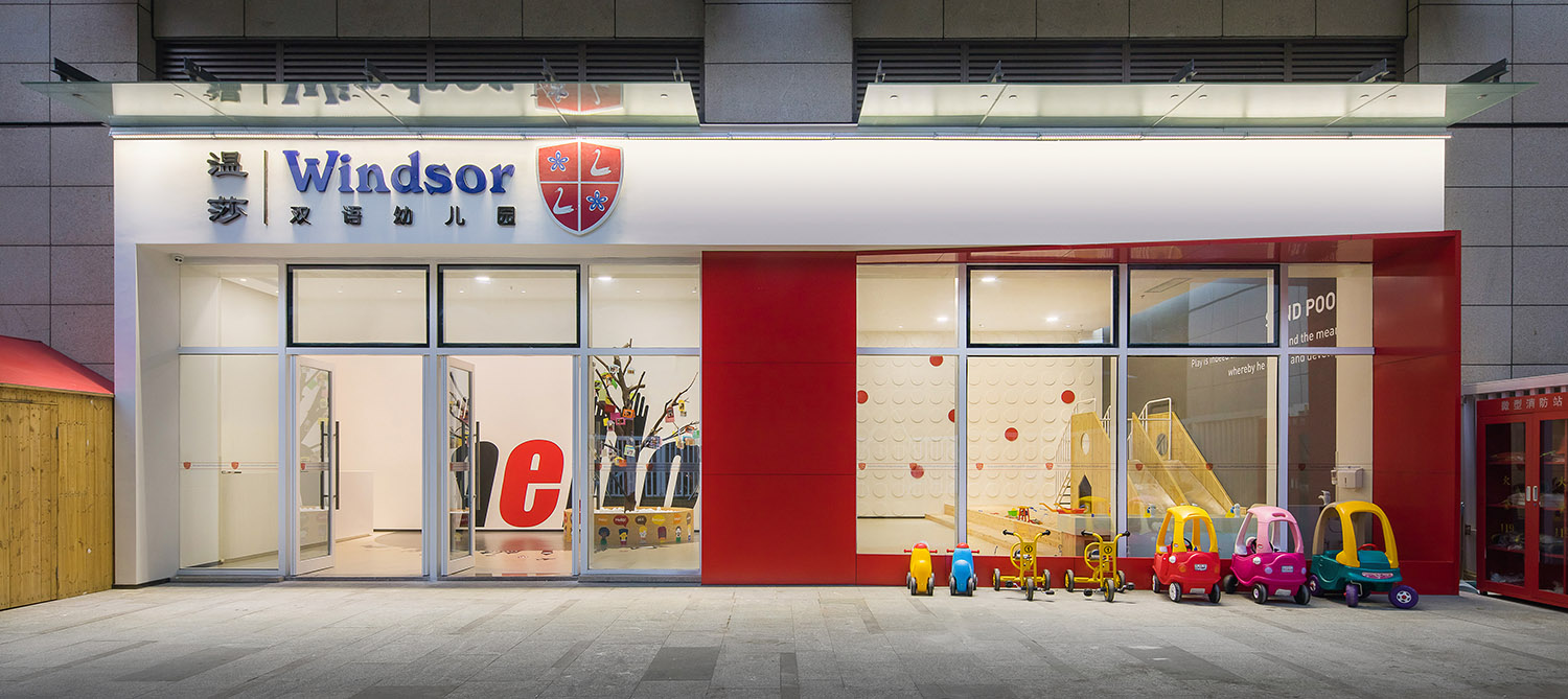
∇从户外活动区看向入口,the entrance view from the outdoor area
孩子通过与各种事物的接触观察和游戏,培养出敏锐的感知力、表达能力和解决问题的能力。设计师的目标是以孩子为中心,创造一个启发性的、提供更多可以与自然接触,能够自由穿行游戏、探索和塑造的空间。
Children grow their keen awareness, expression and problem-solving ability by establishing contacts with, observing and playing games with things. So the designer’s target is to focus on the children and to create an inspirational space where they can get closer to the nature, walk, play, explore and build freely as they wish.
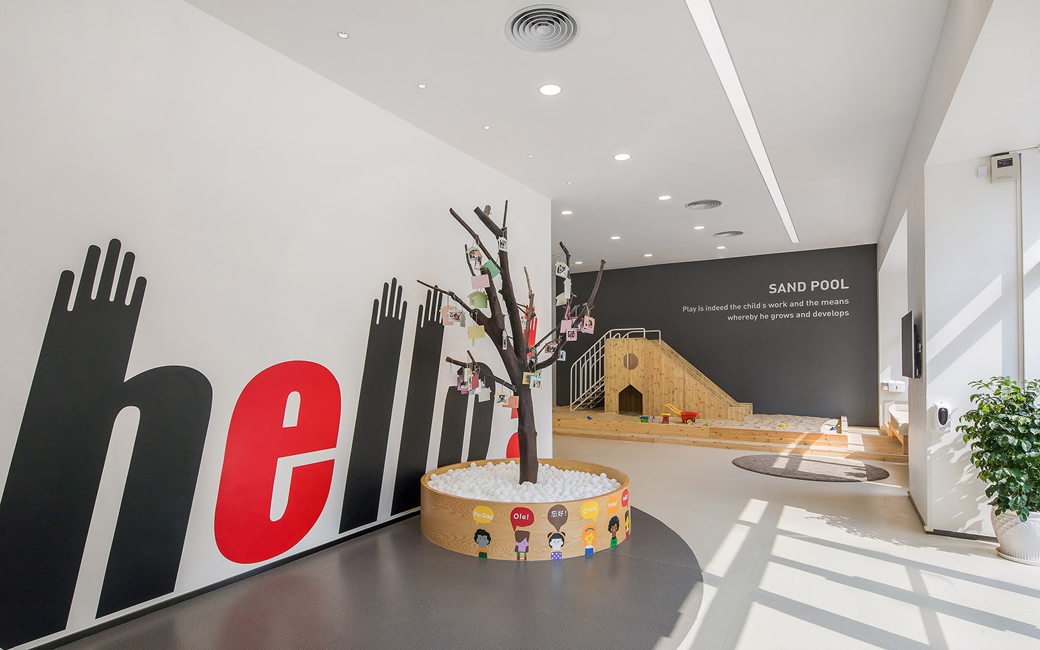
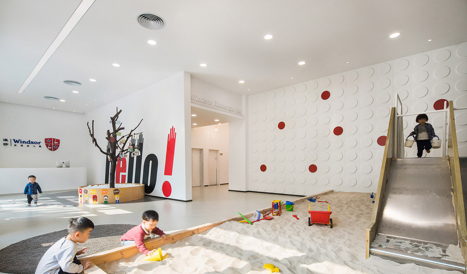
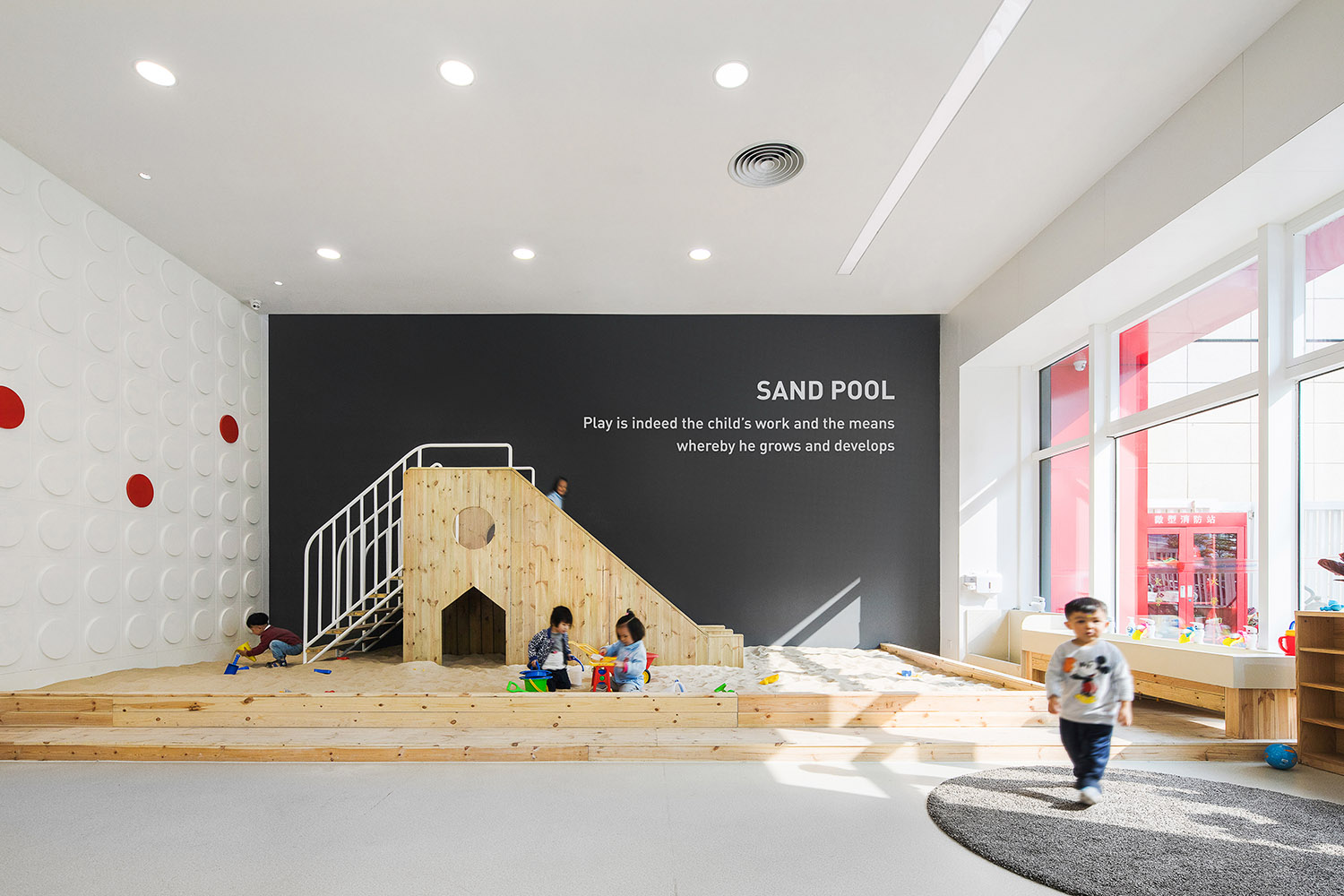
前厅是是每个孩子每天在进入这幢建筑之后的必经之路,我们希望除了接待功能之外,前厅也是一个有趣的、有活力的的空间,因此沙池被安排到该区域靠窗的位置,让孩子可以阳光中活动。
The entrance hall is a very playful, energetic and exciting space and as the only pathway welcoming every child into the building. A sandpit is created next to the windows, engaging the children to play in the sunlight.
∇ 沙池,Sandpit
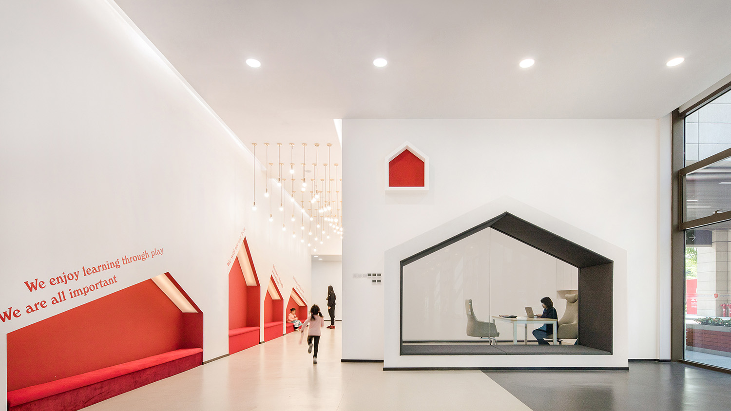
每个孩子都渴望长大,因此设计时并不过分的使用色彩和过于卡通的图形等去激发儿童的兴趣,而是在空间中克制的使用色彩和图形。
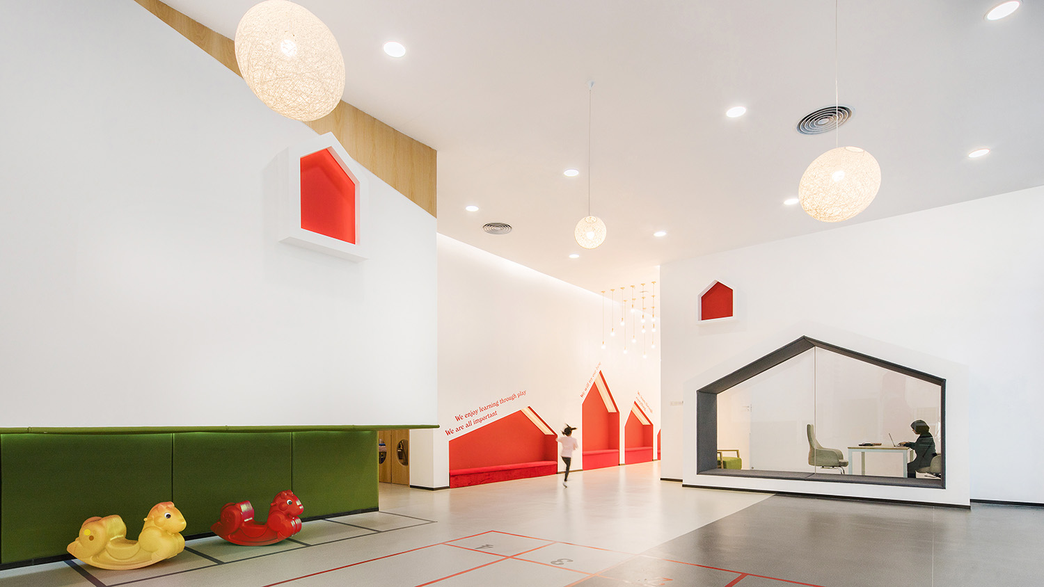
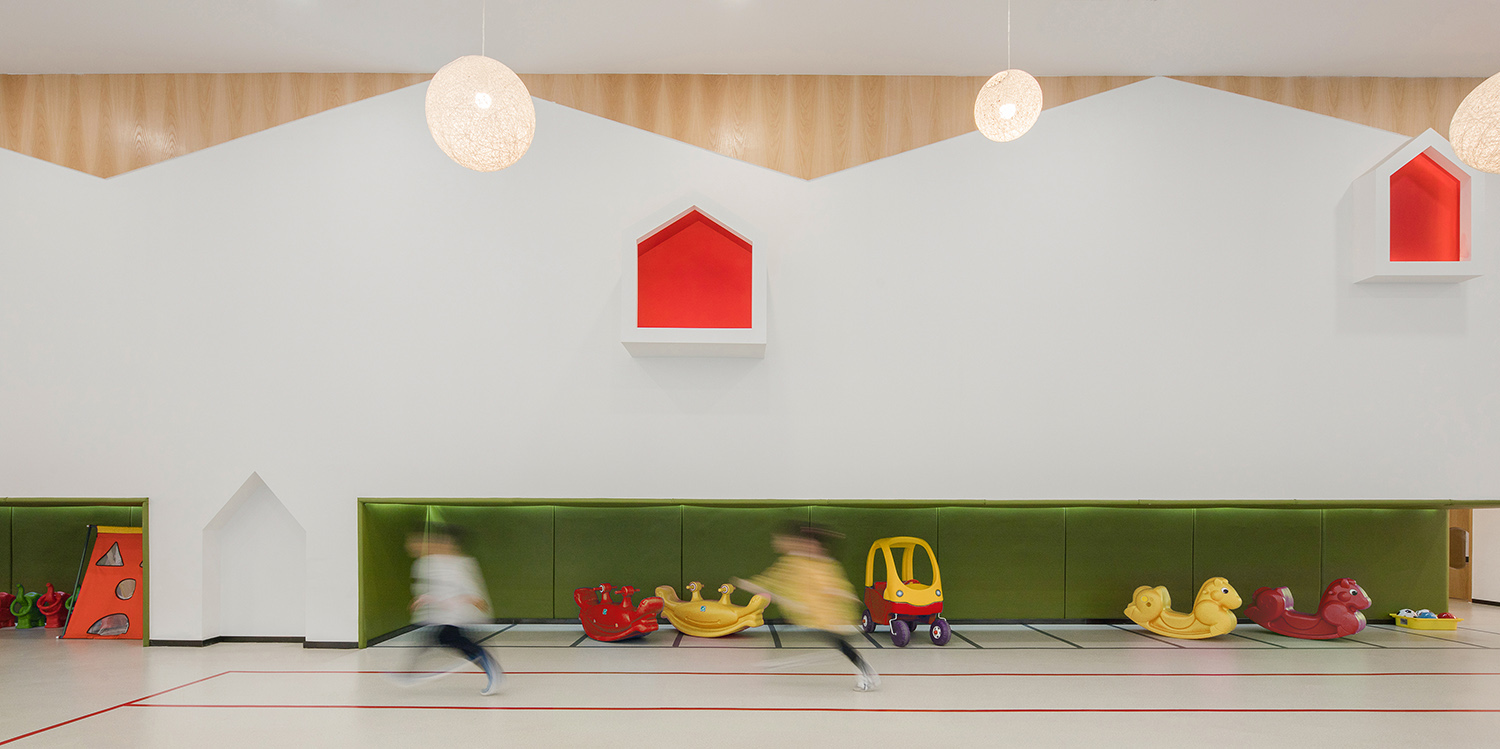
3~6岁的孩子容易将观察到的事物简化成单一简明的符号,以此为基础产生对环境事物的认知,故在设计上我们选用了简洁明了的房屋造型作为贯穿元素,使空间整体简洁而不失活泼。
All kids are eager to play and grow up together. The design abandons excessive colors and cartoon patterns to inspire the kid’s interest, but rather carefully select and restrict its usage.
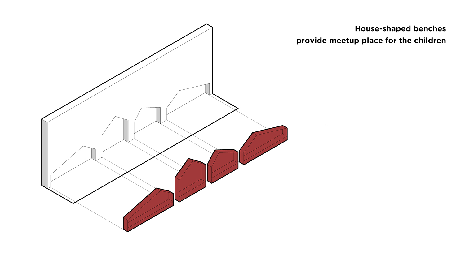
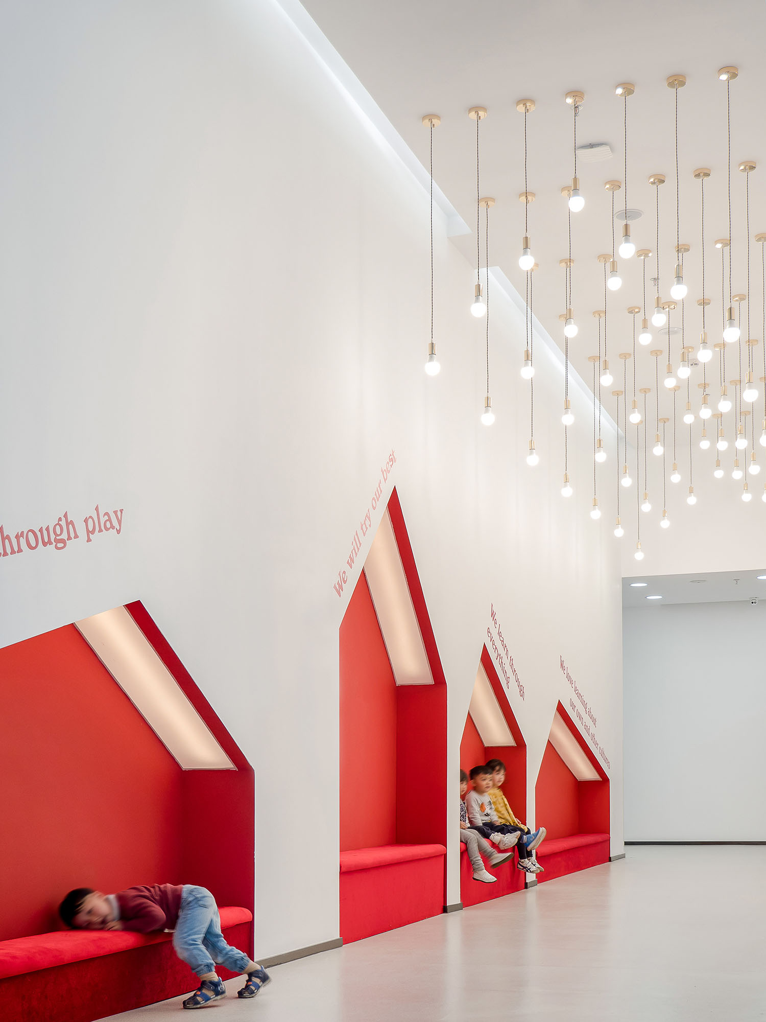
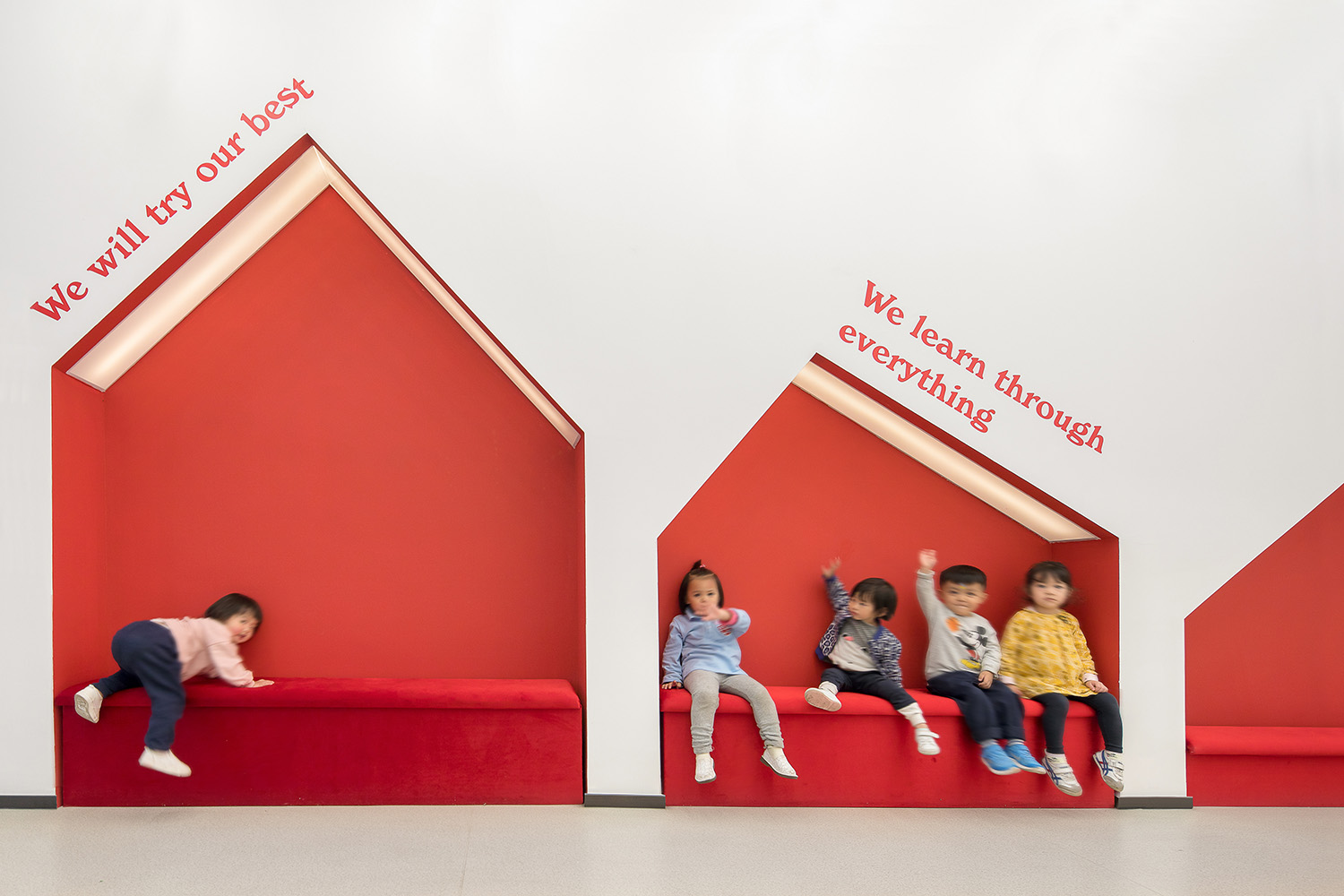
The 3-6 years old children usually convert what they see into simple symbols and it is the way they explore and learn about the environment. Therefore, the house-shaped benches have been cut into the sides of the room to bring out the simplicity and vitality.
∇通往公共活动区的走廊提供了座位,是孩子们交流的重要场所,The corridor to the public playground is an important meetup place for the children.
∇简明的色彩和造型,使空间简洁而不失活泼,Simple colors and clear-cut shapes make the space look clean and vigorous
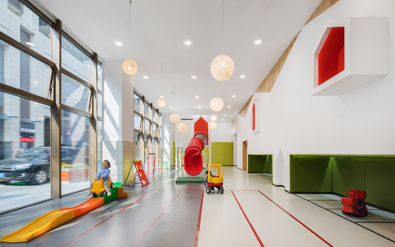
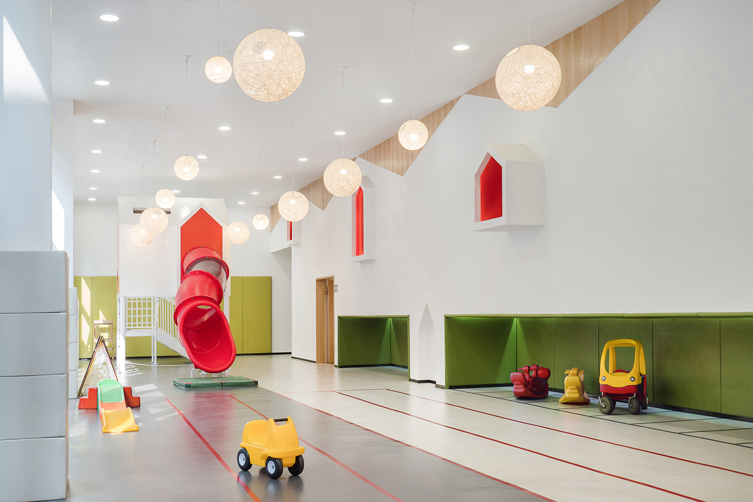
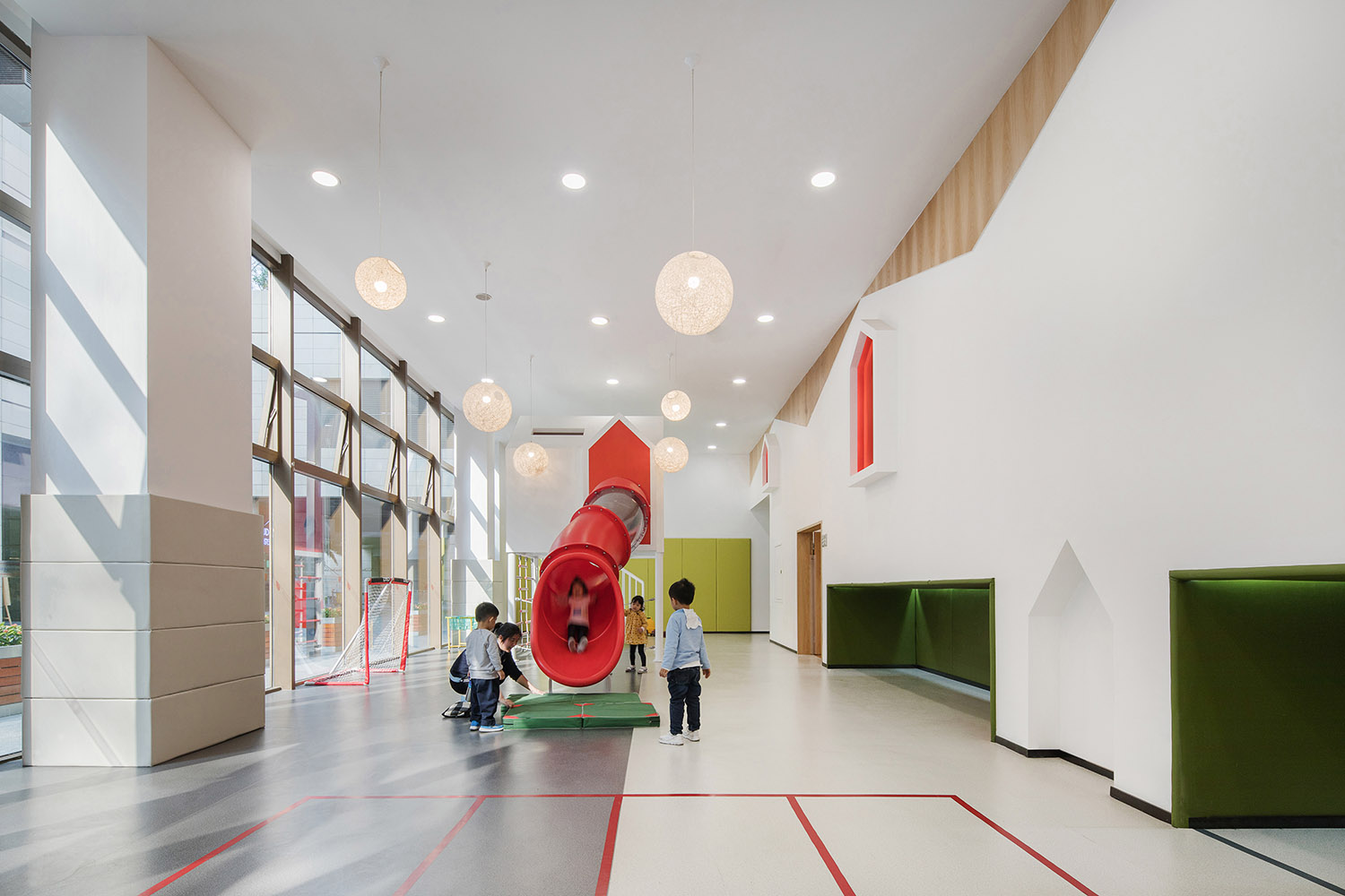
玻璃幕墙一侧被规划为公共活动区,日间的阳光充满该区域,公共活动区内定制了结合滑梯,攀爬,摇荡等功能的活动器械,有效的让孩子在游戏中认识到空间,平衡,速度和节奏,同时也是对户外活动场地面积的补充。
To further connect the children to the nature, the window side is transformed into the public playground, which ensures they have adequate sunshine. The slides, ramps, swings and other facilities are customized for the children, so as to effectively nurture them the perception of space, balance, speed and rhythm through the games while making the supplement to the outdoor activity area.
∇ 儿童公共活动区,Children’s public playground.
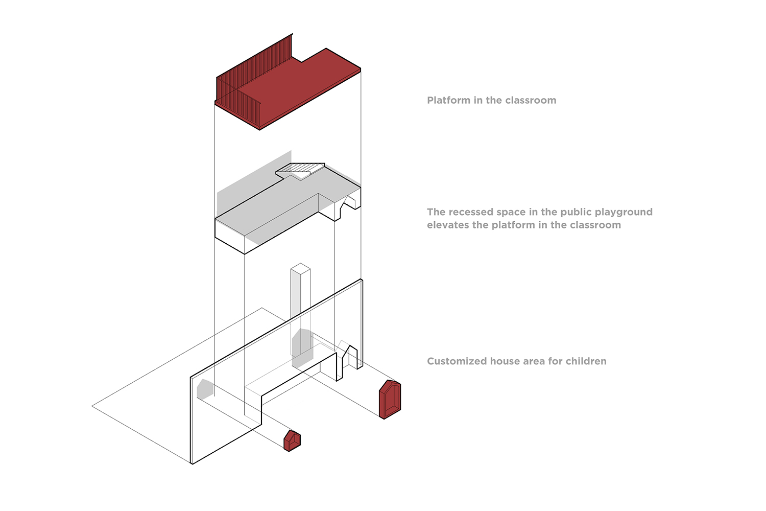
为了在有限的范围里增加儿童的活动空间,我们针对儿童尺度设计了错层的空间结构,构建了一个专属孩子的空间。
The split-level spatial experience is designed to expand the extra space for activities, which exclusively accommodates the kids for their height.
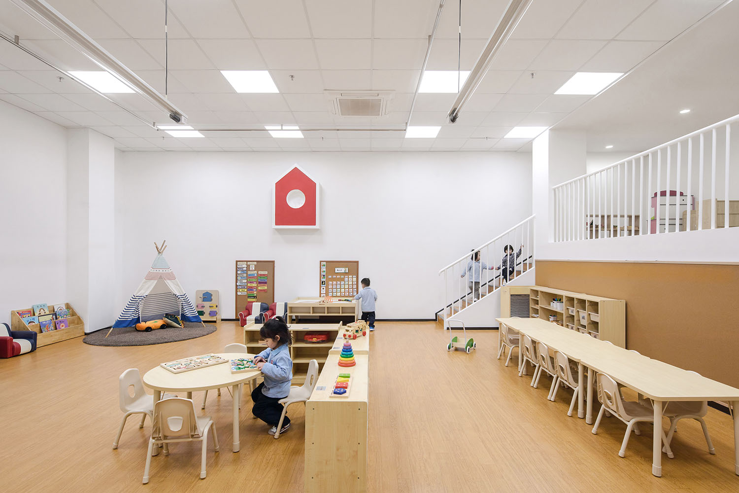
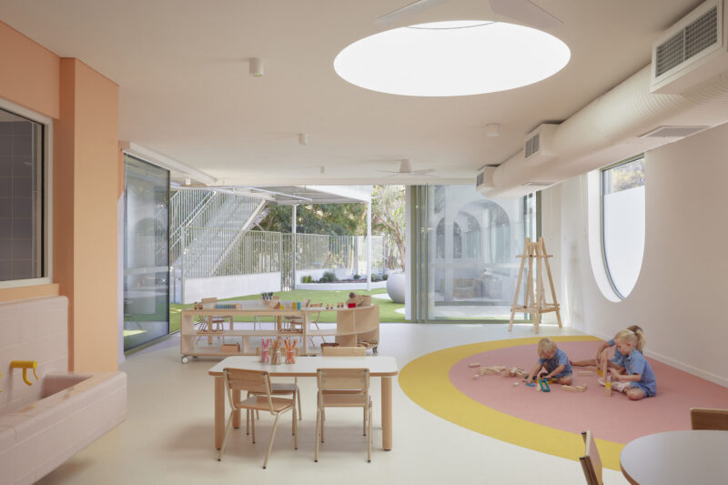
这样的错层也在教室中形成抬高的平台,丰富了教室的空间层次的同时也增加了孩子运动量。教室内还设置了独立的小房子,并将楼梯下方设计为可供儿童钻爬的小空间,这些空间在实际使用中深受喜爱,成了孩子们私下交换秘密和角色扮演的地方。
The split-level arrangement is also adopted in the elevated platform in the classroom, providing different functional levels and encouraging the children to explore around. There are also a separate cabin here as well as some small space under the stairs for crawling and playing. It turns out that they are the kids’ favorite spots for sharing intimate secrets and doing role plays.
∇ 错层平台分析图,Elevated platform analysis
∇ 错层在教室中形成的抬高平台,Elevated platform on a split level in the classroom
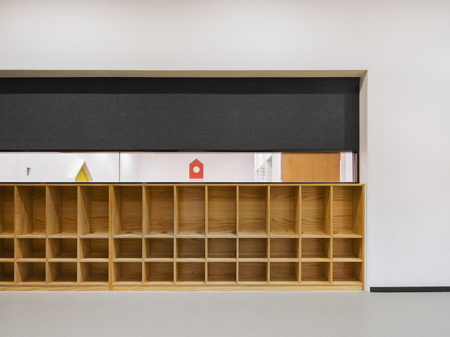
∇课室外的存物柜和观察窗,观察窗上方毛毡可用磁吸作为班级公告栏使用Small cupboards and observation window outside the classroom. The felt at the window can be used as the class bulletin board with magnet
鼓励通过不同形式的活动探索和发展孩子自身特点。室内还规划有儿童剧场,绘本馆,儿童厨房等多个功能空间,鼓励孩子们在戏剧、阅读、手工活动中自行探索发现并通过不同的形式参与其中,从而满足不同年龄孩子的多样化需求。
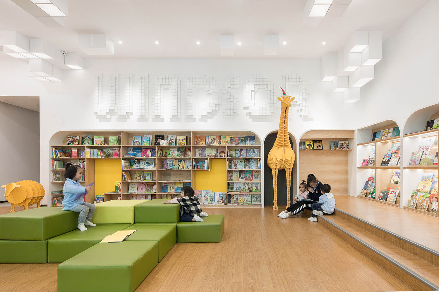
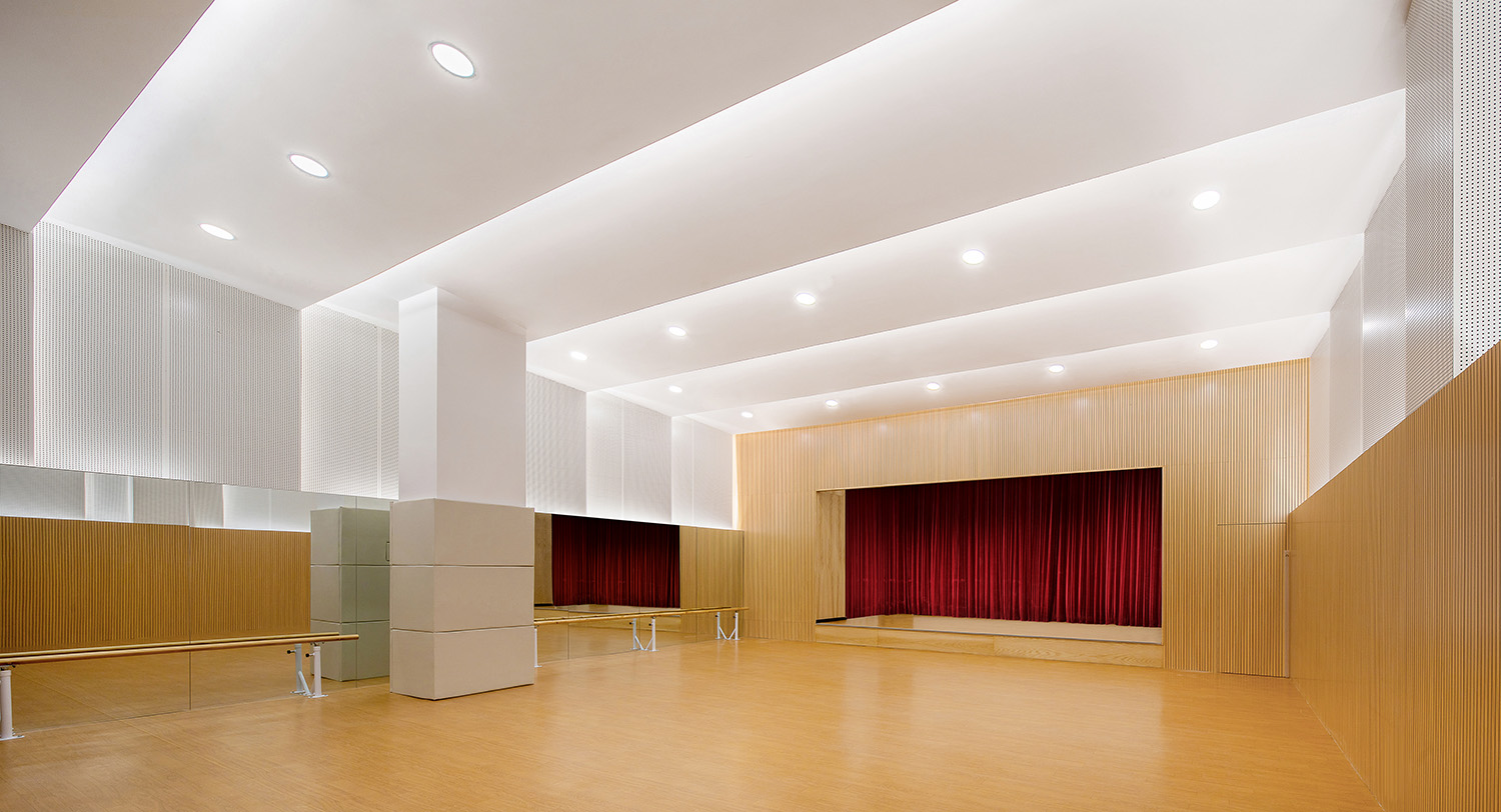
The kindergarten follows the edutainment pattern, discovering and developing the children and their characteristics through various kinds of activities. Indoor multifunctional rooms such as children’s theater, picture book library, play kitchen are also designed to invite and encourage the kids to explore and participate in plays, reading and creative crafts. All of them fulfills the diverse needs of children at different ages.
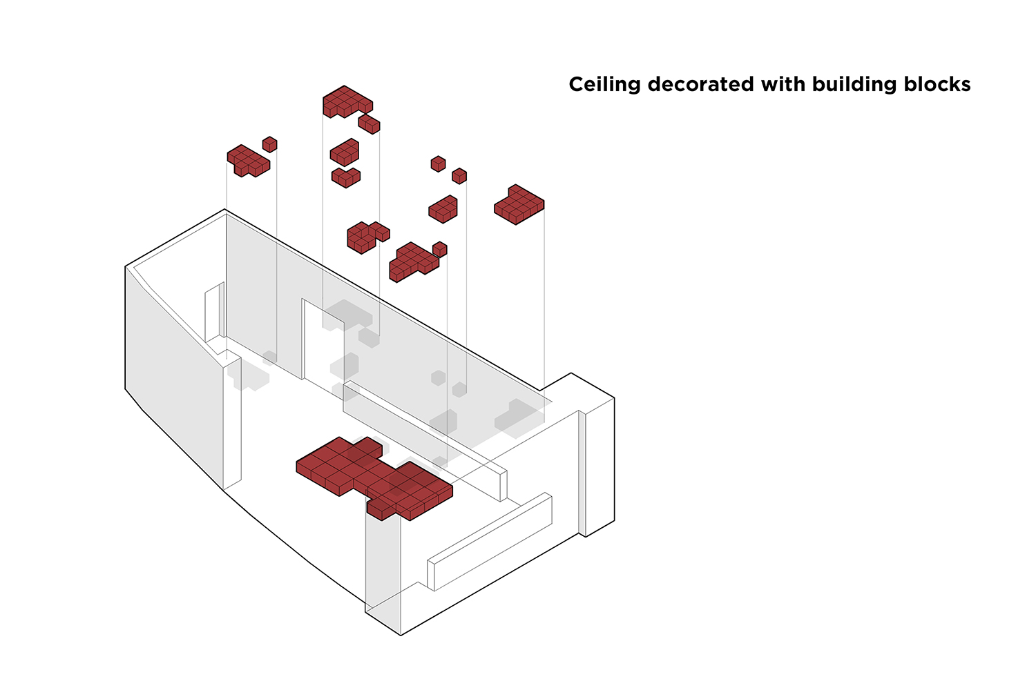
∇绘本馆的天花以堆叠的积木为概念进行设计 Picture book library ceiling decorated with building blocks
∇ 绘本馆,Picture book library
∇ 儿童剧场同时也可作为舞蹈教室和运动场使用,Children’s theater with functions of dance studio and gymnasium
在城市高速发展的过程中,日与俱增的商业购物中心和住宅楼,正逐步挤压公共空间,幼儿园未必能像过往一样获得足够大的场地建立低密的独立建筑,这个问题无法回避,幸运的是我们可以看到园方正积极的做出调整,也有幸参与其中:于高密度的住宅与购物中心中辟出一隅,在有限的场地条件下最终呈现出一个充满活力的教育空间。
In the process of rapid urban development, commercial shopping centers and residential buildings increase day by day and gradually squeeze the public space. Kindergartens are not able to have large enough area to build in a low-density detached structure like the old days. It is inevitable, but fortunately Windsor Bilingual Kindergarten is actively adapting itself and getting involved: a niche is carved out of the high-density residential and shopping buildings and an educational space full of vitality is ultimately created withoutcompromising on the limited site conditions.
∇ 平面图,Plan
主要项目信息
项目名称: 温莎双语幼儿园
设计单位: MOC DESIGN OFFICE
主创设计师: 梁宁森,吴岫微
设计周期:2017.4-2017.7
竣工:2018.3
所在地:中国深圳壹方中心
面积:2200㎡
主材:木饰面板,阿姆斯壮PVC地板,阿姆斯壮矿棉板
业主:温莎幼儿园
摄影师:张超
Project Name:Windsor Bilingual Kindergarten
Design Company: MOC DESIGN OFFICE
Leading Designer:Sam Liang,Vivi Wu
Time:Apr 2017 – Jul 2017
Completion: Mar 2018
Location: Shenzhen, China
Area: 2200㎡
Materials: Wood Panels / Armstrong Hom PVC Flooring / Armstrong Ultima AirGuard Ceiling
Client: Windsor Bilingual Kindergarten
Photographer: Zhang Chao

