LOFT中国感谢来自轩宇设计的办公空间项目案例分享:
项目定位 Design Proposition
沿着巷弄探身走进陈旧华厦内,20坪的旧屋洗去尘染,蜕身成为宁静隐敛的办公场域。以「回归原初本质」为笔墨,泥作板材为纸张,光影彩度为句读,大笔挥毫出刚柔并济的空间章幅。在遵循「形随机能」的自然法则下,我们保留建物原有的轮廓和肌理,仅透过轴线转折呈显有机型态,于深浅对比的质材交扣间,演绎空间独有的层次律动,径自流淌一丝洗炼气韵。
Walking along the bystreet into an aged building. The old house of 66 square meters transformed into as well as a rustic and sedate office. Take the advantage of the original structure, natural wood and bright hue to re-establish the solidity yet geniality space. Following the natural precedent of “functional configuration”, preserve the original building mass and texture to present vivid patterns merely through the twist and turn of the main axis. With deep and shallow tinge contrasting materials, bring about innovative ambience and a distinct layered configuration of the space.
风格情境 Creativity & Aesthetics
「空间」和「人」的内在结构,在本质上是相同的,打动人心的从来不是亮丽鲜明的外衣,而是由内而外兀自流露的淳厚底蕴及温柔坚定的灵魂。作为办公场所,「舒适度」是为最大考虑,不论是对内部职员或外部宾客,贴近人心的感受才是我们最希望被接收到的。因此,将整体彩度降低,谐以灰阶对比穿梭材质间的对话,形塑空间意趣,让一切回归本然,在需要大量思考和不受限制的产业性质下,创造一处纯粹、无界的工作寓所。
As people knows, glossy and glamour appearance would never makes people deeply touched, but the pure and firm soul that manifests from the inside out. And the inner quality of “space” and “human” is essentially identical. As an office interspace, “cozy” is the primary consideration, whether for staff or guests, hold high regard to their heart is what we most want them to perceive. Therefore, simplified the setting tinge, shaping spatial charm merely with gray-scale contrast hue materials, demonstrate the original profound feature, thus create homespun and unbounded working area.
空间配置 Space planning
近20坪的水泥方盒里,经过反复推敲、琢磨,重新定向空间节点和光源路径,以减法建构空间,以加法铺陈细节,并尽可能地引进日光,留存质材纹脉,让小单元划分的场域性质,有条不紊各得其所。施工初期,原想拆除量体所有隔间,以达到最大限度的通透宽敞,然而却桎梏于原有的梁柱结构,遂而顺势与之和平共处,转化为中岛会议桌,不仅将缺陷转为特点,更让整体空间更添旨趣。
According to the space around 66 square meters, reoriented the spatial nodes and illumination routes after repeated deliberation. Construct the space by subtraction, and layout the details by addition, so as to well organized each small section. In the early stage of construction, in order to achieve the maximum transparency and spaciousness, attempt to dismantle the compartments, but they were restricted by the original beam-column structure, thereupon set up an island, which not only turned the defect into the highlight, but also made the whole space more amusing.
选材效用 Materials & Cost Effectiveness
在空间的脸谱上,如何呈现鲜明轮廓,材质的妆点成了至要元素。不需浓妆艳抹、不需矫揉造作,暖一分则过于饱满,冷一分则缺少温度,我们只需忠实地呈现场域原有的质韵,让历经岁月沈淀后的面貌,予人以内心的渲染。水泥钢构的粗犷纹理,贴陈实木皮板的质润温煦,透过镜面投射与光影变化,量体交错和线面之间,相得益彰。
How to present the distinct outline of the space, material selection has become the most important issue. There is no need for excessive decoration or disguise, just frankly states the primitive feature of the space. Make use of cement and steel structure of coarse texture and fine and glossy solid wood veneer, by way of the mirror staggered projection, lead to varied changes of light and shadow, accordingly introduce a timeless phenomenon.
入门玄关——生活需要仪式感
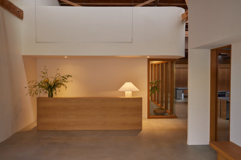
村上春树曾说过:「仪式是一件很重要的事。」作为办公空间的名片,玄关是予人第一印象的场域,因此我们特别选以雕刻黑的花岗大理石铺垫入门氛围,除增添推门入室后的仪式感,更为接下来的步伐递增期待。而设计手法上,则采「先压迫、后放大」的换位心理,视域由低调奢华转为质朴原粹,方寸之间转瞬的反差感,令人意犹未尽。临侧的卫浴空间,同样延续此低奢光氛,仅仅是空间的一隅,却满是细节的铺陈,大理石纹壁砖的柔和质调,在镜面光源透射下,让空间向度获得延展。
The entrance foyer——Living with a sense of ritual
Haruki Murakami once said, “Ritual is essential of living. “The entrance foyer plays a role as the office business card at the first impression, therefore, especially chosen black granite to initiate the introductory atmosphere.In addition to add a sense of ritual while entering the room, moreover to rise up the expectation to the space.In terms of the design techniques, adopted the transposition psychology of “first constrict, then zoom in”. From low profile yet sumptuous to pristine and simplicity, the instantaneous contrast is stunning. The adjacent bathroom remained the low tone yet extravagant ambience, though just a corner of the space, but with abundant details.The gentle marble wall via the light transmitting of the mirror expanded the space.
茶水间及会议桌——化身家的中岛吧台
是否曾想象过在办公场所拥有像家宅一般的自适感受?进门后首先映入眼帘的,是如中岛一般的大长桌,搭衬收束进墙面的开放茶水间,宛如家中的餐厨区域,自在而放松;即便是首次来访的宾客,也能因此卸下心防,而平时需要独立工作的职员,同样能移转至此,缓解思绪、恣意畅想,在工作时分调剂身心、感受生活。又考虑原先的量体限制,我们在廊道过渡区上方,以软膜天花板吊顶,其兼具防火防水及环保节能效用,更让场域明度提亮,挹注一股别于原始况味的现代氛围。
The pantry and the conference table——the imitated home bar and island
Have you ever imagined working in a comfy office just like being at home?While entering the space, the first thing that caught sight is a long table as like an island.The open pantry feels like being in the dining area at home that full of unstrained ambience.Even the first time visiting guests can enjoy themselves.The staff that wants to take break for a while or wish to ponder without disturbed commonly stays here for physical and mental relaxation.Considering the original building mass limitation, above the corridor transition zone, exploit the laminated glass sprung roof, which has the functions of fireproof, waterproof, environmental protection and energy saving. Further to brighten up the space and outline the modern implication that different from the original circumstance.
梁柱结合桌体——转化空间畸零
原先欲将公领域划设为全开放式场域,却因中间梁柱无法拆除,而形成一处畸零,我们索性将缺陷转化为亮点,与之结合桌面,以中岛概念发展出「家」的情境;使原本稍有距离感和带有正式氛围的会议桌间,顿时软化了许多,亦形成和实墙作用相同的隔间,切割空间中的象限维度。而在缜密的计算过后,我们也发现,将天花板刻意压低嵌以照明,能够使粗大的梁柱,视觉上缩小,减低压迫感,蜕皮后的RC钢构,衔接轻盈量体,整体视域达至半通透的微光透亮。
The combination of beam-column and table-——transformed the spatial remnant
At the outset intended to set up an entirely coherent public area, however the central beam column is incapable to dismantled, thence leave a spatial remnant.Consequently turn the defect into a bright spot, combine the beam column with desktop, and established the circumstance with the concept of “home island”, which instantly soften the conference table of the sense of formal, meanwhile formed a partition as like the solid wall.After thorough calculation, the designer figures out that lowering the ceiling and with embedding illumination can make the bulky beam column visually minify and reduces the pressure sensation. After modification, the reinforced concrete steel structure connect the lightweight massing, bring about a visual sense of semi-translucent for the whole space.
墙面镜体运用——延展视野引光入室
位处边间的寓所,受限于开窗面积,光线无法通透入里,因此,为消弭空间中的狭仄感,我们运用镜体贴陈墙面,于有形中挹注无形,于有限中创造无界;辅以户外日光和室内灯源的折射照明下,使光影穿梭其中,形构场域间的流动,让视线所及皆能获得延展,创造明亮净朗的空间框景。
Wall-mounted mirror – extend vision and introduce sunlight into room
Regard to the sunlight is incapable shines into the end unit due to the limited area of the open window; therefore, wall mounted mirrors to eliminate the sense of narrowness of the space. Along with outdoor sunlight and indoor illumination, shaped the mobility of light and shadow of the space, as well as extending the vision to create a bright and lucid scene of the space.
办公场域——线路杂物收束齐整
以深浅木质作为空间的暗语,界定独立的主管办公室及开放的职员工作区,同样为极需专注的场域,我们采用系统板材收纳线路杂物,让整体视野收束齐整、心无旁骛不受干扰。而为呼应空间的原始基底,特别缀以一抹绿意,由植栽延续至布幔,淡雅的自然质蕴流泻而出。
Office zone – well-ordered circuits and sundries
By way of utilize the deep and shallow timber to set out the executive office and the open staff work zone.Since of both areas extremely need focusing, therefore exploit system MDF to lay out the circuits and sundries orderly, bring out an overall neat and tidy vision without being distracted.In order to echo the primitive feature of the space, especially embellished with a touch of green, from plants to drapery, diffuse the natural stylish temperament.
完整项目信息
项目名称:原.初
设计公司:轩宇室内设计
设计总监:戴文轩
联系方式:sustudio.tw@gmail.com
项目地点:中国·台湾·北部
项目面积:20坪(约66㎡)
施工起讫:2019.2.15-2019.3.31
空间格局:玄关、开放厨房、会议区、办公区、主管办公室、影印间、卫浴
主要建材:铁件、实木皮、大理石、灰镜、进口地砖、RC蜕皮


