LOFT中国感谢来自瑞坤国际—正方良行设计公司的建筑改造项目案例分享:
设计如何影响经济How does design affect the economy?
作为中华文明的重要孕育地之一,珠江流域以两千年的百越文化和近代民族工业为基础,被划为改革开放的排头兵。珠江三角洲凭借劳动力和土地的价格优势,成就了“世界工厂”称号。
As one of the important birthplaces of Chinese civilization, the Zhujiang River Basin was planned as the vanguard spearheading the reform and opening-up policy due to its profound culture heritage and great foundation of industry. Because of cost advantages in labor and land, the Zhujiang River Delta has become the “World’s Factory”.
2000年前后,随着经济的发展,珠三角地区的劳动力价格优势缺失,用地趋紧,大部分劳动密集型的工业开始往周围边远山区及东南亚转移,“代工”制造市场也在往后几年日渐回落。
Around 2000, with the development of the economy, this region gradually lost its labor cost advantage and faced the shortage of usable land. For this reason, most labor-intensive industries began to move to the surrounding remote mountainous areas or Southeast Asia, and its original equipment manufacturing (OEM) market gradually declined in the next few years.
如今珠三角跨进粤港澳大湾区的时代,以制造业为基础构建现代产业体系,也被纳入规划之中。由普通“代工”升级为“代工品牌”,成为必然的选择。
Nowadays, the Zhujiang River Delta has been included into the development blueprint of the Guangdong-Hong Kong-Macau Greater Bay Area, and is embarking on the road of establishing a modern industrial system based on manufacturing. In such context, it’s necessary for local OEM manufacturers to upgrade and build themselves into OEM brands.
∇ 广东工厂区截影
代加工企业作为 To B 的制造业,处于市场的幕后,相较于 To C 企业,其品牌意识较弱。其次,因依赖于产业集群的基础设施,这类企业的生产办公建筑,多以当初最基础的刚需建筑在一个地方聚集成群,每家企业都别无二致。
OEM manufacturers are B2B companies, which are not in the frontier of the market and are mostly lack of brand awareness comparing to B2C enterprises. Besides, due to high dependence on the infrastructure of industrial clusters, the production and office buildings of every OEM companies are mostly situated together.
在当下注重品牌和颜值的时代,无论是个体还是企业,提升品牌形象、对外传递品牌信息,已成为商业竞争的重要筹码。正方良行认为建筑空间是最好的传递载体,能够通过立体的感官感受 ,更直接而深刻地向受众传递企业品牌。
In the era that emphsizes brand and appearance, enhancing brand image and communicating brand information have become important strategies in business competition for both individuals and companies. Masanori Designs, an exceptional Chinese design practice, believes that the architectural space is the best media to directly and profoundly communicate corporate brands to the audience through providing multisensory experiences.
这几年,正方良行一直致力于为制造业企业升级品牌,塑造品牌张力,用设计、艺术、美学为企业品牌注入能量,进而发挥商业设计的最优价值,推动企业发展。有竞争就有品牌的意义,代加工领域也必须有“代工品牌”意识。
In recent years, Masanori Designs has been committed to upgrading brand for manufacturing companies. Through shaping brand power, as well as injecting energy into the brand with design, art and aesthetics, it strives to maximize the value of commercial design and facilitate the development of clients. Brand matters in competition, and there is no exception for OEM industry. Hence, it’s important for OEM enterprises to establish brand awareness and improve their brand image.
∇ 改造前
诚远制衣,一家为国内年轻时尚服饰代工的制造型企业,位于广东纺织之都中山的服装加工生产基地沙溪镇。
Chengyuan Garment is a Chinese OEM company specializing in manufacturing young people’s fashionable apparel, which is located in Shaxi Town owthe garment processing and production base of Zhongshan, Guangdong.
该项目是诚远制衣总部一幢办公楼的改造。企业主是青年创业者,她希望厂区旧建筑在升级改造后,首先能满足更多功能需求,其次贴合时代潮流,带动厂区重新焕发活力,传达企业与时俱进、追求品质、国际化的品牌经营理念。
This project is the renovation of an office building in the headquarters of Chengyuan Garment, approached by Masanori Designs. The business owner is a young entrepreneur. She hoped the renovated building to satisfy more functional demands, fit the trend of the times, rejuvenate the factory, and convey the company’s brand management philosophy of advancing with the times and pursuing quality and internationalization.
改造难点Difficulties in renovation
·环境再造:工厂面积偏小,缺少景观环境,首先考虑的重点是自然环境的营造。
·Environmental creation:The factory area is small and lacks landscape, so the first consideration should be the creation of natural environment.
·建筑更新:二十年前的工厂建筑,外观传统,已远远不能满足当下的功能需求及审美趋势。
·Architectural renovation:The old look of the 20-year-old factory building was far away from meeting the current functional demands and aesthetic trends.
·空间重构:室内层级间关系断层,缺乏整体性,无法满足办公使用要求下的空间关系。
· Spatial reconstruction:There was a lack of integrity among interior spaces and levels, which couldn’t meet the requirements of office use.
01平面规划
02景观改造Landscape creation
建筑所在的厂区面积较小,原厂区内也无绿化区域。在这次改造中,由水池、喷泉、绿植和石凳组成微景观。通过以小见大的方式,重新塑造场域生态环境,与自然产生连接,赋予厂区新的生机与活力。
The factory area where the office building is located is small, and there was originally no greenery. During the renovation, Masanori Designs created a micro landscape formed by a pool, a fountain, green plants and a stone bench. By recreating the ecological environment of the site, the designers built a connection between the factory and nature and injected new vitality into it.
办公楼的侧边,原是早年停放车辆的铁棚,拆除后植入了自然景观和艺术美学,自成盎然的一隅。工厂环境的喧嚣得以消除,人们从周边嘈杂的日常状态中脱离,静享园区内一处亲近自然、放松精神的小天地。
They demolished the iron parking shed on one side of the office building, and then brought natural landscape and artistic aesthetic in, forming a visually pleasing view. It adds tranquility to the factory environment, and provides a place for people to escape from the daily noise, relax and get close to nature.
方形的水池之上,从墙外引流的流水喷泉汩汩涌入,动静有序。零星绿植点缀其间,矩形灰石凳呼应水池的直线条,一石一木皆成风景。适度留白的简洁色调,线条利落的建筑,整个画面盈缺妥恰,给人以舒缓和治愈。
A fountain flows through the wall and rushes into the square pool, full of rhythm. Green plants are interspersed within this area, and the rectangular gray stone stool echoes the straight lines of the pool, together producing an enchanting scene. The simple color palette harmoniously integrates with the neat lines of the architecture, which generates a soothing and calming ambience.
为了让这出景观在无形中融入日常,传统厂区的入口路径也被打破,将入口设计在建筑左侧,经由水池景观再进入企业,让每个人都能潜移默化地浸入这处静谧的景象中,沉淀平和心境。
In order to subtly integrate the landscape into daily life, the designers didn’t adopt a traditional entrance path to the office building. They set the entrance on the left side of the building. Before entering into it, people must pass through the entrance and then traverse the pool landscape, so that they can immerse themselves into the tranquil natural view and obtain inner peace.
03建筑改造Architectural renovation
一层的入口与水池之间隔着 L 型走道,在此上方加建成二层的 L 型露台,也把一层的走道变成了景观廊道。露台的围栏和底板与入口室内的天花颜色一致,同时形成有体量感的建筑体块, 拉长了视觉纵深感。
The entrance of 1F is connected to the pool by an L-shaped walkway, above which a same-shaped terrace was added. In this way, the walkway on 1F was turned into a landscape veranda. The floor slabs and the fence of the 2F terrace utilized the same color as the ceiling of the entrance space on 1F, which forms a building block with a sense of volume and lends a visual depth.
L 型露台与围栏围合出天井,使得一层的自然景观也能与二层共享,空间格局因此更加通透。露台的存在也让更多的自然气息渗透入二层的室内。
The L-shaped terrace and the fence enclose an open-air atrium, so that the natural landscape on the first floor can be shared with the second floor, and the spatial structure therefore becomes more transparent. The terrace also allows more natural air to filter into the interior space on 2F.
L 型露台外侧,黑色钢板从建筑主体一直延伸到水池尽头,与 L 型露台闭合,拼成一个“回”字。原建筑、新建的露台和水池构成一个整体,显现一气呵成的建筑美感,外观与气质也契合国际美学时尚。
On the outside of the L-shaped terrace, a black steel plate extends from the main body of the building to the end of the pool and meet with the L-shaped terrace to form a hollow square. The original building, the newly built terrace and the pool are combined into a whole, presenting the architectural beauty of integrity. The appearance and temperament of overall architecture are in line with international aesthetic fashion.
用黑灰与珊瑚红的撞色涂料装饰外墙,形成潮流且活力的视觉冲击。不同色块对应不同的功能区域,大面积色块的运用,凸显建筑的体块感。一改以往传统的制造企业形象,现代时尚的外观,更似“艺术工厂”。在周围的环境中脱颖而出,传达着企业的与时俱进精神和时尚品味。
The exterior walls are finished with dark gray and coral red paint, which generates a contrasting, dynamic and stylish visual effect. Different color blocks correspond to different functional zones, and the large colored surfaces highlight the architecture’s sense of volume. The architectural appearance shakes off the traditional image of manufacturing companies, which is stylish, more like an “art factory”. It stands out in the surrounding built environment, and conveys the company’s spirit of advancing with the times and fashion taste.
04室内改造Spatial reconstruction
空间Space
从室外到室内,以一个过渡空间起到缓冲作用,让外部景观带来的短暂宁静延续至该空间中。在设计上采用“更衣间”的概念打造,既带有潮流服饰的空间属性,又给人以趣味性的感官体验。
There is a transitional space from the outside to the interior, which lets the brief serenity brought by the outside landscape continue into the space. Designed with the concept of “dressing room”, it has the features of a trendy clothing space and also provides fun sensory experiences.
进入办公室,以开放式的布局容纳办公和展示等复合功能,形成动线清晰的空间整合关系。简洁而具质感的办公家具贴合人体尺度,也让企业与国际审美品位相对接。
The office area accommodates multiple functions such as working and display in an open layout, and has a clear circulation route that links all functional divisions. The simplistic and tasteful office furniture fits into human scale, and enables the company to keep up with international aesthetics.
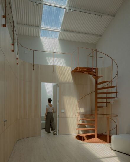
楼层关系上,原有的楼梯以独立的楼梯间存在,这使得一、二楼之间相对割裂。为打破这种现状,首先打通一、二楼之间的墙体,让楼梯以开放状态融入整个空间,使其变成整个空间重要的一角。
The vertical spatial relationship was also rearranged. The stairs were originally enclosed by a staircase hall, which made the space of 1F and 2F relatively separated. In order to change this, the designers demolished the walls enclosing the staircase, so that it was blended into the space in an open manner, becoming an important corner of the entire space.
同时将楼梯后面的空间楼板打通,形成一个有气势的中空空间,使得两层楼的室内空间融为一体,以丰富的节奏感,给人一种焕然一新的体验。
Meanwhile, the floor behind the stairs was opened to form an imposing hollow space and thereby to make the interior spaces of the two floors blend into one, which creates a refreshing spatial experience with a rich sense of rhythm.
室内高低有致的立面,与明暗变幻的光线,构成独特的空间感受。
In addition, the staggered interior surfaces and varying light also make experiences in the space unique.
光Light
光是自然的气息。原建筑室内的封闭式构造被打开,将自然光最大化引进室内,并把光巧妙地变成了室内的天然装饰;在光照与建筑一天明暗交替的互动中,给人带来更舒适的自然体验,赋予空间更自由的呼吸感。
Light is the breath of nature. The enclosed structure of the original building was opened to maximize the introduction of natural light into the interior, which subtly turns the daylight into a natural interior decoration as well. The light changes throughout the day and interacts with the architectural space, generating a more comfortable, free and natural ambience.
靠近前台的公共洽谈区,将原本的外墙拆除,用镂空铝板替代。由下至上,镂空眼由小到大,自然渐变。阳光透过镂空钻进室内,在白墙和地面投下斑驳光影,犹如盛开的繁花。冬季,室内太阳光斑的位置转移变换更加明显,让室内满溢着暖意与温度。
The public negotiation area is close to the front desk. Its original exterior walls were removed and replaced with perforated aluminum sheets. From bottom to top, the size of holes on the sheets increases gradually. The sun shines through the holes, and casts mottled light and shadows on the interior floor and white walls, looking like blooming flowers. In winter, the light spots move more actively within the space, which makes the interior awash with warmth.
为了让光与室内有更多的联系,根据室内位置的具体情况,创造入光口,并在缺口的地方辅以绿植。楼梯边的墙体改成墙体+玻璃,一方面让各处的光线更好地在室内穿透,另一方面也让楼梯墙面那珊瑚红在空间内蔓延。
In order to enable more interaction between light and the interior, daylight openings are positioned strategically in the space and are supplemented with greenery. The solid wall next to the staircase was changed into a “wall + glass” structure, which allows natural light to better flow into the space and also visually extends the striking coral red color of another wall beside the stairs by reflection of the glass.
建筑感的延续Continuation of the sense of architecture
对于室内的处理,在注重引入自然和优化空间舒适度之外,也通过建筑思维下的空间建筑感营造,增强内部的流动与穿插关系。
As approaching the interior, the design team not only focused on binging in nature and optimizing the comfort of space, but also worked to enhance flexibility and interweaving in the interior by adopting architectural thinking.
将二十年前的灰白楼梯稍加翻新,用简洁的大理石板穿过楼梯。楼梯侧前方的前台与侧后方的休闲水吧区串联成 L型,一直延伸到楼梯后的中空。前台、茶水间、操作台、洽谈区被串联起来,形成趣味的流动体,同时又拉近人与人之间沟通交流的距离。
The old gray and white staircase was renovated, with a simplistic marble slab penetrating it horizontally. The reception desk and the water bar area respectively at the front and rear of the staircase are connected, together forming an L shape that extends all the way to the void space behind the stairs. The front desk, the pantry, the operation desk and the negotiation area are linked in a smooth and playful way, which brings people closer to each other.
楼梯和中空区域的墙立面采用与建筑外立面颜色相同的珊瑚红涂料,使得室外建筑感延伸至室内,模糊了室内外的界限。
The stairway and the wall surface in the hollow space are clad in the same coral red paint as the building facade, which extends the sense of architecture from exterior into indoor space whilst blurring the boundaries between interior and exterior.
此次升级改造,通过营造厂区景观、调整建筑与周围环境的关系、室内空间协调性及与自然的联系,多维度地为客户重塑品牌的张力与活力。让每个到访企业的 To C 企业主都能在这个空间体验到与自身企业同频率的品牌格调。
Through creating landscape, adjusting the relationship between the architecture and its surroundings, coordinating interior spaces as well as establishing dialogue with nature, Masanori Designs reshaped the client’s brand image and enhanced its brand power, which enables every B2C company owner who comes to visit to feel a familiar sense of brand.
完整项目信息
项目名称:CY-诚远制衣
项目面积:285㎡
项目地点:中国中山
设计单位:瑞坤国际—正方良行设计公司
主创设计:徐庆良
设计团队:黄缵全、黄伟奇
施工图深化团队:CHL 施工图深化
软装设计团队:瑞坤软装
主要材料:TOA涂料、费罗娜水泥砖、卡布隆、冲孔铝板
材料供应商:归朴选材
原创品牌家具:良行文化
设计时间:2019年4月
摄影师:欧阳云
Project name: Chengyuan Garment Office Building
Project area: 285 m2
Project location: Zhongshan, China
Design firm: Lucien Organization – Masanori Designs
Chief designer: Terry Xu
Design team: Huang Zuanquan, Huang Weiqi, Dai Jiahuan
Construction drawing detailing: CHL
Decoration design: Lucien Soft Decoration
Main materials: paint (TOA), cement tile (Florina), polycarbonate sheet, perforated aluminum sheet
Material supplier: Grepoo Material Trade
Original furniture brand: Masanori Art
Design time: April 2019
Photography: Ouyang Yun


