全球设计风向感谢来自NAN Architects的商业空间(旗舰店)项目案例分享:
NAN Architects设计了在上海的两家线下旗舰店。“NEIWAI”是一家来自中国本土、专注于舒适型内衣品牌。“NEIWAI”一词品牌寓意是“美应该由内而外”,而在建筑范畴内,它很容易激发人对空间、材料、围护这样词汇的再认知。
NAN Architects designed two offline flagship stores in Shanghai.“NEIWAI” is a company from China focusing on comfortable underwear design.“Neiwai”, as it presents in Chinese, has a meaning of “Beauty generates from inside to outside”. While thinking in architectural way, it awakes people’s reconsideration about a certain space, materials, and boundaries.
内外上海长宁来福士实体店
女人是流体。光、金属、塑料、玻璃和木代表着女人个性的各个片断。 材料在空间里流动, 交融在一起。
Woman is fluid. Light, metal, plastic, glass and wood represent the individual pieces of womanhood. Materials flow in space and blend together.
直线、曲线、方、圆、单维曲面、多维曲面…形式不再是限定概念的客体,女人的单纯和复杂, 没有一个词语可以将她概括。
Straight lines, curves, squares, circles, single-dimensional surfaces, multi-dimensional surfaces… The form is no longer the object of the definitional concept. The simplicity and complexity of a woman means that no single word can cover her.
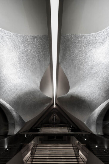
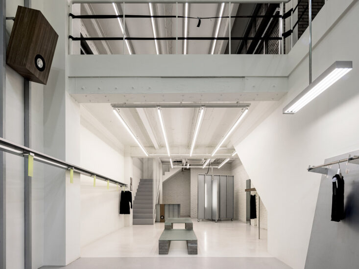
天棚的光带在方向性上给人暗示,将人引入内部空间。氧化铝板将高精度的3D扫描仪包裹在里面。洁白的桌具,纤细的不锈钢架,我们在探求材料特性的同时,回应人们对于女性的各种定义。
The light band of the ceiling gives a hint of directionality and introduces people into the interior space. Alumina plates wrap high-precision 3D scanners inside. With the white table and the delicate stainless steel frame, we responded to various definitions of women while exploring the characteristics of materials.
我们还为NEIWAI设计了专用的展示桌子,她的名字叫“AVA”,由FRP制成。她的曲线代表了对女性肢体美感的暗喻。
We also designed a dedicated display table for NEIWAI, her name is “AVA”, made of FRP. Her curves represent the beauty of the female body.
∇ 平面图
∇ 轴测图
内外上海嘉里中心实体店
如“NEIWAI”所追求的克制的中性状态,一部默剧在商业体内悄然上演:
“NEIWAI” is pursuing a neutral attitude toward daily life, identifying themselves as a “purified”, “peace”, and even “serene” design team, working to make life more comfortable. The architectural elements here in our design which set up as a pantomime is brought into stage:
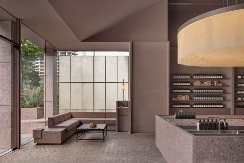
入口处的地面高差与店招共同塑造了一个外向的、类似剧场的剖面。走进这个希区柯克式的舞台,发现自己身处看与被看的经典情节中。Piranesi所描绘的罗马废墟中残存的拱门,则会将你引向另一个空间。边界与隔墙共同构成了内外分明的雕塑感空间,用建筑的方式诠释“NEIWAI”的品牌含义。
The height difference through the entrance and the brand creates a large frame, providing a perspective of a theatre from outside to inside. The frame naturally brings you into a Hitchcock-type experience, you are in the scene from both sides, and the double sided frame sets you as a participants on the stage, not just an observer. As the space shifts, the arch from Piranesi’s Roman remains leads you into another area, the void boundary and the solid walls draws a clear outline of a sculptural and abstract replica of the commercial space, architecturally expressing NEIWAI’s philosophy in life and ideas in design.
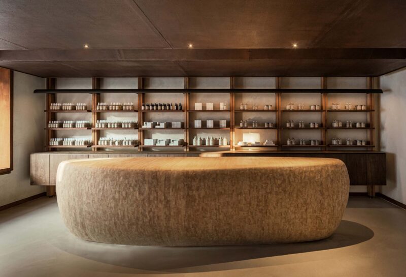
货架被设计为纤细狭长对女性肢体美感的暗喻。书架的薄元素也创造了优雅的感觉,改善了空间体验。
The shelves are designed to be long and narrow, which stand as a metaphor for the beauty of women’s figure. The thin elements of the shelves also creates an elegant feeling and improves the spatial experience.During the design, the limits coming from the structural columns and the vertical pipes leads to some inevitable idea shifts, but on the same time it creates unexpected remapping of the arrangement and emotional change of the “NEIWAI” experience.
在这个项目中,店内的灯具和配件也体现了我们简单的几何设计语言。该设计从空间的不同位置提供了多个视角。由于墙壁朝向不同的方向,空间被赋予了不同的属性。与墙壁相交的角落相融合,我们的设计试图以真实的方式创造一种和平的感觉。
The fixture and fittings in the store also shows our simple and geometric design language in this project. The design provides multiple perspectives from different spots in the space. As the walls facing different directions, the space are identified with various properties. Engaging with the corners intersected by the walls, our design attempts to create a peace feeling in an authentic manner.
∇ 局部效果图
∇ 建筑结构图
∇ 平面图
∇ 轴测图与门店立面图
主要项目信息:
设计公司:NAN Architects (www.nan-xu.com)
主持建筑师:南旭
项目地址:上海长宁来福士广场(120平方米)&上海嘉里中心(40平方米)
项目类型:商业空间/店铺设计
摄影师:钱敏


