全球设计风向感谢来自无非设计(深圳)的商业空间项目案例分享:
女人,从来都带着感性思维认知这个世界。虽韶华易逝、容颜易改,一切云烟终是浮华。但积极乐观的女人,始终拥抱阳光心态,得失无忧,来去随缘。不管时光在你我容貌间留下多少沧桑,请永远记住你那无法改变的初时模样与心境……
Women have always known the world with perceptual thinking. Although youth is fleeting, and appearance is easy to change, all clouds and smoke are ultimately flashy. But positive and optimistic women, always embrace the sunshine mentality, gain and loss without worry, come and go with fate. No matter how many vicissitudes time has left between you and me, please always remember your unchangeable initial appearance and mood……
无非设计首次为Ttsp·X女装品牌新商场旗舰店操刀设计,Ttsp·X是扎根佛山十数年的女装品牌。随着地区型商场的快速升级,原有店面形象无法满足现代女性审美要求,无非设计希望在Ttsp·X的新商场店铺设计上为“她”升级形象,打造成一个低调轻奢的时尚美学生活馆,从而占领市场。
It is the first time that the designer has designed for the flagship store of the new store of women’s wear brand of Ttsp·X, which has been rooted in Foshan for more than ten years. With the rapid upgrading of regional shopping malls, the original store image can not meet the aesthetic requirements of modern women, so the design hopes to upgrade the image of “she” in the design of the new store of TTSP · x, to build a low-key and light luxury fashion aesthetic life hall, so as to occupy the market.
设计灵感来源服装的布艺面料本身。我们从中提炼“曲线”符号,构建曲面空间。步入室内,仿若置身于一个极具动感的空间,搭配的高级空间色彩,使人通过感觉获得对产品的印象,进而对品牌形成新的识别与认知。
Design inspiration comes from clothing fabric itself. We extract the “curve” symbol from it and build the surface space. Stepping into the room, like being in a very dynamic space, with high-level space color, people can get the impression of products through feeling, and then form a new recognition and cognition of the brand.
门头设计,打破千篇一律的大开门形式,而设计成中间对称的“M”曲面造型。门口设计在正中并后退1.2米进入,不求夸张的和谐色彩与柔和的灯光表现,不仅营造了舒适宁静的气氛,亦在不经意间悄然表达一种低调谦卑而极具仪式感的迎接方式。入口两边为曲形橱窗,强调内部空间与商业街区的间隔式设计。各种材质的质感、色彩、线条、形状的重复组合,构成富有艺术情调的展示空间。
The door head design breaks the stereotyped form of large door opening, and is designed into a symmetrical “m” surface shape in the middle. The design of the door is in the middle and 1.2m backward. The harmonious color and soft light performance are not exaggerated. It not only creates a comfortable and peaceful atmosphere, but also quietly expresses a low-key, humble and ceremonial way of greeting. Both sides of the entrance are curved windows, which emphasize the interval design between the internal space and the commercial block. The repeated combination of texture, color, line and shape of various materials constitutes an artistic display space.
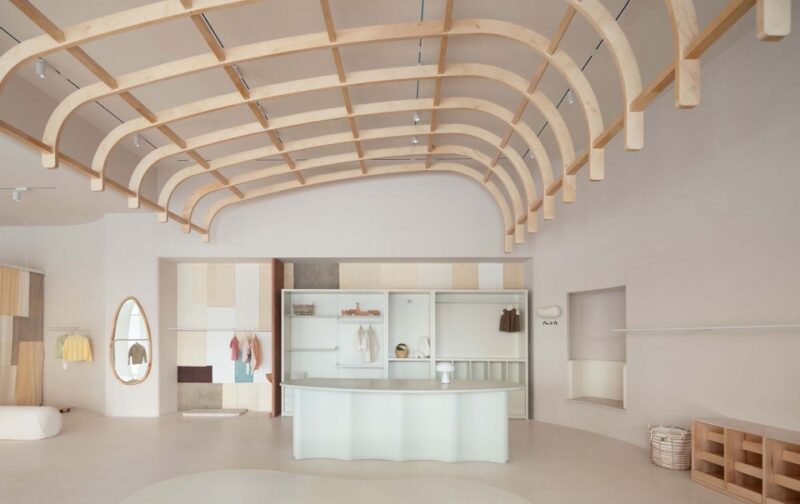
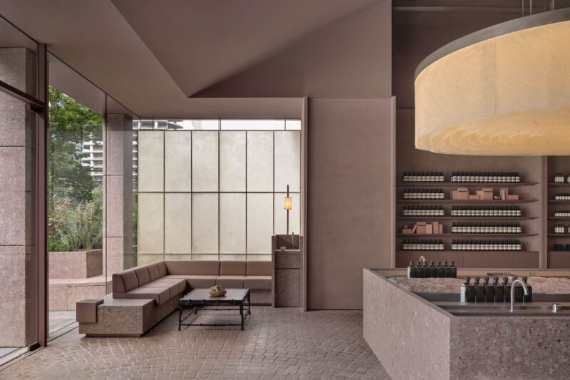
在入门前厅展卖区,为塑造品牌气质,我们沿用曲面元素将前厅设计为弧面穹顶,并通过两级墙面和天花的高低前后错位设计,丰富层次,塑造出独特气质的流线之美。衣架陈列、层层叠展、卷曲造型等陈列组合看似随心所欲、实则独具匠心。身临其中,既有共性又充满个性的体验感扑面而来。圆形柜台的陈列以平面、立体、抽象、动感等形式存在于空间,无形中成了空间最有趣味的一抹亮色。
In the entrance lobby exhibition area, in order to create the brand temperament, we use the curved surface elements to design the lobby as an arc dome, and through the dislocation design of the two-level wall and ceiling, enrich the levels, and create the streamline beauty of unique temperament. The display combination of hanger display, layer upon layer display, curly modeling, etc. seems to be arbitrary, but in fact, it has originality. In it, there is a sense of experience with both commonness and individuality. The display of circular counter exists in the space in the form of plane, three-dimensional, abstract and dynamic, which has become the most interesting bright color in the space.
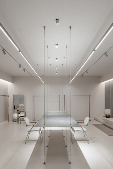
中厅设计,我们大胆将左右两边货架展示墙化为两条自然弯曲的弧面布艺造型,所有货架以穿针引线形式插入墙体。收银台、仓库、换衣间灯功能区巧妙设置于转折处的空间,装点以高级的粉橘色系。前台设计为半包裹形式,传达女性“犹抱琵琶半遮面”的含羞之意,却又不失大雅。中间为休闲长桌,此处将不定期举办各种会员内部沙龙及美学课程,如花艺、手工、摄影等。试衣间设计改变常规做法,设计为试衣大舞台,让客户试衣时如登上舞台成为美的视觉焦点。
In the design of the middle hall, we boldly transformed the display walls of the shelves on the left and right into two naturally curved curved fabric shapes, and all the shelves were inserted into the walls in the form of pins and needles. The function areas of cash register, warehouse and dressing room light are cleverly set in the turning space, decorated with advanced pink orange color. The front desk is designed in the form of half package, which conveys the shy meaning of “holding lute and covering face”, but it is elegant. In the middle is a long table for leisure. From time to time, there will be various internal salons and aesthetic courses for members, such as flower art, handicraft, photography, etc. The design of the fitting room changes the conventional practice and is designed as a large stage for fitting, so that when customers try on the stage, they will become the visual focus of beauty.
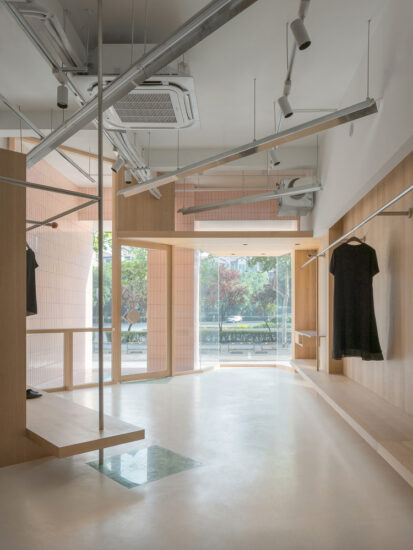
后厅展卖区为近马路次入口,作为门店形象及街边引流。西面与前厅一样为弧面穹顶,材质的肌理、色彩的渐变、光影的虚实、空间的层次、展品的精致灵巧、设计的精心与考究,无不使其呈现浓郁的品牌文化。
The back hall exhibition area is near the road entrance, which serves as the store image and street drainage. The west side, like the front hall, is an arc dome. The texture of the material, the gradual change of the color, the virtual reality of the light and shadow, the level of the space, the delicacy and dexterity of the exhibits, the meticulousness and refinement of the design all make it present a strong brand culture.
∇ 平面布局图
关于无非设计(深圳)
用广告思维重塑空间美学新高度
成立于2017年,设计师团队均毕业于中国著名八大美院。W专注于高端商业空间设计及室内软装陈设,立足于本土设计的再创造,将现代创意思维融合东方文化,以独特的审美视觉和跨界颠覆的思维表达商业空间的独特性,帮助更多品牌获得全新的空间体验。其作品已获得国内外知名大奖,并成为中国顶尖设计机构之一。
Founded in 2017, the designer team has graduated from the famous eight National Academy of Fine Arts in China. W focuses on high-end commercial space design and interior soft furnishings. Based on this The re creation of soil design integrates modern creative thinking with oriental culture. Expressing commercial space with unique aesthetic vision and transversive subversion thinking. Uniqueness helps more brands gain a new space experience. Its work has already been made It has won famous awards both at home and abroad and has become one of the top design institutes in China.
主要项目信息
设计公司:无非设计(深圳)
主创设计师:曹博文
设计团队:陈小北、薛茵琦,朱武清
设计内容:室内设计、软装设计
项目面积:140.0 平方米
完工时间:2020年1月
主材:水磨石地砖、本杰明涂料、地毯、黑钛金不锈钢、木地板
地址:中建灯湖领袖广场,佛山,中国
摄影:REDFLAG


