全球设计风向感谢来自卧野空间设计事务所的办公室项目案例分享:
空间设计/展开设计研究所办公室
一次与材质的对话/将回忆延续的空间之旅
A conversation with the material
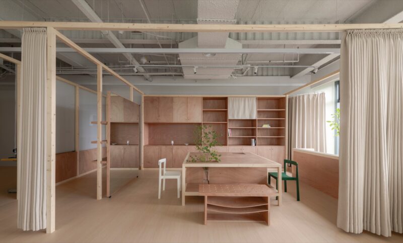
此次项目来自卧野的兄弟公司,展开设计研究所委托。业主希望尽可能保留原有的家居软装。因此,我们运用简洁有力的材质及手法,为其量身打造了空间系统。
The project was commissioned by EXTEND DESIGN. The owner wants to keep the original home furnishings as much as possible. Therefore, we use simple and powerful materials and methods to create a space system tailored for it.
//模糊的边界
有限空间内的极致区域划分
//FUZZY BOUNDARY
Area division in a limited space
∇ 轴测图
鉴于实际可用面积的局限,我们模糊了部分功能区域的边界。
布局的过程中,我们发现这样划分不仅将空间利用最大化,同时使得氛围灵动有趣。
Due to the limitation of the actual usable area, we blurred the boundaries of some functional areas. In the process, we found that this division not only maximizes the use of space, but also makes the atmosphere dynamic and interesting.
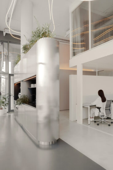
开放式的休闲空间局部吊顶,而沿着巨大的弧形转角则是开阔的办公区域,错落的顶部高差丰富整体空间节奏。
The open-ended leisure space adopts the form of a partial ceiling, while the huge curved corner is an open office area, and the staggered top height difference enriches the overall space rhythm.
//回忆的延续
包含记忆的软装置入
//CONTINUATION OF MEMORIES
Furniture full of memories
业主本身的意愿是想尽可能保留原有家具及软装陈设。
因此,设计团队和施工团队就材料选择和布局上进行了详细讨论和严谨实施。最终,几乎所有家具都得以利用并严格控制了造价。
The owner’s own desire is to keep the original furniture and furnishings as much as possible.
Therefore, the design team and construction team conducted detailed discussion and rigorous implementation on material selection and layout. In the end, almost all furniture was used and the cost was strictly controlled.
//与材质的对话
原始粗旷的材质散发新活力
//A CONVERSATION WITH THE MATERIAL
Original rough texture exudes new vitality
展开设计是一家专注打造品牌视觉的工作室,团队年轻且有活力。他们希望能打造出干净别致,同时能体现出力量感的办公空间,这与设计团队的思路不谋而合。
EXTEND DESIGN is a studio focused on creating brand vision, with a young and dynamic team. They hope to create a clean and chic office space that also reflects a sense of strength, which coincides with the thinking of the design team.
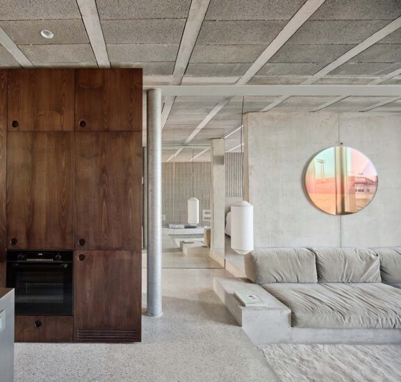
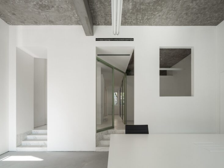
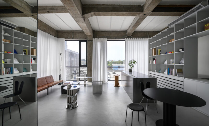
我们采用大量原始粗旷的材料,水泥/超白玻璃/多孔砖等。
同时保留原建筑的混凝土墙面,差异明显的材质碰撞下形成独特的美感,也极大节省造价开支。
We use a lot of primitive rough materials, cement / ultra-white glass / porous bricks, etc. At the same time, the concrete wall of the original building is retained, and the distinctive materials form a unique aesthetic sense under the collision, which also greatly saves the cost of construction.
∇ 平面布置图
主要项目信息
名称:展开设计研究所办公室
地点:浙江杭州
建筑面积:102 ㎡
设计单位:卧野空间设计事务所
主案设计:苏静
设计师:奚浩杰
项目深化:奚浩杰
摄影:苏静
图文编辑:33
PROJECT NAME: Office of Design Institute
LOCATION: Hangzhou, Zhejiang
BUILDING AREA: 102 ㎡
DESIGN UNIT:WILD DESIGN STUDIO
MAIN CASE DESIGNER:SU JING
PARTICIPATING DESIGNER:XI HAOJIE
PROJECT DEEPENING DESIGNER:XI HAOJIE
PHOTOGRAPHER:SU JING
GRAPHIC EDITOR:33


