全球设计风向感谢来自林俊生设计事务所的办公空间项目案例分享:
看过我们办公室照片的人,都想来我们这里上班.
Anyone who has seen the photos of our office wants to work here.
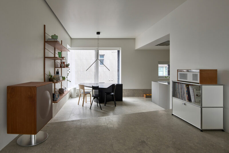
“林俊生设计事务所/绘生活软装设计工作室”位于杭州西湖区西园路,此次设计项目是我们自己的新办公空间,希望在空间上打破原来的生活化场景升级到艺术,在表达它自己的同时,创造出舒适并具备功能性的空间,展示公司的设计理念与设计手法。
Brief introduction: “Lin Junsheng Design Office/Painting and Living Softwear Design ”Studio is located in Xiyuan Road, West Lake District, Hangzhou. This design project is our own new office space. We hope to break the original living scene in space and upgrade it to art. While expressing itself, we will create a comfortable and functional space to display the company’s design concept and design methods.
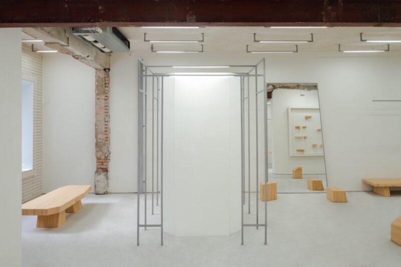
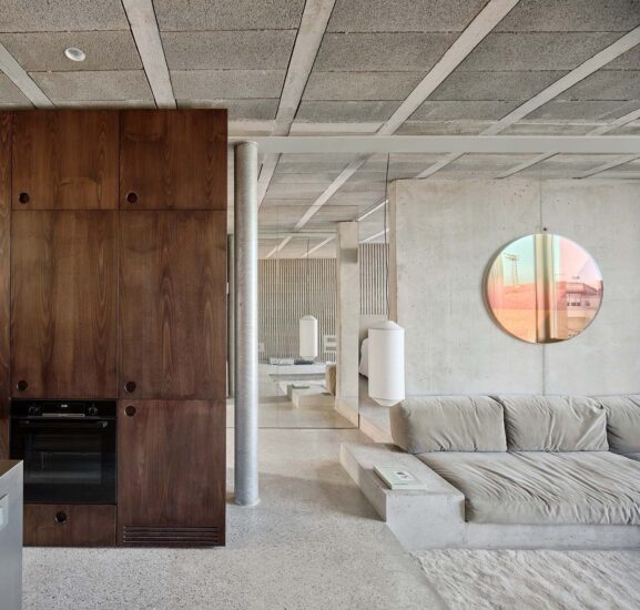
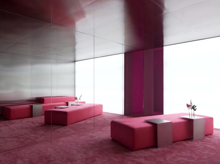
设计上我们充分考虑了团队的需求和日常活动,赋予空间新的特性,以简洁为核心设计理念,白色为主色调,局部以我们DNA蓝色调作为辅色,并运用特殊材料进行空间装饰,配合艺术软装装置,营造一种艺术空间的办公氛围。
In the design, we fully considered the needs and daily activities of the team, endowed the space with new characteristics, took simplicity as the core design concept, white as the main color tone, and our DNA blue tone as the auxiliary color in some parts. We also used special materials to decorate the space and cooperated with the artistic soft fitting device to create an office atmosphere of artistic space.
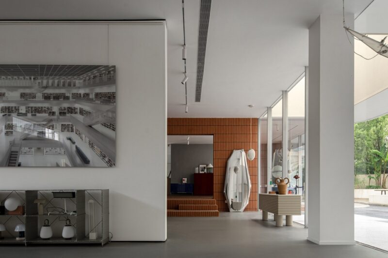
本项目的目的在于通过研究空间与艺术之间的关系来创造形成一个现代空间与质朴空间的对撞。我们以美术馆作为灵感来源把空间打造成一个小型美术馆,空间主要展示装置作品,手工艺术画,雕塑,特殊新型材料工艺品等,原有的实木家具产品作为会客区域。
The aim of this project is to create a collision between modern space and plain space by studying the relationship between space and art. We have turned the space into a small art museum with the art museum as the inspiration source. The space mainly displays installation works, handmade art paintings, sculptures, special new materials and crafts, etc. The original solid wood furniture products serve as the reception area.
我们将二楼布局划分出不同的使用功能,左侧为员工办公区与茶歇区的结合,是为了方便员工日常活动,员工区域以回字型作为办公区是为了员工之间方便沟通与艺术创造。
We have divided the layout of the second floor into different functions. On the left is the combination of the employee office area and the tea break area to facilitate the daily activities of the employees. The employee area uses the font back as the office area to facilitate communication and artistic creation between employees.
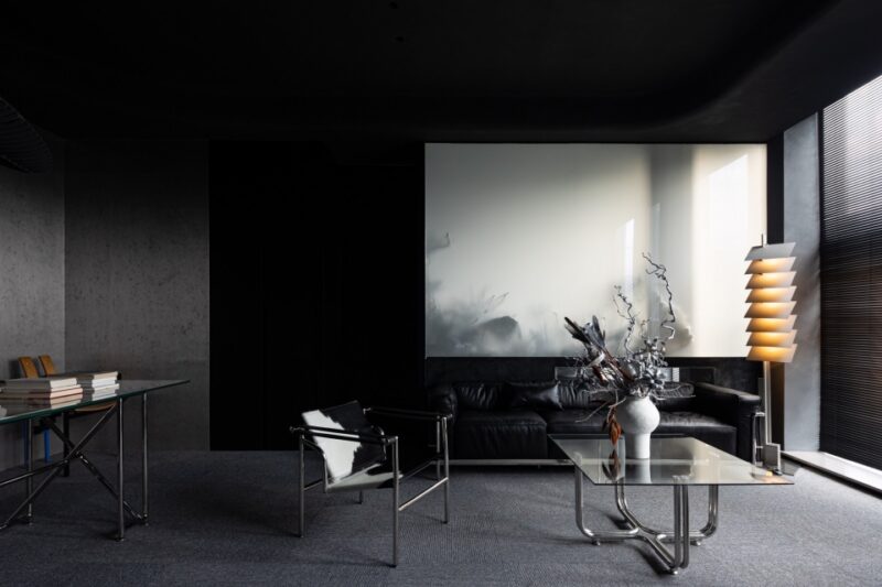
右侧为材料区,总监接待区,总监办公区,会议室。整个右侧空间既相互连接又有自己独立的区域划分,将原本空间的疏密有序的分割,虚实之间形成丰富又连续的空间秩序。
On the right is the material area, director reception area, director office area and conference room. The whole space on the right side is connected with each other and has its own independent regional division. The original space is divided in a dense and orderly way, and fiction and fact forms a rich and continuous spatial order.
总监接待区与材料区是为了方便客户能直观的对材料进行认识和选择,在空间上陈列了绘生活软装工作室所设计的装置摆件,让装置摆件与装饰材料结合产生出新的运用方式。另外在装饰上我们与JNBY HOME,北欧表情NORHOR,HANCOCK HOME合作,使办公空间瞬间增添了温暖的气息。
The Director’s reception area and materials area are designed to facilitate customers to know and select materials intuitively. The installation ornaments designed by the living soft-fitting studio are displayed in the space, so that the combination of installation ornaments and decorative materials can produce a new application mode. In addition, we cooperated with JNBY HOME, NORHOR and HANCOCK HOME in decoration, which instantly added warmth to the office space.
完整项目信息
项目名称:绘生活软装设计工作室-办公空间
设计方:林俊生设计事务所
联系邮箱:1359859339@qq.com
完成年份:2019年12月
项目地址:浙江省 杭州市 西湖区
建筑面积:380M²
摄影版权:TangWimages
运用材料:水波纹板/水波纹板/烧杉板/实木与钢的结合
合作方
定制道具厂:杭州安迪文化
工程灯具:杭州博荡照明,杭州卓承照明
品牌
窗帘:ALDOMO
品牌家具家居:北欧表情NORHOR,HANCOCKHOME,JNBY HOME
部分装饰灯具:SEEDDESIGN


