全球设计风向感谢来自拓维设计的建材展厅空间项目案例分享:
汇亚陶瓷总部地处珠三角制造业中心地带——佛山,作为一个具有二十多年历史的建材行业老大品牌,几乎见证了陶瓷行业的整个发展历程。面对市场的激变,行业转型,传统制造业品牌何去何从!
我们面对的是:一栋老建筑,一个老品牌……
老,是历史沉淀,文化传承,如何保留历史痕迹和文化轨迹?
老,也是包袱,20年前的建筑结构哪里都显得不合时宜,哪里都显得传统而过时……
Based in Foshan within the Pearl River Delta known as a manufacturing hub, HUIYA CERAMICS is a leading building material supplier which has witnessed the development of China’s ceramic tile industry. In face of drastic changes of the market and industry transformation, what should traditional manufacturing brands do? Under such circumstance, HUIYA CERAMICS entrusted Foshan Topway Design to conceive its headquarters and exhibition hall via transforming an old building.
The old building constructed 20 years ago is a historical heritage that carries past memories. However, it posed some challenges to the design because of the inappropriate and outdated architectural structures.
原始建筑结构有诸多不合理的地方,比如庞大而笨重的楼梯堵在入口大堂,将整个空间一分为二,中间一个巨大中空占据了最主要空间,在主体建筑结构不变的情况下如何通过局部空间改造让分离的空间串联起来,流动起来,使得旧的建筑焕发新的光彩!
For instance, there is a massive staircase fronting the foyer, which divides the space into two sections and forms a huge hollow space in the middle. The goal was to link up the separated spaces, create fluidity and inject new vigor into the old building, through transforming parts of the space while remaining the main architectural structures unchanged.
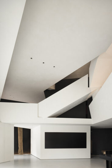
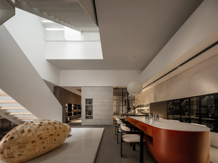
试图将自由空间理念融入到有序的工业文明之中,将当代美学融入到传统空间中去,在原结构基础上加强弧形楼梯的曲面属性,使之产生的流动性引导了整个视觉路线,大量使用白色材质使原本笨重的楼梯变得轻盈和活泼,楼梯天花像白色布幔飘向远方,两条灯带强化了这种飘逸感,它更像两条故事线索在诉说品牌的过去。在整体翻新改造过程中,特意保留了楼梯间的两根米黄石材柱子,它既象征着品牌的支柱,也是对品牌过去历史的一种尊敬和传承!
The designers tried to integrate the concept of free space with industrial civilization, and incorporate modern aesthetics into the traditional space. They intensified the curved shape of the staircase based on its original structure, which produces fluidity and guides the sight line. The white finishes make the originally cumbersome staircase appear lightweight and lively. The white ceiling is like an extending fabric curtain, and the two light strips highlight its flexible and graceful form, just like two clues telling stories of the past. During the renovation, the designers deliberately retained two beige columns on the two sides of stairs, which symbolize pillars of the brand and also pay tribute to the past.
利用楼梯底部空间,用几个不同形态的盒子进行自然叠加,不锈钢圆环穿插其间,水在盒子间流淌,自由理念贯穿其中,让空间静中有动,曲中有直!
At the bottom areas of the staircase, several different “boxes” are stacked naturally, with a stainless steel ring inserted in. Water flows between “boxes”, endowing the space with a free, tranquil yet dynamic ambience.
利用两根结构柱做成的“H”造型源于“汇亚”品牌的第一个字母,它既是品牌的文化符号,也代表着工业文明的结构感,更体现出工业制造的一种品质感,造型采用科幻主题动画演绎空间的自由变化,以极光,云彩,宇宙的表达方式强化项目主题,动感画面的植入,以创意手法实现来访者与品牌的自由互动。
Two structural columns help to form an H-shaped structure, which echoes with the first letter of the brand name HUIYA. Apart from being a cultural symbol of the brand, it also presents a sense of structure, and represents quality of industrial manufacturing. In addition, the futuristic animation shown on it brings free visual variations to the space, accentuates the project theme via elements of auroras, clouds and universe, and enables interaction between visitors and the brand.
入口休闲区穿插着多媒体的形式以呈现最佳的展示效果,借助这种方式,让客户在虚拟场景空间中慢慢享受科技带来的全新感受。漫步其中,伴随轻柔音乐律动而产生迷离虚幻的动感画面,虚拟的极光映衬在水面上,在空间中融合科技元素,创造出独特的沉浸式场景体验,勾引人们对未知世界的探索欲望。
In the leisure area inside the entrance, multimedia technology is applied to create virtual scenes, which produce perfect visual effects and allow visitors to be immersed in novel futuristic experiences. Along with the rhythm of soft music, various dynamic images are presented on walls, creating immersive scenes and stimulating people to explore. Virtual auroras are reflected on water surface, very charming.
品牌形象区采用长尺度的接待台引导空间动线,拓展空间边界,通过真实和虚拟场景结合的方式让空间无限延伸,模糊现实的边界,整个动线采用自由平面的方式展开,以一步一景的方式形成客观动线,实现观者在空间中自由漫步。
The brand image area has a long reception desk, which guides the circulation route and also extends spatial boundaries. Real and virtual scenes are well combined to endlessly extend the space and blur boundaries. The circulation route is unfolded freely based on the plan, which enables visitors to freely stroll in the space and have varying visual experience at every step.
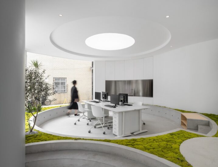
现代人们渴望亲近大自然,远离都市的繁忙和嘈杂。利用展厅的层高优势,开辟成天井,将自然生态环境引入室内,绿树成荫光影变换,阳光挥洒。正是这精心构建的方寸天地,让大堂吧充满了鲜活气息,更具格调,给人以垂直绿洲的奇妙感觉。通过设计手法把户外景观引入进来,实现与空间自由的连接,促进人与自然之间持续的互动。
Modern people aspire to escape from the hustle and bustle of urban life, and get close to nature. Taking advantage of the exhibition hall’s storey height, the design team carved out an atrium, where nature is brought in. Featuring green plants, interplay of light and shadows as well as ample daylight, this well-designed hollow space injects vitality into the lobby bar, and creates a “vertical oasis”. Outdoor landscape is introduced into it, which facilitates free connection of spaces while promoting continuous interaction between human and nature.
咖啡吧区以一面斜形书柜墙分割空间,并贯穿二楼屋顶,形成强烈的视觉冲撞,这里既满足对客户的服务功能,也成为共享体验空间,在自然面前,设计应当是谦卑的,尽量地克制人为的符号与手法,以干净的色彩,不同温度的材质,令空间配合自然,贴近自然,还原自由空间的本真。
The coffee bar area is characterized by a full-height bookcase, which partitions the space and penetrates the ceiling of the second floor, hence generating drastic visual effects. This area not only serves the brand’s clients, but also functions as a sharing experiential space. In face of nature, the design should be humble and restrained. Clear hues and materials of different textures are perfectly combined to coordinate and blend with nature, so as to let the space return to simplicity.
光与色集合成的梦境,带着令人怦然心动的魔力,迷幻的色彩敲开了一场时空之旅的大门。一直以来,设计师通过去繁就简的方式,重新构建了空间关系,并植入适当的色彩与光感,用自由空间取代传统的平铺直叙,以光色的体验为导向展开叙事,让光与影本身形成一组有趣的组合,以神秘的方式打开感官探寻的通道。
Lights and colors are integrated to create an enchanting “dreamland”. The diverse and changing hues open up a mysterious journey. Through cutting out the superfluous, the designers re-organized the spatial relationship, which is awash with freedom. Then, appropriate hues and lights are brought in, which generates fun interplay of light and shadows, produces color-changing effects, enriches visitors’ sensory experiences and guides them to explore the space.
会客厅充分利用空间尺度,采用大规格连纹大理石做背景,镜面天花将空间二次反射延伸,紫红色沙发使空间变得热烈起来,矩阵星光灯焕发出迷人的光,使空间具有足够亲近的温度!卧室采用哑光木纹和柔软的布艺结合,大片落地玻璃将户外园林引入室内,营造一种宁静而又雅致的空间体验。
Based on the spatial scale, the living room utilizes large marbles featuring continuous grain to form the backdrop. The mirror ceiling generates reflections, and helps to visually extend the space. Besides, the red sofa adds a lively atmosphere to the space, and the matrix-like lighting fixture emits charming lights, rendering this area intimate. The bedroom shows perfect match of matte wood-grain tiles and soft fabrics and features a large French window that bring in outdoor landscape, together producing a tranquil and elegant spatial ambience.
网架元素和建筑体块交织在一起,在视觉上形成一种虚实感和建筑结构感。不规则,不拘束的盒子体块叠加在一起,用金属网做成的艺术装置,时尚的灯箱元素,精致的软装摆件,让空间更添层次。
The grid structure and architectural blocks are interwoven, showing a sense of structure and the contrast of solidness and void. The freely-stacked blocks, the art installation formed by metal grid, the stylish light box, and exquisite adornments, all enrich the layering of the space.
椭圆形线光把天花和地面相互呼应,倒三角的木炭装置像悬浮的碎片,形成一个富有文化调性的空间。将品牌故事用文字的方式篆刻在有机玻璃上,通过藏光使它漂浮于空中,有效增强空间的科技感和视觉特效!
Oval lights on the ceiling and the floor echo with each other, and the inverted pyramid art installation is composed of charcoal pieces, which look like floating fragments. All of those elements help to inject a cultural atmosphere into the space. The brand story is carved on glass. The inlaid light makes the carved characters seem to float in the air, and effectively highlights a futuristic feeling.
整体三层的空间是开放和流动的,没有明确的空间边界相互穿插在一起,但却有隐藏的精心设定的交错关系。镜面天花把整个空间无限延伸,从而使得整个空间达到了视觉上的最大化。
The overall three-storey space is open and awash with fluidity. There are no apparent spatial boundaries interlacing with each other, which is replaced by carefully-designed hidden intersecting relationships. The reflective ceiling infinitely extends the entire space, and maximizes it visually.
完整项目信息
项目名称:汇亚陶瓷总部展厅
项目类型:企业总部、展示空间
项目地址:佛山市禅城区南庄陶博大道十六座
设计单位:佛山市拓维室内设计有限公司
设计主创:汪志科&李小水
设计团队:拓维设计
项目面积:4000平方米
设计时间:2019.7
竣工时间:2019.10
主要材料:本杰明涂料、汇亚瓷砖、幻彩玻璃
业主:汇亚陶瓷
摄影师:欧阳云
Project name: HUIYA CERAMICS Headquarters & Exhibition Hall
Category: headquarters, exhibition space
Location: Bldg.16, Taobo Avenue, Nanzhuang Town Chancheng District, Foshan, China
Design firm: Foshan Topway Design
Chief designers: Wang Zhike & Li Xiaoshui
Design team: Foshan Topway Design
Area: 4,000 m2
Start time: July 2019
Completion time: October 2019
Main materials: paint (BENJAMIN MOORE), tile (HUIYA CERAMICS), color-changing glass
Client: HUIYA CERAMICS
Photography: Ouyang Yun


