全球设计风向感谢来自NA-DECO那漠含风设计的商业空间项目案例分享:
那漠含风设计的最新作品VLAB位于新建成的呼和浩特振华广场的二楼,这座广场现已成为该城市最大的商业综合体。作为内蒙古第一家潮流用品集合店,VLAB专注于提供时下最尖端的设计型产品,涵盖高端音响、耳机、游戏机、小家电、玩具、摆件、餐具等。因此,店铺的设计工作也是围绕营造“潮流感和未来感”展开。
VLAB , the latest work designed by NA-DECO is situated in the newly built Zhenhua Plaza in Hohhot, which has become the largest commercial complex in the city. As the first multi-brand store featuring cutting-edge technology and design in Inner Mongolia Region of China, VLAB displays various goods ranging from high-end stereo speakers, headphones, game machines, small appliances, to toys and ornaments. To echo the brand positioning, the interior design job is mainly about constructing a “futuristic laboratory”.
店铺所在的地块并不理想,处于逼仄的边角位置,而且也不是规范的矩形,这对设计提出了很大的挑战。为了能让店铺更加醒目,品牌色选择了饱和度极高的蓝,配合厚重硬朗的字体设计,能让顾客在二楼的很远处就能一眼看到店铺门面,不仅能精准地塑造品牌形象,更能轻松地吸引客人到店体验,这对商业空间来说至关重要。
Unfortunately, the store is located at corner position on the second floor, and characterized with with an unusual field shape, like a branch broken itself from the middle, which poses a great challenge to the design. In order to make the store more eye-catching, the color blue with high saturation is carefully chosen as the brand color, to provide a perfect backdrop to the bold font design. This strategy can not only effectively enhance the brand image, but can also easily attract customers to walk into the store from the far distance, which is of vital importance for a commercial project.
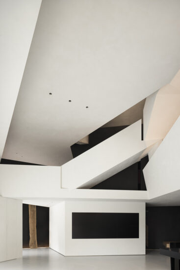
由于地块形状怪异,设计师没有试图去修正这个“缺陷”,而反之受到该“缺陷”的启发,联想到了立体派艺术中交错叠放的形状和线条。因此,在店铺空间中随处可见三角形、矩形、圆形、六边形、直线、斜线,通过如此大胆地组合运用,设计师使空间拥有了硬朗和锐利的风格,地形“缺陷”则成为了不可或缺的组成部分。与立体派艺术怪诞的平面构成不同,设计师运用了更多严谨的横线和垂直线,使空间不会显得杂乱无章,在未来感的基础上,给空间增添了一份现代理性主义的色彩。
As far as the odd field shape is concerned, “it should not be reckoned as a ‘defect’, but as an opportunity to evoke imagination,” Ha Da said. Inspired by its irregularity, the space is composed of geometry elements such as triangles, rectangles, circles, hexagons, straight lines. The space turns into a big canvas to paint Cubism arts, most of which appeared in the history are known for overlapped shapes and lines. The vividly sharp style makes the “defect” become an indispensable part. Distinguished from the grotesque composition of Cubism, however, more rigorous horizontal and vertical lines are applied to organize the space, which can shield from visual disorder and add to rationalism in a way.
一个巨大的半包围结构被放置在空间的中心位置,这里主要用来陈列特殊产品和供顾客休息,同时通过镜面的巧妙安排,使这里成为了交通中心和视觉中心,无论从外侧进入还是从内侧进入,顾客都能获得奇妙的的行走体验,这是对地块形状的最重要的解读和利用。
A huge half-open enclosure with two triangle windows is placed in the center of the space, which is primarily used to display special products and to provide rest. At the same time, through the subtle arrangement of a mirror, it has become a traffic center and visual center. No matter from the outside or from the inside, customers can get marvellous walking experience, which is the most imaginary utilization of the field shape.
与那漠含风设计以往的折衷主义风格不同,VLAB的空间并没有丰富的材料和色彩配搭,墙面是单一的灰色阳极氧化铝板,地面是单一的灰色意大利石纹砖,只有品牌灯箱和局部使用了蓝色,这种干净洗练的氛围能很好地衬托丰富的产品陈列,而不会与其产生冲突。设计师更多地是从未来与经典、感性与理性的角度寻求矛盾与统一,VLAB是前所未有的一次尝试。
Slightly different from the eclectic style of NA-DECO works in the past, the space of VLAB is not rich in textures. The wall is purely covered by gray anodized aluminum panel, and the ground is covered by gray Italian limestone tiles. Only the brand light boxes and few parts of the space are painted with blue brush strokes. With no question, this clean and sharp ambience can well set off the affluent product display. VLAB is an unprecedentedly ambitious attempt, on the whole, where Ha Da practices eclecticism in an understated way, creating balance from the perspectives of future and history, sensibility and rationality, rather than from materials and color palettes.
主要项目信息
项目名称:VLAB
设计公司:NA-DECO那漠含风设计
官网:www.nadeco.com.cn
联系邮箱:nadeco.contact@qq.com
完成年份:2020年1月
建筑面积:90㎡
项目地点:内蒙古呼和浩特市
摄影师:哈达
设计团队:哈达、刘国霞
主要材料:氧化铝板、意大利石纹砖、烤漆
Project Name: VLAB
Design Firm: NA-DECO
Website: www.nadeco.com.cn
Email: nadeco.contact@qq.com
Completion: January 2020
Area:90㎡
Location:Hohhot City, Inner Mongolia, China
Photographer:Ha Da
Design Team: Ha Da, Liu Guoxia
Material: anodized aluminum, Italian limestone tiles, lacquer


