全球设计风向感谢来自末染设计的摄影工作室项目案例分享:
早期区分摄影工作室是以楼宇内的小型店加网络店的经营模式。摄影工作室抛弃了呆板的模式化的拍摄,透过摄影师的艺术感,带领顾客的情绪投入角色,令每张照片变得独一无二,绝对个性化。位于山西太原的一栋高级写字楼内,个性、简洁且舒适的原创设计空间,恰好契合了消费者独道的眼光,给予其非同寻常的体验。业主理想的空间需要洽谈区,化妆室,更衣室,影棚,以及可以大量放置服装及配饰的空间。在设计时想要把这里打造成一处自由释放的乌托邦,但在设计时保持了克制,用极其简单的方式与材料,让体块与空间能够愈发的纯净素雅,而又充满着变化。
In the early days, the division of photography studios was based on the business model of small shops and online shops in the building. The photography studio abandons the rigid mode of shooting. Through the artist’s artistic sense, the customer’s emotions are brought into the role, making each photo unique and absolutely personal. Located in a high-end office building in Taiyuan, Shanxi, the original, simple, and comfortable original design space just fits the unique vision of consumers and gives them an extraordinary experience. The owner’s ideal space requires a negotiation area, a makeup artist, a studio, and a large space for clothing and accessories. In the design, I want to make this a free-release utopia, but I kept restraint in the design, and used extremely simple methods and materials to make the body and space more pure and elegant, but full of changes.
空间衬托出的前与后,前者呈现出一种随意且开放的面貌,以便于吸引顾客的目光,而后者从外面看起来朴实无华,一旦进入就会被深深地吸引,好奇心被空间那种意想不到的方式迅速激发,这不是一个巨大的空间,而是一个有深度的空间。
The front and back set off by the space, the former presents a casual and open look, in order to attract the eyes of customers, while the latter looks unpretentious from the outside, once entered, it will be deeply attracted, curiosity is that This unexpected way quickly inspired, this is not a huge space, but a deep space.
克莱因蓝在白色的包裹下,愈发悦动,拥有可探索的神秘,冰冷的既视感,也埋藏着无限怪诞的种子。置身其中,让人迷失在这片广阔的色调里。
Under the white package, Klein Blue is more and more moving, with an exploreable mystery, a cold sense of sight, and the seeds of infinite grotesque. Being in it makes people lost in this vast hue.
∇ 我们用光做导演,影子做主角,进行空间叙事。We use light as the director and shadow as the protagonist for space narrative.
∇ 虚实,迂回,乘隙,流动Virtual and real, roundabout, ride gap, flow
整体的大色调采用了简单且温柔的白色,配以一抹鲜明的克莱因蓝加以点缀,给人带来了不小的视觉冲击。以一种统一的现代表现形式,通过颜色,肌理和材质的变换,将各区域,有机的联系在一起,空间即统一连贯又显得意趣盎然。
The overall large color scheme uses simple and gentle white, and is decorated with a vivid Klein blue, which brings a lot of visual impact. In a unified modern form of expression, through the transformation of color, texture and material, the regions are organically linked together, and the space is unified and coherent and interesting.
∇ 最单纯,才最悸动,The most simple, the most throbbing
通过造型的门洞来分割公共与私密空间,但是地面上统一的材质又将其完美的融合在了一起,丝毫不会觉得隔阂。通过一抹艳丽,空间与空间之间更加的具有意味,正是因为其多元性和复杂性以及它的不确定性,空间便有了无限可能。
The public and private spaces are divided by the shape of the doorway, but the uniform material on the ground blends them together perfectly, without any sense of separation. Through a touch of gorgeousness, space is more meaningful, and it is precisely because of its diversity and complexity and its uncertainty that space has unlimited possibilities.
∇ 置入一抹鲜明,冲突也和谐,Put a clear touch, the conflict is also harmonious.
根据立体空间而不是平面图展开想象,无论是人造光还是自然光,都是项目中不可或缺的因素。
The imagination is based on a three-dimensional space instead of a floor plan. Whether it is artificial light or natural light, it is an indispensable factor in the project.
∇ 上下错落有致的空间结构,The spatial structure staggered up and down
∇ 看似走到尽头,实则内有乾坤。It seems to have come to an end, but in reality there is a universe.
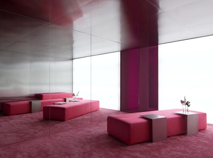
∇ 镜子反射光线,同时为空间增添些许戏剧感。The mirror reflects light while adding a sense of drama to the space.
∇ 不是巨大空间,而是有深度的空间。Not huge space, but deep space.
∇ 颇有趣味的窥探,Very interesting prying
定制的推拉门,采用阳光板代替传统磨砂玻璃,换来的是更好的透光性以及隐私性,见光不见人,还有更加轻便的重量。极窄的黑色不锈钢包边与之白色的大色调形成了鲜明的对比,也呼应了极简的设计和风格,相得益彰。
The customized sliding door adopts the sunlight board instead of the traditional frosted glass. In exchange for better light transmission and privacy, it is lighter and lighter. The extremely narrow black stainless steel edging and the large white hue form a sharp contrast, and also echo the minimalist design and style, complementing each other.
主要项目信息
项目名称:7VFIX
设计公司:末染设计
联系邮箱:moothan@sina.com
完工时间:2020.01
建筑面积:380㎡
项目类型:摄影工作室
项目地址:太原市
陈设:黑猫
摄影:小驴
材料 :艺术漆,水磨石,阳光板,软膜天光
Entry name/7VFIX
Design company/moo than.dengsign
E-mail/moothan@sina.com
Makespan/2020.01
Floorage/380㎡
Category/Photography studio
Location/Taiyuan City
Furnishings/Black Cat
Photograph/Little Donkey
Material: Art paint, terrazzo, sun board, soft film skylight
公司介绍:[末染设计moo than.design] 设计作者|孟 飛,毕业于2011年,从事设计工作已有九年,怀着对设计的热爱与坚持,18年与搭档一起创办自己的工作室——末染设计,出自more than、one、other,设计的初心是生活中不止有设计,还有其他包括在内的人文关怀和情感;“一”即为万物发展其本源,由每一个“个体”共同组成为一个大家,人与自然共同发展;即取首字母为“moo than”谐音“末染”设计。善于用独特思维发现空间艺术,以人为本,通过细节化的设计将它展现发挥至最完美,做适合的设计。
联系人:18636167147 程小姐


