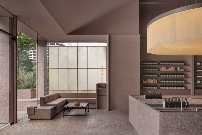
全球设计风向感谢来自Sò Studio的买手店项目案例分享:
CANAL ST.是由纽约downtown引入上海的时尚潮流买手店。我们希望能将纽约downtown的生活方式带入中国,带入上海,打造一个汇聚纽约与上海生活方式的潮流零售店面,兼具本土文化与纽约downtown的气质。上海与纽约都是包容性极强的超级国际化城市,是潮流文化艺术经济的汇聚中心。你能在纽约见到百年前建成的基建设施,工业时代飞速发展留下的城市印记与当今最前沿的时尚艺术潮流文化共存,复古与时尚的兼收并取。Downtown的文化是包容多样自由的,而上海同样是近百年飞速崛起的超级国际化城市,与纽约一样兼具包容性,多样性,国际化,而不同的是上海的发展是建立于中国传统文化与世界窗口的基础上和近百年租界文化的融合,我们能在上海看到纽约的气质,同时上海也具有独有的气质,细腻优雅又不失大气。而作为城市,上海更加年轻,富有活力。我们希望它是有点叛逆的但又是细腻的。有粗糙的部分,但是是精致中的粗糙,是带有冲突感和矛盾感的,是年轻的,站在潮流最前沿的同时拥有历史和时间沉淀感的。我们希望顾客和进入店里的人们能从我们的设计中感受到这些。
CANAL ST. is a select shop introduced from Downtown New York. We hope it will bring the Downtown lifestyle to Shanghai by creating a retail storefront that merged the lifestyle of two cities with both local and Downtown ethos. In New York, you see the coexistence of the mark made hundreds of years ago back to the industrial age with the cutting-edge art, fashion and pop culture in our era. Such kind of inclusion and diversity resonate Shanghai. Differently, Shanghai’s unique ethos is built upon in Chinese traditional culture as well as nearly a century’s concession experience. As a rising international city, Shanghai is younger and more energetic. We perceived Shanghai is a bit of rebel but in the meantime, exquisite. More interestingly, the vulgar part is wrapped in Shanghai’s exquisiteness. The constant tension let everything new here has also been polished and precipitated by time. We hope that people visiting the store can feel and experience it.
CANAL ST.一楼的地铁空间,这个区域本来是建筑原有楼梯的位置,狭长,又处于整个空间的中部。于是我们利用这个横向的空间营造了一个纽约地铁车厢氛围的过度空间,将纵深过长的一层空间划分为前后两个部分,纽约街道上餐车缩影也成了我们café的基因。
The space of subway located on the first floor of CANAL ST. was originally the stairs of the building which was long and narrow, which lies in the middle of the whole space. So, we take advantage of this horizontal space to create a transition space with the atmosphere of New York City subway carriage. The long and deep space is divided into two parts and the miniature of the dining cars on the streets from New York City also becomes the gene of our café.
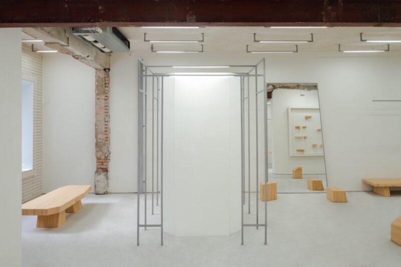
窨井盖的格栅装饰,霓虹灯,建筑保留的钢结构,裸露的砖墙等等,都是downtown的细节体现,它或许不同于纽约downtown,却是传达出相同的气质。
The grille decoration of the manhole cover, neon lights, the reserved steel structure of the building, the exposed bricks and etc. all represent the details of downtown. It may be different from the downtown of New York City, but it conveys the same temperament.
在空间中,我们置入了几个不同规格的“box”,如悬浮在楼梯上的绿色玻璃box,打破原有空间界限的box木框结构,矩形绿色亚克力地台道具等。我们运用同一种元素但不同的设计手法贯穿整个空间使其连贯,统一。在灯光的选择方面,这次我们放弃了通常retail里的大量筒射灯的点光源主要照明,采用了大面积平板灯,灯膜,瓦楞板等面光源照明,使室内光源统一均匀,更加温柔。舒适的光源能大大增加人在空间中逗留的欲望,同样选取材料的亲和度同样能使人在空间中感受到舒适。
In this space, we display several ‘box’ in different specifications, for example, the green glass box hung above the stairs, wood framed structure box which breaks the original space boundaries, rectangular green acrylic floor props, etc. We use the same elements but various in design techniques throughout the space to make it coherent and unified. In terms of lighting, instead of the point light source from a large number of tube lighting as the main lighting in the usual retail, we use a large-area of panel lights, light films, corrugated boards and other lights to make the indoor light source uniform and softer. The comfortable light source can significantly increase people’s desire to stay in. Besides, the affinity of the selected materials can also make people feel comfortable.
室内空间作为店内陈列的base,怎样精彩生动而又不抢夺主体也是我们一直思考的,而材料是构成空间的基础,空间也是材料的容器。于是我们将在城市中常见的材料换了一个容器承载,便有了不一样的体验感。CANAL ST.的品牌本身带有一种street culture,街头和城市是street culture的承载容器,现在我们希望通过我们的设计将这种文化呈现在我们的室内空间中。
Interior Design, as the basis of shop display, we continuously think about that how to express it extraordinarily and vividly but avoid distracting attentions from products. Moreover, material is the basic element over constructing space while space is the container which contains material.
Then, we changed another container for the regular material in the city to acquire a diverse experience. CANAL ST. itself, with kind of street culture that comes from street and culture. For now, we hope to display street culture in our interior space through our design.
在空间中我们运用了多种材料,不同质感,拼接,重叠,碰撞,重组,但大部分材料的选取是基于空间的叙事性氛围,也需要控制整体体验感的节奏变化。这种变化会让空间氛围微妙具有细节,同时又不会抢夺主体的吸引程度。而在需要重点表达的空间区域,我们会运用到跳出整体感的材质,增强空间的冲突感层次感。
In the space, we utilized multiple materials with different textures by means of splicing, overlapping, bumping and recombining. Nonetheless, selection over most of the materials is based on the atmosphere that space will tell and also, we need to control rhythm of the overall experience.
And the experience above will promote space atmosphere subtly and carefully but avoid distracting attentions from products. When comes to the space area that need to be emphasized, we used materials that stand out of others to enhance the sense of conflict and hierarchy in the space.
生活在法租界的我们,对于历史建筑会兴奋和迷恋,retouch最初时期我们会预设一些空间中的体量留给未知的可能性,想象它的美,然后开始边清拆边探索。当原有装修拆除后我们发现这栋老房子的结构并非想象中简单,拆除完的现场也极其混乱破败。由于年岁的关系可以看到有多种不同结构混合存在,像木结构的楼板,红砖墙和青砖墙,加固的钢结构钢梁钢板,以及混凝土的结构,墙纸的印记层层叠叠,这些都是不同时期对建筑休整加固的痕迹。
Living in the city’s former French Concession, it is hard not to feel excited and even obsessed with the historical buildings. During the early retouch period, we reserved some space for the possibility to the unknown to imagine its beauty, so we were exploring as we demolished it. After the removal of all the decorating, the site was entirely dilapidated, and we realized that the structure of this building is not as simple as we thought. Because of its old age, we saw the mixed type of structures, like wooden floors, red and grey brick walls, strengthening steel beam and plate, and concrete structure. The wallpapers, layer upon layer, showed the traces of different period’s reparation and reinforcement.
但在这破败中我们惊喜的发现其本身的旧结构与印记却是很好的空间叙述者,好像沉默的讲述着发生在这个空间中的故事。这份惊喜把我们认知深处的“palimpsest”情结挖掘了出来;palimpsest可以直接解释为“rewrite”重写;通过遗留的或者过去痕迹的trace来表达作品。所以我们决定保留部分它原有的结构,墙面,我们相信这些旧的结构痕迹与新设计的碰撞融合将会呈现给我们完全不一样的体验感,以此来制造空间的冲突感与戏剧性。通常我们总是希望创造空间的叙事性,而这个空间本身就可以带给我们叙事感。
Whereas, we surprisingly figured that such hybrid structure with the mark of time turned out to be a good narrator who attempted to tell us stories in its own way. It reminded us the complex of “palimpsest” – to rewrite, to create through traces of the past. We thus decided to reserve its original structure and walls as we believed that when these old marks met with fresh design, it would produce a stipulating spatial experience to excite people’s conflicting senses. The typical practice is we try hard to create the narrativity of the space, this building can tell itself instead.
在空间结构的处理上我们首先进行了全面的建筑加固,然后拆除了一些原有的墙体,使其变得更加通透有利于retail。重新规划了楼梯的位置,保证流线的通畅。
而对于旧墙的保留设计则是与施工同步进行的。有一个空间的墙体按我们原来的设计规划是准备做涂料的,在施工准备过程中铲除了原有基层时我们发现,铲子留下的痕迹与原始墙面的颜色竟与空间非常和谐又富有美感,当即现场决定不做涂料,保持原始墙面的状态。
In the treatment of the space structure, we firstly carried out comprehensive building reinforcement, and then removed some of the original walls to make them more transparent and beneficial to retail. In addition, we reestablish the position of the stairs in order to ensure a smooth streamline.
The preservation design of the old wall synchronizes with construction. For the wall from one space planned to be painted in accordance with our original design. However, after the original grassroots layer was removed during the preparation of construction, we found that the traces left by the shovel and the color on the original wall matching with the space harmoniously and aesthetically pleasing. As a result, we decided to remain the original wall’s condition instead of doing the painting works on the spot.
诸如此类的“by accident process”还有很多,这是旧建筑改造难以控制的众多不确定因素之一。作为设计师在解决这些不确定因素的同时,我们更享受这种设计过程中的“accident”带给我们的意外与惊喜,这种不确定性也是设计过程中迷人的一部分。
Things like this are too numerous to mention, which is one of many uncertainties that cannot control in reconstruction of old buildings. When dealing with these uncertainties, an interior designer enjoys the surprises brought by the “accident” during the design procedure, which is also a fascinating part of the design procedure.
我们在设计的过程中长期面对未知,尝试不同的叙事方式,不稳定的材料,结构的可能性。我们喜欢这些不熟悉的一切,所以我们一直说 there is no plan & beauty by the accidents。
During the design procedure, we will face the unknown over a long period of time, by experiencing different narrative methods, unstable materials, and potential structures. We are obsessed with everything what we are unfamiliar with, so we keep saying there is no plan & beauty by the accidents.
∇ 平面图
∇ 分析图
∇ 空间结构图
∇ 空间结构图
主要项目信息
项目名称:CANAL ST. 坚尼街买手店(新乐路上海旗舰店)
概念:downtown NYC
面积:300 m2
地址:上海徐汇区新乐路163号
客户:CANAL ST. 坚尼街
完成年份:2019年11月
设计团队:Sò Studio(http://sooostudio.com/)
设计总监:吴轶凡、刘梦婕
空间设计:李宇飞、王菲
影像制作承制公司:牧一制作
摄影师:丁宇豪、Elbe、李宇飞、刘梦婕
Project information
Name: CANAL ST. Selected Store
Concept: downtown NYC
Gross Built Area: 300 m2
Address: No. 163, Xinle Road, Shanghai
Client: CANAL ST.
Completion Year: 2019.11
Design team: Sò Studio (http://sooostudio.com/)
Design director: Yifan Wu, Mengjie Liu
Space design: Yufei Li, Fei Wang
Image Production: MUYI Concept + Production
Photographer: Yuhao Ding, Elbe, Yufei Li, Mengjie Liu


