全球设计风向感谢来自偏离设计的商业空间项目案例分享:
MOON 由摄影师/金浩森和文子/于2009年创立,以摄影的视角分享生活的点滴,“记录你的美好”。新工作室选址杭州滨江,为一个500㎡的空间,由MOON DRINK、金浩森摄影学院、MOON摄影工作室三部分组成。
MOON was founded in 2009 by photographer/Jason and Wen/to share your life from the perspective of photography and “record your beauty”. The new studio is located in BINJIANG HANGZHOU, with a space of 500 square meters and consists of three parts: MOON DRINK, Jinhaosen photography institute and MOON photography studio.
∇ MOON DRINK | Spase
原始建筑概况
Overview of original building
原建筑为一个层高9m的钢结构,彩色压型瓦作为表皮的建筑体,一层为6m*16m的长方形空间,二层为16m*25m的方形空间,如何在这个7字形空间里呈现MOON的专属形象成为此案的一个重要课题。
The whole space is a 9m high steel structure, the color pressure tile as the skin of the building body, the first floor 6m*16m rectangular space, the second floor 16m*25m square space, how to present the exclusive image of the MOON in this 7-shaped space has become an important issue.
设计逻辑
Design logical
本案以相机为出发点搭建整个空间形态。同时提出三个问题作为核心设计逻辑:
1、如何形成高辨识度的视觉形象与记忆点?
2、如何展现当下的审美标准与品牌特性?
3、如何控制建造成本同时呈现强烈的质感?
This case takes the camera as the starting point to build the entire spatial form. At the same time, we propose three questions as the design logic of this case:
1. How to form a highly recognizable visual image and memory point?
2. How to present the current aesthetic standards and brand characteristics?
3. How to control the construction cost and present a strong texture?
∇ MOON DRINK | Spase
镜头作为通道,折射物质空间,经过层层过滤,形成光学影像。
The lens ACTS as a channel, refracting material space and filtering through layers to form an optical image.
∇ 统一材质下的质感呈现 Unified material under the texture of the present
设计概念
Design concept
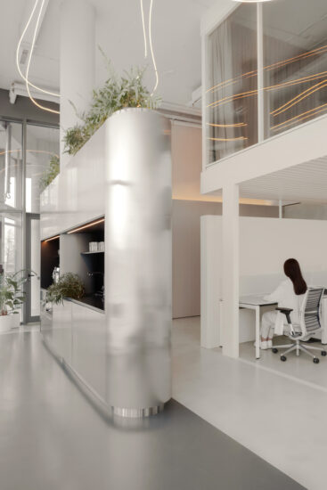
空间构思从镜头、快门、相机皮腔出发作为三大基本样式,以此展开延伸,将6m*16m的体块部分作3层划分,依次为:MOOM DRINK; 摄影学院;摄影工作室。MOOM DRINK区域以大面积的铝板与玻璃作为主要材质以获得极具现代感的空间质感,形成整个品牌的第一视觉体验。
The space conception starts from the lens, shutter and camera skin cavity as three basic styles, which are expanded and extended, and the volume part of 6m*16m is divided into three layers. Photography academy; Photography studio. The MOOM DRINK area USES a large area of aluminum and glass as the main materials to obtain a very modern spatial texture, forming the first visual experience of the whole brand.
∇ MOON DRINK | Spase
∇ 由相机构件概念延伸设计的室内道具 Interior props designed by extending the concept of camera components
夜晚从外部观察,整个一层成为一个透明的发光体,使建筑呈现悬浮的状态,营造出具有强烈记忆点的视觉效果。
Viewed from the outside at night, the whole ground floor becomes a transparent luminescent body, making the building appear to be suspended and creating a visual effect with strong memory points.
∇ MOON Photo Studio | facade
∇ 整个一层成为一个透明的发光体 The whole ground floor becomes a transparent luminescent body
空间划分
Space division
将前端的两层建筑体作为三层划分,重新确立空间尺度。阶梯作为连接三层空间的主要路径,承担着三维坐标轴的角色。长方体块的直向运动呈现阶梯的连续状态,在这个纵向的空间里,我们设计了一个镜头状的圆形窗,使这个纵向路径有了横向的视线,同时镜头的形式给窗户的功能带来窥视感,形成趣味性的第二空间体验。
As the main path connecting the three floors, the ladder plays the role of three-dimensional coordinate axis. The straight movement of cuboid blocks presents the continuous state of stairs. In this longitudinal space, we designed a shape lens circular window, so that the longitudinal path has a horizontal view. Meanwhile, the form of the lens brings a sense of peep to the function of the window, forming an interesting second space experience.
∇ Ladder | Space
∇ 长方体块的直向运动呈现阶梯的连续状态 The straight movement of cuboid blocks presents the continuous state of stairs
摄影工作室
Photo Studio
MOON摄影工作室部分,去除了多余的造型,留下一个纯白的干净空间,给人以放松感,在满足功能需求下,屋顶面切割出长条形的天窗,计算完比例后,在接待区部分增加白色格栅以过滤光线,阳光透过格栅游走于纯白的墙面,使三维的空间有了一份时间的感知,给原本的物质空间增加了一份诗意。
MOON photo studio, in addition to the redundant modelling, leaving a clean white space, give a person with relaxed feeling, in meet the functional requirements, the roof surface cutting out the rectangular skylight, after calculating the ratio, increase in the reception area part white grille to filter the light, the sun through the grille loiter lily-white wall, make the three-dimensional space has a copy of the perception of time, to the original material of the space added a poetic.
∇ STUDIO | Spase
天窗区域作为整个工作室的中心,营造一种积极的空间氛围,阳光的摄入丰富了整个空间的表情,同时在心理层面影响使用者的状态。
The skylight area, as the center of the whole studio, creates a positive spatial atmosphere. The intake of sunlight enriches the expression of the whole space, and at the same time affects the state of the users on the psychological level.
∇ 光线游走于白色的墙面,给物质空间增加了一份诗意 The light walks in white metope, added a sense of time to material space.
∇ Photography local | Spase
结语:
MOON 案列为偏离设计研究如何将品牌在空间里视觉化呈现的一次新的尝试,将空间本身作为品牌的阐述,以相机确定为整个概念的原点,通过对形体的拆分,重组,叠加,在空间上予以呈现。
Conclusion:
MOON is a new attempt to deviate from the design and study how to visually present the brand in space. It takes the space itself as the brand’s elaboration, takes the camera as the origin of the whole concept, and presents it in space through the separation, recombination and superposition of the form.
平面布置
Floor plan
∇ 一层平面布置图 | 1F Plan
项目信息
项目名称:MOON Photo Studio
设计公司:偏离设计
联系邮箱:H2design@126.com
设计时间:2019年9月
竣工时间: 2020年1月
主创设计: 小岛
设计团队: 徐俊彪、李钢、戚帅奇、苏荣荣
项目地址:中国 杭州
项目面积: 500㎡
工程施工: 欧来艺(杭州)装饰有限公司
项目摄影: 邵炜亮
设计撰文: 小岛
项目主材: 铝板、水磨石、黄铜、亚克力


