全球设计风向感谢来自于强室内设计师事务所的办公空间项目案例分享:
简单是复杂的最高境界。
Simplicity is the ultimate form of sophistication.
设计的作用在于寻找功能和社会间的接点,在功能足以说明一切的前提下,装饰成分是可以节制的,如何把握节制的度是考验一个设计师是否成熟的标尺。
The role of design is to find the connection between function and society. On the premise that the function is sufficient to explain everything, the decorative components can be controlled, which is a test of the maturity of a designer.
深圳,从进入大众视野开始,就站在时代的浪潮尖端之上。源源不断的前浪不断推动着发展的边界,新兴的创业者走在这趋势前沿,也迫切需要一个开放、多元的环境,来融聚每个人的凝聚力,共同创造出秩序统一、抚慰人心的办公环境。
Since Shenzhen entered the public’s field of vision, it has stayed on the frontier of the times. The constant wave of frontiers continues to push the boundaries of development. The innovative entrepreneurs are at the forefront of this trend. They also eager for an open and diverse environment to gather everyone’s cohesion to jointly create an orderly and comforting office environment.
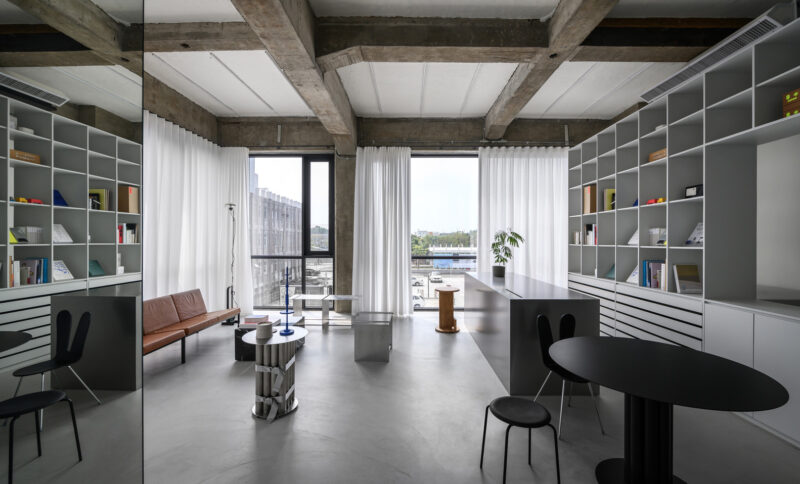
招商中心作为传递项目价值的载体,需要满足营销活动的功能。设计师充分平衡办公与展示的空间,完美融合Work&Live&Exhibition的多种需求,设置了展示区、洽谈区、办公区、休闲区等,真实诠释了现代智慧办公的品牌理念,打造理想商务生活标杆。
As a carrier of project value, Luohu Zhonghai Commercial Center needs to meet the functions of marketing activities. The designer fully balances the space for office and display, and perfectly integrates the various needs of Work&Live&Exhibition, setting up exhibition areas, negotiation areas, office areas, leisure areas, etc., which truly interpret the brand concept of modernly smart office and create an ideal business life benchmark.
01.直线象征无限Straight Line Symbolizes Infinite
每一种线条都有它的性格。直线是逻辑的,稳定的,刚硬的。线的粗细、长短、聚散等排列构成对比。
Every line has its own characters. The straight line is logical, stable, and rigid. The line’s thickness, length, convergence and divergence constitute a contrast.
设计师通过对空间气质的分析,优先考虑将“直线”形态列为贯穿始末的特征元素,来强调办公空间的专业度,极简的直线元素表达着空间序列的美感。
Through the analysis of the spatial temperament, the designer prioritizes the straight line form as a characteristic element that runs through the beginning and the end to emphasize the professionalism of the office space. The minimalist linear elements express the beauty of the spatial sequence.
∇ 区位分析
直线象征着思维的延展、无限。设计师在此基础上,延伸出另一个更为全面、丰富的表现形式——阵列。
The straight line symbolizes the extension and infinity of thinking. On this basis, the designer extended a more comprehensive and rich form of expression-array.
这里作为空间第一印象的“导航式”存在,我们更多考虑的是其代表的形式感,将贯穿全局的直线线条以一种充满建筑体量感的形式出现,层次渐出。
As the navigational existence of the first impression of space, we are more concerned with its representative sense of form. The straight lines that run through the whole project, appearing in a form which is full of architectural volume, and sense of hierarchy gradually emerge.
工作空间在空间中占了很大的比重。这里采用中性线条感进行简单的铺陈,桌椅组合呈现出的阵列感让人无法忽视,突显出年轻人严肃而丰富的工作氛围。
Work space occupies a large proportion of this project. Neutral lines are used for simple layout, and the array of tables and chairs can not be ignored, highlighting the serious and rich working atmosphere of young people.
02.空间秩序之美Rational Art of Space
∇ 功能分析
∇ 立面分析
这是一个兼具写字楼与公寓产品的综合性城市更新项目,经过前期的调研,设计师将客群划分为四大类,主要为商贸物流、科技创新、文化创意及现代服务。根据企业入驻的类型占比,将空间的调性定义为理性与艺术的交融。
This is a comprehensive project of urban renewal containing office buildings and apartment. After preliminary research, the designer divided the customer group into four main categories: commerce logistics, technological innovation, cultural creativity and modern services. According to the proportion of the types of enterprises settled in, the tonality of space is defined as the blend of reason and art.
设计师利用理性的线性元素分割空间,以空间构造及尺度引导行动流线。我们对于空间边界的设定,并非简单的摧毁截停,而是用另一种线条进行模糊与填充,让其充满柔和的情感过渡。
The designer uses rational linear elements to divide the space, and guide the flow of action by spatial structure and scale. Our setting of the space boundary is not simply to destroy and stop, but to fill it with a soft emotional transition by another kind of line to blur and fill in.
空间内有这样一种“功能模糊”的地带,一直被赋予着“情感载体”的寓意。身在其中,可与空间交融,放松疗愈;亦可在此栖息,与人建立共鸣。
There is such a functional ambiguity zone in the space, which has always been given the meaning of “emotional carrier”. Being in it, you can blend into this space and relax and heal; you can also live here and build resonance with other people.
03.开启智慧办公Key to Smart Office
线性的细节形成了原始的设计构思,穿插的变奏简洁而抑扬顿挫,引导人类去构建一个“商务办公”的日常情境。
The linear details form the original design concept. The interspersed variations are concise and mellow, guiding humans to construct a daily situation of business office.
设计师利用精致的线性细节设计元素强调商务办公的设计背景,搭配简约经典的品牌家具,点缀当代艺术饰品,营造一个精致细腻的顶级商务空间。
The designer uses the elements of exquisite linear detail to emphasize the design background of the business office, with simple and classic brand furniture, embellished with contemporary art accessories, to create an exquisite and delicate business space.
∇ 通电玻璃智能调光 Lighting Control
04.艺术氛围营造Creating Art Atmosphere
整体空间舒适柔和,简练干净。人文的细节构思,艺术化的氛围表达,让空间更灵动而变化。
The overall space is comfortable and soft, simple and clean. Humanistic details and artistic atmosphere expression make the space more flexible and changeable.
坐拥这样一座海岸线都市、碧海蓝天、山脉起伏的旖旎风光,折射射着这座城市永不疲惫的豁达与精力。
Sitting on such a beautiful scenery of coastline city, blue sea and sky, as well as undulating mountains, reflects the never-tired open-mindedness and energy of this city.
∇ 平面图
项目信息
工程名称:罗湖中海慧智大厦招商中心
建筑设计:于强室内设计师事务所
室内设计:于强室内设计师事务所
软装设计:沃屋陈设
项目完工:2020年4月
项目面积:662㎡
项目地点:广东深圳
项目摄影:黄早慧、姜得强
Project Name: Luohu Zhonghai Commercial Center
Architectural Design: YuQiang & Partners
Interior Design: YuQiang & Partners
Furnishing Design: Wow Deco
Project Completion Date: April,2020
Project Area: 662㎡
Project Location: Shenzhen, Guangdong Province,China
Photography: Huang Zao Hui, Jiang Deqiang


