全球设计风向感谢来自创本设计 CB DESIGN的商业空间项目案例分享:
肃穆的门诊,冰冷的长凳,生硬的服务,这些都是我们过去对传统医院的记忆。然而,这一切现在默默在改变。设计师正是关注到这样社会现象的变革,随着社会的发展,人们从物质生活的满足衍生到精神层面的慰藉,晶奇口腔项目是设计师和业主对患者的精神需求的呵护。设计师在分析行业背景和客户的心理需求后,提出“友好亲切”“清晰专业”的设计理念。
The snooze clinics, the cold benches, the hard service, these are our memories of the traditional hospitals. However, all this is now quietly changing. Designers are concerned about the change of such social phenomena, with the development of society, people from the material life of the satisfaction derived from the spiritual level of comfort, Jingqi oral project is the designer and owners of the patient’s spiritual needs of care. After analyzing the industry background and the psychological needs of customers, the designer put forward the design concept of “friendly and friendly” and “clear and professional”.
友好
门厅入口恰如其分的弧度不仅仅是为了导流,也凸显了友好欢迎的姿态。墙面镂空使在前台的员工提前预见到来往的客人,也让厚实的体块变得轻盈起来,同时也起到借景的作用。
The fitting arc of the entrance to the foyer is not only for the diversion, but also highlights the gesture of friendly welcome. The hollowwalls of the walls make the staff at the front desk anticipate the guests in advance, and also make the thick body blocks become light, but also play the role of borrowing.
纯粹
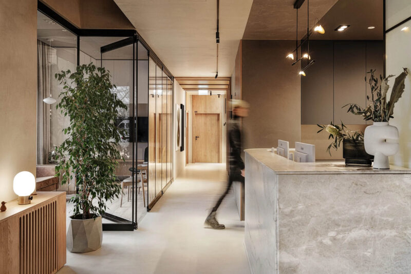
前台接待干净清晰有力,创本设计一直坚持纯粹给人带来的美感,通过材质和空间的结合让接待区的心理空间呈现接纳的氛围,同时墙面木饰面的延伸把医患的动线指引的非常清晰,墙面的弧形灯光和整体呼应,提示了接待台的主体意义,同时营造会所般的温馨氛围。
The front desk reception clean clear and powerful, the design has always adhered to the pure lying aesthetic, through the combination of materials and space to make the reception area of the psychological space to present an acceptable atmosphere, while the extension of the wall wood finished to the doctor-patient line guide is very clear, the curved lighting of the wall and the overall echo, prompting the main meaning of the reception desk, while creating a warm atmosphere like the clubhouse.
体量
体积就是力量。冲孔铝板围合的儿童活动区,把通道和等候区分割开来,让每一个空间具有独立的体量。我们希望把这种能量传递给医患,让每一个心理空间独立而又清晰,再也不会出现混乱的视觉体验。
Volume is power. The punched aluminum plate scalls the children’s activity area, separating the passage way from the waiting area, so that each space has its own mass. We want to pass this energy on to doctors and patients so that every psychological space is independent and clear, and there will be no more chaotic visual experiences.
关怀
等候区如同被空间的手掌包围,温馨而私密。座位的设计灵感来源于牙齿的造型,让医患相对独立而又相互关联。
The waiting area is like being surrounded by the palm of the space, warm and private. The design of the seat is inspired by the shape of the teeth, which makes the doctor and patient relatively independent and interconnected.
趣味
儿童活动区为儿童打造一个玩乐的空间,圆形的发光灯膜。处处圆角的设计,不仅考虑到安全性,同时也消除儿童对治疗的恐惧感。
The children’s activity area creates a playful space for children with a round light film. The fillet design not only takes into account safety, but also eliminates the fear of treatment in children.
清晰
整个设计中设计师都在刻意营造清晰的视觉形象。为了使品牌能够传达专业而透明的VI形象,如同过道的设计,把患者的治疗空间和医生的后场空间用不同材质区分。这样做不仅仅是为了美观,而是让运营更加便捷实用,同时顶面的光带起到了明确的动线指引作用。
Throughout the design designers are deliberately creating a clear visual image. In order for the brand to convey a professional and transparent VI image, like the aisle design, the patient’s treatment space and the doctor’s backfield space are distinguished by different materials. This is not just for aesthetics, but for operations to be more convenient and practical, while the top light band serves as a clear line guide.
专业
诊室的设计干净明亮,这里主要体现了医疗行业的专业性,干净而易于清洁的墙面,无影灯明亮而柔和,让医患都能集中精神关注到治疗之中。
The design of the clinic is clean and bright, here mainly reflects the professionalism of the medical industry, clean and easy to clean the wall, shadowless lights bright and soft, so that doctors and patients can focus on treatment.
卫生
卫生是医疗机构最令人关心的问题,在卫生间的设计上最需要体现干净卫生,镜面弧形墙的处理和整体元素呼应,台盆的高度考虑到成人和儿童的功能需求,墙面涂料采用环保的纳米材料,整个空间干净而温馨,让患者在治疗的间隙得到了精神的舒缓。
Health is the most important concern of medical institutions, in the bathroom design most need to reflect clean and hygienic, mirror arc wall treatment and overall elements echo, the height of the basin takes into account the functional needs of adults and children, wall paint using environmentally friendly nanomaterials, the whole space clean and warm, so that patients in the treatment gap has been spiritual relief.
项目信息
项目名称:晶奇口腔空间设计
设计机构:创本设计 CB DESIGN
公司网址:https://cbdesign-group.com/cn/
联系邮箱:cbidesign@163.com
项目设计 & 完成年份:2019
参与设计:施再勇、陈盈
项目地点:中国·上海
项目面积:1000 m²
项目摄影:Leo Zhu


