全球设计风向感谢来自佛山市拓维室内设计有限公司的卫浴展厅空间项目案例分享:
当时间推移,光随之移动,当时间推移,水随之流淌。时光就像刻录机,记录着所有轨迹,予人一场关于时空的独特体验。
Light moves and water flows as time flies.
As a recorder, time takes down every track of the universe,
Giving people a unique journey about time and space.
以“穿越时光的线索”为主题的卫浴展厅,以流水线,时光线,竹条线为介质,将产品融入空间,通过不同形态的线条穿越厚重空间来营造视觉特征,并利用产品本身纯净的质感和优美的形体,让空间和产品和谐相处。整体空间以深灰色为主色调,并充分利用自然装置元素,让白色产品成为主角,再加上温润柔和的自然木纹,营造一种宁静优雅回旋有温度的空间。
With the theme of “clues through time”, the sanitary ware exhibition hall draws on lines of water, light and bamboo strips to integrate the products into space. Lines in various forms are deployed in the space to create a visual impression. In addition, the design makes full use of the pure texture and elegant shape of the products to boost harmonious coexistence between the space and the products. Dominated by dark gray color, the space makes the best of natural art installations to render white products as the eye-catching elements. The delicate and natural wooden grain helps build the exhibition hall as a tranquil, graceful, and warm space.
循环往复的水线Circulating Lines of Water
展厅入口空间采用转折式回廊,使人对空间产生神秘感,以及进入空间的仪式感,作为外部空间和内部空间的衔接,用一个吊挂的自然装置悬浮于空中,放佛空间可以呼吸。
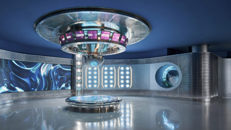
穿过狭长的通道空间,眼前豁然开朗起来,映入眼帘的是一个以“流水线”为主题的沉浸式装置,一束束密集的水线从天花倾泻而下,撒进洁白的圆形浴缸,仿佛时间慢慢流逝,雨沐在灯光和菱形镜面不锈钢的映衬下呈现出奇幻的变化,亦动亦静,亦实亦虚,如梦如幻……在碰撞下交汇融合构成深刻的场景体验。
The entrance space of the exhibition hall adopts a turning corridor, making it a mysterious space with a sense of ceremony when visitors are entering the space. As the transitional space between the external and the internal spaces, it uses a natural art installation hanging in the air, as if the space could breathe.
Through the narrow passage, visitors are suddenly surprised by an immersive art installation with the theme of “lines of water” coming into their views. Bunches of dense water lines pour down from the ceiling to the white round bathtub, like the gradual elapsing of time. The pouring water, like falling rain, showcases fantastic changes against the background of lights and the rhombic mirror made of stainless steel. The collision and combination of those elements offer impressive experiences of amazing scenes.
穿梭时空的竹线Time-traveling Bamboo Strips
如何让参观者认知这个品牌的历史,是设计师重点思考的部分,利用纤细的竹片材质进行弯曲拼接,营造一个自由交织的曲线性装置,犹如茫茫时光的一条条线索,蜿蜒回旋,穿越时空通向未知的世界。
The focus of the design is to enable visitors to recognize the brand’s history. The designers bent and spliced slender bamboo strips to produce a freely interwoven curved device. It seems to have clues through time passing to the unknown world.
不同方向的灯光投射在竹线上,在墙面上形成奇特的光影,空间是静止的,时光是流动的,动静之中自成一方天地,在这条时空走廊里,展示着品牌的过去现在和未来的过程和发展轨迹,空间不再是简单的物质构造,更是一种诗意的远方,能充分激发人们对于未来的联想,除了视觉美感,更是一种思维导向。光影与追忆释放在空间形态中,唤起产品与人、人与空间之间虚又实的感知与想象,引领人们从空间中追忆过去、体会当下,畅想未来。
Stunning shadows are cast on the walls when lights from different angles shine onto the bamboo strips. The stationary space and the flowing time create another world where it displays the brand’s history and development. The space is no longer a simple construction work, but a poetic dream, which can stimulate people’s imagination of the future. Apart from visual aesthetics, the space is more like a “guider” of thinking. The light and shadows within the space awaken people’s perception and vision about their relationship with the products and the space, leading them to recall the past, enjoy the present, and imagine the future.
设计师刻意营造狭长空间,制造新的意外空间,让空间充满悬念和探索欲望,除了不同的感官对立,氛围也扮演了重要角色,透出强烈的神秘感,体块和曲线的冲撞代表着现实和思维的关系。
The designers intentionally built such a narrow corridor to create new mysterious spaces that can inspire the desire for exploration. Besides varying sensuous contrasts, the atmosphere is also crucial in enhancing the sense of mystery. The collision of blocks and curved bamboo strips stands for the relationship between reality and mind.
视觉引导观者从物质结构转换成思考和联想模式,也是设计师对于物质空间如何深入转化的再次探讨,线索从入口开始穿过黑色长廊,几经辗转,结束于时空之中,这种元素极大程度的构建了空间,他们可以足够大,使人迷失,也足够小,使人见己。
The designers further probed into transforming visitors’ perception of material structure into thinking and association via visual guidance. The clues eventually end up in the space through the dark corridor from the entrance. The curved elements help establish an amazing space, which could be large enough to have people lost and be small enough to make them see themselves through.
远离尘嚣的光线Light in Tranquility
陶渊明在《归田园赋》里说:“久在樊笼中,复得返自然”。人们对大自然总是充满的无限的向往,生活源于自然,艺术更源于自然,城市的延伸,自然地生长。设计师试图寻找内心的静谧感受,建造一个于自然间休憩的归隐之所。
若论空间,自然离不开光线,卫浴空间是人最隐秘的场所,也是一方安静思考之地,设计师避开直通的窗户,在每个空间单独设置一个围合式院墙,只保留屋顶一方的天空,在院墙内设置芭蕉树等绿植,让空间变得隐秘而充满诗意。天井的自然光穿过芭蕉叶照进室内,使空间充满生机。整体空间动线采用开放式的布局,可以是人在空间中走动时更为流畅舒适。被植物细细切分的光,投射在空间的墙面上,光影感亦不同于空间中庭的专注和立体,凸显了其秀美的一面。无形的光与有形的光以不同的方式在建筑间穿梭,在建筑的表面,或是在内部留下自己的叙事语言。
Tao Yuanming, a famous poet in ancient China, wrote in his poem Return to Nature I, “After long years of abject servitude, again in nature I find homely pleasure”. It shows that people are full of infinite yearning for nature. Life originates from nature, so does art in particular. The designers tried to explore a peaceful mind and build a secluded place in nature.
Light is an indispensable element of space. The bathroom space is the most private place as well as a site for meditation. Instead of arranging windows with a direct link to the outside, the designers erected separate an enclosed courtyard for each space and left only the opening above the yard. Green plants like banana trees are grown within the courtyard, adding a mysterious and poetic ambience. The space is enlivened when natural light shines through banana leaves into the room. The overall circulation route adopts an open layout, which offers people a more smooth and comfortable experience when they are walking within it. The shadows on the wall that are segmented by plants generate different visual effects from that of the atrium, highlighting the elegance of the light. The visible and invisible lights shuttle between buildings in varied ways, leaving marks on the surface or the interior of the building.
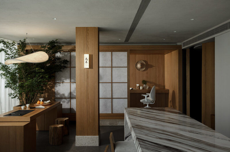
洽谈区温润的灯光和手感厚实的木质交相辉映,使整个空间呈现出休闲,舒适,自然之感,天花特殊设计的圆形灯饰装置,呼应展品设计主题,以圆的方式呼应产品的轮廓,亦如朝阳起落,细描时间的绘本。大面积柔和的灯光让环境更加舒适。“我们种了一棵生命之树”这棵树承载了生命力,也带给我们一个有生命力及活力的空间。
The warm light in the negotiation area interacts with the wooden material, creating a cozy and natural ambience. The specially designed circular light feature on the ceiling responds to the design theme and the contour of the products, just like the rising and falling of the sun. Large areas of soft lighting make the surrounding more pleasing and comfortable. The designers arranged a “tree of life”, which brings out a space with vitality and vigor.
丝印渐变玻璃的屏风隔断给封闭空间带来若隐若现的清透感,视觉上的传统秩序被打破,为空间增添无穷生命力。恰如其分的设计,并未顾此失彼,空间呈现刚柔并济的调性,难得在其秩序里有趣味,理性中显诗。增强构造穿插和引入自然光线,使室内更为开放,从而极强展示效果,让室内外融合的更为舒适自然。
The screen made of gradient glass with patterns, as the partition, creates a looming ambiance to the enclosed space. It breaks out the traditional visual order and injects infinite vitality into the space. The appropriate design takes every detail into concern. The tone of blending hardness and softness shows a playful feeling from order, and a poetic rhythm from rational thinking. The strengthened structure combination and the introduction of natural light allow for a more open indoor space, better for exhibition. Moreover, it integrates the indoor and the outdoor spaces more pleasantly and naturally.
室内空间设计上传递着现代风格简洁极致的细节美感,流露出独有的格调和艺术情怀。接待洽谈空间中用整体木饰面盒子空间分割空间与动线,整体气质会相对更加硬朗,富有艺术馆的稳重大气的气质。
The interior design conveys simplistic and exquisite details of a modern style, exuding unique stylistic and artistic sensation. The reception and negotiation areas look relatively hard-edged by dividing the space and the circulation route with a large part of wood veneers, showing a temperament as magnificent as the art museum.
软装会为了空间牺牲装饰,硬装也会为软装舍弃许多技巧,但我们依旧尽可能地保留对二者的平衡,让空间饶有趣味的不只是炫技式的聪明,更包含对空间深层次的体会和理解。当这种思想浓缩,就成为了美学。抽象与表现,隐藏与揭示,我们在动与静之间捕捉诗意。
The decoration design generally sacrifices the decoration part for the space, while hard-decorative techniques would be abandoned for the decoration. However, the designers tried a lot to maintain a balance of two aspects, embodying that the space’s fascination lies not only in the showy techniques of design but also in the profound experience and understanding. The goal for aesthetics of the space is accomplished when all these ideas are grasped. The designers intended to obtain a poetic expression between motion and stillness.
如果说设计师是空间的艺术家,那么展台上与墙面上挂着的是艺术家的艺术作品,用厚重的墙体塑性光的形状,当光束洒落,一个奇妙的场域便形成了:墙体光滑的质感,圣光一束天外来,在这样的空间之中,聆听内心本真的声音,发现自我的价值与需求,平生出几分仪式感。此情此景,与其说空间是光的容器,倒不如说是光雕刻了空间。
If the designer is the artist of the space, the ornaments and products on the exhibition stands and walls are artworks produced by the designer. Shaped by the wall, the light constitutes an amazing place when light from above shines upon the smooth wall surface. In such a space, visitors can listen to their inner voice and discover their values and demands, immersed in a sense of ceremony. In brief, it seems to be more like that the light shapes the space than the space is the container of light.
∇ 平面图
探索光线与空间格局之间的相互作用,由自己真实生活中使用过的物品和到访过的风景开始,在这些地方的记忆上注入新的想法,包括对创意本质的思考,并用这些具象性的物品平衡空间,令这些物品构成的时间场域在空间中增长,令墙壁成为一个充满可能性和自由的场所,是一个让所有物品产生另类视觉语言的地方,或许算是一种所谓物派的艺术形式。
将自然光引入室内,可以丰富空间的光影层次,同时空间也会因为有光的进入而更加富有灵性。
The exploration of the interplay between light and space layout originates from the articles and scenery in the daily life. Those items are endowed with new ideas, including the reflection on the essence of creativity. Moreover, the designers utilized these concrete items to create a harmonious space, in which the time-based area formed by these items extends in the space, and the walls become a site of possibilities and freedom. It’s a place where all the objects can create different visual effects. This might be an artistic style of Mono-ha.
The introduction of natural light into the exhibition hall would enrich the layers light and shadows in the space, making it more inspiring.
项目信息
项目名称:艺朗达卫浴展厅
项目地址:佛山市三水区
设计公司:佛山市拓维室内设计有限公司
设计主创:汪志科&李小水
设计团队:邱文峰、兰菁薇
软装设计:杨仕威
面积:200平方米
设计时间:2020年02月
竣工时间:2020年07月
业主:佛山市艺朗达卫浴有限公司
摄影:欧阳云
文案:兰菁薇
Project name: ARTLAND Exhibition Hall
Location: Sanshui District, Foshan City
Design firm: FOSHAN TOPWAY DESIGN
Chief designers: Wang Zhike & Li Xiaoshui
Design team: Qiu Wenfeng, Lan Jingwei
Decoration design: Yang Shiwei
Area: 200 m2
Start time: February 2020
Completion time: July 2020
Client: Foshan ARTLAND Sanitary Ware Co., Ltd.
Photographer: Ouyang Yun
Text: Lan Jingwei


