全球设计风向感谢来自DAS大森设计的售楼处空间项目案例分享:
“由于空间,宇宙便囊括了我并吞没了我。由于思想,我却囊括了宇宙。”——帕斯卡
By space the universe encompasses and swallows me up like an atom; by thought I comprehend the world. —— Pascal
空间布景中,几乎一切都与表演有关。如果说身体是空间的表达,或是空间内容具体形态,那抽象思考的一部分,早于肢体语言之前便铺设出了逻辑的基石。
Almost everything in the space setting is related to the performance. If the body is the expression of space, or the concrete form of space, the abstract thinking lays the foundation of logic before the body language.
项目位于深圳罗湖区,基于商业环境的迭代,我们对营销空间有了新的思考,结合甲方的商业构想,我们放弃了一切复杂的装饰和造型。去挖掘和运用材质本身不同韵律与肌理,然后把它放在最合适的位置,发挥它的特点,由使用者自己赋予空间定义。
The project is located in Luohu District, Shenzhen. Based on the iteration of the business environment, we have a new thinking on the sales center. Combined with our client’s idea, we abandoned all the complicated decorations and shapes. Using the different rhythm and texture of the material , and put it in the most appropriate position, to show its characteristics, and define the space by the user himself.
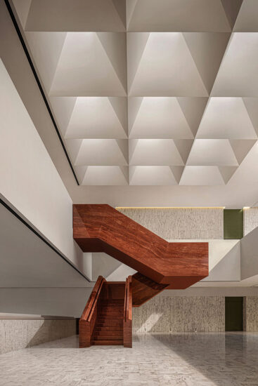
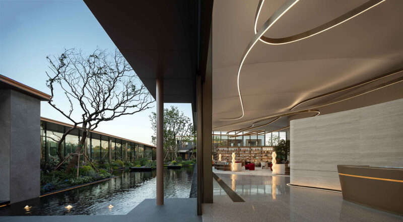
空间的功能属性,在设计之初便埋下了伏笔,直面入口的接待前厅,回归于简洁,让客户拥有更直接的体验感。
At the beginning of the design, designers considered the function of the space . The reception hall facing the entrance returns to simplicity, allowing customers to have a more direct sense of experience.
穿过接待厅可看到隐藏的取景框,如同戏剧上映的初始,让客户充满好奇。空间并不只是线性的叙事,不同人在空间中的行为,瞬间戏剧化的情绪才是表演的魅力。每一个穿插的墙体中的故事,构建了整个设计的逻辑。
Through the reception hall you can see the hidden view frame, like the beginning of the drama, so that customers are curious. Space is not only linear narration, but also the charm of performance. Each interspersed wall story constructs the logic of the whole design.
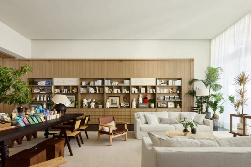
多功能活动区是日常展示的主力,人们于场景中进入、游走、活动。营销与社交功能的并行,在这空间里创造一个个可以触及的场景。
The multi-function area is the main space of daily display, people enter, walk and move in the space. The parallel of marketing and social functions creates accessible scenes in this space.
它具有现代性和非结构化特征,结合感知上的回忆、类比和着迷,将项目所呈现的意义转化为普通状态。看上去就如幻境的抽象派艺术,是这个空间不可或缺的元素。
It has the characteristics of modernity and unstructured, combined with perceptual recall, analogy and fascination, to transform the meaning of the project into a common state. The abstract art that looks like a fantasy is an indispensable element of this space.
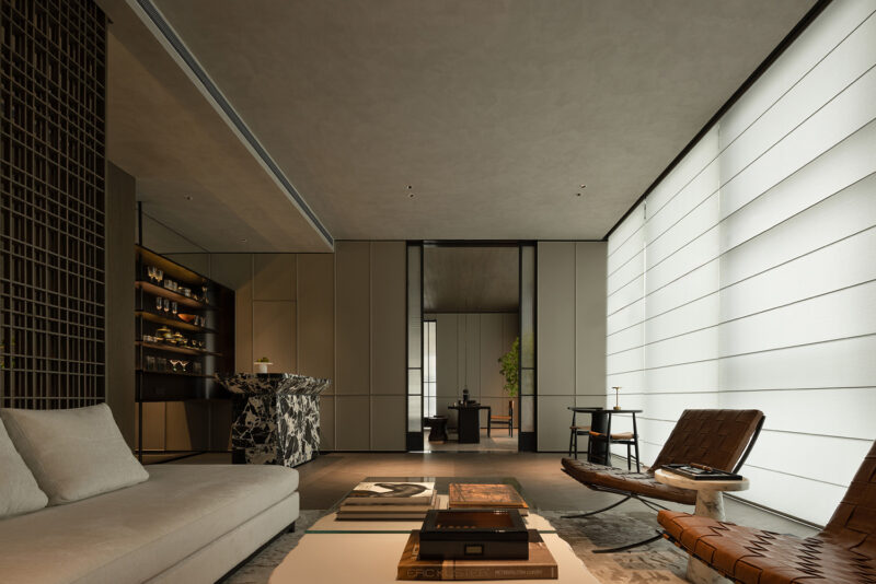
光在沙盘区是一个决定性的元素,通过光线传达其想呈现的感觉或情绪去增强了这些模型不同的表现。达到有力的构造感,浮华并不是最好的表达,更单纯的元素和连接方式,用相同颜色中不同质感的表达,来诠释现代的气质。
Light is a decisive element in the model area, which enhances the different performance of these models by communicating the feeling or emotion . To achieve a strong sense of construction, flashy is not the best expression, more simple elements and connections, with the same color in different texture expression, to interpret modern temperament.
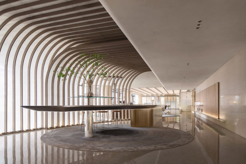
于空间的另一侧,设计创造了一个可随着实际推移而不断自我调节的灵活空间,独特的悬浮式艺术绿植,展现了强大的展示功能。
On the other side of the space, the design creates a flexible space that can be adjusted continuously with the actual process, and the unique suspended art green plant is a powerful show.
一切回归于简单,让空间凸显最实质的作用,在光与影中点燃空间的灵魂。
All return to simplicity, igniting the soul of space in light and shadow , the space highlight the most substantive role.
∇ 效果图
∇ 轴测图
∇ 平面图
项目信息
项目名称:兆鑫汇金广场营销中心
项目地址:中国 深圳
业主名称:深圳市兆鑫房地产开发有限公司
业主团队:黄晴 刘岱镔 苏晓宇 何辉
设计团队:崔端、罗辉、刘旭安、李优、张媛、卢桂星
室内设计:深圳市大森设计有限公司
标识设计:深圳市瑞海标识有限公司
灯光设计:深圳市辰河灯光设计顾问有限公司
完工时间:2020年7月
项目面积:500㎡
项目摄影:感光映画


