全球设计风向感谢来自元致设计的商业空间项目案例分享:
∇ 商铺位置 ©元致设计 Shop location Yuanzhi design
项目背景:上海浦东新区华润时代广场,是一个老商场改造,主持改造的是日本设计师佐藤大,轻盈、时尚简洁的日系风是整个商场环境气质。
Project background: China Resources Times Square in Pudong New Area, Shanghai, is an old shopping mall renovation, presided over by Japanese designer Sato da. The light, fashionable and concise Japanese style is the environmental quality of the whole shopping mall.
区域状况:由消防疏散通道连接的一个三角形和一个接近正方形的两个独立区块,单块面积不足两百个方。
Regional situation: A triangle and a square-like area which connected by a fire evacuation passageway have a single area of less than 200 square meters.
对两块区域业主也很纠结,担心将来给人造成两家店的错觉。
The owners of the two areas are also very tangled, worried about the illusion of two stores in the future.
设计策略Design strategy
用“加法”Using “addition”
由于是两块区域,和商场走廊临界立面加起来有四十多米,用“加法”把两块区域的临界立面“加”到一起,虽说借用了商场一部分公共走廊,但是把立面放入左右邻居的大立面里来看,无论体量还是视觉效果上来看都足够起到一个很好的心里暗示(一个整体空间)。
Because they are two areas, and the critical elevation of the shopping mall corridor is more than 40 meters, the critical elevation of the two areas is “added” by “addition”. Although some public corridors of the shopping mall are borrowed, the facade is put into the large facade of the left and right neighbors. In terms of volume and visual effect, it is enough to give a good psychological hint (an overall space) .
用“减法”Using subtraction
考虑到瑜伽的习练者女士居多,女士的着装绚丽多彩,把这些色彩放到未来空间的使用场景里,也是设计考虑的一部分。
Considering that the majority of yoga practitioners are women, and the women’s clothes are gorgeous and colorful, putting these colors into the future space use scene is also a part of the design consideration.
瑜伽的习练多是练习呼吸和静心冥想居多,同时业主也希望未来的习练者不只是练瑜伽、修形体,也可以在这里修习心境。
Yoga practice is mostly breathing and meditation. At the same time, the owners also hope that future practitioners can not only practice yoga and body, but also practice mood here.
所以在物理空间形态上,我们用“减法”来思考,减去多余的形式和色彩,尽量消减空间的个性,还原空间的本质,营造一个模糊暧昧的空间大容器。
So in the physical space form, we use “subtraction” to think, subtract the redundant form and color, try to reduce the personality of space, restore the essence of space, and create a vague space container.
∇ 从加法到减法-空间生成图解 ©元致设计 From addition to subtraction space generation diagram Yuanzhi design
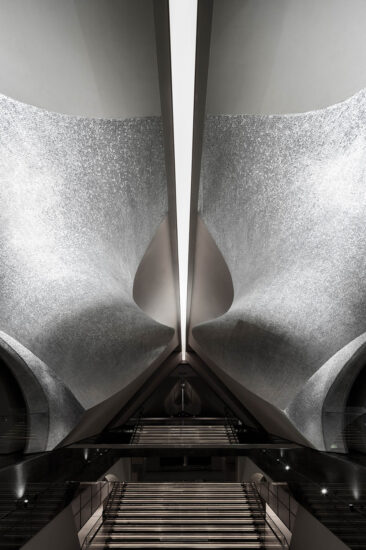
∇ 改造后效果 Effect after transformation
用“容器”来作为未来空间的关键字。
Use “container” as the keyword of future space..
用黑白灰来调配基调,如果把“这个场所”来比喻一幅画,我希望空间是背景,活动在里面的人才是画的内容,那样每天都会出现不同的画,这样不是更有意思吗?
Using black and white to mix the tone, if “this place” is compared to a painting, I hope that the space is the background, and the talents who are active in it are the content of the painting. In that way, different paintings will appear every day. Isn’t it more interesting?
空间功能组织Spatial function organization
入口动线用开放的形式回应逛街的“逛”、希望逛着逛着在下意识的情况下“误入藕花深处”。
The entrance moving line responds to the “stroll” of shopping in an open form, hoping to “enter the lotus root deep place” subconsciously.
表现形式上:我们在走廊临界处设计了卡座,在前台接待处也设计了开放式的座椅组合,椅子的最大本质就是吸引人来坐。吸引人不就是商业活动的一部分吗?让逛累的人在这里休息,在下意识的情况下瑜伽悄然无声地没准就走进了她的生活。
Form of expression: we have designed the booth at the critical position of the corridor, and also designed the open type seat combination in the front desk reception desk. The biggest essence of the chair is to attract people to sit. Isn’t attraction part of business? Let the tired people rest here. Under the subconscious situation, yoga may enter her life quietly.
在临界的瑜伽大教室理也做了适当的开洞,希望在未来的运营中形成“看与被看”,一次无意的回首没准成就了一个邂逅的爱情故事……
In the critical Yoga classroom, we have also made appropriate openings, hoping to form “seeing and being seen” in the future operation. An unintentional looking back may lead to an encounter love story…
其实这样也有一个弊端:缺少逻辑性很强的流线。接待起来有点麻烦。
In fact, there is also a drawback: the lack of logical streamline. It’s a bit of a hassle to receive.
在静谧私密的“SPA护理 ”区,通过一个闭合的走廊和置入一个内向的小庭院,来转换空间的属性。在走廊里刻意营造一个香烟缭绕,烛火摇曳,光影斑斓的阴翳空间来铺垫引导。
In the quiet and private “spa care” area, a closed corridor and a small inward courtyard are placed to transform the spatial attributes. In the corridor, deliberately create a smoke wrapped, candle flickering, light and shadow colorful shade space to pave and guide.
∇ 平面图
∇ 剖面图
项目信息
设计单位:元致设计
项目地点:上海浦东新区
建造周期:2019.8-2019.11
建筑面积:380㎡
摄影:三像摄
Design company: Yuanzhi design
Project location: Pudong New Area, Shanghai
Construction period: August to November, 2019
Area:380㎡
Photograph: Threeimages


