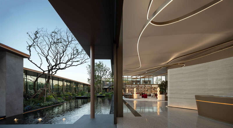
全球设计风向感谢来自筑睦建筑设计事务所/ZHUMU Architectural的售楼处/样板房空间项目案例分享:
本项目位于侨乡江门·开平。地处开平梁金山与开平人民公园交汇之地,地理位置相当优越。是当地最具影响力的开发项目之一。有人民公园、金山湖等优美秀丽的生态人文资源环绕。我们接受委托方设计其样板房、营销中心以及整体景观设计。
尚璟营销中心是包含建筑与室内设计的项目。我们将其整体归纳在“空间设计”系列。因为我们认为内外结合一并思考是对空间最佳的考虑。在既定的条件(功能和造价等)下,建筑造型需要服从于销售(及后续使用属性)为目的的室内,并对空间采光、通风、使用流线等进行优化。
The project is located in Kaiping, One of the hometowns of overseas Chinese. It is at the intersection of Liangjinshan and Kaiping people’s Park, which is a place full of merits. Surrounded by a multitude of beautiful ecological and cultural resources, such as Kaiping’s largest municipal park and Jinshan Lake makes it one of the most influential local development projects. We are commissioned to design the architecture, interior and overall landscape design of the residential area.
We prefer to consider it in a whole space design. Because we think that through the combination of internal and external, common thinking is the best plan for space.Given the conditions (function, cost, etc.), the optimization of building shape, lighting, ventilation and use streamline of indoor space is deemed as an approach to achieve the best sale.
作为销售道具而存在的空间,营销中心在吻合当地具体销售模式的前提下,以渲染品牌为核心任务;空间特殊性、差异性和优化体验为次级诉求;接待功能完整为基本任务。本建筑作为营销中心的使用周期为3-4年,空间同时需要具备日后改建成临街商业的功能性。以上所有,意味建筑体外立面需要以商业临街建筑外立面为蓝本,尽量减少二次修改建筑体构造为原则;在两三个月的建设周期内完整呈现本场所。§ § 而我们在此项目的兴趣点在于,如何在以上限制内呈现出最好的体验空间;§ § 经现场考察发现,若以原结构进行营销中心设计,空间会被原结构柱影响体验,而且1.5层的构造会让空间显得狭窄。经我们建议后,甲方同意在减少二次改造及以销售中心空间体验优先为前提,进行对建筑结构的优化。§ § As the space for selling props, the core task of marketing center is to play up the brand concept and tension on for the sake of conforming to the local specific sales mode. The service life of the building as a marketing center is 3-4 years, which means that the external facade of the building needs to be coordinated with the external facade of the Commercial Street building, with the principle of reducing modification, and present the site completely in two to three months. Our interest lies in how to present better space under these restrictions;§ § It is found that the original structure has many structural columns that affect the spatial experience, and the structure of one and a half floors will make the space appear crowded. After our suggestion, client agrees to optimize the structure.
空间概念,concept
我们的做法是
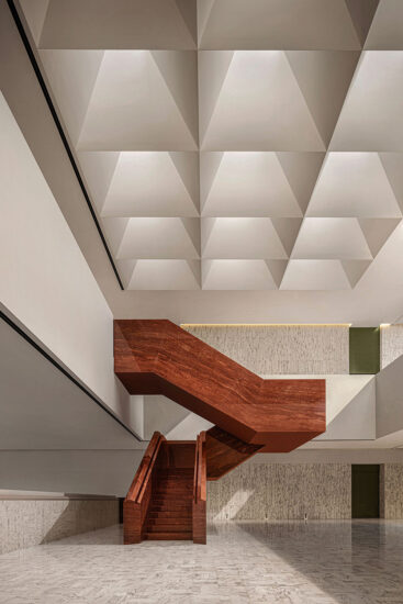
1.优化结构,跨度加大,保证室内空间不会被柱子打断节奏;
2.净空优化,柱距优化后同时优化梁体的高度,保证室内空间不会被横梁打断节奏;
3.优化净空后,建筑外立面的采光面加大,增大展示玻璃的伸展度和高度;利用好建筑正立面朝西的特点,尽量吸纳更多自然光,使之能搭配室内的空间和材质达到最佳效果;
3.空间在1,2步后得出一个完整的长方体空间,解决了狭长的空间带来的不便;
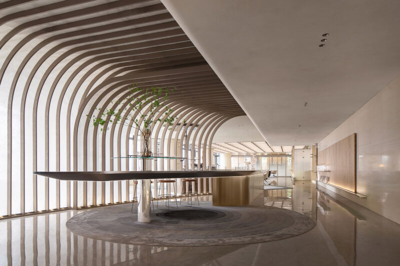
4.划分好平面分区后,因应空间高度作出空间秩序重构,以灰空间的形式划分三维空间上的分区。让分区更有立体感。
What we do
1. Optimize the structure, increase the span, and ensure that the indoor space will not be interrupted by the structural column rhythm;
2. Ameliorate the space of Headroom. Ensure that the interior space will not be interrupted by the structural beam rhythm;
3. Expanddaylighting surface(area) of the building’s exterior facade, and increase the extension and height of the display glass; more natural light will be absorbed as much as possible to match the indoor space and materials to achieve the best effect by using the characteristics of facing west;
3. Obtaina complete cuboid space by finishing 1st and 2nd steps, which solves the inconvenience of the original narrow space;
4. Dividethe plane partition and reconstruct the spatial order according to the height of different space, to make the partition more three-dimensional.
空间内部interior view
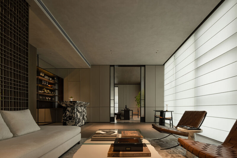
用不同材质界定不同空间的存在感 Distinguish different spaces with different materials
材质material
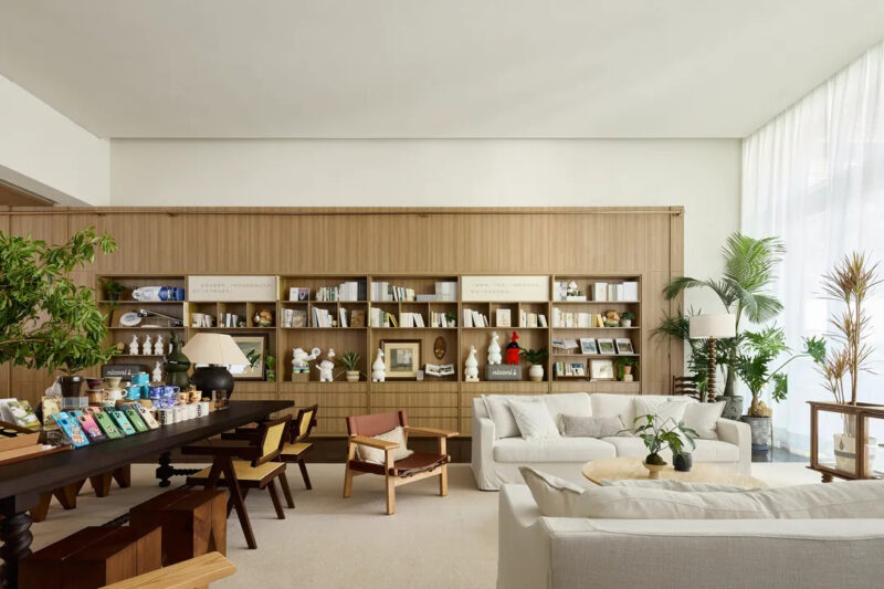
为了让空间质感更加纯粹,浓郁而又不失爽朗,我们引入了绿植要素增添生气。我们同时选用了线、面作为形态的不锈钢钢材,配搭更大块面的木料作为主要装饰要素;
In order to exhibit the purity of space, we used the materials which texture is rich and refreshing. At the same time, green plants are utilizedto vitalize(invigorate) the space. We choose stainless steel in the form of line and surface, and wood with larger surface as the main decorative elements;
质感texture
在块面感和线条感如此强烈的视觉冲击下,并不会让人觉得冰冷难以接近,因为在光面不锈钢材质的反射下,户外绿植景观的景象被吸纳进了室内空间,为了更加增添绿趣,我们甚至把绿植带入了室内。在有序而无机的材料和有机而无序的植物交融下,空间变得不再局限。
The strong visual impact caused by block and line sense would not chill people and hinder them from approaching the space, because the outdoor green plants are showed on surfaceof smooth stainless steel reflects. Green plants become a part of the interior space.The combination of orderly and inorganic materials and organic and disordered plants makes the space no longer limited.
功能应用the commercial application in the sales space
∇ 沙盘区 Sand table area
∇ 水吧区
∇ 洽谈区
∇ 收银区
意境artistic conception
透过笔直的不锈钢钢材,我们要表达出的不只是秩序之美,在纯粹的背后,更多是为了突出细腻的排布与环境交融之美。如丝般顺滑,入纸般感觉,在这基础上以丰收的香槟金色作为主调。简单直接也不失温柔。
Constructing by the straight stainless steel, not only the elegance of order butalso the glamour of delicate arrangement and the beauty of the blend ofenvironment are demonstrated. On this basis, it takes the golden harvest of champagne as themain tone. Simple, direct and gentle.
∇ 平面图
项目信息
项目名称:尚璟营销中心
室内设计:筑睦设计
外立面设计:筑睦设计
完工年份:2019
材料:不锈钢饰面、不锈钢构架、橡木、瓷砖、大理石
面积:680㎡
建筑所在地:江门·开平
业主:泰和集团
主创设计团队:胡耀英、陈永林
摄影版权:胡耀英
NAME:SHANGJING SALES CENTER
INTERIOR DESIGN:ZHUMU ARCHITECTRUL
FAÇADE DESIGN: ZHUMU ARCHITECTRUL
COMPLETION: 2019
MATERIAL:STAINLESS STELL WOOD TILE MARBLE
AREA: 680㎡
LOCATION:JIANGMEN.CHINA
CLIENT:GUANGDONG TAIHE GROUP
DESIGNER:BAN HU / LIN CHEN
PHOTOGRAPHY COPYRIGHT: BAN HU


