全球设计风向感谢来自COLORFULL 昱景设计的公共空间/产业园项目案例分享:
∇ 无限外延的东方三角 The infinite extension of oriental triangle
∇ 现代技法泼墨山水写意 Splash ink landscape painting with modern technique
01项目区位Project Location
项目位于杭州市西湖区翠苑街道,地处“文三路电子信息一条街”的西端,工专路与文三路交汇口,距离西湖景区步行仅十余分钟,地理环境优越。占地约6500平方米,由3栋多层框架结构主楼组成。改造前主要服务于贸易加工类企业和仓储功能。园区内硬件设施老化、业态落后杂乱、办公环境陈旧的问题日趋凸显,市场竞争压力趋大。园区的全面提升和改造迫在眉睫。
The project is located on Cuiyuan Street, West Lake District, Hangzhou, at the western end of the “Wensan Road Electronic Information Street”, at the intersection of Gongzhuan Road and Wensan Road. With a favorable geographical environment about only ten minutes away from West Lake, it occupies an area of about 6500 square meters and consists of three multi-story buildings with frame structure. Before the renovation, it mainly served the trade processing enterprises and as warehouses. The problems of aging hardware and facilities, backwardness and chaos, and obsolete office environment in the park had become prominent, and the pressure of market competition has increased. The comprehensive upgrading and transformation of the park was imminent.
02设计理念Design Concept
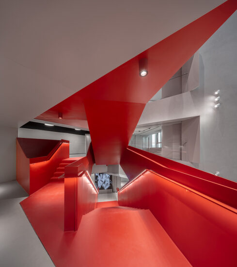
项目既存建筑中存在大量三角形元素,这既是项目特征,又是一种充满东方神韵的符号。因此我们决定在设计中尽可能放大该元素,使之成为项目的标志性特征。
这些三角形大小和夹角各不相同,将它们不断延展并相交后,在建筑立面上形成了犹如联袂山棱的图形,同时也符合基地片区特色。在此基础之上,我们决定以黑白做为项目主色调,点缀以红砖、木纹、绿植,用现代的建造技术在西湖的周边泼墨一幅立体山水画。
The presence of many triangular elements in the existing buildings is both a feature of the project and a symbol of oriental charm. Therefore, we decided to maximize this particular element in our design, and make it an outstanding feature of the project.
The triangles vary in size and angle, so that when they are extended and intersected, they form the shape of paired mountain ridges, which is also consistent with the character of the site. Based on this, we decided to use black and white as the main color of the project, interspersed with red brick, wood grain, and greenery, to create a three-dimensional ink landscape painting around the West Lake using modern construction techniques.
空间理念Space Concept
项目设计之初确定了园区“生态、人文、科技”的主题,强调人与自然,工作与环境的和谐发展。因而如何高效使用有限的空间成为了设计的重中之重。
园区原高密度的办公和仓储功能,使之缺乏共享休闲空间。我们联想到西湖风景区以西湖为动线串联各个景点的空间布局规划,决定在不同维度置入不同体量的公共空间,并通过细节处理保证这些空间可见可达。同时也充分利用每栋楼的屋顶区域,根据大小布置空中花园、屋顶运动场等功能模块。
At the beginning, we’ve set the theme of the park as “Ecology, Humanity, Science and Technology”, emphasizing the harmonious development of human and nature, work and environment. Thus, the efficient use of limited space became the most important design priority.
Originally served as high-density offices and warehouses, the park lacked shared leisure space. We were inspired by the spatial layout of the West Lake Scenic Area, which has the West Lake as its dynamic line connecting various attractions. We decided to put in different volumes of public space in different dimensions, and made sure that these spaces were visible and accessible through our detailing. We also made full use of the rooftop area of each building, arranging functional modules such as sky gardens and rooftop playgrounds according to the size.
光影游戏Shadow Game
现场考察时,我们还有一个特别的发现,因为既存建筑的围合布局,当阳光以不同角度照入时,会在建筑外墙上形成不同尺度的三角形阴影。利用这一点,我们通过设计,使得正午时阳光的阴影,与立面上设计放大后的三角形体块交错,形成了新的等腰三角形。既丰富了立面效果,也使得园区更具趣味性。
Another particular finding during the site visit was that the envelope layout of the existing buildings creates triangular shadows on the facade at different scales when the sunlight enters at different angles. We took advantage of this, and through our design, the shadows of the midday sun intersect with the triangular block of the facade, which is magnified by our design, to create a new isosceles triangle. This enriches the facade effect and makes the park more interesting.
03沿街面Frontage
改造前的园区是完全封闭的,我们首先打开了沿街面,并在沿街面首层引入了精品配套,同时也丰富了园区的功能构架。
由于项目地处道路交汇处,该处立面就成为了项目沿街展示面的核心部分。我们通过增加造型雨棚、植物墙等手法营造出山峦叠嶂的感觉。即便在很远处,屋顶的绿化墙也能跃入眼中,成为城市天际线中的一点新绿。
As the park was completely closed before the renovation, we opened up the street frontage and introduced boutique amenities on the first floor along the street, which also enriched the functional architecture of the park.
As the project is located at the intersection of roads, this facade became the centerpiece of the project. We created a sense of mountain peaks by adding stylized canopies and plant walls. Even from a distance, the green roof wall can be seen as a bit of new green in the city skyline.
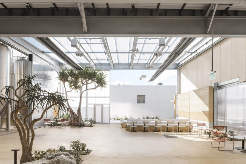
充分研究建筑体量之后,我们决定打开1至3层的电梯厅,增加户外平台作为园区共享会客厅、休闲厅。同时继续运用三角元素,配以彩色不锈钢板、水纹不锈钢板、绿化墙和LED屏,以此实现科技与自然并重。
After a thorough study of the building’s volume, we decided to open up the elevator halls from the 1st to 3rd floors and add outdoor terraces as a shared living room and lounge in the park. Also, we continue to use triangular elements, with colored stainless steel panels, water grain stainless steel panels, green walls and LED screens, in order to achieve equal emphasis on technology and nature.
04愿景Vision
我们希望通过设计改造升级,将中电·万谷项目打造成一个集创业、办公、休闲于一体的互联网+文化主题的未来园区。
同时作为杭州市西湖区老楼宇、老商圈改造的首批重点项目,我们希望通过设计,使中电·万谷项目滴水涟漪,成为片区内的亮点。
We hope to transform and upgrade the CEC WEGO into a future park with the theme of Internet + culture, which integrates entrepreneurship, office and leisure.
Meanwhile, as one of the first batch of key projects of renovation of old buildings and old business districts in West Lake District of Hangzhou, we hope to make the CEC WEGO project a highlight of the area through our design.
∇ 总平面图 Site-plan
∇ 一层平面图 First floor plans
∇ 二层平面图 Second floor plans
∇ 三层平面图 Third floor plans
∇ 立面图 Elevations
项目信息
项目名称:中电・万谷
项目地址:浙江省杭州市西湖区文三路408号
设计方:COLORFULL 昱景设计
建筑面积:12,000㎡
公司网站:http://www.colorfull-design.com/
联系邮箱:cf@colorfull-design.com
项目设计 & 完成年份:2020
设计指导:赵宗阳、小野良介
建筑方案设计:川合丰、钱杨婷、安部井桥
建筑设计深化:张颢、钱杨婷
室内方案设计:孙秀云、谢晧翔、蒋瑜桑
室内设计深化:李立群、朱丽艳、蒋瑜桑
摄影版权:何炼
客户:南京万谷集团
材料:仿古红砖、实木抽槽板、铝板、防火板
Project name: CEC WEGO
Project location:408 Wensan Road, Xihu District, Hangzhou, Zhejiang Province
Design:COLORFULL YUJING DESIGN
Gross Built Area (square meters):12,000㎡
Website:http://www.colorfull-design.com/
Contact e-mail:cf@colorfull-design.com
Design year & Completion Year:2020
Design Guidance:Sunny Zhao, Ryo Ono
Architectural Design:Yutaka Kawai, Dodo Qian, Takashi Abei
Deepening of architectural design:Hao Zhang, Dodo Qian
Interior Design:Sylvia Sun, Louis Xie, Yusang Jiang
Deepening of interior design:Lily, Jolie Zhu, Yusang Jiang
Photo credits:Lian He
Clients:Wangu Group
Brands / Products used in the project:Antique red brick, solid wood grooved board, aluminum board, fireproof board


