全球设计风向感谢来自奈时设计的商业空间项目案例分享:
茶,是人类文化的一种载体。茶中蕴藏的悠久智慧,和醇厚净亮的美,已跨越东西方的认知而为世所共通。茶兼有健康属性和社交属性,新的时代背景之下,这双重属性亦被赋予更加丰富多元的表达,使之契合当代都市人群的生活方式。
Tea embodies humanity and culture. Its inherent ancient wisdom as well as its pure and clean beauty have surpassed an awareness of East and West to gain universal acceptance. This beverage is healthy and suitable for social interactions. In the context of a new era, tea’s dual advantages express it in more enriched and diverse ways, making it a suitable aspect of modern urban residents’ lifestyles.
茶妆品牌Cosmetea,颠覆美妆以往定义,将传统的Tea与潮流的Cosmetics创新融合,运用“Tea Beauty Science”,衍生自然主义的东方情愫为当代时尚美学。Nax Architects奈时设计为Cosmetea打造线下体验店,从空间设计和品牌策划的维度,构筑艺术化和沉浸式的场景体验,探索自然与人造之间,既有环境与未来建筑之间的关系哲学,也将品牌引向创意与可续的进化之道。
The tea cosmetics brand Cosmetea subverts the previous definition of cosmetics by innovatively integrating tea with trendy cosmetics. It uses Tea Beauty Science to create modern fashion aesthetics based on natural Eastern sentiments.
Nax Architects was entrusted to conceive a store for the brand in Shanghai. Based on the dimensions of spatial design and brand planning, construction of art and an immersive scenario experience, as well as an exploration of differences between natural and artificial realms, the pop-up represents the philosophy of relationships between existing environments and future architecture. Moreover, it promotes the brand’s creative and sustainable evolution.
老城区里的时尚自留地A fashion destination in old neighborhood
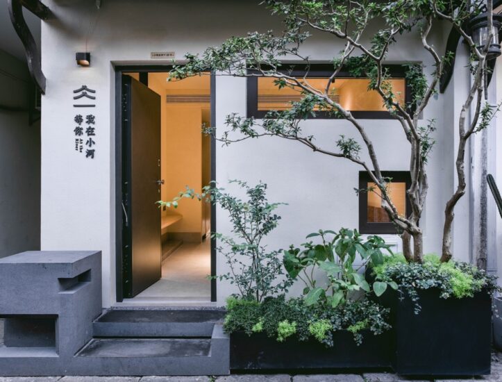
项目位于愚园路,一条历经百年沧桑的马路,凝刻着上海的历史与文脉精华。基地夹杂在愚园路鳞次栉比的老式建筑群中,我们围绕“Taste a beautea”的概念原型展开创作发想,取层叠错落的山峦之型与闲适恬淡的待客之境为设计语汇,用75平方米创造新语境下的美妆零售及社交与体验空间——漂浮山间的茶室。
This project is located on Yuyuan Road, a hundred-year-old road that has undergone many changes and represents the essence of Shanghai’s history and culture. The site is surrounded by dense rows of old buildings. We drew on the brand’s conceptual prototype of ‘taste a beautea’ to develop new ideas, and chose the form of layered and irregular mountain ranges as well as a leisurely, quiet and welcoming atmosphere as design languages. Within an area of 75-square-meter, we created a cosmetics retailing, socializing and experiential space, which was conceptualized as a “tea house floating in the mountains”.
光影流转的超现实意趣Surreal scenes & lighting effects
借鉴东方园林的框景手法,在入口处引入现代极简的不锈钢屏风,平添朦胧韵律的同时,暗示传统茶室的蜕变,也构成极具辨识度的品牌性格,吸引着行人驻足光临。
Taking inspiration from the “view framing” techniques in Chinese classical garden design, we set a modern minimalist stainless steel screen at the entrance. This adds a hazy rhythm while hinting at the “tea house” concept. It also forms a readily recognizable brand personality, which attracts pedestrians to stop and visit.
渐入室内,与立面不锈钢屏风相呼应的是置于场地中央的不锈钢悬挑长桌,以及混凝土旧屋顶下方的“漂浮灯”装置,配以玻璃砖的新颖光效,演绎曲水流觞的生色光影。
When gradually entering the store, customers will encounter a long suspended stainless steel table set in the middle of the space, which matches with the stainless steel screen. Moreover, the floating lighting fixtures installed under the old concrete ceiling, along with the unique lighting effects of glass bricks, generate surreal scenes and interplay of light and shadows.
中性而柔和的色彩肌理Soft hues & tactile textures
在空间基调上,萃取普洱的红艳汤色,将之调和为饱和度较低的暗粉,既诠释了美妆产品与茶文化的融合,也为现代生活压力带来一种亲和的抚慰。
The overall spatial tone is based on an extract of Pu’er tea’s brilliant red color, which is blended into low-saturation pink hues. The pink color palette explains the integration of cosmetics products and tea culture, whilst creating a soothing environment for modern people.
渐变硅藻泥墙体在间接光源的晕染下,铺陈出留白与想象的东方水墨画卷,墙体表面立体触感的纹理给人予回归自然的生命气息。
The indirect light source’s smudging gradually results in the diatom mud walls displaying a blank and imaginary Chinese ink wash painting. Moreover, the wall surface’s three-dimensional tactile texture makes people feel that they are experiencing nature’s vitality.
灵活可变的空间“魔方”A flexible and variable “magic cube”
玻璃砖与金属结合而成的固定台阶,以轻盈与厚重之间的平衡美感,引导客人拾级而上,自由落座。通透的材质不止打破沉闷,为多层次空间注入“漂浮感”,也可视作一种激发潜能的邀请,让他们在店内自由探索。
The fixed steps composed of glass bricks and metal provide an esthetic that balances lightness and heaviness, and guide customers to slowly walk upwards and freely sit down. The transparent materials enliven the atmosphere, infuses the multilevel space with a “sense of floating”, and invites customers to freely explore inside the store.
空间形态与功能的灵活性还体现于:可插拔的陈列架,给予产品陈列以更多可能;欧松板和金属穿孔制成的移动台阶,内嵌Cosmetea产品瓶盖,透过照明显现品牌logo,回收材料因此升华为可持续的艺术表达。
The flexibility of spatial configuration and functions is embodied in the pluggable display rack that creates more possibilities for exhibiting products, and the mobile steps made of OSB paneling and perforated metal. The movable stairs are inlaid with Cosmetea product bottle caps, and the brand logo on the caps are highlighted by lighting, which turns the recycled materials into sustainable expressions of art.
∇ 平面图
项目信息
项目名称:Cosmetea 新型美妆茶文化品牌店
项目地点:上海愚园路
项目面积: 75平方米
完工时间:2019年底
设计公司:奈时设计(www.nax.group)
主创设计师:Lina Chan、Yiting Ma、Jo Jiao
摄影师:Raitt Liu
业主:上美集团/韩束妆业韩国分公司HONDO红道
Project Name: Cosmetea Store
Project Location: Yuyuan Road, Shanghai, China
Area: 75 Square Meters
Completion Time: 2019
Design Firm: Nax Architects (www.nax.group)
Design Team: Lina Chan, Yiting Ma, Jo Jiao
Photographer: Raitt Liu
Client: SHANGHAI CHICMAX COSMETICS CO., LTD


