全球设计风向感谢来自Young H Design/研趣设计的餐饮空间/咖啡厅项目案例分享:
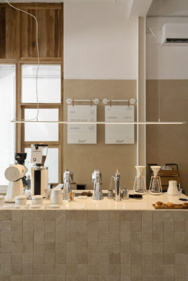
SOE想要在西单更新场打造一个不一样的咖啡店,因为面积很小,只有30平米左右,他们并不想做一家标准的咖啡店,他们希望售卖黑白两种咖啡,简单而又直接,但是担心同一个店一黑一白看起来很奇怪,所以希望YHD能给到一个好的解决方案。
S.O.E coffee opened a special store in Beijing Xidan. The footprint is quite small, around 37 sqm. They don’t want to design a standard coffee shop, they wanted to sell black and white coffee, the whole space looks simple and clear. But they were worried that having black and white in the same space would look strange, so they hoped YHD would figure out a good solution.
经过在现场的观察,现场有根柱子,正好将场地一分为二。小的那个空间就是黑色空间,大的那个空间就规划成白色空间。我们希望人们在黑色空间里时候能完全沉浸其中,不被白色空间干扰,而在白色空间里也是同理。
After the observation on the site, there is a pillar in the middle, which divides the space in two. The smaller one is the black space, and the larger one is planned as the white space. We want people to be completely dropped into the black space and not be distubered by the white space, and the white space is the same.
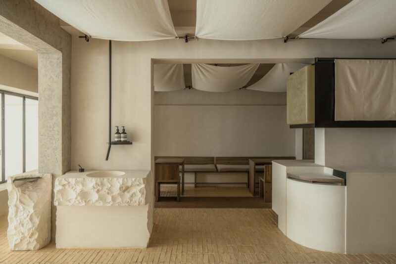
黑白不止存在于色彩里,还存在于造型里,一个造型,有受光面和背光面,这是黑白的另一种表现。从咖啡豆获得的灵感,创造了一个造型,旋转一定角度形成受光和背光两个面,让本来白空间的纯白,展现出不同的明暗,不再是单调的白色。
Black and white not only exist in colour, also exist in shape. A shape, there are light and shadow, this is another manifestation of black and white. Inspired by coffee beans, we created a shape, which rotated at a certain angle to form two surfaces, defined the light and the shadow, so that the originally white space would show different light and shade instead of monotonous white.
这些金属的部件通过发送三维文件给厂家,厂家通过电脑切割折弯以后,运到现场安装,从设计到实施通过数字化确保了没有误差。这也是新设计的一些尝试。
The 3D file of metal parts is sent to the manufacturer. After the manufacturer cuts and bends the metal by computer, it is shipped to the site for installation. From design to installation, no mistakes. These are also some attempts at a new design.
∇ 平面图
项目信息
项目名称:S.O.E Coffee
设计方:Young H Design/研趣设计
公司网站:www.younghdesign.com
联系邮箱:david.zhou@younghoodesign.com
项目设计 & 完成年份:2020-2021
主创及设计团队:周方旻,邹有鑫,夏光
项目地址:北京更新场
建筑面积:37sqm
摄影版权:非啦
客户:八平方咖啡
Project name:S.O.E Coffee
Design:Young H Design
Website:www.younghdesign.com
Contact e-mail:david.zhou@younghoodesign.com
Design year &Completion Year:2020-2021
Leader designer & Team:David Zhou,Bill Zou, Parker Xia
Project location:Beijing
Gross Built Area(square meters):37sqm
Photo credits :Feila
Clients:S.O.E Coffee


