全球设计风向感谢来自Studio A+的公共空间/艺术馆项目案例分享:
关键词Key Words:
艺术馆、漂浮、艺术与自然、人工与自然、艺术乌托邦、平行线、光与色彩、场所、开放性与社会性
Art gallery, floating, art, nature, manmade, utopia, parallel, light, color, place, openness and sociality
摘要Summary:
中环艺术馆旨在搭建平台,让艺术、艺术家与大众相遇。通过对场地景观的整体梳理,打造一片人工化的“自然”,一个艺术与自然共同造就的“小气候”,一个都市里的艺术乌托邦。为了场地上统一而延续的风景,建筑以漂浮的姿态存在。这一由建筑与景观构建的“场所”具有高度的开放性及包容性。
A floating art gallery together with its large ‘manmade nature’ landscape surroundings creates an urban art utopia where art and artists meet the public. The place created by both the architecture and the landscape, is a highly welcoming and inclusive public space, where people can easily access, experience, and celebrate art while feeling inspired and enlightened.
设计背景故事Background information
中环艺术馆的设计图纸于2008年完成,十年之后得以建造,已于2019年七月底竣工。
The design was finished in 2008. 10 years later, the construction started and was completed by the end of July, 2019.
中环集团CEO余竹云先生是一位有着艺术情怀和责任担当地产人。十多年前,他在走访了安徽一带民间艺术家的工作室后,看到那些造诣精深的艺术作品在狭窄的空间中无处安放,更无缘为世人所知后,痛惜之余萌生了要为它们搭建平台的想法。他在找到我们时说,希望这个低密度、小规模的艺术馆园区成为艺术及艺术家与大众相遇的场所,并以其独特的能量辐射周边,成为造访这座城市的游客们必打卡之地。而与这个地块比邻的将是高楼大厦的丛林(当时还是一片平地),如何实现他这个既单纯又颇有难度的理想呢?
12 year ago, the CEO of the Central Ring Real Estate Group, found us after visiting poor folk artists in the rural area of An Hui province. Seeing so many outstanding art works stacked inside humble residences with no opportunity to be shown to the public, he decided to build an art gallery in a new urban district in the capital city of the province.
He envisioned this low density and low-rise art district to be the place where art and artists meet the public, to radiate its unique energy to the surrounding neighborhoods, and to become a must-visit attraction. To do so, the site must stand out from the backdrop of a typical urban jungle – high-rises.
设计思考起点Concept
对场地形态深入思考后,我们很快决定,在这个以高密度的建筑、超宽度的机动车道为显著特征的现代都市新区中引入一片人工“自然”,以成片的开花树木为主要元素,将这个地块打造为一个艺术与自然共同造就的小气候,一个关于艺术的乌托邦,一个都市里的艺术童话。我们相信没有一个生活在城市里的人会拒绝一片“世外桃源”,并且,一片美好的自然很有可能在钢筋混凝土的丛林中脱颖而出,成为致命吸引力。我们希望以这样一个难得的“自然”场所为舞台来容纳甚至强化各类艺术品及艺术活动的意境与价值。让艺术与自然在这里平行自在地并置、流动,彼此独立存在而又处处相融。在灿烂的季节里,艺术更能成为与自然相应成趣的大型活动内容。整个场地洋溢出不同于这个城市那些标准街区的独特气质。
我们倡导以步行为主的区域内“漫步”。并不希望艺术馆仅仅是一个关起门来独自美好的艺术品容器,而是像纽约当代艺术馆馆长Glenn D. Lowry所说,“艺术馆把作品和参观者置于时间与空间当中,并在艺术作品与欣赏者之间搭建起一个架构”,成为“一个公众参与的教育机构,一个文化基地,在其更广泛的城市与地区的范围内,会在塑造城市的、地区的或国家的文化生活方面发挥更大的作用。”因此我们希望艺术馆成为一个具有强烈开放性、社会性,容纳并积极影响人们日常生活的场所。对于漫步其间的主体——人而言,则随时在自然与艺术之间进行多层次、多维度的切换与审美联想。
原则很快被制定下来:一切以景观至上,建筑作为大景观的一部分融入整体环境。
How do we turn this simple but idealistic goal into reality? After analyzing the site and its surroundings, which were totally vacant at the time, we decided to introduce a ‘manmade nature’ into this new urban area that will be typically occupied densely by tall buildings and super wide motorways according to the planning. We believed that no one who lives in the city would refuse a land of idyllic beauty – a land full of cherry blossoms may have a better chance to be more attractive than a tall concrete forest. We wanted to create a micro-climate characterized by art and nature, or an urban oasis with an art utopia within it.
Such invaluable setting of nature becomes a stage to accommodate art and art activities. Art and nature, though independent from each other, juxtapose, flow, connect and fuse with each other at the same time. In the spring time during the flowering period, activities such as special art festivals can even give the place a one-of-a-kind signature, which attracts people near and far.
The main expected activity on site is promenading, through which people can enjoy and contemplate art and nature on multiple levels. The gallery in turn is not an isolated inward-looking art container. Together with the settings, it becomes a welcoming and inclusive public place, where people can easily access, experience, and celebrate art while feeling inspired and enlightened.
景观至上原则The priority of landscape design
艺术,是与自然平行的和谐世界。——保罗·塞尚
Art is a harmony that runs parallel to Nature. —— Paul Cézanne
这个项目的景观设计先行于建筑设计。我们首先用一系列简约的平行线沿场地的长轴展开,对场地进行“初始格式化”,意在建立一套MATRIX,对万变的自然进行梳理。平行线的格局强调此处自然的人工性,并方便为将来的种植进行色彩上的布局。
Landscape design was the first step of the design work. A series of parallel lines are adopted as the matrix of re-formatting the site. Upon this configuration, colors from different local vegetation were mapped out to articulate the manmade nature.
在后续的景观设计深化中,这些平行线内的区域演化成为下沉广场的阶梯型大看台、静水面浅水池、大型坡道、室外和半室外平台、樱花树阵、以及颜色各异的灌木丛。灌木丛树种既有红花继木、红叶石楠,也有金叶女贞、茶梅、毛鹃等,甚至还预留了区域可以季节性耕种油菜以供春季赏花。
The areas defined by the parallel lines later become a sunken plaza, stepped seating stands, reflecting pool, giant sloping walkway, terraces on different levels, array of cherry trees, and bushes of different local species with various colors.
在这个大格局中,中环艺术沙龙作为本项目一期于2009年(十年前)落成并投入使用。其后院绿坡上伫立着以参与此项目的建筑工人为原型的真人尺度雕塑,在新落成的艺术馆背景的映衬下,以艺术的形式和语言致敬着普通劳动者。
Within this configuration, there situates the Central Ring Art Saloon, the first phase of this project which was completed 10 years earlier in 2009. A group of human scale sculptures based on real construction workers of this project stands on the sloping lawn in the backyard. With the façade of the new art gallery as the backdrop, the sculptures commemorate ordinary workers in a special language of art.
建筑与室内空间Architecture and Interior Space:
为了场地上统一而延续的风景,建筑以漂浮的姿态存在,给地面上的景观让路。艺术馆沿场地短轴展开、垂直于景观平行线的走向,正对东侧地块步行商业街的街口,邀请来访者进入并开始一段与艺术有关的漫步。
Positioned at the point where a pedestrian shopping street ends from across the road, the gallery building invites people in and engages them with a pleasant journey with art.
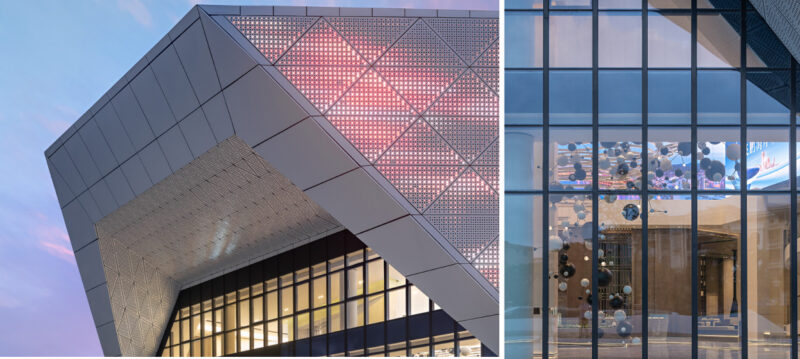
进而,我们希望建筑本身也成为一个漂浮的风景。从枝杈繁茂的森林截取一个片段,成为建筑的外观形象。因为“漂浮”,建筑与大地之间形成一系列供各种活动展开的室外及半室外空间,如入口广场、与其相通并通向下沉庭院的大台阶看台、与入口广场隔下沉庭院相望并与大型坡道相连的西侧平台,等等。同样因为“漂浮”,入口大厅被抬至二层,人们在建筑内部的艺术漫步需开始于一个充满舞台戏剧效果的大型楼梯。
Perpendicular to the parallel lines of landscape, the gallery building floats above the ground and gives way to the landscape that runs through the site. The building becomes a floating scene, with a specially designed envelope derived from a fragment of ‘forest’. The floating structure forms a series of semi-outdoor space that hosts various art activities.
大型楼梯将来访者直接引入二层的接待区和开敞的多功能大厅,贵宾厅、会议室均与大厅直接相邻。大厅与环廊共同构成了这一层的自由流动空间,可以举办活动和引入非专业性小型展览。
The indoor journey begins at a grand entry stairway, leading visitors directly to the lobby and an open multifunctional space on the second floor. The VIP lounge and conference room are immediately adjacent to the open space, where activities such as opening ceremonies can take place.
主要展厅均位于三层。大小两个展厅成为建筑的“内核”,是两个仅局部屋顶对天空开敞的内向型盒子;“内核”之外的空间则被最大程度地“释放”,并被独特的建筑外皮统一包裹。建筑的外皮成为室内与室外之间一道具有强渗透性的界面。游走于其中的人则在虚实之间欣赏被并置的自然景致(窗外)和艺术作品(窗内)。
Two exhibition halls – one large and one small – are placed on the 3rd floor and only open to the sky partially. Space around these two boxes is liberated in such a way that the building skin is highly permeable and the indoor and outdoor are blended instead of being separated via this interface. The spaces can accommodate temporary non-official art shows. Walking along it, people can enjoy both the indoor art exhibition and the nature beyond.
光与色彩 Light and Color:
建筑的主要内部空间分为两类,一类是展厅空间,自然光从屋顶垂直进入内部;另一类是展厅外空间,自然光从侧面水平进入室内。大型垂直交通楼梯间则介于两者之间,主要采光从屋顶天窗获得,兼备少量侧窗洞,从相邻空间获得借景,及水平向间接采光。
There are three major types of interior spaces in the gallery: the core spaces, i.e. the exhibition halls, where the daylight gets in vertically from above through the skylight; the spaces outside of the core, the promenade corridors and free spaces they connect, where the daylight gets in horizontally from side windows; and the grand staircase, somewhere in between. Inside the grand staircase, the daylight is sourced mainly from the skylight above, while horizontal daylight and views can also be borrowed through side openings from adjacent spaces.
建筑外表皮的颜色为灰与白,取自徽州民居的黑白素色。容纳主馆与副馆的“核体”,外表皮为彩色(粉色和黄色分别取自徽州春季的特色植物——桃李及油菜花的颜色),内表皮为纯白色用以展示多彩的艺术作品。而垂直交通核的内、外表皮均为新叶绿色,明亮而新鲜,令穿梭于其间的人如入画中,成为“舞台”的主角。
The color of the exterior, the white and dark grey, are from the local ‘Hui’ style traditional building (mainly black and white). Pink (cherry blossoms), yellow (rape flowers) and green (young leaves) are applied to interior skin to echo the local landscape in spring time. The inside of the exhibition halls is painted white to ensure best lighting quality and artworks are best displayed. A fresh and bright green color is applied to both inside and outside of the grand staircase to give the space a character intentionally. When people start the journey with art on the first step, they would feel like they stepped into a painting to become the leading role of the stage.
这些室内空间的色彩将从白色镂空外墙面隐约渗出,在白天和夜间,为建筑增添一抹含蓄的神秘色彩。
Interior colors permeate through the architectural skin, and are illuminated at night, rendering a mysterious atmosphere for the place.
∇ 地下一层平面图
∇ 一层平面图
∇ 二层平面图
∇ 三层平面图
项目信息
项目名称: 中环艺术馆(The Central Ring Gallery)
项目类型:建筑 /景观/室内
项目地点:安徽省 合肥市
设计单位:Studio A+
主创建筑师: 王敏
设计团队名单:王敏,丁梅,李辉,张雯雯,王崇硕,竟昕,魏玉伟等
甲方:安徽中环地产有限公司
造价:1.5亿元
建成状态:建成
设计时间(起迄年月):2008年5月-2008年12月
建设时间(起迄年月):2018年3月-2019年7月
用地面积(平方米):30017㎡
建筑面积(平方米):16525㎡
合作单位:CCDI(悉地国际)
照明:北京宁之境照明设计有限责任公司
施工:安徽中环创新绿色建筑产业有限公司
摄影:陈溯,方淳
Project Name: The Central Ring Gallery
Architecture Firm: Studio A+
Firm Location: Beijing, China
Completion Year: 2019.7
Gross Built Area: 16525 sqm
Site Area: 30017 sqm
Project Location: Hefei city, Anhui province, China
Lead Architect: Min Wang
Design Team: Min Wang, Mei Ding, Hui Li, Wenwen Zhang, Chongshuo Wang , Xin Jing, Yuwei Wei
Project Type: architecture, landscape and interior
Project Status: Built
Design Period: 2008. 05 – 12
Construction Period: 2018.03- 2019.07
Collaborator: CCDI
Client: An Hui Central Ring Real Estate Group
Cost: 150 million RMB
Photo credits: Chen Su, Fang Chun


