全球设计风向感谢来自杭州DNA邸内建筑设计的住宅空间项目案例分享:
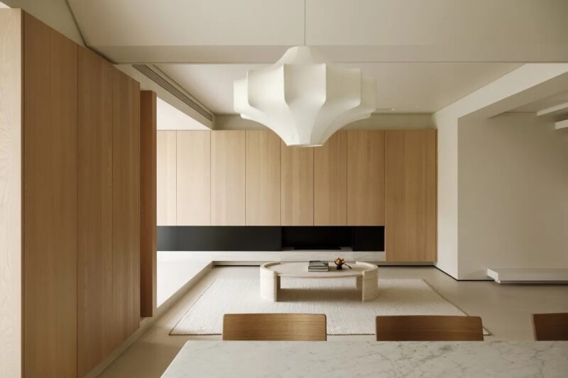
该项目是设计师为自己设计的居所,房屋西面临江环山,景色悠然。为了更好地衬托外界环境,室内空间的材质和色彩都运用得十分克制,以混凝土、洞石、桦木这些极具亲和力的材质装点,营造”自在、恰当“的氛围。这不仅仅是一种设计手段,更多是设计师理想生活的一种缩影。
The project is a residence designed by the designer for himself. The west side of the house is surrounded by mountains and rivers, with leisurely scenery. In order to better set off the environment, the use of the materials and colors are restrained for the interior space, with concrete、cave stone、 birch, such as very friendly materials decoration, to create a “comfortable and appropriate” atmosphere. This is not only a means of design, but also an epitome of the designer’s ideal life.
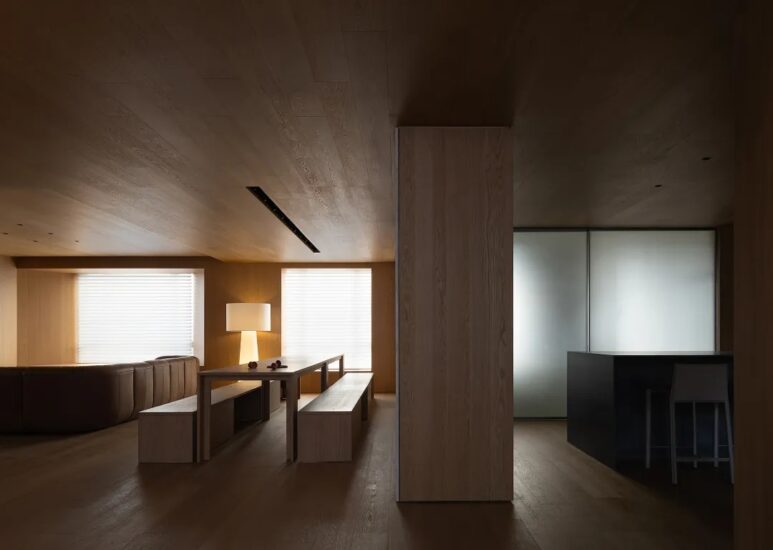
当打开垂帘,翠绿的山野映入眼前,午后的阳光通过窗台的桦木材质反射,将整个空间“染”上昏黄,显得恣意、悠然。以山为画,以江河为毯,抛弃多余的装饰性设计,透过大面的窗户,在空间里回转时能体会到不同样貌的自然景色。
When the curtain is opened, the verdant mountains come into view. The afternoon sunlight is reflected through the birch material of the window, dyeing the whole space with a dim yellow, which looks carefree and leisurely. Taking mountains as paintings and rivers as blankets, get rid of unnecessary decorative designs, feel the different natural scenery when you turn around in the space through the window.
立面材质以黑色、灰色、木纹三个主要块面来快速划分不同的功能区,并设计了大量的隐蔽收纳,来维持外部整洁性。
The facade material is made of three main blocks, black、gray and wood grain to quickly divide the different functional areas and a large number of hidden storage is designed to maintain the external cleanliness.
在设计语言统一的前提下,刻意将部分混凝土楼板裸露,这种不加修饰的粗犷纹理丰富了视觉层次。为了达到完美的视觉平衡,设计师将顶面、立面、家具之间的每一寸尺度都进行了反复的测算和调整。
Under the premise of unified design, part of the concrete floor slab is deliberately exposed, this kind of undecorated rough texture enriches the visual level. In order to achieve the perfect visual balance, the designer has repeatedly measured and adjusted every inch of the scale between the top surface, the facade and the furniture.
开放书柜以窗台的延伸形态呈现,更加自然地处理两个立面的转换关系。
The open bookcase is presented as an extension of the windowsill, which deals with the transition between the two facades more naturally.
柜体与顶面的细节处理。
The details processing of cabinet body and top surface.
过程中设计师把握设计介入的分寸,致力利用自然给予的光、风、雨露,来带动空间的情绪。
In the design process, the designer grasps the sense of propriety of design intervention and strives to make use of the light、wind、rain and dew given by nature to drive the emotion of the space.
通过黑、灰色两个块面之间形成通往厨房的入口,顶面暗装移门轨道来保持简洁的设计语言。
The entrance to the kitchen is formed between the black and gray surfaces and the top surface is hidden mounted sliding door tracks to keep the design simple.
卧室整体延续了桦木和水泥色的材质运用,顶面暖色灯带营造的氛围消除了水泥的冰冷感。
Bedrooms continuation of the materials used birch and cement-colored, the atmosphere created by the warm light on the top surface to eliminates the cold feeling of cement.
次卧室仅用了桦木一种材质,以不同的形态尺寸变换着不同的功能形式。桦木的质感除了外在的温润,还散发着一种特殊的清香。通过气味感官营造出自然朴实的居住氛围。
The secondary bedroom only used birch a kind of material, changing different functional form with different morphological dimension. In addition, the texture of birch is warm and moist, also send out a special fragrance. Through the smell sense to create a natural and simple living atmosphere.
在桌面一侧设计了便于放置手机、眼镜等随身物品的细心设计。
On the side of the table, a careful design is designed to facilitate the placement of mobile phones、glasses and other personal items.
∇ 产品 | Product
∇ 平面图 | Plan
项目信息
项目地点:中国杭州
项目面积:180㎡
设计时间:2020.05
主案设计:夏伟
设计团队:sasa、张李薇
空间摄影:川河映像
主要材料:桦木板、洞石、水泥板


