一迳抱幽山
居城市间
——宋·苏舜钦
《水调歌头·沧浪亭》
Embracing Youshan
Actually City Room
——Song Su Shunqin
“Shui Tiao Song Tou Canglang Pavilion”
∇ 外立面概览 Facade overview
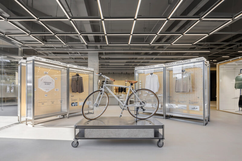
WEI STUFF,末染设计全案设计项目,历时弥久,无一处不倾注心血。“品牌、空间、产品,全方位武装到牙齿”。但我们其实只想表达一件事情:让空间内的一切都是那么自然得当。
WEI STUFF, the final dye design full case design project, lasted for a long time, and no effort was devoted to it. “Brand, space, and products are all armed to the teeth.” But we only want to express one thing: to make everything in the space so natural and proper.
自然质朴的亲近感|Natural intimacy
一楼 ,不定义空间
The first floor is provided with undefined space
∇ 地面大面积红砖定义出整体温暖印象The large area of red bricks on the ground defines the overall warmth
选用历久弥新的老红砖,切割成片3厘米薄片,人字形均匀铺贴在地面及卡座位置,呈现平滑且利落的平面和立面,又在间隔加入浅灰混凝土质材,有很好的压制住红砖本身粗旷的材质语言,清晰干净后用一层清漆罩面,给予其温润的质地,在将美丽封存的同时,也能禁受住时间带来的考验。
Choose the old red bricks that have been growing for a long time and cut them into slices of 3 cm. The chevrons are evenly spread on the ground and the deck position, presenting a smooth and neat plane and elevation, and adding light gray concrete materials at the intervals, which has a lot of It is good to suppress the rough material language of the red brick itself. After being clear and clean, it is covered with a layer of varnish to give it a warm texture. While sealing the beauty, it can also withstand the test of time.
造就诗意的光影打造优雅又兼具现代感的空间。搭配一面面玻璃窗将自然光引入,帮粗旷的红砖空间揉入现代俐落感。在这个镜面空间之内,人、器物、家具与植物景观相互映射,实像与镜像叠合交织于一处,人与物产生有趣的关联。
Create a poetic light and shadow to create an elegant and modern space. Paired with glass windows on one side introduces natural light, helping the rough red brick space blend into a modern and tidy sense. In this mirrored space, people, utensils, furniture, and plant landscapes are mapped to each other. Real images and mirror images are superimposed and interwoven together, creating an interesting relationship between people and objects.
红砖自带的复古韵味无论用在哪里,都能让空间呈现出一种经时间洗礼后深厚底蕴。尤其在复古潮流的当下,我们让红砖成为一种记忆符号。
The retro charm that comes with the red bricks, no matter where it is used, can make the space show a deep heritage after the baptism of time. Especially in the current retro trend, we let the red brick become a kind of memory symbol.
室内部分用最本质的材料创造出一种微妙的和谐感;流动的空气、变化的光线,都是设计考量的一部分。最终营造出一个自然和城市、室内与室外、过去与未来之间不中断的叙事空间。
The interior part uses the most essential materials to create a subtle sense of harmony; flowing air and changing light are all part of the design considerations. Finally, an uninterrupted narrative space between nature and city, indoor and outdoor, past and future is created.
一窗之隔|One window away
面向休闲区一侧设置了一扇可以向上推拉的窗户,在天气宜人的时候都可以完全打开,让内外连通增加互动。而在窗户上我们没有使用玻璃来作为隔断,而是用“透光的纸”让内部的光线显得柔和与温暖。
A window that can be pushed upwards is set on the side facing the leisure area, which can be fully opened when the weather is pleasant, allowing the connection between the inside and the outside to increase the interaction. On the windows, we did not use glass as a partition, but used “transparent paper” to make the internal light appear soft and warm.
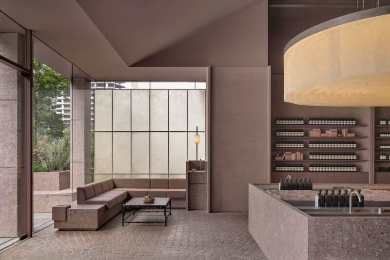
吧台的弧形墙体,自然的融入在空间内。软膜天花也模拟了自然光的天井,彰显自然的光线氛围,吧台没有过多的装饰,与精致的空间与陈设形成对比,愈发的映衬出空间的细腻。
The curved wall of the bar is naturally integrated into the space. The soft film ceiling also simulates the patio of natural light, highlighting the natural light atmosphere, the bar is not too much decorated, and it contrasts with the exquisite space and furnishings, reflecting the exquisiteness of the space more and more.
打破常规的材质平铺,将红砖以阵列排布的方式叠加、堆砌于地面、卡座之上,形成视觉上的聚焦点与冲突感。而绿植与绿色石材的加入,既避免了单一材质满铺的单调与呆板,增加了空间的层次,又可以将环境光暗藏其中,营造温馨的就餐氛围。
Breaking the conventional material tiling, the red bricks are superimposed in an array arrangement and stacked on the ground and the deck to form a visual focus and sense of conflict. The addition of green plants and green stone not only avoids the monotony and dullness of a single material, but also increases the level of the space. It also hides the ambient light and creates a warm dining atmosphere.
看见”韵律与节奏|“Seeing” Rhythm
红砖之外,选取“灰与白”作为顶和地的主色调,辅以白色的挂衣道具及置物层板,打上柔和的暖光,从玻璃窗望进去仿佛一场舞台剧正上演,置身于空间中的客人就是剧中人,每一位都是自己那一帧故事的主角。外围途经的路人,就像观看一出出表演,禁不住幻想自己也是其中之一。
In addition to the red bricks, “grey and white” is selected as the main color of the roof and the ground, supplemented by white clothes hanging props and storage shelves, and soft warm light, looking through the glass windows as if a stage play is being performed. The guests in the space are the people in the play, and each of them is the protagonist of their own story. The passers-by passing by, like watching a performance, can’t help but imagine that they are one of them.


我们对材料的精挑细选也决定了空间的造型和气质,柔软的织物缓解了地砖和金属所带来的冷硬感。所以物体本身存在的价值就是多样性的,可以通过某一种物质中的材质,或是某一种物体构造去模糊空间和另一个界面的关系,空间也就存在了更大的价值变化。空间与品牌产生对话,建立一个态度,向市场发出一个声音,追求一种永恒的美。
Our careful selection of materials also determines the shape and temperament of the space. The soft fabric relieves the cold and hard feeling brought by the floor tiles and metal. Therefore, the value of the object itself is diverse, and the relationship between the space and another interface can be blurred by the material in a certain substance or the structure of a certain object, and the space also has a greater value change. The space has a dialogue with the brand, establishes an attitude, sends a voice to the market, and pursues a kind of eternal beauty.
收银台使用了天然火山岩作为饰面材料,给人在无论视觉还是触觉上,都带来深刻的体验,提供一个使人沉浸和愉悦的外表,使得我们的眼睛和所有的感官被诱醒,去形成一个从进入开始的完整的体验感。
The cash register uses natural volcanic rock as the facing material, which brings a profound experience to people in terms of vision and touch, and provides an immersive and pleasant appearance, so that our eyes and all senses are awakened. Form a complete sense of experience from entering.
∇ 柔和的光线照射在火山岩的纹理上,露出它的颗粒和轮廓
The soft light shines on the texture of the volcanic rock, revealing its grains and contours
一面的我是告别过去的我
一面的我是崭新美好的我
On the one hand, I say goodbye to the me in the past
One side of me is a new and beautiful me
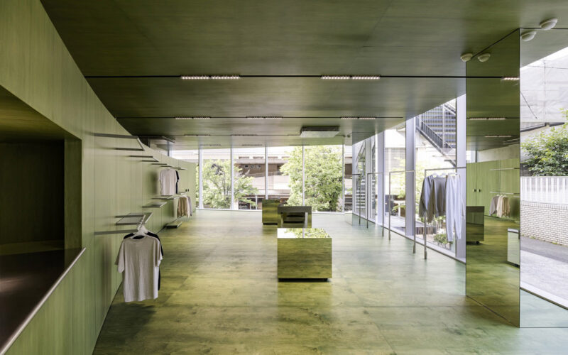
为了减轻空间的压力并实现展示空间的延展,我们引入了两块大的镜子。在设计过程中,我们通过反复的试验来模拟镜面在场地中的反射效果,通过探讨镜面的摆放方式,组织调整在空间中的游览路线,以达到增加空间的层次,增加游览时间的目的。通过镜面之间产生的德罗斯特效应,形成一个个没有边界的无限空间,让参观者的视线能得到最大限度的延伸。
In order to reduce the pressure on the space and realize the extension of the exhibition space, we introduced two large mirrors. In the design process, we simulated the reflection effect of the mirror surface in the site through repeated experiments, and organized and adjusted the tour route in the space by discussing the placement of the mirror surface to achieve the purpose of increasing the level of space and increasing the tour time. Through the Drost effect between the mirrors, an infinite space without boundaries is formed, allowing the visitors’ sight to be extended to the utmost extent.
我们还在空间的尽头设置了一个绿色的体块。在镜面的反射下,这一抹亮眼的绿色反复出现在整个游览路线中。这种“看到却还未走到”的空间体验将成为参观者探索空间的重要线索,引领他们继续向着二层行进。
We also set up a green volume at the end of the space. Under the reflection of the mirror, this bright green appears repeatedly throughout the tour route. This kind of spatial experience of “seeing but not yet coming” will become an important clue for visitors to explore the space, leading them to move on to the second floor.
平行空间的“内外关系”|The inside-out relationship of the parallel space
楼梯形成了一道景观。我们没有重新更换楼梯的位置,而是对旧建筑进行了大量的结构重塑。在进入楼梯的前一段,一侧墙的墙面安装镜面,由立方体块组合而成的风景,与镜子里的虚像形成视觉图像的关联。使原本单一的空间在视觉上变的开阔,镜子的加入也让原本单调的空间多了一些趣味。
The stairs form a landscape. We did not change the position of the stairs, but made a lot of structural remodeling of the old building. Before entering the stairs, a mirror is installed on the wall of one side wall, and the scenery formed by the combination of cube blocks forms a visual image connection with the virtual image in the mirror. The original single space becomes visually open, and the addition of mirrors also makes the original monotonous space more interesting.
楼梯间的窗户给室内带来了丰富的光线。一天当中不停变化的太阳高度角控制了光线的变化,加强了空间内昏暗区域的光照强度。阳光和阴影的轨迹共同塑造了空间给人的感受。
The windows in the stairwell bring abundant light to the interior. The constant change of the sun’s altitude throughout the day controls the change of light and strengthens the light intensity in the dim areas of the space. The trajectory of sunlight and shadow together shape the feeling of the space.
在优雅自由的线条上,素面朝天的地面材质去掉了所有的装饰,把服装挂进去,传达出舒服的、艺术的、自由的空间气息。每个人眼中的自由不同,比如有经典的自由,恒久的自由,但这传达的并不是视觉,而是自由的情绪表达,消费者会被这种气息所吸引,从而感受这个空间的态度。
On the elegant and free lines, the ground material that faces the sky removes all the decorations and hangs the clothes in to convey a comfortable, artistic and free space atmosphere. Everyone sees freedom differently. For example, there is classic freedom and permanent freedom, but what it conveys is not vision, but free emotional expression. Consumers will be attracted by this breath and feel the attitude of this space.
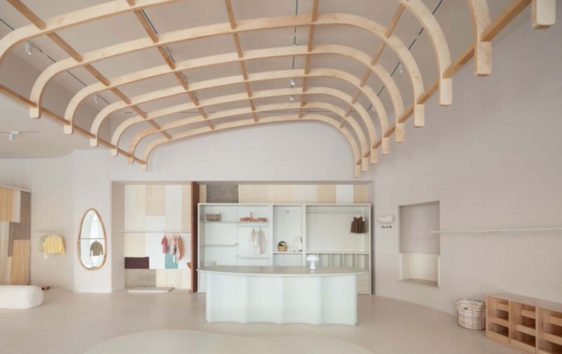
二层作为VIP展示区,设计师希望整个消费体验更具有仪式感,所以空间运用教堂式的建筑形态来契合这个买手店的品牌信仰,延续一层中轴线的构图及对称式设计语言,赋予了空间仪式感和神圣感,让空间能够代替侍者的一些部分,自由又稍稍带些庄严感。
The second floor serves as a VIP display area. The designer hopes that the entire consumer experience will have a sense of ritual. Therefore, the space uses a church-like architectural form to fit the brand beliefs of this buyer’s store, and continues the composition and symmetrical design language of the central axis of the first floor. In addition, the sense of ritual and sacredness of the space allows the space to replace some parts of the waiter, giving freedom and a little sense of solemnity.
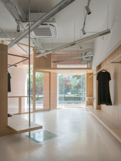
基础空间延续了一楼的风格,浅木色地板与灰色哑光砖,整体的暖色调让空间呈现出了柔和的女性气质;动线设计借鉴了园林营造中的“移步换景”手法,通过隐性的隔断围合出一个个日常生活小场景,增加了顾客探索的乐趣。
The basic space continues the style of the first floor, with light wood floors and gray matte bricks. The overall warm color makes the space present a soft femininity; the moving line design borrows Hidden partitions enclose a small scene of daily life, which increases the fun of customers’ exploration.
室内空间中,大量的留白创造了简约的空间表面,集中场景美学,放大空间故事。整体空间纯净整洁,强化人对空间框架和秩序的知觉。
In the interior space, a large amount of white space creates a simple space surface, which focuses on the aesthetics of the scene and amplifies the space story. The overall space is pure and tidy, which strengthens people’s perception of space frame and order.
在质朴中洞察美感|The use of simple and natural materials

一层层打开,最终看到窗外的风景。这种内部极致的秩序感和看似并列的排布方式却能让视线层层递进,最终聚焦在一窗的景观中。
Open layer by layer, and finally see the scenery outside the window. This extreme sense of internal order and the seemingly juxtaposed arrangement allows the line of sight to progress layer by layer, and finally focus on the one-window landscape.
自由流淌、明暗交错、婆娑起舞,是光,亦是空间的韵律。身处几何墙面的包围,倘若只看到大面积的纯色,也会让人略微紧张,但若眼前出现粼粼光影,灵动婆娑。
Flowing freely, interlacing light and dark, and dancing whirling, it is light and the rhythm of space. Surrounded by a geometric wall, if you only see a large area of pure color, it will make you a little nervous, but if there are sparkling lights and shadows in front of you, it will be agile.
空间运用低饱和度,纯粹的材质在空间中表达出一种静谧感,跳脱于底色的同时又能与空间氛围融汇统一。
The space uses low saturation, and the pure material expresses a sense of tranquility in the space. While jumping off the background color, it can be integrated with the atmosphere of the space.
遵从极简,释放压力——让本该那么存在着的物体变得简单,却由多意、模糊的意念组合而来,营造出由内心触发,与形式相融的独有意境。
Follow the minimalism and release the pressure-to make objects that should exist as simple as possible, but are combined with multiple and vague ideas, creating a unique mood triggered by the heart and blending with the form.
空间设计本身就是一种交流,当设计师利用色彩、结构、光线来营造出一种能与人产生共鸣的意境氛围,让进入其中的人能获得更多层次的体验,才是设计师想要创造这个空间的本质。建筑的简洁性、构造的清晰度和材质的纯粹感成为空间新的美学载体。
Space design itself is a kind of communication. When the designer uses color, structure, and light to create an atmosphere that resonates with people, so that people who enter it can get more levels of experience, that is what the designer wants The essence of creating this space. The simplicity of the building, the clarity of the structure and the purity of the material have become the new aesthetic carrier of the space.
项目信息
项目名称:WEI STUFF
设计公司:末染设计
联系邮箱:moothan@sina.com
完工时间:2021.08
建筑面积:360㎡
项目类型:商业空间
项目地址:太原市
摄影:RICCI空间摄影、双备
材料 :艺术漆,软膜天光,不锈钢
Entry name/WEI STUFF
Design company/moo than.design
E-mail/moothan@sina.com
Time of completion/2021.08
Dimension/360㎡
Category/Commercial space
Location/Taiyuan City
Photography/Ricci spatial photography,Shuangbei
Material: Art Paint, Terrazzo,Stainless steel


