城市里的世外桃源
never slow down
传统现代相互融合
Traditional and modern fusion
从不放慢脚步
Paradise in the city
但坚决不去迎合
But definitely not to cater to
WEI SPACE是一间纯正的西餐店, 项目坐落在太原市闹事区的街边。临街带院落的铺面对主理人来说是可遇不可求的。我们也格外珍惜这一处美景,希望能以最合适设计将项目完美呈现。
WEI SPACE is a pure western restaurant. The project is located on the street in the troubled area of Taiyuan City. The shop facing the street and the courtyard is hard to come by for the manager. We also cherish this beauty and hope to present the project perfectly with the most suitable design.
∇ 项目概况 Project Overview
后疫情时代我们的生活似乎都被按下了快进键,习惯了与时间作斗争,原本忙碌的身影变得更加繁忙,而作为设计师的我们,在思考后疫情时代城市或生活能否更加安静与友善,让大家疲惫的身心得到一丝慰藉与放松。
In the post-epidemic era, our lives seem to be fast-forwarded. We are accustomed to fighting against time. Our busy figures have become even busier. As designers, we are thinking about whether the city or life can be better in the post-epidemic era. Quiet and friendly, so that everyone’s tired body and mind can get a little comfort and relaxation.
入口&吧台 DOOR & BAR
餐厅的入户处给客户的第一印象做好极为重要。设计之初,我们依照着原始的场地因素,以原始的承重结构,在入口与吧台的操作去之间加入了一条连廊,这里不仅作为室内外的缓冲区域,同时也作为整个空间的交通中心,串联起室内的整个动线
It is extremely important to make a good first impression on customers at the entrance of the restaurant. At the beginning of the design, in accordance with the original site factors and the original load-bearing structure, we added a corridor between the entrance and the operation of the bar, which not only serves as a buffer area for indoor and outdoor, but also serves as the traffic center of the entire space. , connecting the entire moving line in the room in series.
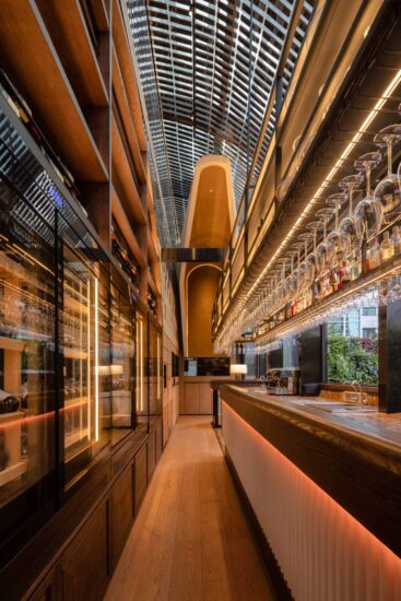
吧台操作区/收银区呈一字型布局,顾客绕过玄关后,第一视野看到专业的饮品制作区及收银区。我们通过优化利用通道空间的尺度,将各种餐饮专业设备的合理布局,尽可能的用好每一寸有限空间,温和的室内色调等恰到好处的给于了顾客专业,健康,亲切的就餐第一感。
The bar operation area/checkout area is in a line-shaped layout. After customers bypass the entrance, they can see the professional beverage making area and the cashier area at first sight. By optimizing the use of the scale of the passage space, we have rationally arranged various professional catering equipment, and made the best use of every inch of limited space. The mild interior colors are just right to give customers a professional, healthy, and friendly first sense of dining.
吧台,作为空间视觉核心,由仿古铜板搭配暖系灯光组成。因其涉及点单收银、咖啡制作、面包陈列等核心功能,故在柜体规划与立面点线设计中遵循祛繁就简、突出核心的思路,规整有序,层层递进。
The bar, as the visual core of the space, is composed of antique copper plates and warm lighting. Because it involves core functions such as ordering and cashiering, coffee making, bread display, etc., the cabinet planning and façade point and line design follow the ideas of eliminating complexity and simplicity, highlighting the core, orderly and progressive.
艺术漆尽可能的还原自然的质感,不做多余的装饰。集中精力将吧台丰富起来,通过琳琅满目的酒水和灯光设置,以及黄古铜色的金属质感,形成一个较好的视觉中心点。空间中始终以人为本,人在中央吧台处操作就成了磁场中心点。人们在吧台以外的落座,可以得到较为私密和舒适的体验感。
Art paint restores the natural texture as much as possible without any extra decoration. Concentrate on enriching the bar, and form a better visual center point through a dazzling array of drinks and lighting settings, as well as the bronze-colored metal texture. The space is always people-oriented, and people operating at the central bar become the center of the magnetic field. When people sit outside the bar, they can get a more private and comfortable experience.
就餐区 Ⅰ DINING & LANE
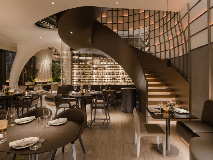
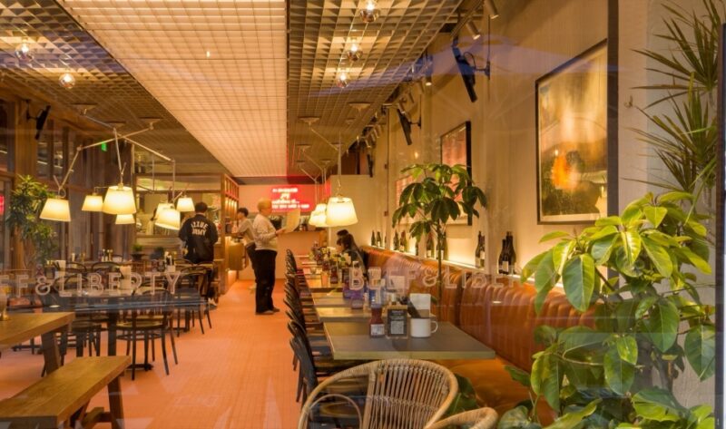
一层空间绝不能推掉的隔墙,空间分散带来的局限性,给设计带来了诸多挑战。我们需要更谨慎、合理、讨巧的梳理动线关系,以保证客人进入到室内后的能自在的通达各功能空间,同时设法带给空间趣味性、丰满的就餐情景感,进一步充盈室内的自然光线,并使用了更为舒适的自然通风。
The partition wall that must not be removed in the first floor space, and the limitations brought by spatial dispersion brought many challenges to the design. We need to sort out the relationship between the moving lines more cautiously, reasonably and ingeniously to ensure that the guests can freely access various functional spaces after entering the room, and at the same time try to bring the space interesting and full of the dining scene, and further fill the interior with natural light. , and uses natural ventilation for more comfort.
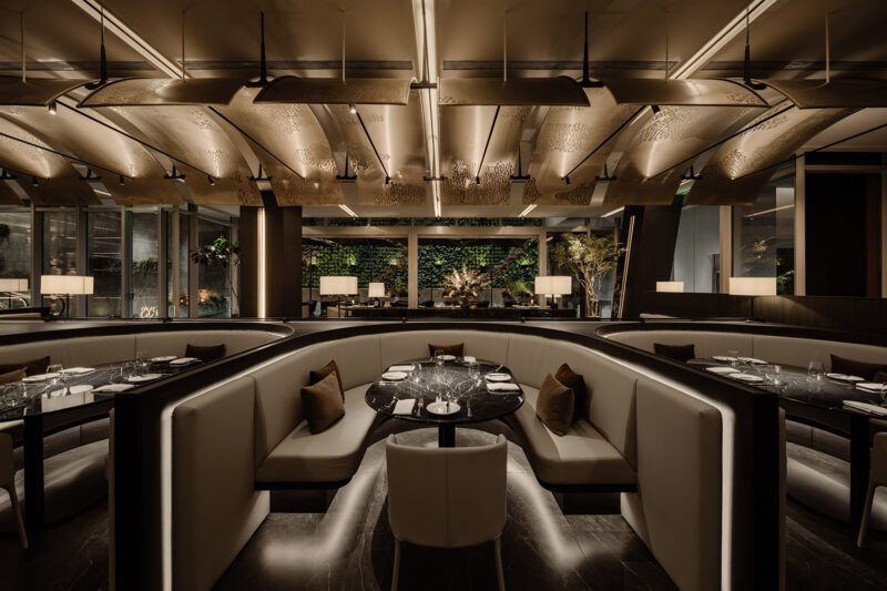
以解构手法,为餐饮空间探索出一种全新的美学空间概念。但是,与艺术运动中典型的元素“交织”的概念不同,在本项目的设计中,从以木材和水泥基墙面漆为主的色彩特征,到秩序排列、对称形式的空间塑造,再到天花板装饰造型,以及绿植在空间中的运用,这一切所有的元素都是从空间结构本身中解构而来,彰显出该餐厅独一无二的品牌个性。
With deconstruction, a new aesthetic space concept is explored for the dining space. However, unlike the typical concept of “interweaving” of elements in the art movement, in the design of this project, from the color features dominated by wood and cement-based wall paint, to the orderly arrangement, the shaping of space in symmetrical forms, to the The decorative shape of the ceiling and the use of green plants in the space, all these elements are deconstructed from the space structure itself, showing the unique brand personality of the restaurant.
天然的木板,富有肌理的墙面,特别设计的天花造型与材质,源于自然,也充满了秩序。连接室内外的窗口,创造了一个明亮而通透的空间,让人瞬间感到清爽,也削弱了两者的边界。
Natural wood boards, textured walls, and specially designed ceiling shapes and materials originate from nature and are full of order. The windows connecting the interior and exterior create a bright and airy space that instantly refreshes and weakens the boundary between the two.
肌理漆与所有室内材质的结合,同时满足了灯光与音乐效果。肌理漆较低的灯光反射与室内材质对环境光渲染的对比,丰富的面层凹凸质感能赋予场所声音较好的收音效果。不仅有声有色,更声色和谐,双重感官愉悦地互相加持,将空间情绪诠释得更为淋漓尽致。
The combination of texture paint and all interior materials satisfies the lighting and music effects at the same time. The contrast between the low light reflection of the texture paint and the indoor material’s rendering of the ambient light, the rich texture of the surface layer can give the venue a better sound reception effect. Not only sound and color, but also sound and color harmony, the dual senses happily support each other, interpreting the space emotions more vividly.
就餐区 Ⅱ DINING & PARTY
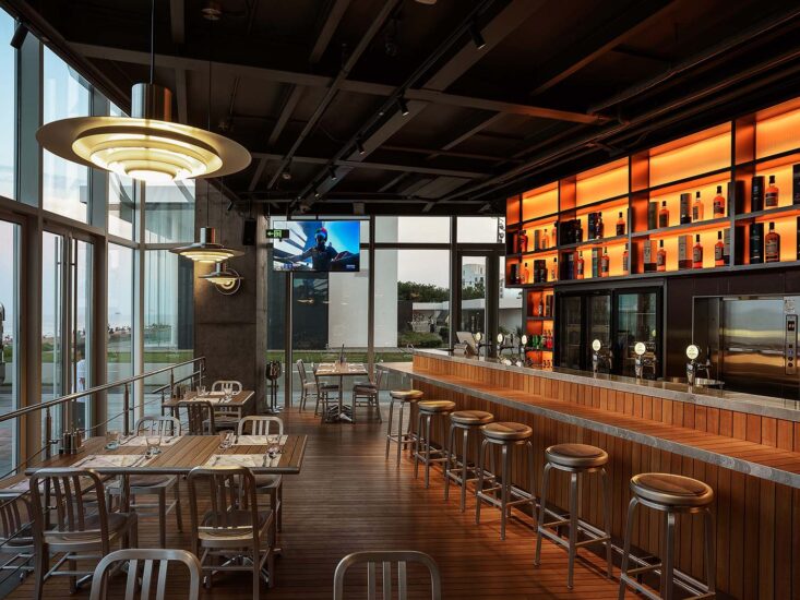
不论设计坐标如何,但毋庸置疑仍是具有商业性质的经营场所。然而我们却并未配置软座与卡座,只留以少量客座。从而减弱纷杂,维持视觉感、冲击感与空间感。酒的馥郁芬芳、醇厚热情,而纯粹则与毫无杂质的心灵相比拟。浓淡恰好至微醺的氛围,抛却扰人尘嚣,或自我沉醉清欢半晌,或友人几许畅语乐话。隐匿于此,偷得浮生半日闲。
Regardless of the design coordinates, there is no doubt that bars are still commercial premises. However, we did not configure soft seats and card seats, leaving only a small number of guest seats. Thereby reducing the clutter and maintaining the sense of vision, impact and space. The wine is rich and fragrant, full-bodied and enthusiastic, while the purity is compared with the pure heart. The atmosphere is just right to the slightest drunkenness, leaving the distracting noise, or indulging in self-indulgence for a long time, or friends chatting happily. Hiding here, stealing a half-day leisure.
空间给人自在,轻松的就餐感受。难得从繁琐的生活中抽离,她希望能建立起一片自由的天地,让人感觉到的是放松,来到这里,寻找能属于自己的一方小天地。可以是一个人寂静狂欢,也可以是三五好友的愉快派对。
The space gives a comfortable and relaxed dining experience. It is rare to get away from the tedious life. She hopes to establish a free world, which makes people feel relaxed. Come here and find a small world that can belong to her. It can be a quiet carnival alone, or a happy party with three or five friends.
就餐区 Ⅲ DINING & WORK
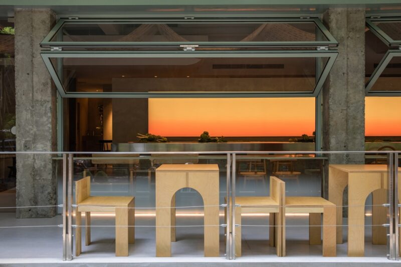
∇ “WINDOW”临街半开放式餐区
将临街面的窗洞加大,主动增加受光面积,使得临街室内就餐区域能更大范围引入充足的自然光线的同时,也增加与街道的交互感。
The window openings on the street-facing side are enlarged to actively increase the light-receiving area, so that the indoor dining area facing the street can introduce sufficient natural light in a wider range, and at the same time increase the sense of interaction with the street.
WEI SPACE是一间真正意义上的“街边咖啡”,坐落茂盛楼宇之间,紧邻街道。大面的格子窗,可折叠开启,将室内与街区完全交互有态度且融于街区环境。阳光透过玻璃格子窗、玻璃屋檐,自然光线被更好的引入到室内空间,有效的弥补原始老房层高矮的缺陷以及阴暗带来的压抑感。光线在室内交互穿插着,窗内有景,室内有光。
WEI SPACE is a true “street coffee”, nestled between lush buildings and close to the street. The large lattice windows, which can be folded and opened, fully interact between the interior and the block, and integrate into the block environment. The sunlight penetrates through the glass lattice windows and glass eaves, and the natural light is better introduced into the interior space, effectively making up for the defects of the original old buildings and the depression brought by the darkness. The light is interspersed in the interior, there is a scene in the window, and there is light in the interior.
我们与项目主理人考虑将此区域提供给平时需要独立办公、微商务、学习的第三空间。一杯浓缩、一份文件或是一本读物与暖暖的阳光,外出工作也能是一件很享受的事情。
We and the project manager are considering providing this area as a third space that usually requires independent office, micro-business and learning. A cup of concentrate, a document or a reading and the warm sunshine, going out to work can also be a very enjoyable thing.
AFTER
此区域的南侧,我们将空间打开,使其与二层的艺术空间的产生连接,拆除楼板后,室内的视野也变得开阔起来,独到的设计理念和精妙的设计手法,糅合极致纯粹,让WEI SPACE与自己的期待相逢,消解冗积在灵魂中的毒素,停止下沉与窒息,让心事有处可诉,让灵魂轻盈呼吸。
On the south side of this area, we open the space to connect it with the art space on the second floor. After the floor slab is removed, the indoor view is also broadened. The unique design concept and exquisite design method combine the ultimate purity, Let WEI SPACE meet your expectations, eliminate the toxins accumulated in the soul, stop sinking and suffocation, let the heart have a place to complain, and let the soul breathe lightly.
∇ 二层俯瞰一层就餐区 The second floor overlooks the dining area on the first floor
放空之余,倏而一瞥
锈镜映照,亲切如故
相互呼应,亦作昭示
灵动变化,柔软蔓延
艺术空间 ART ROOM
视、听、味三觉艺术在这里相互交融,彼此生辉,形成了一个让人可以瞬间沉浸其中,忘却时光的“wei space”。它建立起生命的美好姿态,是心灵的空间,是繁忙后的静心之所,洗礼灵魂,润泽生命。恰如冈仓天心所言:“生活中的小事亦蕴含有伟大之处。”
The art of sight, hearing and taste blends with each other and shines with each other, forming a “wei space” where people can immerse themselves in it instantly and forget the time. It establishes a beautiful posture of life, a space for the mind, a place for meditation after a busy schedule, baptizing the soul and moisturizing life. As Okakura Tenshin said: “The little things in life also contain greatness.”
音乐是人类智慧凝结和情感表达的结晶,也是“WEI SPACE”的灵魂之一。喜欢黑胶爆豆声中自然本真的温暖音质,也喜欢CD清晰透亮、对于音阶的完美呈现感。每时每刻都会期待音乐响起,它的激情和舒缓,寂寥和澎湃,历经沧桑后的淡定从容;沉着厚重后的云淡风轻。如此反复,起起落落,留恋忘返。
Music is the crystallization of human wisdom and emotional expression, and it is also one of the souls of “WEI SPAACE”. I like the warm sound of the natural nature of vinyl popping beans, and I also like the clear and transparent CDs, and the perfect presentation of the sound scale. Every moment I look forward to the music, its passion and soothing, silent and surging, calm and relaxed after the vicissitudes; calm and heavy after the clouds and breeze. So repeatedly, the ups and downs, stay and forget.
中古家具像饱经风霜的硬汉,环境的材质又如此柔软,两者互相平衡使空间氛围沉着优雅。为了突出空间特点,选用了水磨石来提升气质,当你步入于此仿佛进入了一个冥想之庭,远方尽头的一丝光芒,让你心之向往。
The middle-aged furniture is like a weather-beaten tough guy, and the material of the environment is so soft. The balance between the two makes the space atmosphere calm and elegant. In order to highlight the characteristics of the space, terrazzo is selected to enhance the temperament. When you step into this place, you seem to have entered a meditation court, and a ray of light at the end of the distance makes you yearn for it.
展陈空间 Exhibition space
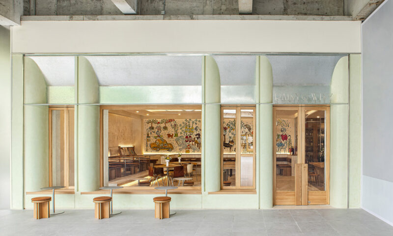
外立面的水洗石延伸进入室内,减弱了空间之间的边界,也将拉近了室内外的距离。空间,更像是一种容器的概念,与艺术本身达成共生关系,设计与艺术的模糊,不去定义何种风格,放下所谓设计感,空间与游走在其中的演变过程。一同存在于这宁静之地。
The washed stone on the façade extends into the interior, which weakens the boundary between spaces and also shortens the distance between interior and exterior. Space, more like a concept of a container, achieves a symbiotic relationship with art itself. Design and art are blurred, not defining what style, let go of the so-called sense of design, and the evolution process of space and wandering in it. together in this peaceful place.
城市空间构成元素的丰富多彩,大量的颜色,图案。热烈的社会空间,可能会有时喧闹。观察艺术空间的行业特征,白色不为任何一种颜色体系,可能是一种反叛,一种宁静。时间静止,呼吸暂缓,脚步停下。
The colorful elements of urban space, a large number of colors and patterns, and a lively social space may sometimes be noisy. Observing the industry characteristics of the art space, white is not any kind of color system, it may be a kind of rebellion, a kind of tranquility. Time is still, breathing is slow, and footsteps stop.
调和&细节 Harmony & Details
城市之间 BETWEEN
春日里,阳光下,一杯浓郁的美式,一本喜欢的杂志,一份愉快的心情,一种只能在WEI SPACE享受到的生活方式,静静地沐浴在风中,与自然,与自己对话,享受这一刻自然的小憩。
In the spring, under the sun, a cup of rich American style, a favorite magazine, a happy mood, a way of life that can only be enjoyed in WEI SPACE, quietly bathing in the wind, talking with nature, and yourself , enjoy this moment of natural rest.
当和煦的阳光透过茂密的钢铁丛林,洒在记住的水洗石的墙面上,WEI SPACE*CASA又以其独有的个性和气质在这片静谧中彰显无遗。我们将建筑打造成老洋房,我们要把空间打造成一个文化地标,是所有人共同的生活方式,也是城市文化生态的亮丽风景。WEI SPACE*CASA是一封给城市的情书,其灵感源自历史悠久的“坊”,即老上海街坊和里弄。WEI SPACE*CASA将作为街区的基石,重新诠释里弄生活的开放和融合。
When the warm sun shines through the dense steel jungle and sprinkles on the wall of the washed stone that you remember, WEI SPACE*CASA shows its unique personality and temperament in this silence. We will make the building into an old house, and we will make the space a cultural landmark, a common way of life for all, and a beautiful landscape of the city’s cultural ecology. WEI SPACE*CASA is a love letter to the city, inspired by the historic “fang”, the old Shanghai neighborhoods and lanes. WEI SPACE*CASA will serve as the cornerstone of the block, reinterpreting the openness and integration of Lilong life.
我们的设计企图这里,足够自然,简单,生活化。选用了一颗大小合适的柿子树,作为整个迷你院落的视觉垂足,每到结果的时候,好事也随着生活、随着空间。自然的院落环境,郊游露营般的户外家具,也给这快节奏城市里的餐厅带来一丝假日感。
Our design is intended to be natural, simple, and life-like. A persimmon tree with a suitable size was selected as the visual foothold of the entire mini courtyard. Every time the result comes, good things also follow life and space. The natural courtyard environment and outing camping-like outdoor furniture also bring a sense of holiday to the restaurant in this fast-paced city.
∇ 一层餐厅平面布置图Floor plan of the restaurant on the first floor
∇ 二层艺术空间平面布置图 Floor plan of the second floor art space
能做出一间纯正且贴近太原生活方式的西餐餐厅,从开业就让客人把它视作邻居般的亲近,变作日后休闲&工作生活中不可缺少的聚点,这便是我们作为设计方能有幸参与这个项目的最佳成果。
To be able to create a pure western restaurant that is close to Taiyuan’s way of life. From its opening, customers can regard it as a neighbor-like closeness, and become an indispensable gathering point in leisure & work life in the future. This is what we design as a design. Only have the honor to participate in the best results of this project.
“我们不做网红店,只做实实在在的品质输出,至于流量带来的红利,网红效应,那都是自然而然的事。”这也是 WEI SPACE主理人WeiXiu跟我们说过的经营理念。我们感谢足够信任并交付我们项目整体设计任务的甲方,使得项目最终能完美落地呈现。
“We don’t do online celebrity stores, we only do real quality output. As for the dividends brought by traffic and the influence of Internet celebrities, it is natural.” This is what WeiXiu, the manager of WEI SPACE, told us. idea. We are grateful to the Party A who trusted and delivered the overall design task of our project, so that the project can be perfectly presented in the end.
项目信息
主案设计师/孟飛
Lead Designer/Meng Fei
参与设计师/张林林、程备备
Participating designers/Zhang Linlin and Cheng Beibei
项目位置/山西·太原
Location/Taiyuan, Shanxi Province
项目面积/700m²
Project area /700m²
项目类型/商业空间
Project Type/Commercial Space
摄影/刘育麟、双备
Photography/Liu Yulin ,Shuangbei


