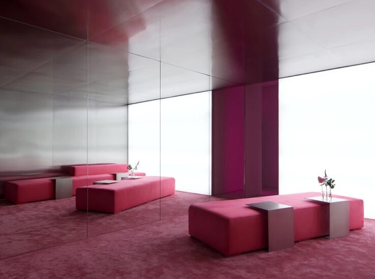
请查收,来自美术馆的一束光
“我们生于光。我们通过光感受四季。”——路易斯·康
∇ 室外光与室内空间,outdoor light and indoor space
路易斯·康是建筑设计中光影运用的开拓者,他认为空间应该是一个能让人在精神感受纯粹的地方。在这里,让一些空间可以是“无限的”,但也有一些空间就应该完全地“有限”。不同光引发空间的不同节奏感,室内空间随着光环境的变化而产生丰富的表情。
Louis Kang is a pioneer in the use of light and shadow in architectural design. He believes that space should be a place where people can feel pure in spirit. Here, some spaces can be “infinite”, but some spaces should be completely “limited”. Different lights lead to different rhythms of the space, and the indoor space produces rich expressions with the change of the light environment.
∇ 从吧台望向盒子,look at the box from the bar © 吴鉴泉
让光变得自由又可控制,便成为设计RAyinGallery摄影空间的思考核心。
Making light free and controllable has become the thinking core of designing rayingallery photography space.
∇ 植物与结构,plant and structure © 吴鉴泉
空间与光是不可分离的,因为所有对建筑的空间体验都要有光。即使在完全的黑暗中,仅凭听、摸或闻所掌握的具体的空间体验,其实也参照了通过视觉和光线建立的对空间的理解。
Space and light are inseparable, because all the spatial experience of architecture should have light. Even in complete darkness, the specific spatial experience mastered only by listening, touching or smelling actually refers to the understanding of space established through vision and light.
∇ 入口空间,entrance space © 吴鉴泉
商业思维 BUSINESSMIND
本案项目位于太原市万柏林区,紧邻万柏林生态园。项目希望围绕品牌“留住此刻”,打造一家以故事性来记录当下生活的摄影空间。“光”是摄影和空间两个不同艺术领域中相通的元素,摄影就是光的艺术,而对于空间体验也同样重要。
The project is located in Wanbailin District, Taiyuan, close to Wanbailin ecological park. The project hopes to build a photography space with a story to record the current life around the brand “keep the moment”. “Light” is a common element in the two different art fields of photography and space. Photography is the art of light, and it is also important for space experience.
∇ 建筑立面,building facade © 吴鉴泉
∇ 轴测图,axonometric © HOOOLDESIGN
光是组成摄影的重要部分,有光才有影。摄影就是用光来作画,如何利用光与影的关系来构成影像和影调,是摄影创作中的一大关键。
Light is an important part of photography. Only with light can there be shadow. Photography is to draw with light. How to use the relationship between light and shadow to form images and tones is a key in photography creation.
∇ 改造过程,renovation process © HOOOLDESIGN
∇太阳从日出到日落,一分一秒都在改变位置,因此,照射在被摄体上的光也会随着太阳位置的推移而不断改变角度。随着角度的改变,被摄体表面的质感描写,阴影的均衡都会直接影响整体的表现效果。
The sun changes its position every minute from sunrise to sunset. Therefore, the light shining on the subject will constantly change its angle with the passage of the sun’s position. With the change of angle, the texture description of the subject surface and the balance of shadow will directly affect the overall performance effect.
∇ 通透的一层大厅,a transparent first floor hall © 吴鉴泉
∇ 贯穿一层的连廊,corridor running through the first floor © 吴鉴泉
∇ 一层大厅回廊,lobby corridor on the first floor © 吴鉴泉
原建筑为一个层高8米的钢结构建筑体,设计从光的三原色——“蓝、红、绿”的概念出发,由这三种不能再分解的基本色彩可以组合成无数其他色彩,以这三种颜色作为不同区域空间的主题色,预示着空间未来更多的变化。
The original building is a steel structure building with a height of 8 meters. The design starts from the concept of the three primary colors of light – “blue, red and green”. These three basic colors that can no longer be decomposed can be combined into countless other colors. These three colors are used as the theme colors of different regional spaces, indicating more changes in the space in the future.
∇ 另一侧大厅视角,view of the hall on the other side © 吴鉴泉
∇ 视觉互动,visual interaction ©吴鉴泉
∇ 回廊细节,ambulatory details ©吴鉴泉
真正的空间体验都具有身体性和多重感知性。每个引人注目的空间和场所势必都有它独具特色的光,而光通常也是最能直接调节情绪的空间特性。
The real spatial experience is physical and multi perceptual. Every eye-catching space and place is bound to have its unique light, and light is usually the spatial characteristic that can directly regulate emotion.
∇ 回廊内部窗口,cloister interior window ©吴鉴泉
设计方案从“来自美术馆的一束光”为主题,在空间上让光为建筑的体量、空间和表面赋予性格和表现力,显示出材料的形状、重量、硬度、肌理、温度、光滑度、温度等方面,在拍摄的同时以光为主题的空间也能帮助灵感不断迸发。
The design scheme takes “a beam of light from the art museum” as the theme, and allows light to give character and expressiveness to the volume, space and surface of the building in space, showing the shape, weight, hardness, texture, temperature, smoothness, temperature and other aspects of the material. While shooting, the space with light as the theme can also help the continuous burst of inspiration.
∇ 公共区域内部,Inside the public area ©吴鉴泉
光控制着生物体的生命进程,甚至人类的某些激素活动也依赖于光。光影响着我们的情绪、活跃性和体能水平。
Light controls the life process of organisms, and even some human hormone activities depend on light. Light affects our mood, activity and physical level.
虽然光通常被理解为一种纯视觉现象,但它其实还与触觉感知联系在一起。在设计中,创造出一种捕捉并留住光线的空间,以便所有人可以用身体来感受,这是一种对“眼睛会触摸”和“眼睛会感受”的理解和实现。当你睁开眼睛并允许这种感觉发生时,触觉就从眼睛里跑出来,就用手去摸一样。
Although light is usually understood as a pure visual phenomenon, it is also associated with tactile perception. In the design, create a space to capture and retain light so that everyone can feel it with their body, which is an understanding and Realization of “eyes can touch” and “eyes can feel”. When you open your eyes and allow this feeling to happen, touch comes out of your eyes, just touch it with your hand.
∇ 室内“盒子”,Indoor “box” ©吴鉴泉
建筑语言 ARCHITECTURALLANGUAGE
设计构思以展示作为所有空间的内核,从“光之画廊”搭建整个空间形态,通过建筑语言引入室内,形成高辨识度的视觉效果和空间记忆。设计上打破常规适用区域“一室一用”,使其满足“一室多用”,赋予空间多重属性,更大限度的促进空间与人的互动性,形成品牌在空间上的记忆。
The design concept takes exhibition as the core of all spaces, builds the whole space form from the “Gallery of light”, and introduces it into the interior through architectural language to form a highly recognizable visual effect and spatial memory. In terms of design, break the conventional applicable area of “one room and one use”, make it meet the requirements of “one room and multiple uses”, endow the space with multiple attributes, promote the interaction between space and people to a greater extent, and form the memory of the brand in space.
∇ 从廊道看向圆形公共区,from the corridor to the circular public area ©吴鉴泉
让空间沐浴在一片方向不定的光线中,使光源变得捉摸不透。
Let the space bathe in a piece of light with uncertain direction, so that the light source becomes elusive.
∇ 圆形公共区,circular public area © HOOOLDESIGN
∇ 廊道踏步,corridor step © HOOOLDESIGN
通过前厅吧台对面圆形公共区,可以看到悬挑的空间盒子,彼此独立但又充满一定的私密感。顺着台阶往里走,立刻置身于一个层次更加复杂的空间之中,红色配合灯光将空间点亮。每个空间都设有开口,保证其功能的同时又保留体验的趣味。
Through the circular public area opposite the front bar, you can see the cantilevered space boxes, which are independent of each other but full of a certain sense of privacy. Walking down the steps, you will immediately be in a more complex space, and the red light will light up the space. Each space is equipped with openings to ensure its function while retaining the interest of experience.
∇ 选片区,select photo area © HOOOLDESIGN
在一层的公共空间中,光妥帖的透过结构的开口洒在区域内,通过设计的手法将建筑体块进行融合与穿插,让人的活动在此更加多样,设计将室外交往活动中最基础的人际交往方式(散步、停留、小坐、观赏、倾听、交谈)在室内进行规划,保障最基础的活动才能自然而然变化为更大型、更复杂的活动。
In the public space on the first floor, the light is properly sprinkled in the area through the opening of the structure. The building blocks are integrated and interspersed through the design method to make people’s activities more diverse. The design plans the most basic interpersonal communication methods (walking, staying, sitting, viewing, listening and talking) in outdoor communication activities indoors, Only by ensuring that the most basic activities can naturally change into larger and more complex activities.
∇ 多功能区,multi function area © HOOOLDESIGN
∇ 多功能区,multi function area © HOOOLDESIGN
设计中,不对光线进行均匀分布,增强场所感和私密感,营造出一种抚慰人心的拍摄体验。光透过玻璃照在墙壁上,仿佛放慢了速度,使太阳光和照明设施在弧形墙的表面和边缘之间顽皮地跳跃反射。在墙壁中设计的狭缝,是为了把光挤压成具有方向性的薄片,使它变成触不到的一层刀刃,从而切断空间中的黑暗。
In the design, the light is not evenly distributed to enhance the sense of place and privacy, creating a soothing shooting experience. The light shining on the wall through the glass seems to slow down, making the sunlight and lighting facilities jump and reflect playfully between the surface and edge of the arc wall. The slit designed in the wall is to squeeze the light into a directional sheet and turn it into an untouchable blade, so as to cut off the darkness in the space.
∇ 傍晚时分的二层廊道,the second floor corridor in the evening © HOOOLDESIGN
在空间中放置的“球”,运用弧形的白色表面来发射光线,这些圆形转角的表面所创造出的明暗对比为光赋予了一种体验上的物质性和造型感,也增强了光的在场感。这是经过铸造的光,通过“球”让光具有了物质的体征。
The “ball” placed in the space uses the arc-shaped white surface to emit light. The light and dark contrast created by the surface of these circular corners gives the light an experiential sense of materiality and modeling, and also enhances the sense of presence of the light. This is the cast light, which has the physical sign through the “ball”.
∇ 光影不明显的二层廊道,the corridor on the second floor with no obvious light and shadow © HOOOLDESIGN
空间体验 SPATIALEXPERIENCE
光只有被包含在空间中,或通过它所照亮的表面而得以具化时,它才能使人在体验中的情感上感受到它的存在。在二楼的走道里,从外立面透进的自然光让人感觉像是一件上天赐予过道的美好礼物,在黯淡背景的衬托下,幻化成了一幅氛围感十足的油画。
Only when light is contained in space or embodied through the surface it illuminates can it make people feel its existence in the emotion of experience. In the corridor on the second floor, the natural light penetrated from the facade makes people feel like a beautiful gift given by God to the aisle. Against the dark background, it turns into an oil painting with full atmosphere.
∇ 一、二层视觉互动,visual interaction © HOOOLDESIGN
设计时也在建筑内部引入光线,利用窗洞的剖面性质,在解决视觉舒适度的同时创造出一种神圣的照明体验。墙体的厚实感、窗洞的深度感,以及窗洞的剖面形式结合在一起,共同创造出一幅丰富多变的光影图画。
In the design, light is also introduced into the interior of the building, and the sectional nature of the window opening is used to create a sacred lighting experience while solving the visual comfort. The thickness of the wall, the depth of the window opening and the section form of the window opening are combined to create a rich and changeable light and shadow picture.
∇ 二层廊道休息区,corridor rest area on the second floor © HOOOLDESIGN
∇ 二层化妆区,makeup area on the second floor © HOOOLDESIGN
二层作为主要的拍摄区域,通过一大一小两个体块作为主要拍摄区域来进行使用。在这个纵向的空间里,设计将空间挑高,让拍摄也可以更加“自由”。半私密性的空间结构,让拍摄活动也可以进行展示,让等候区的客人也可以提前了解拍摄流程。
The second floor is the main shooting area, which is used by one large and one small block as the main shooting area. In this vertical space, the design will raise the space, so that shooting can be more “free”. The semi private space structure allows the shooting activities to be displayed, and the guests in the waiting area can also understand the shooting process in advance.
在此案例中,光线通过浅灰色水泥顶面得以强调,在二层公共天井区域中,体块间的融合、穿插、分离与叠加,让空间灵活且赋予变化。在与阴影和黑暗发生关系的过程中,光的价值和情感力量都获得了提升。
In this case, the light is emphasized through the light gray cement top surface. In the public patio area on the second floor, the integration, interleaving, separation and superposition between blocks make the space flexible and changeable. In the process of relationship with shadow and darkness, the value and emotional power of light have been improved.
∇ 二层洗手间,bathroom on the second floor © HOOOLDESIGN
为了保证空间的连续,在设计上避免掉漫长而笔直的步行线路,蜿蜒和富于变化的小路为空间增添趣味,丰富的过渡空间使不同形式和氛围的空间加以融合,为情境之间创造无形的秩序。设计利用中国传统匠师的手法去营造空间氛围,让人产生“游”的欲望,身处其中也能领略到空间的丰富。
In order to ensure the continuity of space, long and straight walking lines are avoided in the design. Winding and changing paths add interest to the space, and rich transition spaces integrate the spaces of different forms and atmospheres to create an invisible order between situations. The design uses the techniques of traditional Chinese craftsmen to create a space atmosphere, which makes people have the desire to “swim”, and they can enjoy the richness of space when they are in it.
∇ 一、二层视觉互动,visual interaction © HOOOLDESIGN
∇ 拍摄区,photo area © HOOOLDESIGN
通过动线的规划,将人际交往的接触强度随着空间体验逐步递增。不仅通过空间区域设计使探店、咨询、拍摄等不同人群的活动保持了私密性,也将空间边界柔性处理,去掉了传统意义上的门,也以建筑体块的视觉差做了半私密的处理,让空间得已“流动”。设计希望以一种轻松自在的方式让相互交流有更多的机会。
Through the planning of moving line, the contact intensity of interpersonal communication will gradually increase with the spatial experience. Not only through the space area design, the activities of different groups such as shop exploration, consultation and shooting are kept private, but also the space boundary is handled flexibly, the door in the traditional sense is removed, and the semi private treatment is made with the poor vision of the building block, so that the space has been “flowing”. Design hopes to provide more opportunities for mutual communication in a relaxed way.
分析图 ANALYSISDIAGRAM
∇ 一层平面图,first floor plan © HOOOLDESIGN
∇ 二层平面图,second floor plan © HOOOLDESIGN
∇ 三层平面图,third floor plan © HOOOLDESIGN
光为空间注入生命力并将物质世界融入影像之中
Light injects vitality into space and integrates the material world into images
项目信息
项目名称:RAyinGallery
项目区位:山西太原
设计公司:HOOOLDESIGN事务所
主创设计师:韩磊
设计师团队:荆超、黄德斌、郑天阳、李静怡、智鹏飞
照明团队:LST商业照明设计
艺术壁材:JCC精创色彩设计中心
产品设计:艾诺一宅·系统家具
项目面积:1400平方米
设计起止日期:2021.1
完工时间:2021.5
主要材料:水磨石、JCC肌理漆
业主名称:任雅楠
项目摄影:吴鉴泉
Project Name: RAyinGallery
Project address: Taiyuan,Shanxi
Design company: HOOOLDESIGN STUDIO
Main designer: Han Lei
Assistant designers: JiLL 、Huang Debing 、Toren Tseng、Li Jingyi、Zhi Pengfei
Lighting Team:LST Lighting Design
Art Wall Material:JC COLOR DESIGN CENTRE
Product Design:AINO HOME
Project area: 1400m2
Design start and end date: 2021.1
Completion time: 2021.5
Main materials: terrazzo、 JCC texture paint
Name of owner: Ren Yanan
Project photographer: Wu Jianquan


