以情感张力触发生活感知
如果有一个品牌能够象征意大利家具的发展史,那必然是专注于高端衣柜和系统家具的Molteni&C——创始于1934年,独到前沿的设计理念与完整的生产链,以及长达八十余年臻于内在品质的坚定追求,让其成为家具生产和设计领域的顶级品牌,不仅在行业内备受推崇,更是各界名流青睐的上乘之选。
Founded in 1934, Molteni&C is a time-honored brand that represents the history of design furniture in Italy, dedicated to creating superior closets and system furniture products. Based on innovative design ideas, a complete production chain and a persistent pursuit of quality for more than eight decades, Molteni&C has been a leading popular design furniture brand across the globe.
正反设计提炼其品牌基因,解构品牌特质,将商业理念溶解于空间之中,营造注重情绪价值输出的居所氛围。“我们一直在想这所SHOWROOM没有怎么在张力上的用力,这是情感上的努力。这个空间,都是关于情感的。我们希望是一个居所的情感寄托,就像感知里面每一件产品用于生活的感触,才匹配这么多设计大师的作品。”
As conceiving the showroom for Molteni&C in Ningbo, design studio OUTIN. DESIGN dug into the brand’s genes and character, incorporated business ideas into the space, and created a “home” setting with a focus on emotional experience.
“For this showroom, we emphasized emotional experience rather than visual tension. The entire space is about emotions. By bringing in multiple furniture pieces designed by master designers, we created immersive, emotion-evoking home scenes to let customers better perceive the displayed furniture’s application in daily life.” the design team explained.
1、空间内外的构建法则
Holistic interior and exterior design
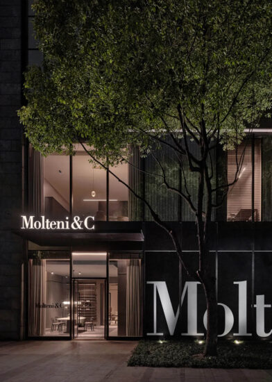
在保留原始建筑物的原有结构上,正反设计为Molteni&C(宁波店)打造干净简洁、更趋于本质化的外立面。展区一层与未进行改造的路面呈现出落差感,不仅是塑造外立面的设计基础,也是展厅融入城市的过渡点。
While retaining the original structures of the building, OUTIN. DESIGN created a clean, simple and pure facade for Molteni&C | Dada Showroom in Ningbo. The exterior of the exhibition area on 1F presents a strong contrast with the unrenovated road outside, and acts as an interface that blends the showroom into the city.
∇ 户外楼梯结构图
室内空间也并非是独立于外界的存在,而将其视为城市建筑的延续,在品牌空间中窥见城市的吉光片羽。不受“新与旧”的区分定义,不追求特定的意义归属,只是将故事与理念诉诸于空间,又以空间形式进行宣发和深化,让观者对产品有所感触,让“居所”成为情感寄托的有形载体。
The interior space is not isolated from the outside, but is regarded as the continuation of the urban architecture. Rather than clearly distinguishing the old and new, or pursuing specific meaning of the space, the designers focused on telling stories, conveying brand values and strengthening customers’ perception of products by creating a series of “home” scenes that stimulate emotional resonance.
∇ 窗口分析 Window opening diagram
室内与室外空间的双重塑造让设计理念阐释得更为完整生动,从内到外贯彻着简静宁和的品牌形象,情绪空间的故事便在体块的介入中娓娓道来。
The interior and the exterior are unified to vividly interpret the design concept, and to communicate a simple, calm brand image from the inside out. After inserting blocks into the space, a storytelling, emotional space is created.
2、以柜筑形Space shaped by cabinets
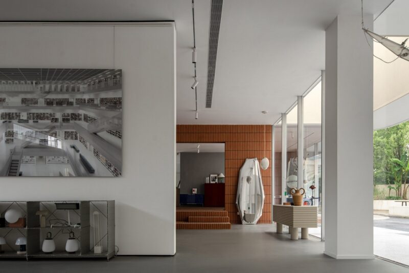
比起空间形式上的张力,正反更倾向于温和的建构法则,这也是基于Molteni&C本身内敛气质的考量。削减商业气息却不脱离商业属性,透明玻璃打造通透性视点,室内架构清晰而呈。采用柜体与家具相结合的方法,创造出相对“完整”的居所环境。
Instead of trying to create a spatial form full of tension, the designers tended to adopt more moderate structural languages, to fit into the brand’s character. The design weakened the commercial atmosphere without breaking away from the showroom’s commercial attribute. The transparent glass allows for clear sight lines, unveiling interior structures distinctly. Through combining cabinets with furniture pieces, a relatively complete “home” setting is created.
引用柜体的直面与斜面,截取动态画面,穿插于空间各处,让品牌历史的回响来建立空间秩序。对柜体的体块进行解构与融合,形成更具结构化的场域,以形化意彰显品牌基因。
The design team extracted the dynamic straight and oblique surfaces of cabinets, and inserted them into the space, to create the spatial order that echoes the brand. Through deconstructing and combining cabinet blocks, the design team created a structural realm that communicates the brand’s genes.
∇ 元素分析 Element analysis diagram
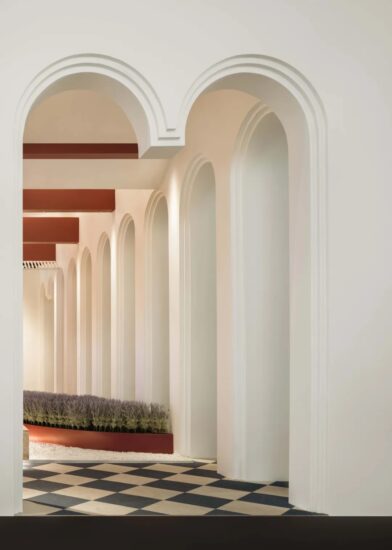
以产品与空间之间的链接,实现更具完整的居所概念,颠覆人们对于“门”的固有印象,建造出“隔而不绝”的整体空间,使其成为空间的连接者。产品与空间联结并互动,以此消解空间的边界感,创造出隔断却连续的经典美学。让衣帽间成为既是相对独立的微型场域,也是灵活互动的中转站,如同隐藏着不同惊喜的神秘盲盒,打开后通往未知的领域,感知Molteni&C品牌在建筑空间中释放的无尽魅力。
By building connection between products and space, the project presents a complete series of home scenes. It breaks with the stereotype of “doors”, and forms various separate yet connected areas, making products the connectors in the overall space. Products interact with the space, which alleviate the sense of boundary and create a classic separate yet continuous aesthetic. The walk-in closet acts as an independent micro spatial realm, and also a flexible, interactive “transit station”. It’s like a surprising, mysterious “blind box”, which opens up an unknown field and invites customers to perceive the charm of Molteni&C in the space.
∇ 衣帽间
设计理念之于品牌空间的构造,一方面需要尊重品牌历史弧度的印迹,另一方面也需要对所表达之情绪的精准拿捏。
The design needs to not only respond to the brand’s context, but also convey emotions accurately.
3、品牌空间的情绪锚点Emotion-evoking space
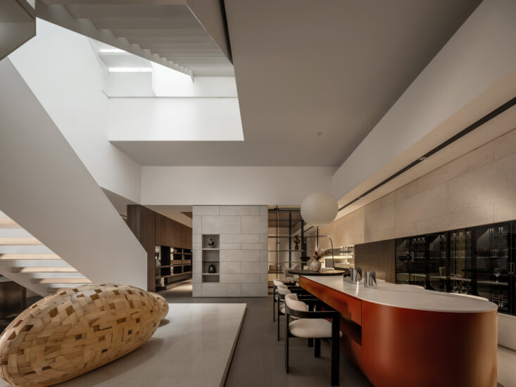
不是简单的产品陈列,而是在塑造的空间基调之上,用各类产品围合出居所氛围,引发观者的情绪共鸣。
The spatial design is not merely about products display, but more about creating a living atmosphere through various furniture products, so as to evoke customers’ emotional resonance.
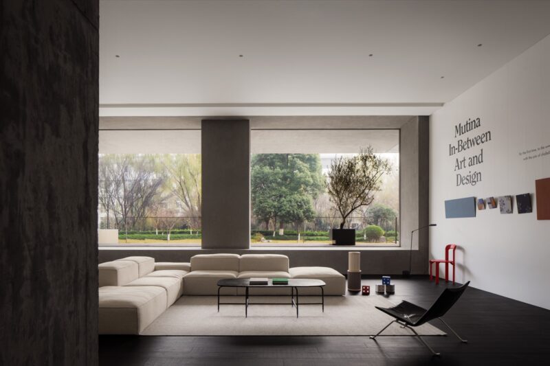
温和肌理弱化光线的反射强度,柔美的色调营造具有温度的视觉画面。自然的光线经由磨砂玻璃过滤,以更柔和的语汇描绘更贴近“居所”的感觉,牵引出饱满的生活颗粒感。
The gentle material textures weaken the reflection of light, and the soft spatial tones offer a warm visual experience. Natural light is filtered in and softened by the frosted glass, enhancing the living atmosphere of the space.
浅色调的平和与深色系的沉静在跌宕的光线中互为加持,岁月的疏影在此间悄无声息地流动。
Peaceful pale hues and dark colors complement each other under the light, which creates shadows and fluidity in the space.
从色系、光线到材质的不同层次细节考量,让感官情绪在简单纯粹却又丰盈的居所氛围之中谧然生长。
With meticulous consideration into color palette, light, material textures and details, the design created a simple, pure yet strong home-like atmosphere in the showroom, which stimulates infinite sensory and emotional experiences.
∇ 楼梯细节 Staircase details
以内敛的空间衍造富有延展力的精神性场域,让产品与空间的关系在生活感触的漫延下形成内在共鸣。
The restrained space forms a spiritual field filled with a sense of extension, where displayed products and space dialogue with each other.
一个品牌向外界传达理念的方式,并非只能是张扬高调的昭示。也许附着温度的内凝叙事更能诠释其时间沉淀后的内核理念。以Molteni&C本身气质为出发点,构建空间的内与外,尊重其历史特质,让情绪在品牌空间里自然流淌。
The way that a brand communicates itself doesn’t necessarily have to be high-profile. Perhaps a storytelling narrative may help better interpret and convey the core values of the time-honored brand. Starting from the character and history of Molteni&C, the design team conceived both the interior and exterior of the showroom, which evokes customers’ emotional resonance with the brand.
项目信息
项目名称|Molteni&C|Dada(宁波店)
项目地点|中国 浙江
项目商体|第六空间DERLOOK
项目面积|570㎡
完工时间|2021年9月
设计公司|正反设计/OUTIN. DESIGN
设计主持|王琛 W.C
设计管理|正反OUTIN – R.E.C Team
道具制造|正反OUTIN – R.E.C Team
灯光设计|正反OUTIN – R.E.C Team*云曦照明
陈列设计|四般Sìbān
市场媒体|杀菌
项目摄影|Wen Studio
主要物料|水磨石、白洞石、肌理涂料
Project name: Molteni&C|Dada Showroom, Ningbo
Location: DERLOOK, Ningbo, Zhejiang, China
Area: 570 square meters
Completion time: September 2021
Design firm: OUTIN. DESIGN
Chief designer: Wang Chen
Design management: OUTIN – R.E.C Team
Props production: OUTIN – R.E.C Team
Lighting design: OUTIN – R.E.C Team, Yunxi Lighting Co., Ltd.
Display design: Sìbān
Market promotion: Shajun
Photography: Wen Studio
Main materials: terrazzo, white travertine, textured coating


