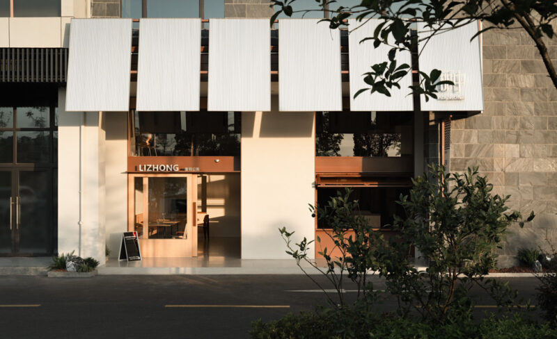
本案位于杭州赞成中心,一座有着方格结构立面的建筑,南面毗邻钱塘江畔,吸引了众多大型国际公司入驻办公。
This project is located in Hangzhou Zancheng Center, a building with square structure façade. It is adjacent to Qiantang River in the south, attracting many famous international companies to settle in for office.
∇ 项目概览 ©薛钰滔 An overview of the project
业主是一家专注于高端服装设计与面料研发的公司,随着业务发展,需要一个全新的空间以展现对于材质和面料的一直以来的坚持和品牌精神。
The owner is a company founder, who focuses on high-end clothing design and fabric R & D. With the development of business, a new space is needed to show the persistence and brand spirit of materials and fabrics.
∇ 商谈会客区 ©薛钰滔 The meeting area
项目伊始,设计师胡之乐及其设计团队经过与业主的多次沟通之后,着重考虑的是如何通过空间与色彩来表达服装精良的布料材质和剪裁。
At the beginning of the project, designer Leo Hu and his design team, after many times of communication with the owner, focused on how to express the excellent fabric material and cutting through space and color.
∇ 材料细节 ©薛钰滔 The material detail
设计师胡之乐希望使用极简的线条和装置对空间进行重塑,设计出一个集展示、会客、办公于一体的空间。
Leo Hu, the designer, hopes to use simple lines and devices to reshape the space and create a space integrating exhibition, reception and office.
简单的色块和使用设计定制材料分隔出的空间,让大型空间没有强烈的区域功能感,身处于其中又不会感觉拘束,而是放松和自在,这正如拥有高端剪裁材质的服装给人带来的舒适穿着感一样,不会感到拘束,而是超脱一切的舒适自如。
The simple color block and the space are separated by the use of design and customization materials make the large space not have a strong sense of regional function, and the body in it will not feel constrained. To create a space relaxing and comfortable, just like the comfortable wearing feeling brought by the high-end cutting materials. It will not feel constrained, but detached and comfortable.
∇ 走廊 ©薛钰滔 The corridor
∇ 原始的混凝土立柱 ©薛钰滔 The original beam
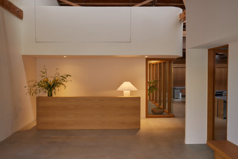
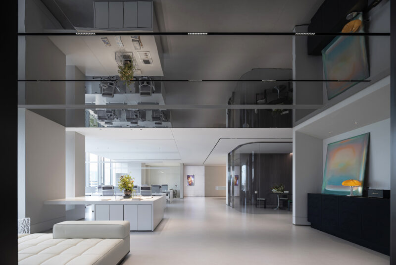
在入口处,选用了白色进行展开,墙壁处也只选用了最简单的线条进行装饰,每一个到访的人都能在第一次进入空间时感觉极致的纯粹,而白色墙面与投影的搭配,让入口空间多了现代与专业气息,也让入口空间有了不同的视觉层面。
At the entrance, white is used for development, and only the simplest lines are used for decoration at the wall. Every visitor can feel the extreme purity when entering the space for the first time. The combination of white wall and projection makes the entrance space more modern and professional, and also makes the entrance space have different visual levels.
∇ 入口处 ©薛钰滔 The entrance
与传统办公空间不同,入口处选择了无前厅无招待的设置,在空间中做减法,能让整个办公空间更完整,使用简单的线条装饰进行间隔,既有分隔作用,又避免了常规的墙壁间隔,让空间灵动起来,而线条的装饰感,又仿佛是服装上简单的绗缝装饰,远看极具序列感,近看发现是精心巧妙的设计。
Different from the traditional office space, the entrance chooses the setting of no lobby and no entertainment. Subtraction in the space can make the whole office space more complete. Simple line decoration can be used for spacing, which has the function of separation and no rigid wall spacing. It makes the space have more simplicity It seems to be a simple quilting decoration on the clothing, which is orderly from the far view and close to the view Elaborate low-key design.
进入主空间中,一侧的落地窗让整个空间可将钱塘江秀美的江景尽收眼底,空间中使用了极简的色彩,设计师希望能够重现旧工业时代的质感与工艺。
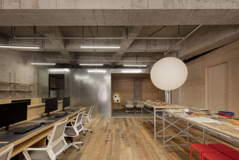
Entering the main space, the floor-to-floor window on one side allows the whole space to have a open view of the beautiful Qiantang River. The space only uses simple colors. The designer hopes to reproduce the texture and technology of the old industrial era.
∇ 办公区 ©薛钰滔 The office
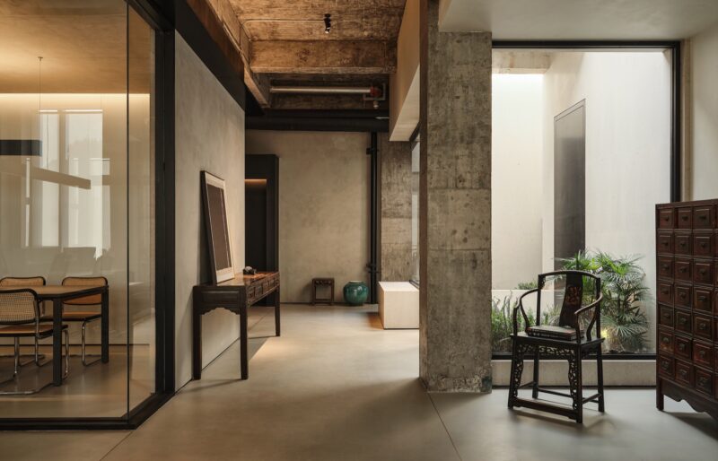
完全被保留的原始建筑中的清水梁架,未经过油漆的纸质板材墙面以及设计订制的极细圆角铝制板材,几种完全不同的材质和色彩构建出了这个空间的表情,新材料与旧材料的使用,也让空间碰撞出了一种全新的视觉氛围,也正如不同面料在服装中的使用,拼接出不一样的搭配。
The use of new and old materials also makes the space collide with a new visual atmosphere, just like the use of different materials in clothing, splicing out various collocations.
∇ 细节 ©薛钰滔 The detail
作为办公和展厅双重属性,空间的需求被满足是不可或缺的,最简单的色彩搭配,为服装和布料做映衬,而办公区域也为日常工作提供更多的可能。
As a dual attribute of office and exhibition hall, space needs to be met is indispensable. The simplest color matching is to set off clothing and cloth, and the office area also provides more possibilities for daily work.
布料展厅区域,设计师选择了最简单的线条进行组合,空间的视觉是干净、简单、直白,灯光的设计也让材料和服装的精致被展现的淋漓尽致。
In the fabric exhibition area, the designer chooses the simplest lines for combination. The vision of the space is clean, simple and straightforward. The design of lighting also makes the delicate materials and clothing displayed incisively and vividly.
∇ 布料展厅区域 ©薛钰滔 Fabric exhibition hall area
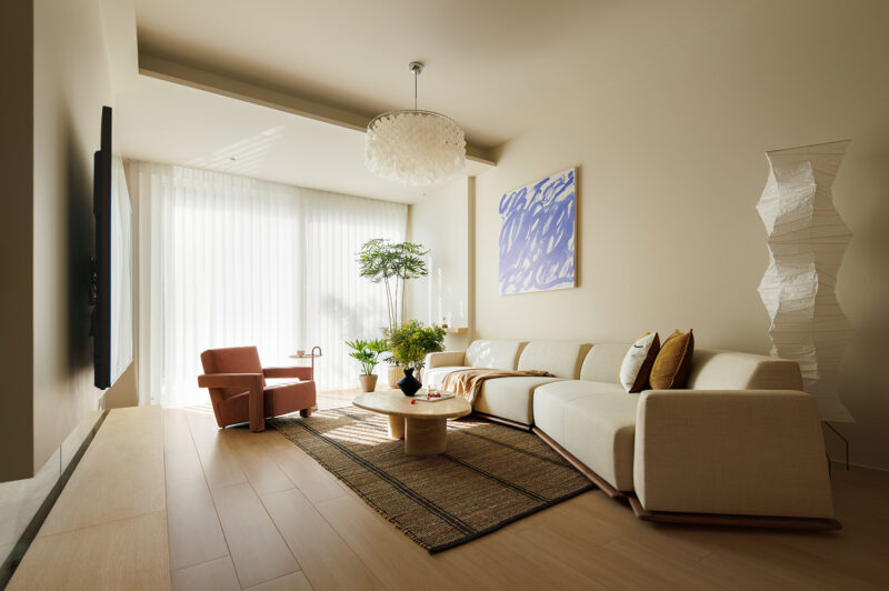
设计师在江景视线区域内,对于区域的功能性做了一个全新的规划与整合,让这个区域空间的使用度变得更加自由,沙发、地毯、单人椅,质感与色彩相得益彰,设计师希望每个到来的使用者都能有一种闲适自在的心情,天气好的时候,向外望去,江上波光粼粼,船只来往,空间有了更多自然和人文气息。
In the river view area, the designer has made a new planning and integration for the functionality of the area, making the use of the area space more relaxing. The sofa, carpet, single chair, texture and color complement each other. The designer hopes that every user will have a kind of leisure and comfortable mood. When the weather is good, look out and the river is sparkling. Natural and cultural atmosphere is expresing in the space between ships.
∇ 商谈会客区 ©薛钰滔 The meeting area
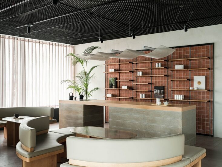
空间中的小型的咖啡Box,打破了以往茶水区域单独于主空间之外,这个嵌入的小型咖啡茶水吧,让享受一杯咖啡或茶的时间更加放松,又为每天工作时间中的下午茶增添了一点日常和趣味感。
The small coffee box in the space breaks the past that the tea area is separate from the main space. The embedded small coffee and tea bar makes the time to enjoy a cup of coffee or tea more relaxed, and adds a little sense of daily life and interest to the afternoon tea in the working time every day.
∇ 茶水咖啡吧 ©薛钰滔 Coffee bar
简单的东西往往能够在细节之处带给人们更多感受,空间在自带辨识度的同时亦解决了大环境所带来的纷杂之感,一个全新的空间正在发挥着它无限的可能。
Simple things can often offer people more feelings in details. While space has its own identification degree, it also solves the complex feelings brought by the environment. A new space is playing its infinite potential.
∇ 室内细节 ©薛钰滔 The detail
∇ 平面图 The plan
∇ 爆炸图 The explosive view
项目信息
项目名称 Project: 凌笛办公空间 LINGDI OFFICE
项目地点 Location:杭州·赞成中心 Zancheng Center
竣工时间 Complete:2020
项目类型 Type:办公/展厅 Office/Exhibition hall
项目面积 Area:800平方
业主单位 Client:凌笛Lingdi
设计单位 Design company:万境设计 WJ Design
主创设计 Design director:胡之乐Leo HU
设计团队 Team: 金旻/杨丽莲/林润泽Jimmy JIN/Lilian YANG/ Runze LIN
施工团队Construction:伍匠Uhjoh
多媒体影像Mutimedia:三臻科技 Sanzhen Tech
家俱 Furniture:Enjoyspace
灯光 Lignting:全晟照明 Huah
摄影 Photogranph:薛钰滔Yutao Xue
撰文 Text:Lucie


