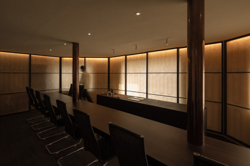
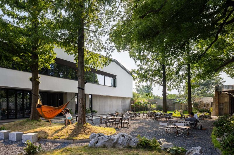
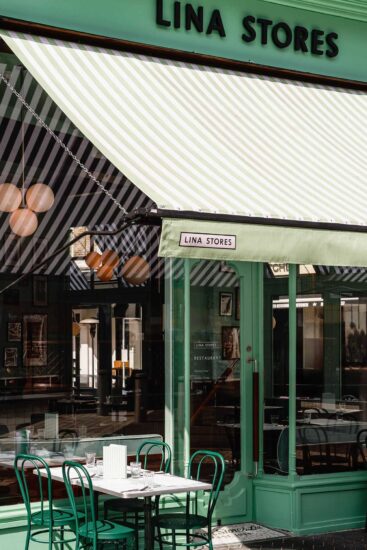
店铺位于个性张扬,五彩斑斓的苏州淮海街。本店外立面采用烧杉板与不锈钢金属板、以低调内敛地方式区别于街道其他商铺。店面入口隐蔽地设置在外立面背后,经过弯折的,色调暗淡的小径入店,将店铺内环境与喧闹的户外街道缓慢地划分。
The store is located on the colorful and individual Huaihai Street in Suzhou. The facade of the store is made of burnt cedar panels and stainless steel metal panels, which distinguish it from other shops on the street in a discreet and restrained manner. The entrance to the store is hidden behind the facade and is accessed by a curving, dark pathway that slowly separates the interior of the shop from the hustle and bustle of the outdoor street.
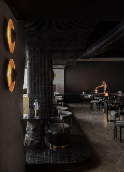
伊都竹彩的室内空间充分反映“都”与”彩”两个元素,消除在常规日料店中频繁出现的仿日式装饰。
The interior space of ‘YIDUZHUCAI’ fully reflects the two elements of “DU” and “CAI”, eliminating the imitation Japanese decoration that frequently appears in conventional Japanese food stores.
都:利用原本建筑框架的高净空,在室内制作若干有高差的吊顶,通过不同净高高差将大环境分割成若干空间,仿佛一座小都市。公共走道区处于高净高处,反映小都市的户外,在此处设置环形动线的人造景。就餐区在低净高处,反映小都市内的一处处房屋。
DU: Taking advantage of the high headroom of the original building frame, several suspended ceilings with differential heights have been created in the interior, dividing the large environment into several spaces through differential heights, resembling a small city. The public walkway area is at a high headroom, reflecting the outdoors of a small city, where a circular movement of the man-made landscape is set up. The dining area is at a low clear height, reflecting the houses in the small city.
彩:在日本的和服正装与礼物包装会用彩色的”带“作为点缀。本店的内部空间中,大面积运用暗淡的黑色调,在营造别于日常生活的非日常体验的同时,通过”带“状的彩色点缀强调空间的独特性。”带”前设置就地取材的太湖石、枯花木以及定制灯具,成为”带”中点缀,增添景色的层次。
CAI:In Japan, kimono formal wear and gift wrapping are embellished with colored ‘bands’. In the interior of the shop, the use of dark black tones is used extensively to create a non-daily experience that is different from everyday life while emphasizing the uniqueness of the space through the colored accents of the “band”. In front of the ‘band’, locally sourced Taihu stones, dead wood, and bespoke lighting are used as accents in the ‘band’ to add layers to the landscape.
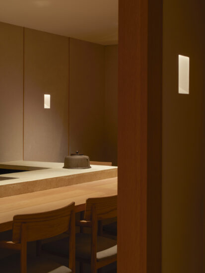
包厢内、餐吧台通过明暗色调对比,包厢内的浅色榉木桌面板与餐吧柜台的光面金属板仿佛漂浮在空中,暗淡的空间中突显桌面的菜品与对面人物的肤色面孔,产生戏剧般的就餐体验。
The contrast between the light beech wood tabletop panels in the booths and the glossy metal panels of the bar counter seems to float in the air through the contrast of light and dark tones, highlighting the dishes on the table and the complexioned faces of the opposite of the character in the dark space, producing a theatrical dining experience.
∇ 轴测图
∇ 平面图
项目信息
项目名称:伊都竹彩日式料理店空间设计
设计团队:树獭建筑(素螺建筑设计(上海)有限公司)(英文名称:Slothwork Architects)
设计师:秋天(Qiutian),张雪薇(Xuewei Zhang)
公司所在地:中国上海
项目完成年份:2022
建筑面积:280m²
项目地址:中国江苏省苏州市虎丘区淮海街
委托方:伊都竹彩日式料理
摄影师:Eiichi Kano


