这是一家为了吸引年轻女士的JK制服租赁店。我们以强烈的色彩对比与单纯的几何构成营造可以勾起路人好奇心的店面。
This is a JK uniform rental shop designed to appeal to young ladies. We have used strong colour contrasts and simple geometric compositions to create a shop that will arouse the curiosity of passers-by.
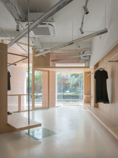
店里的功能包括甜品区和制服租赁区两种功能,我们通过空间的疏密划分两个功能区。沿街的甜品区密度稀疏,内部的制服租赁区货架密集。密集的货架令人产生在店铺内的寻宝感,同时通过稀疏密度的甜品区过滤,使得店铺立面外观干净、避免杂乱。 另外,通过不同色彩将两个功能区进一步细化。以色彩区分产生的折线动线令客人在店铺内的活动时间更长,让客人自然而然产生在店铺内逛街的状态。
The function of the shop includes two functions: the dessert area and the uniform rental area, and we have divided the two functional areas by the sparseness of the space. The dessert area along the street is sparse in density, while the uniform rental area inside is dense in shelving. The dense shelves create a sense of treasure hunting within the shop, while the sparse density of the dessert area is filtered through to give the shop facade a clean and uncluttered appearance. In addition, the two functional areas are further subdivided through different colours. The colour distinction creates a folding line that allows customers to spend more time in the shop, making them naturally feel like shopping in the shop.
货架内部两侧使用镜面材料,透过镜子,即使在狭窄的货架通道内行走也可以看到和视线垂直的物品展示。其中一些货架采用封闭的可开启门,仿佛就是一个更衣柜。就像从某个女生的更衣柜借衣服一样,体现制服租赁店本身的理念。家具、灯具选用纯粹的三角与圆形。这两种几何造型非常纯粹、不与店里商品冲突。 同时他们是几何形体里边数最少和最多的两种形状,他们与任何形式相融,组合在一起又会令空间产生令人印象深刻的对比。
The interior of the shelves is flanked by mirrored materials, through which items can be displayed perpendicular to the line of sight even when walking through the narrow aisles of the shelves. Some of the shelves have closed, openable doors, as if they were a locker. It is like borrowing clothes from some girl’s locker, reflecting the concept of the uniform rental shop itself. The furniture and lighting are purely triangular and circular. These two geometric shapes are very pure and do not conflict with the shop’s products. At the same time they are the two shapes with the least and most sides in the geometry, they blend in with any form and together they create an impressive contrast in the space.
项目信息
项目名称:KIRAKIRA JK制服租赁店
设计团队:树獭建筑(素螺建筑设计(上海)有限公司)(英文名称:Slothwork Architects)
设计师:秋天,陈旭,张雪薇,钱依雯
公司所在地:中国上海
项目完成年份:2021
建筑面积:80m²
项目地址:中国上海杨浦区大学路
主创建筑师:秋天
摄影师:Eiichi Kano
委托方:kirakira


