「妙妙屋」WONDER HOUSE
奇妙即是多Wonder is more
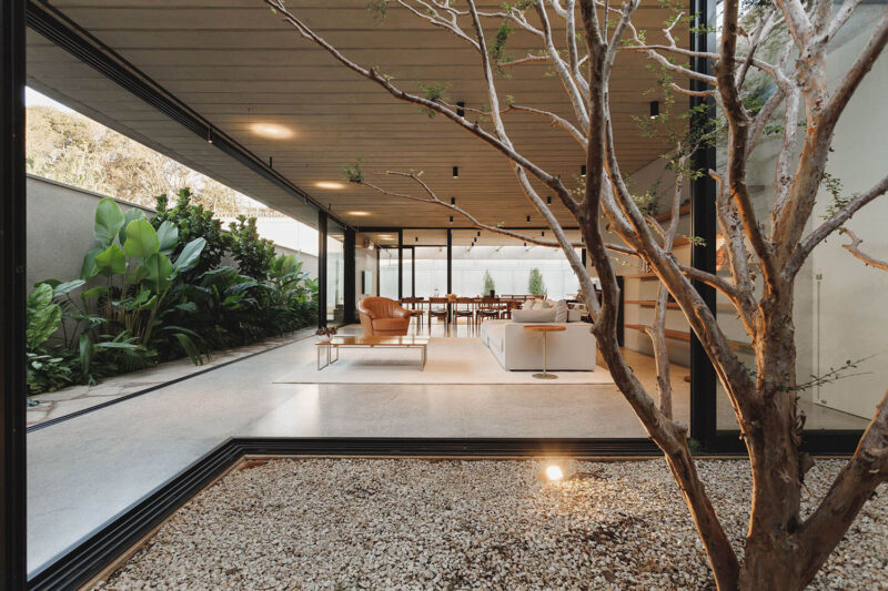
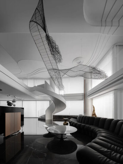
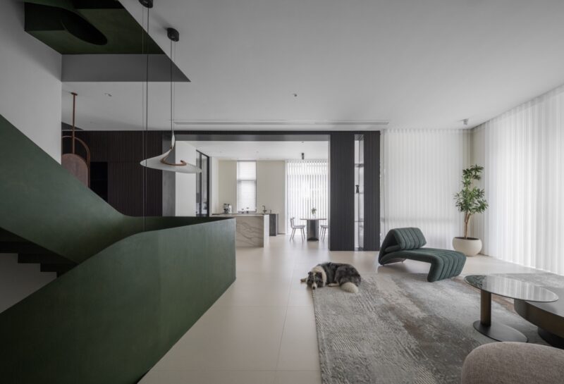
∇ 拼贴艺术创作,素材源自网络 Collage Art Creation, Material From the Internet
概念阐述Design Concept
本案是为小朋友打造的家,充满奇幻感的娱乐化设计,让一个家各处充满惊喜。毕加索曾说希望“像孩子一样绘画”,“脸图形”长期以来作为现代艺术大师们的绘画对象被反复使用,同时在当代娱乐中以机器人、吃豆人、米奇妙妙屋等人们耳熟能详的原型为代表呈现。脸的象征性得以让人们感到更童真、趣味和亲切。
本案以戏谑的方式体现“刻奇”的概念。即在追求设计逻辑的同时又拒绝绝对理性,将看似“流俗”的娱乐符号,以一种“拼贴性”和“达达式”的创作模式融入当代住宅设计之中,籍由荒诞主义式的讽刺和批判来揭示顽固不化的“功能主义”套型产品住宅,空间的复杂与矛盾性得以显现。
This case is a home designed for children. With an entertaining design full of fantasy, it brings surprises to every corner of the home. Once Picasso said he wanted to “paint like a child”, and the “face figure” has long been used repeatedly as the object of painting by modern masters, and it is also represented in contemporary entertainment by familiar archetypes such as robots, Pac-Man, and Mickey Mouse Clubhouse. The symbolic nature of the face gives people a more childlike, joyful and friendly feeling.
This case embodies the concept of “kitsch” in a jocular way. In other words, while pursuing design logic and rejecting absolute rationality, it incorporates seemingly “vulgar” entertainment symbols into contemporary residential design in a “Collage” and “Dadaistic” creative mode. Through absurdist irony and criticism, it sheds new light on the traditional dwelling house model with “functionalist”, showing the complexity and contradiction of space.
∇ 场地概况 © 戏构建筑设计工作室 Site Overview © XIGO STUDIO
前期分析Preliminary Analysis
原始户型为133平米的两室一厅,东西朝向。客厅采光较差,44平米偌大的客厅空间确仅靠一个3平米的西侧窗户采光,显得昏暗不堪。公共属性的厨房被挤压在北侧卧室附近的角落,导致餐厅与厨房较远相互关系较弱,厨房与两间卧室的交通路径相交叉。卫生间设置在了玄关处,卧室却在最内处,从卧室到卫生间需要绕两个弯,动线距离较长,为7.6米。这样的原始布局也使得各空间始终处于动线关系较为混乱的状态。
The original house is designed as two bedrooms and a living room, totaling 133 square meters, and it is in the east-west direction. However, the living room is with poor lighting, and such a 44-square-meter large living room space only has a 3-square-meter window on the west, making it very dim. Besides, the kitchen with public properties is squeezed into the corner near the north bedroom, increasing the distance between the dining room and the kitchen, weakening their interrelation, and making the traffic paths between the kitchen and the two bedrooms cross each other. In addition, the bathroom is set at the hallway, but the bedroom is at the innermost place, and it takes two turns from the bedroom to the bathroom, with a longer moving line distance of 7.6m. This original layout also makes the spaces always in a state of confusion regarding the relation between the moving lines.
∇ 平面前后对比 © 戏构建筑设计工作室 Before and After Plan Comparison © XIGO STUDIO
改造后将客厅位移作为整个住宅的中心公共空间,整合零散孤立的各功能区的空间规划策略,如此整个空间将会获得高效的合理动线和相对均质的自然采光。空间组织围绕中部开放的公共空间与其他区域相互关联展开。中心空间叠加了客厅、餐厅、厨房、娱乐,老人居住等多样化的使用功能,抽象的“脸图形”正对开放的公共区形成焦点,多样可变的脸形态,以适应不同的生活场景。玄关经由弧形墙流畅的过渡到开放的西厨就餐区,继续向东侧延伸至可独立使用的中厨,形式赋予连贯的功能布局得到整合。
After the renovation, it displaces the living room to the central public space of the whole house and integrates the spatial planning strategy of scattered and isolated functional areas, thereby the whole space will get efficient and rational moving lines and relatively homogeneous natural light. Besides, the spatial organization revolves around the central open public space interconnected with other areas, and the central space is superimposed with diverse functions such as living room, dining room, kitchen, entertainment space, and elderly living room, etc. The abstract “face figure” faces the open public area to form the focal point, with many variable face shapes to adapt to different living scenes. The hallway smoothly transitions through the curved wall to the open western kitchen dining area and continues to the east side to the independently usable Chinese kitchen, integrating the form to give a coherent functional layout.
∇ 概念分析 © 戏构建筑设计工作室Concept Analysis © XIGO STUDIO
∇ 叙事轴测图 © 戏构建筑设计工作室 Narrative Axonometric Drawing © XIGO STUDIO
流动玄关Flowing Hallway
入户第一视觉,三个弧形限定出内部空间与玄关过渡区的边界。考虑男主人经常出差,行李收纳的便利性,同时尽量不打扰其他家庭成员休息。衣帽收纳区设置在了玄关附近,单独规划出的小储物间建立玄关和主卧间的视觉隔断,为主卧的私密使用提供保障,双门设计可以直通卧室。玄关上方的“青空灯”为灰色吊顶打开了一扇窗口,模拟出的天空光照视错觉,使原本幽暗的玄关变得通透明亮。
Seen from the first vision of the hallway, three arcs define the boundary between the interior space and the hallway transition area. This takes into account the convenience of luggage storage for the male master who is often on business, while not disturbing other family members’ rest as much as possible. The cloakroom is situated near the hallway, and a separate small storage room is planned to establish a visual partition between the hallway and the master bedroom, providing a guarantee for the private use of the master bedroom. The “Cyan sky light” above the hallway opens a window for the gray ceiling, simulating the optical illusion of sky light to brighten the dark hallway.
餐厨一体Integrated Dining & Kitchen
弧形墙,动势从玄关流畅地连贯至住宅的中心空间,迎面是空间的中心视觉符号“大比例的抽象面孔”,形成了生活与视觉的焦点。垂直的界面因弧形灰色吊顶和对应的地面铺装产生形态上的张力,利用东向三面采光引导进入显得更加开敞明亮,扩大通向餐厅两侧的走廊宽度。通过利用厨房阳台的封闭,中西厨得以分开。开放式的西厨与餐厅相互关联,同时整合了众多家用电器形成了一体化的家政服务区。
The curved wall creates a dynamic momentum smoothly flowing from the hallway to the central space of the residence, with the oncoming “large scale abstract face”, the central visual symbol of the space, forming the focal point of life and vision. The vertical interface generates morphological tension with the curved gray ceiling and the corresponding floor pavement, and it is more open and brighter by using the east-facing three-sided light to guide in and expand the width of the corridor to both sides of the dining room. By the closed kitchen balcony, it is available to separate the Chinese and Western kitchens. The open western kitchen is interconnected with the dining room, while integrating many household appliances to form an integrated housekeeping area.
趣味符号Fun Symbols
抽象拟化的“面孔”被故事性地编排入家庭成员的日常生活中,以戏谑的方式体现“刻奇”概念。“脸图形”同时传递趣味与童真,通过眼皮装置产生场景互动,为这个家增加了一种生活上的趣味焦点,形成了具有唯一性的符号象征。
The abstract anthropomorphic “faces” are arranged into the daily life of family members in a story-like way, which embody the concept of “kitsch” in a jocular way. The “face figure” conveys fun and childlike innocence, generating scenes of interaction through the eyelid equipment, adding an interesting focus to the home, and forming a mark symbol with uniqueness.
多功能起居空间Multifunctional Living Space
中心空间作为灵活开敞的起居室,叠加了就餐、会客、娱乐、办公、储物收纳、临时居住等多项日常使用功能。空间边界之内,设计师没有继续附加限定条件,餐桌、沙发、茶几等功能部件的摆放皆可在开敞的空间内灵活调整。沙发面向东侧儿童房,将得到一个自由的娱乐活动空间。将起居室内的靠窗角落作为供临时留宿的客卧,隐藏在儿童房走廊处的移动拉门可将客卧区从起居室当中独立划分出来。
The central space serves as a flexible and open living room, which was added with several daily functions such as dining, meeting, entertainment, office, storage and temporary living. Within the boundaries of the space, the designer does not continue to add restrictions, and it is available to flexibly adjust the placement of the dining table, sofa, coffee table and other functional components within the open space. The sofa faces the children room on the east side, and it will be a free space for entertainment. The window corner in the living room is used as a guest bedroom for temporary stay, and the sliding door hidden in the corridor of the children room can separate the guest bedroom area from the living room.
儿童房的眼皮装置EyelidInstallationinChildren‘sRoom
儿童房的设计考虑到了家庭结构情况和未来的改变,下铺为1.5米双人床给出阿姨留宿与陪伴孩子入睡成长的空间,嘴形态开启状态可以为客厅增加更多采光,通过拉帘关闭后达到完整的私密状态。上铺为1.3米的单人床,为未来二孩的到来提供了更多居住可能。眼皮装置对应上铺位置,小朋友可以通过操控装置使“眼皮”开合,与房间外部发生趣味的情景互动。除了互动的娱乐性,眼皮装置也可以暗示人在其中的作息变化,眼皮打开,暗示行为处于活动状态,眼皮闭合,暗示从活动进入就寝状态。
The design of the children’s room takes into account the family structure and future changes. Therefore, the lower bunk is a 1.5m double bed to give space for auntie to stay and accompany the child to sleep and grow. The opening state of the mouth form will bring more lighting to the living room, while the complete privacy is achieved by pulling the curtain closed. The upper bunk is a 1.3m single bed designated to provide more living possibilities for the arrival of the second child in the future. The eyelid equipment corresponds to the position of the upper bunk, and children can open and close the “eyelid” by controlling the operation device, creating an interesting interaction with the outside of the room. In addition to the entertainment of interaction, the eyelid equipment can also suggest dwellers’ state inside. If the eyelids open, suggesting that people are in an active state; if the eyelids closed, suggesting that people are in a resting state.
主卧室Master Bedroom
主卧室改到西侧的原客厅区,3平米飘窗式的采光刚好可以照亮整个卧室空间。进入主卧的推拉门隐藏在衣柜的两侧,与柜体合二为一。从主卧室到卫生间的动线也更加直接,动线距离从原户型的7.6米缩短到3米。
The master bedroom was changed to the west side of the original living room area, with a 3-square-meter bay window whose light is just enough to illuminate the entire bedroom space. The sliding doors in the master bedroom are hidden on both sides of the closet, merging with the closet body. The moving line from the master bedroom to the bathroom is also more direct, with the distance shortened from 7.6m of original house to 3m.
卫生间中的“卫生间”“Cat Toilet“in the Bathroom
卫生间被安置在了玄关旁的弧形墙内,为了缩短家庭成员从各空间到达的距离,门的方向有所改变更为直接。猫咪作为家庭成员之一,卫生的便利自然不能忽视。考虑到方便人的清洁与气味的隔离,在弧形墙上开设了猫洞,给予宠物独立的交通动线。猫室设置在了卫生间洗手台下方的浴室柜内,预留出了猫砂盆与食物投放机的功能,且加入了换气系统。将人与宠物的基本卫生需求得到体面的解决。
The bathroom was built on the curved wall next to the hallway, and the direction of the door was changed to be more direct to shorten the distance between family members arriving from each space. Cat is one of the family members, certainly, it is unable to ignore the convenience of its hygiene. Considering the convenience of human cleaning and odor isolation, a cat cave was opened in the curved wall to design the independent transportation line for the pet. The cat room is set up in the bathroom cabinet under the bathroom sink, with the function of a cat litter box and food dispenser reserved, and an air exchange system added, making the basic hygiene needs of both people and pets decently addressed.
∇ 平面图 © 戏构建筑设计工作室 Plan After Renovation © XIGO STUDIO
∇ 立面图 © 戏构建筑设计工作室 Model © XIGO STUDIO
项目信息
项目名称:妙妙屋
项目类型:住宅公寓
项目地址:北京市朝阳区松榆南路
建筑面积:133㎡
设计公司:戏构建筑设计工作室 XIGO STUDIO
方案主创:刘阳、李娅楠
方案深化:王丹
设计时间:2020年12月-2021年4月
竣工时间:2022年6月
撰文排版:刘阳、于水骄
学术顾问:朱力
摄影版权:立明
视频版权:WM STUDIO 阿正
施工工长:朱新贵
家具定制:梵尔奇整屋木作
主要材料:微水泥、乳胶漆、木地板
Project Name: Wonder House
Project Type: Apartment
Project Address: Songyu South Road, Chaoyang District, Beijing
Building Area: 133 square meters
Design Company: XIGO STUDIO
Chief Designers: Liu Yang, Li Yanan
Scheme Deepening Design: Wang Dan
Design Duration: December 2020 – April 2021
Completion Date: June 2022
Academic Counsellor: Zhu Li
Photography Copyright: Li Ming
Video Copyright: WM STUDIO – Ah Zheng
Construction Foreman: Zhu Xingui
Furniture Customizing: LE VERCHY
Main Materials: microcement, latex paint, wood floor


