精巧破立,老屋新貌.以家为线,交织社区纽带
Delicate renovation,creating a new impressive face. Relying on a apartment as a thread to interweave community ties.
项目背景及思考
Project background and considerations
尽管近几年经历了新冠及房市动荡,但是大城市对于高资和高职“新移民”越来越开放的引入态度导致购房需求任然呈上升趋势。然而购置新房的购置政策对于他们来说太过严苛,他们不得不选择一些市区内相对老旧小区的二手房。此类高密度、低维护和怪异户型对生活品质有一定要求的业主来说,创造一个功能化、舒适化及个性化的室内空间是个逃不掉的挑战。
Despite the COVID-19 pandemic and the turbulence of real estate market in recent years, increasingly open attitude of metropolis caused the introduction of highly-qualified and highly-employed “new immigrants”,which has led to an upward trend in the demand for housing. However, the acquisition policy for the city immigrants is too harsh for the immigrants to follow, so they have to choose some second-hand apartments in the relatively old community in Shanghai. Living in Such high-density, low-maintenance and bizarre apartment shapes are a challenge for owners who require a certain quality of life including a functional, comfortable and personalized interior space.
本项目是位于市区内环滨江的龙南小区。跟大多数的老旧小区一样,如此老龄化和流动化严重的室内空间更是被不同时期的住户随意对待和拆改,甚至加盖和违建,导致个人及公共区域环境相对杂乱和残破。我们企图通过小单位的内空间创造价值从而引导甚至同化感染其他单位空间,这样的探索和实验将被视为对于不同空间尺度的一个升级方式。
This project which is settled in Longnan community is located in the inner ring of Shanghai close to the waterside park. Like most old communities, Longnan community’s interior space using by such aged and high mobility tenants has been treated and demolished carelessly in different periods, such as disorderly additions and illegal constructions, resulting in a relatively cluttered and dilapidated environment for personal and public areas. We attempt to create value through the internal space of small units, then guiding and even assimilating the space of other units, and such exploration and experimentation will be regarded as a way to upgrade the scale of different spaces.
项目房子建于上世纪90年代是一套顶层40多平米的老公房,内空间只有35㎡。此类一室户紧凑型老公房相当具有代表性,以它为原型模板;对小空间动线单一与功能冲突进行深入的研究。以生活习惯和使用方式为出发点,以人为本重新规划空间。通过重塑空间并融入个人特色元素,以达到空间对使用者身心的牵绊与共鸣。
The apartment was built in the 1990s as a top floor 40 square meters old public apartment unit, with only 35 square meters of internal space. This kind of compact unit is quite representative and taking it as the prototype template; we conduct an in-depth study on the single movement line and functional conflict of small space. Taking living habits and usage as a starting point, the space is re-planned in a people-oriented way. By reshaping the space and incorporating personal characteristics elements, achieving the physical and mental ties and resonance of the space to the owner.
∇ 平面图
设计概念
Design Concept
我们创造的空间更像一个容器和孵化物,空间一直是“成长”的。我们建造的“容器壁”优化空间使其具备更为舒适实用的硬性条件,并在随后的时光中陪伴使用者一起变化成长。
We create spaces are more like containers and incubators, we also believe that spaces are always “growing”. building “container walls” optimize the space to make it fit in hard conditions comfortably and functionally, then changing and growing with the owner in the following years.
如此小的室内面积,设计策略上我们必须精准的把握尺寸,除此之外该有的功能和空间在融合的前提下具备弹性。压缩中部空间,成功疏通一字户型南北两端;扩展了视觉及空间感受。同时开洞的中段隔墙引入更多的光线,激活负空间以嵌入更多功能。因此,通道形成一个空间纽带将隐私和开放空间体块链接形成一条动线。 在更大尺度下,我们也期待这条纽带它成长的不确定性,或许会成为链接室内与室外小区的桥梁。
With in such a small interior area, our design strategy had to be precise in terms of size, in addition to that, the functions and spaces should be flexible in the context of integration. By compressing the middle space, we succeeded in unblocking the north and south ends of the linear apartment; expanding the visual and spatial feeling. At the same time, the open middle partition wall brings in more light and activates the negative space in order to embed more functions. Thus, the passage forms a spatial link between the privacy and open space blocks to form a flowing route. At a larger scale, we also expect that this link can grow uncertainly and perhaps become a bridge connect the indoor and outdoor relationship.
改造思路
Renovation
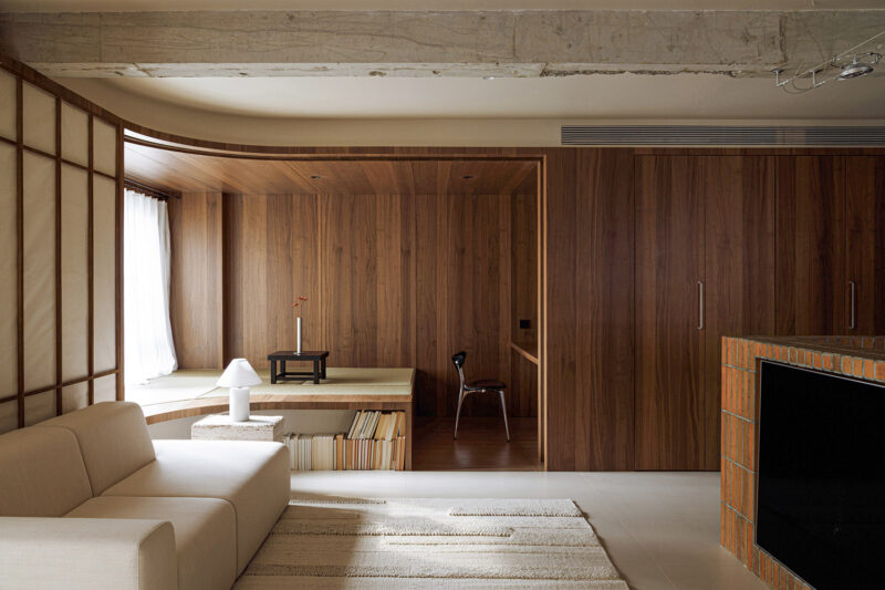
空间上我们选择空间膨胀的设计手法,通过简单通透视觉延伸,用立面弧形达到空间上的松弛有度并扩大视觉与光线效果。凹凸的弹性空间则将可用空间最大化,为之后的延展与自由搭配空间提供可能。另外将‘‘窗’’的故事性与设计方式贯穿整个空间,在借景与移步中体验生活的乐趣。
Spatially, We chose the design technique which expand space through simple and transparent visual extension, using the curved facade to achieve spatial relaxation and expand the visual and light effect. The concave and convex flexible design maximizes the available space and provides the possibility of extending and freely matching space afterwards. In addition, the storytelling and design of “windows” are used throughout the space to experience the joy of life through borrowing and moving.
在空间材质上,整体颜色和材质把握在三到四种在做到足够的氛围感和区块化的前提下又不至于太过杂乱。软装上挑选也以凸显材质本色的物品在硬度和光泽下体现质感。
In terms of material, the overall material is grasped in three to four colors in order to achieve enough sense of atmosphere and blocking without too much clutter. The decoration and furniture are also selected to highlight the original color of the material and reflect the texture under the hardness and luster.
空间策略
Spatial Strategy
厨房玄关入口及过道作为一字型空间的前半部,承担着生活功能与储藏功能双重要求。通过将动线通道中移,切分出左右两侧的使用空间,并将所有的电器内嵌入这些空间,从而达到水平空间的最大化。后半部的客厅与上抬卧室为承担更多的功能性与舒适性空间提供可能。由过道步入客厅在一紧一松之间产生的空间对比从而达到小中见大的感受。
At the front half of the linear apartment, the kitchen entrance and the hallway are asked for the dual requirements of living and storage function. By shifting the hallway to the middle, the space to the left and right is cut out and all the appliances are built into these spaces, thus maximizing the horizontal space. The living room on the back half of apartment and the raised bedroom provide the possibility to take on more functional and comfortable space. The contrast between the tight and loose spaces carried the hallway into the living room, which gives a feeling of small but big.
厨房正面的操作台与背面的酒水台在呼应功能性的前提下,也能提供相对独立且精致的生活内容。内缩式的餐桌也是将人性化精致化发挥到了极限。玻璃隐藏门在切断厨味的同时又提供通透性。
The kitchen counter and the wine counter echo functionality while providing a relatively independent and sophisticated life-style. The retracted dining table is also humanized and refined to the limit. The glass concealed door provides transparency while cutting off the cooking smell.
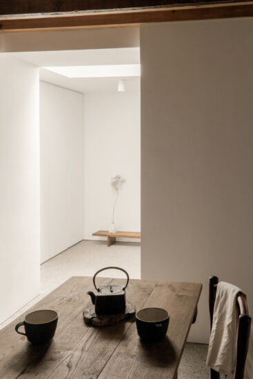
入口玄关由于房子的横向深度太窄,将整个换鞋区作为延伸实体的一部分并做空间内凹与悬挑。这个方式有效的缓解了入口空间的局促感。景窗的概念则在这里做了第一次的交代。过道与卫生间之间墙体的内移出干区空间并不仅仅是生活便捷性上的考量,内推的干区空间也给整面柜体的过道留出呼吸感。
Since the horizontal depth of the entrance is too clamped, the entire shoe changing area is made as part of the extended entity with recessed space and overhang. This approach effectively alleviates the sense of constriction. The concept of view window is explained here for the first time. The inward shift of the wall between the hallway and the bathroom creates a dry area space which is not only a consideration for the convenience of living, but the inward push of the dry area space also leaves a breathing sense for the hallway cabinets.
卫生间内部材质搭配与厨房一致使用了立面分块的手法丰富立面空间。虽小,但其隔断景窗承载了整体空间的秩序与光线的过度作用。空间上的调整和功能上的精致是为了让步于客厅与卧室拥有更大空间提升舒适度。为了将公共空间与私密空间进行区分,将卧室区进行抬高,而景窗的设计方式也在这里得到了延伸。这样的处理方式提高了卧室的仪式感和包裹感。
The materials of the bathroom are the same as the kitchen, and the facade is enriched by the blocking technique of design. Although it is small, the partition window carries the order of the overall space and the excessive role of light. The spatial adjustment and functional refinement allow more space for comfort in the living room and bedroom. In order to distinguish the public space from the private space, the bedroom area is elevated, and the design of the view window is extended here. This treatment enhances the sense of ritual and wrapping in the bedroom.
项目信息
项目名称:浦巢
设计团队: 晟与兴造工作室
项目类型:建筑室内改造
项目地址: 上海徐汇
项目面积: 35平方米
设计周期:2022.08—2022.10
完工日期:2023.05
设计师:徐晟、丁艳、马腾腾
结构设计:徐晟
摄影: 郑昊
主要材料:乳胶漆,珠光艺术漆,微水泥,马赛克,艺术砖,贴皮橡木,混油板
家具洁具品牌:晟与兴造设计(家具研发设计)、吉博力、高仪、科勒、USM,北欧表情
照明顾问及产品:西顿照明
Architect firm: Atelier Sheng
Scope: interior
Location: Xuhui,Shanghai
Net Area:35㎡
Completion Date: 2023.05
Designer: Eric Xu、Ding Ding. Kate Ma
Structure engineer: Eric Xu
Photographer: Hao Zheng
Key Materials: Latex paint, Pearl Stucco, Micro-cement, Mosaic tile, Oak Veneer, Waterborne colored board
Furniture:Atelier Sheng、Geberit、Grohe、Kohler、USM、Norhor
Lighting consultant:CDN Light


