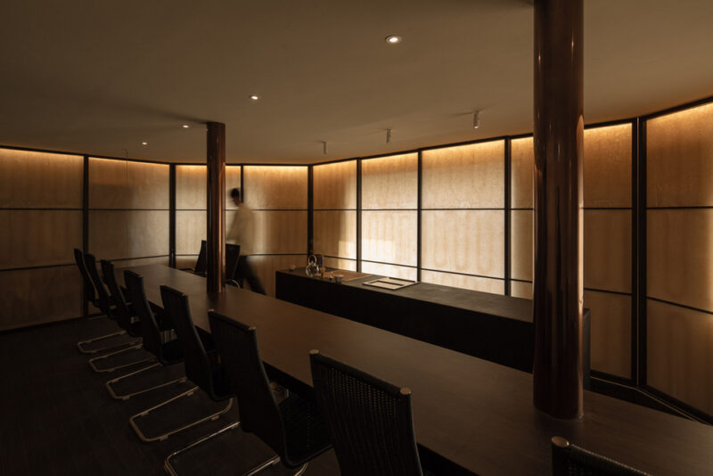
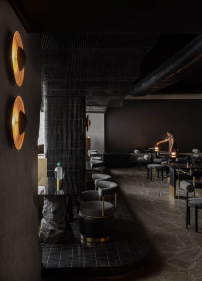
谢培河新作|隐藏在深圳博物馆心脏的一抹红
Red Classic Chao Cuisine, Shenzhen by AD ARCHITECTURE
A taste of red hidden in the heart of Shenzhen Museum
01胭脂璀璨|包裹于闹市中的宁静一隅
Brilliant carmine hue|Embraced by the tranquility in the downtown city
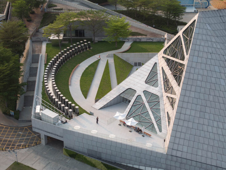
「红」经典潮菜坐落于深圳博物馆内,建筑主体潜藏于京基100塔尖下的文物,新旧碰撞启动餐厅,一馆藏天下之韵。该馆是特区建立之初设立的八大文化设施之一,在上世纪80年代被誉为国内最现代化的博物馆,并被称为“深圳改革开放十大历史性建筑”。
Near the KK100 skyscraper, Red Classic Chao Cuisine selects its venue in an ancillary building of the Shenzhen Museum of Ancient Art, which blends the old and new, brimming with versatile charm. The museum is one of the eight significant cultural facilities built since the establishment of the Shenzhen Special Economic Zone, hailed as one of the best modern museums in China in the 1980s and one of “the top ten buildings of reform and opening up in Shenzhen”.
随着深圳市文体设施规划建设的加快推进,为更好的响应深圳城市规划属性,本案调性紧贴落位属性及品牌商业属性,用东方红结合潮汕底蕴诠释潮菜形构,脉络,以及菜品的熟练度,既精致洗练,又稳健诠释了胭脂璀璨。在这极具美学的新潮菜与充满建筑诗意的空间环境下食色饕殄,身临渊博之境品鉴舌尖,仿佛将身心包裹于闹市中宁静一隅的典韵。——一种融合的视角,一个全新的现代馆区餐饮运营生态界面,于城市的繁华中氤氲而生。
Keeping abreast of the rapid development of the planning and construction of cultural and sports facilities in Shenzhen and responding to the urban planning of Shenzhen, the restaurant’s design fully takes into consideration its locality and brand features, and combines a touch of brilliant rouge with the cultural context of Chaoshan to interpret a space for fine Chaoshan cuisine experiences through exquisite, concise, and mature expressions. Dining in such a profound ambiance infused with new Chaoshan cuisine aesthetics and poetic architectural sense, the mind and body are embraced by the tranquility at a corner of the bustling city. From an integrated perspective, a brand-new operation mode of a modern restaurant in a museum area emerges and stands out in the prosperity of the downtown city.
02荷塘悦色|一池秋水映芙蓉 可爱深红爱浅红
Lotus pond scene|Blooming flowers reflecting in the pond reveal red with different saturation
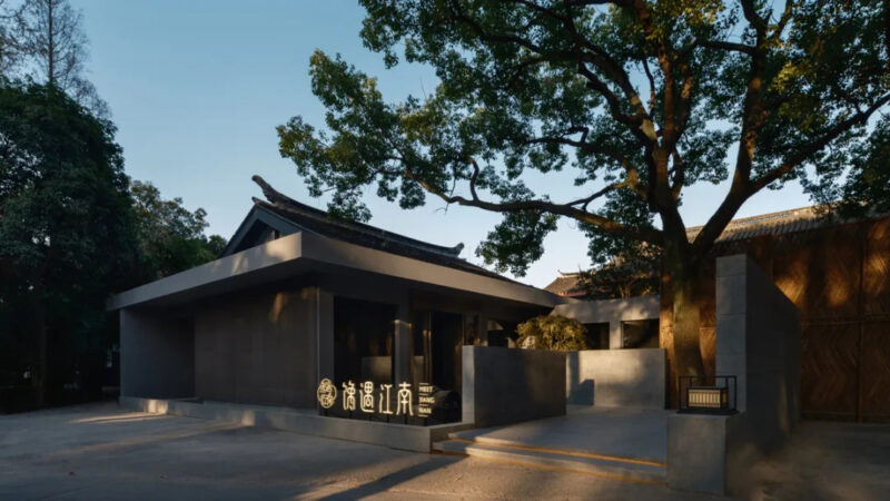
“四季轮换景随时异,境由人定,在新旧与艺术,人文的土塘上构筑空间氤氲”。小院竹篱,春水秋月,虽由人作,宛自天开。画中有境,境中有画,移步意境,踏步山水中览尽荷塘悦色,途中八角亭点缀一园景色,任凭小径引领着向餐厅入口寻寻步进石狮驻守的祥瑞之境,佳境隐序。AD艾克建筑设计基于人口红利消失,消费谨慎,行业内卷的大背景下,锁定消费人群,对空间进行人群属性定位,并贴合新旧交替的城市规划群,在平和中制造张力。空间处理上向细处察,向远处观,不论身在空间何处,都可以在绿影摇曳的视线余光中切换内外感受。
Surrounded by a vibrant natural environment, the mellow space is created based on the combination of the old and new, art and humane. The yard built with bamboo fences is like a masterpiece of nature. Stepping into the multilayered picturesque landscape, visitors will enjoy the lotus pond scene, encounter an octagonal pavilion and a path leading to the restaurant, a secluded place with Chinese guardian lions sitting at the entrance. In the context of the shrinking demographic dividend, prudent consumption, and fiercely competitive market, AD ARCHITECTURE conceived the space based on the target customers and took account of the integration of the old to the new in urban planning to create tension in the peaceful space. With delicate design in detail and a big-picture vision, visitors will enjoy an alternation between indoor and outdoor experiences anywhere in the restaurant filled with swaying shadow of greenery.
03碧瓦朱檐|入门一径小迂回 殿后鞓红色漫秾
Graytiles and vermilion eaves|A winding path leading to theluxuriant red hall
踏过悠悠小径,穿越满园旖旎。空间情绪强调与室外绿境连廊的联系以及相对年轻的构体张力形成强烈的色彩对冲,连廊与穹柱拉长空间距离,狭长进深形成的慢镜头感。大厅的构成以墙面红色艺术漆进行几何构成分割,创作者对体块张弛有度的克制,将块面和线条及光线以结构学的视角最大程度地进行几何符号诠释。
Passing through the winding path, the guests will encounter the restaurant entrance. The space design emphasizes the connection with the outdoor garden landscape and corridor, and creates a strong color contrast with structures as the media. The entrance elongated by the corridor and columns becomes narrow and long, which creates a slow-motion illusion. The hall is defined by red wall coatings and a restrained scale of structures, where the block, plane, line, and lighting are interpreted as geometric expressions from a structuralist perspective to the greatest extent.
室内柱廊数组排布廊道,通透彰显,除了满足用餐功能之外,载体平和的氛围在红韵中裂变而出,在室外形成强烈的几何秩序感,分布的天花灯箱根据几何变换来强调空间的解构性,这是一种整合几何构体的张力。空间大量运用红色烤漆、原木色系与质朴的青砖,现代与传统元素的碰撞、岁月沉淀与新生裂变碰撞的韵味油然而生。
The interior colonnade forms the corridor to create spatial permeability. Except for meeting the dining needs, the space achieves a strong sense of geometric order in the peaceful red palette, and the ceiling light boxes emphasize the deconstruction of space through geometric transformations, creating a tension that integrates geometric structures. The combination of red paint, wood color, and gray bricks symbolizes the collision between modern and traditional elements, and the charming coexistence of the old and new.
04瞬息万变|最食人间烟火色觚觥交错杯杯尽
Ever-changing|The unchanged fun of life is enjoying the tasty food and wine
环绕视觉,味觉,听觉的观感漫步其中……慢慢渗透至醇厚浓郁的餐饮气氛。气味在空间中是被充当传达物理现象的一种介质,在设计的思考中,空间大幅度的几何式切割,留白的园林与室内设计,在「小家碧玉」的空间观感上,在与「红」对潮菜的演绎,尺度,对话上,艾克建筑认为气味就是一种显性的与空间兼容的五感体验,应该作为空间中看得见的主体来呈现。
A strong dining vibe conveyed by smell permeates the space, offering immersive visual, taste and auditory experiences. The large area of geometric divisions and blank surfaces in interior design create a pretty space form that dialogues with the red tone symbolizing Chaoshan cuisine. AD ARCHITECTURE believes that smell, as an explicit experience of the five senses compatible with space, shall be highlighted as a visible presence in space.
餐饮上惊艳在白灼的脆鲜、生猛劲道,有赖于刀工、陈列、精细、别致,亦得以无比绵软细嫩后再冰镇定型,质地圆润中见清甜、浓腴之味。刀工火候,五位调和,不仅是潮汕人处理食物的方法,更隐含着他们的烹饪审美和处事哲学,为品牌客户忠诚度及溢价奠定了稳定基石。
The delicacy of Chaoshan cuisine lies in the fresh ingredients, skillful cutting, and curated plating. The cutting skills, duration and degree of heating, and coordination of different tastes are not only about the cooking approach of Chaoshan people but contain their culinary aesthetics and life philosophy, laying a fundamental foundation for patron loyalty and pricing of the brand.
05大开大阖|凤凰上击九千里 半江瑟瑟半江红
An open layout|A magnificent and innovative diningdestination
主空间设计结构为区别于传统的“博物馆/馆区式游客导向”路径,AD项目团队提出以“客群生态”构建、发展“社群式兴趣粘性”为路径,构建城市新餐饮设计营销建设方式。通过发掘地域文化背景特色,发扬现有生态环境优势,以打造餐饮空间,营造社群,建设空间载体,吸引广大民众的形式打造辐射域,促进历史建筑发展的无界联动。主空间中的行为是主体,行为的发生所衍生的空间规划行为是内核。
Different from the traditional “museum tourist-oriented” strategy, AD ARCHITECTURE proposed a new catering marketing strategy of constructing “a customer group system” and developing “customer stickiness by interests of the community”. By excavating the regional cultural context characteristics and carrying forward the existing ecological environment advantages, the design team intended to create a dining space, a community, and a spatial carrier to attract patrons and exert certain influences to facilitate the cross-over connection with the historical and cultural architecture. Taking the activity in space as the clue, the space layout is derived from user behaviors.
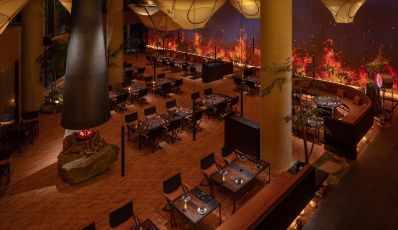
设计思考上这一部分我们精准定位客群背景最敏感的空间要求,打破周边餐饮产品结构及同质化问题,使空间语言及材质与光影的呼应将大厅餐饮氛围感拉满,手法上将体块大开大合,在空间上演几何符号的构成游戏。当人在空间中获得愉悦,意味着不属于真实的游戏规则在产生价值,并且使人们在这个游戏中获得利益。我们希望空间完成从“构建客群生态”到孵化空间载体与时代背景下生活方式的转化,与城市本身的人文情怀一并融入潮汕的筋骨和气血。
The design team grasped the most sensitive space requirements of the customer group and broke away from the homogeneous structure and form of surrounding restaurants. The dialogue of space language, materials, light and shadow maximize the dining vibes of the hall, and the open layout creates a game constituted by geometric symbols. The pleasure gained from the space is the significance and benefits for guests produced by this intangible game. Beyond the concept of “constructing a customer group system”, the design team hopes to turn the space into a medium that drives changes in the contemporary lifestyle that blends into the soul of the Chaoshan spirit and the humanistic sentiments of the city.
二楼进入我们视野的是前台接待与水吧功能结合的多功能服务区,开放式的露台坐拥人间烟火,吧台顶部用当代的几何造型与手工编制的家具及户外家居编织质感的手艺进行碰撞,几何符号围合出了让人具有探索欲望的空间情境。笑看清浅流年,曲径通幽,张扬且含蓄,一场东西方美学与哲学的碰撞。
Up to the second floor, what comes into view first is the multifunctional area composed of the reception counter and water bar. The open terrace enjoys a pleasant ambiance. The contemporary geometric form above the bar counter contrast with the handmade rattan furniture and outdoor woven structures, creating a space atmosphere that encourages people to explore through the use of geometric symbols. The bold yet restrained design generates the collision between Eastern and Western aesthetics and philosophy.
06包罗万象|名馆雅格待高朋 迭进呼应相纵横
All-embracing|An elegant restaurant to receive friends with its echoing and collision charm
以【气韵生动】和【起承转合】来控制节奏和韵律。是化,是无,是空,是间,是微,是合,是生,是气。空间的一分一步都有它的使命所承。城市幕景包罗万象,包房强调与周围环境的对话,以分割比例为建造语言对话建立青砖幕墙,整体强调舒适,强调人与人的互动与交流。
With vibrant and coherent rhythm, each part of the space plays its role. Set against the all-inclusive urban backdrop, the private dining rooms dialogue with the surroundings, and interact with the gray brickwork wall through structural divisions and proportions. The design highlights an overall comfortable and interactive environment, as well as communication among diners.
室外绿色与室内红色的呼应感,具有汉代东方的色彩韵味。以一种不规则的空间形态出现,像自然围合又像建筑的延伸,像意外又像有意而为之,营造了意外的确定感。空间构成理念是一个被折断掏空的雕塑体,让现实变得虚幻。而这样夸张的表达方式,离不开艺术的张力。
The outdoor greenery echoes with the indoor red tone, which reveals the eastern color charm of the Han Dynasty. The irregular spatial form appears as natural enclosures or an extension of the building. Coincidentally or intentionally, it creates an unexpected sense of certainty. The interior design concept takes inspiration from a broken and hollowed sculpture, making the reality illusory. This bold and exaggerated expression is inseparable from the tension of art.
设计团队对漆艺材质的表现形式进行实验性的创作,用大面积漆艺贯连空间,意外的拥有混凝土的质朴,同时也拥有了华丽的视觉。结合地面木地板与收口金属材料的碰撞,软硬的互相推让与和谐,冷暖色彩的交替,收口的细节,表现的是整体产品平和与热闹的和谐,并将热烈、响应、对冲等元素融入空间的建造体系中。
The design team experimented with lacquer art in an innovative way. The large area of lacquer art throughout the entire restaurant unexpectedly retains the simplicity of concrete and meanwhile generates a gorgeous visual effect. The contrast between the wood flooring and metal edging, the harmonious coexistence of hard and soft textures, the alternation of warm and cold colors, as well as the edging details, present a peaceful and lively harmony and integrate various contrasting, resonating elements in the space.
07红色记忆|笑看清浅流年事 纂刻时光镀年华
Red memory|Retrospect the past beautiful memories and depict the future
空间整体动线考虑到消费者的消费动机,我们结合空间整体主替功能做了合理性规划,最终呈现结合功能布局做整体响应。「红」是AD艾克建筑设计团队在用西方的设计秩序来建树东方的空间情绪与哲学。餐厅的整体设计语言促进馆区启动转型融入新消费模式生态:提供多媒介多感官体验,在线流量推动线下体验,空间加强消费客群粘性,助力潮菜品牌推广。这也是AD全案策划团队的服务宗旨。
The guests’ consumption motive was a key consideration in the circulation design, so the design team worked out a rational layout based on the main and auxiliary functions of the overall space. AD ARCHITECTURE used Western design order to build Eastern spatial sentiments and philosophy in the restaurant space. The overall design language of the restaurant introduces a new consumption mode into the library area to drive its operational transformation. The restaurant offers a multi-media and multi-sensory experience and improves the offline experience through online media promotion. The space design aims to increase consumer stickiness and promote the Chao cuisine brand, which is exactly the objective of AD ARCHITECTURE in this project.
∇ 平面图 1F © 艾克建筑设计 Plan 1F © AD ARCHITECTURE
∇ 平面图 2F © 艾克建筑设计 Plan 2F © AD ARCHITECTURE
项目信息
项目名称:「红」·经典潮菜(深圳店)
项目业主:深圳市潮膳荟餐饮
设计机构:AD ARCHITECTURE|艾克建筑设计
总设计师:谢培河
项目地点:深圳
建筑面积:600 ㎡
主要材料:不锈钢、亚克力、岩板、意大利手工漆、定制木地板
设计时间:2023年1月
竣工时间:2023年5月
项目摄影:欧阳云
Project name: Red Classic Chao Cuisine, Shenzhen
Client: Shenzhen Chaoshanhui Catering Co. Ltd.
Design firm: AD ARCHITECTURE
Chief designer: Xie Peihe
Location: Shenzhen
Area: 600 sqm
Main materials: Stainless steel, acrylic, sintered stone, Italian handmade paint, bespoke wood flooring
Design time: January 2023
Completion date: May 2023
Photography: Ouyang Yun


