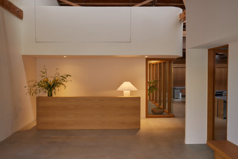
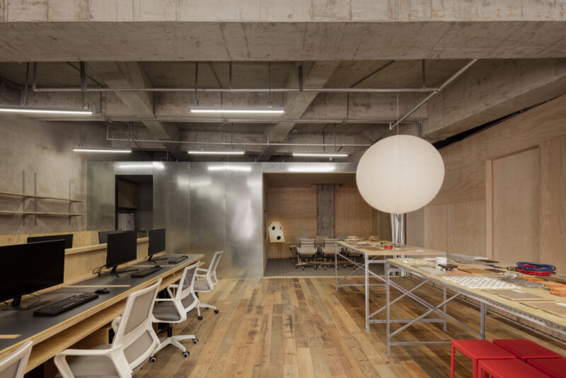
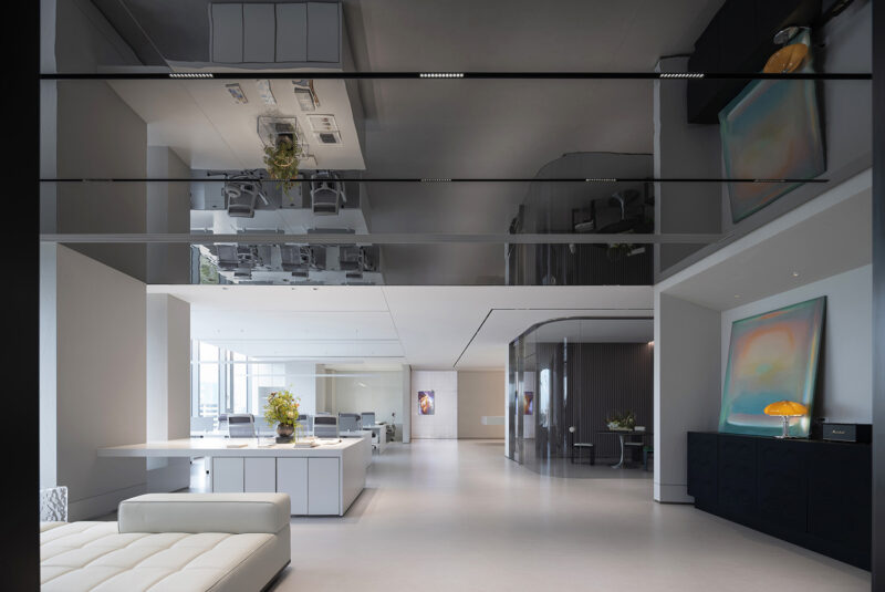
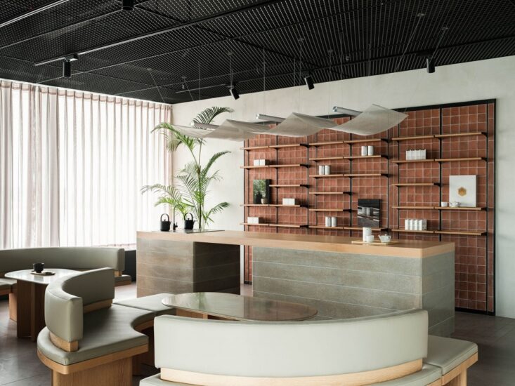
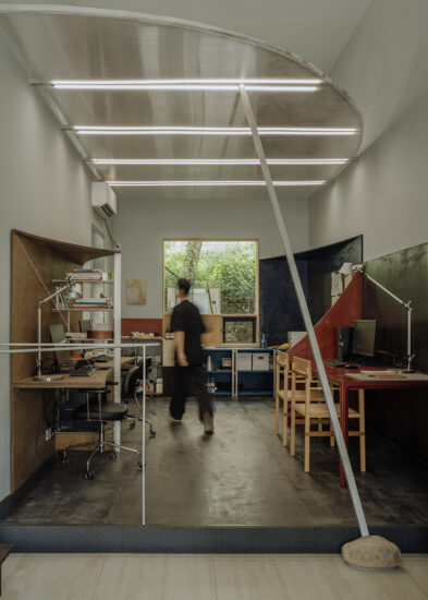
我们这次选择了一处拥有独立院落的住宅空间作为新的办公场所。
面对相比原工作室缩小近40%体量的情形,如何合理且有效利用空间,同时营造一处弱化办公标签的场所成为了我们此次设计尝试的方向。
We have chosen a residential space with an independent courtyard as our new office space this time.
Faced with a reduction of nearly 40% in size compared to the original studio, how to make reasonable and effective use of space while creating a space that weakens office labels has become the direction of our design attempt this time.
原始户型属于框架式结构,全屋只有两根柱子。这在住宅建筑里较为少见,该结构形式极大的满足了我们在空间布置上去挖掘更多可能性。
The house type belongs to a frame structure, with only two columns throughout the house. This is less common in residential buildings, and this structural form greatly satisfies our exploration of more possibilities in spatial layout.
∇ 开物营造分析动画
布局优化 esign scheme
缩小原有入口,使其与厅内柱体北侧齐平。拆除部分墙体后通过“H”形动线的设置,分离出洽谈区与陈列区的功能,同时分离出南北两条动线脉络。原有的朝南三开间布局确定了主办公区的位置,将原双阳台结构改为单阳台,并将阳台与客厅之间的墙体南移,扩大室内有效面积的同时,确立了阳台“灰空间”的属性,并在阳台东西两侧墙体上设置窗户,使阳台成为“光盒”,为东西两个房间引入采光。 拆除原厨房、客卫及北侧房间隔墙,通过空间的相互错位借用,建立起新的茶水、客卫与书房/休息室布局,实现了空间的进一步利用。
Reduce the original entrance to be level with the north side of the pillars in the hall. After dismantling some of the walls, the functions of the negotiation area and the exhibition area are separated through the setting of an “H” shaped moving line, while also separating the two moving lines of the north and south. The original three bedroom south facing layout has determined the location of the office area, changing the original double balcony structure to a single balcony, and moving the wall between the balcony and the living room south to expand the effective indoor area. At the same time, the property of the balcony as a “gray space” has been established, and windows have been installed on the walls on both sides of the balcony, making it a “light box” and introducing daylight to the east and west rooms. Dismantle the original kitchen, guest bathroom, and partition walls of the north room, and establish a new layout of tea, guest bathroom, and study/lounge through mutual displacement and borrowing of space, achieving further utilization of space.
∇ 开物营造分析图
∇ 入口使用内部空间相同的材料来实现内外视觉上的一致性
The entrance uses materials with the same internal space to achieve visual consistency both inside and outside
∇ 入口看向内部视角 Looking indoors from the entrance
进入“H”动线的第一条通道,通道右侧为洽谈室,左侧为茶水间,自然光从南北两侧交错涌入,与暖色桦木板覆盖的墙体营造出整体秩序感。
Enter the first channel of the “H” streamline, with a negotiation room on the right and a pantry on the left. Natural light flows in from both sides, creating an overall sense of order with the warm birch board covering the wall.
∇ 由北向南视角 View from north to south
“H”动线的横向连接通道将洽谈区与“L”型陈列柜分为东西两个体块,在洽谈区木屋上设置了三组不同高度不同形态的洞口,将障子纸嵌入方形窗洞,通过灯光开关的控制,使木屋呈现“点亮”的动态效果,形成有趣的互动。
The horizontal connection channel of the “H” streamline divides the negotiation area and the “L” display cabinet into two individual blocks, east and west. Three sets of holes with different heights and shapes are set up on the wooden house in the conference room, and paper is embedded in the square window opening. Through the control of the light switch, the wooden house presents a dynamic effect of “lighting up”, forming an interesting interaction.
∇ 茶水间看向洽谈室及工作区 The pantry looks towards the negotiation room and work area
∇ 入口走廊由西向东视角 View from west to east of the entrance corridor
∇ 入口走廊与洽谈区 Entrance Corridor and Discussion Area
∇ 洽谈区看向陈列柜,呈现出H动线与功能区的关系
The negotiation area looks towards the display cabinet, presenting the relationship between the H streamline and the functional area
∇ 洽谈区看向工作区 Discussion area looks towards the workspace
∇ 工作区与陈列区及洽谈区 Work area, exhibition area, and discussion area
∇ 工作区由南向北全貌 Overview of the work area from south to north
∇ 利用洽谈室南侧的立面设置了材料展示架
A material display rack was set up on the south side facade of the discussion room
∇ 材料架细部 Material rack details
∇ 工作台细部 Workbench Details
∇ 陈列柜细部,贯穿式的洞口增进了两个空间的联系,并将更多光线引入
The details of the display cabinet and the penetrating openings enhance the connection between the two spaces and introduce more light into them
∇ 工作区看向接待室 Looking towards the reception room from the work area
∇ 接待室兼茶室功能,因地制宜的采用了定制木质长桌,满足了更多场景需求
The reception room also serves as a tea room, using customized wooden long tables tailored to local conditions to meet the needs of more scenarios
∇ 接待室细部 Reception Room Details
∇ 接待室与办公区 Reception and office areas
∇ 接待室窗景 View outside the window of the reception room
∇ 独立办公室 Independent Office
∇ 独立办公室细部 Independent Office Details
∇ 柜体北侧的洞口看向独立办公室及工作区,贯穿的洞口为空间增加了更多的趣味
The opening on the north side of the cabinet looks towards the independent office and work area, and the penetrating opening adds more fun to the space
∇ 工作室庭院鸟瞰视角 A bird’s-eye view of the studio courtyard
∇ 平面图
项目信息
项目名称: 开物营造办公室
Project name:KaiWu Design Office by Kai Wu Design
设计公司: 开物营造研究室
Design:Kai Wu Design
项目地址:江苏南通
Project location:NanTong
项目类型:办公空间
Project type:office
设计年份:2022.6
Design year:2022.6
项目完成年份:2023.4
Completion Year:2023.4
建筑面积:105㎡
Gross built area: 105㎡
主持设计师: 高远
设计团队:张聪 张雯静
Leader designer & Team:GaoYuan ZhangWenjing ZhangCong
摄影版权:©川河映像 ©高远
Photo credit: ©川河映像 ©高远


