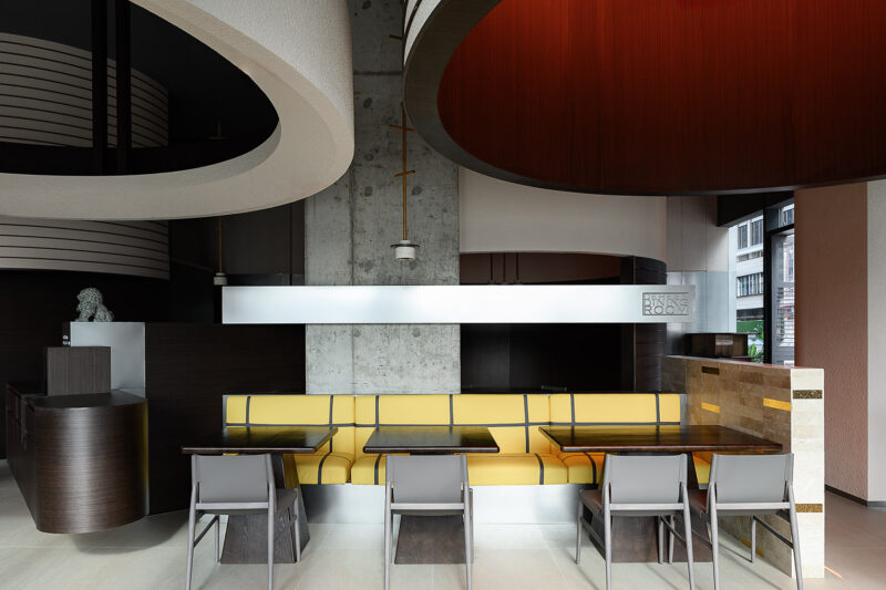
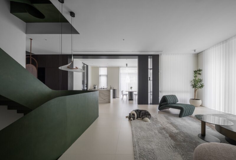
A3 VISION艾舍尔设计将他标志性的实用主义美学应用于5号餐厅设计,工作室解释说:“对空间的重新构想始于将一切都削减到最合适的状态,其中一切都以某种有序、最有效和最好的方式设计,它们通过空间、比例、光线和材料的纯粹相互作用,以产生最大程度的清晰度和纯度。”
A3 VISION, renowned for its iconic utilitarian aesthetic, has applied this style to the design of Restaurant No. 5. The studio stated that, “The transformation of the space began by simplifying everything to its most suitable state, where each element is designed in an ordered, efficient, and optimal manner, utilizing the natural interaction of space, proportion, light, and materials to achieve the utmost clarity and purity.”
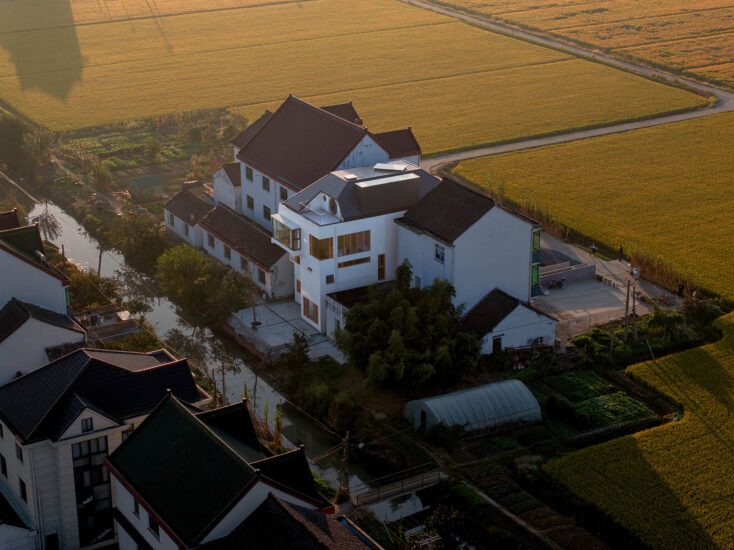
该建筑是个单层式的独立建筑,在重新设计之前,该建筑是企业的文化活动中心,此次通过重新规划创建了一个独特的开放式轻餐食空间。
The building is a standalone single-story structure. Prior to the redesign, it functioned as the cultural activity center for the enterprise. The redesign aimed to create a distinctive, airy dining area.
明亮、开放的空间关系
Bright and openspatial relationship
吧台区位于主入口的位置,使用了浅色水洗面花岗岩和拉丝不锈钢两种材质,花岗岩的纹理和不锈钢的光滑搭配在一起,轻盈而明亮。
The bar area,located at the main entrance, is constructed from two materials: light-colored washed granite and brushed stainless steel. The texture of the granite and the smoothness of the stainless steel complement each other, resulting in a bright and airy ambiance.
四周通体落地玻璃把室内空间与室外的自然景色融合在一起,轻巧而透明,呈现出「穿透」与「流动」的质感。在这里,流线和走道相互重叠、连接,人们在室内获得更高的自由度和多样的活动体验。
The floor-to-ceiling glass throughout the space seamlessly integrates the indoor environment with the natural scenery outside, creating a sense of lightness and transparency that promotes a feeling of ‘penetration’ and ‘flow’. The flow lines and walkways overlap and connect, providing individuals with greater freedom and diverse activity experiences within the space.
简单、自然、舒适的氛围
Simple, natural,comfortable atmosphere
大面积柚木天然材料地板,使室内保持温暖和简单,白色的顶部和深色木地板地面,在视觉上分为上与下、轻盈与厚重的关系。
The interior is kept warm and simple with large areas of natural teak flooring. The white top and dark wood floors are visually divided into upper and lower sections, creating a contrast between lightness and heaviness.
整个室内是一个围绕中心点旋转上升的开放式平面,利用落差形成四个不同的高度平台作为就餐空间,形成多层次的就餐区域。天气晴朗时,阳光透过玻璃洒满室内,人们在里面与周围的盎然绿意互动共生、相映成趣。
The entire interior is designed as an open plan that revolves and ascends around a central point, utilizing the varying heights to create four distinct elevated platforms as dining spaces, forming a multi-level dining area. On sunny days, natural light streams through the glass, infusing the interior with lush greenery, fostering an interactive and harmonious atmosphere between the occupants and the surrounding environment.
由于没有明显的棱角,围护界面的物质属性被消解,室内与室外的界限模糊,空间本身成为唯一凸显的主角。
Because there are no distinct edges and corners, the material attributes of the enclosure interface are dispelled, the boundaries between indoor and outdoor are blurred, and the space itself becomes the only prominent protagonist.
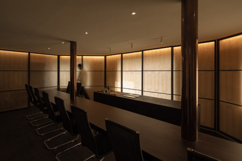
夜幕降临,室内亮起了温暖的灯光,整个建筑升起,漂浮在地面上,轻盈又明亮。
As night falls, the room lights up warmly, the whole building rises, and the ladle floats on the ground, light and bright.
∇ 平面图 Floor plan © 艾舍尔设计
∇ 立面图 Elevation © 艾舍尔设计
项目信息
项目名称:5号餐厅
项目地址:上海
建筑面积:300平方米
室内设计:艾舍尔设计
设计总监:王志峰
项目总监:范进
设计深化:裴泳翰
建筑设计:formless design
项目时间:2023年3月
项目摄影:yuuuunstudio
Project Name: Restaurant No. 5
Project Address: Shanghai
Building Area: 300 sqm
Interior Design: A3 VISION
Design Director: Wang Zhifeng
Design Management: Fan Jin
Design Team: Pei Yonghan
Architectural Design: formless design
Project Time: March 2023
Photography: yuuuunstudio


