南枝凭昨记,回味旧粤香
Memories of South Branch Sign, Savoring the Old Cantonese Fragrance
味道甚至是难于记忆的,只有你又闻到它你才能记起它的全部情感和意蕴。——史铁生
Even the taste can be challenging to remember, but once you smell it again, you can recall all its emotions and significance.——Shi Tiesheng
近十年间,广东味以其饮食风味和餐饮文化在内地的大街小巷遍地开花,大有百花齐放的繁华态势。与一般快餐速食不同,南枝记作为新派广式餐厅在传承之余也在以变换姿态,展现出在地性与现代性,用实力成为港餐的代表之一。本案落址于江苏常熟的“城市会客厅”——溪里花园,以烹炒镬气与和美氛围为远近居民提供了一个聚餐好去处。
Over the past decade, Guang Dong-style cuisine has flourished the Chinese mainland, with its culinary flavors and dining culture blooming in streets and alleys. Unlike typical fast food, South Branch Sign, as a contemporary Guang Dong-style restaurant, not only inherits tradition but also demonstrates its locality and modernity. Located in Xilihuayuan, the “urban living room” of Changshu, Jiangsu, it offers a dining haven for local residents, blending the aromas of stir-fried dishes with a harmonious ambiance.
南枝向暖
South Branch Sign’sWarmth
以老广东味为餐饮发心,用新装潢演绎多样食味,常熟南枝记通过对颜色、质感与形态的把控,将餐饮区域营造出家庭之味,让“带家人吃饭,就到南枝记”超越语言与口号,成为店中可观可感的餐食与环境。
Inspired by the old Guang Dong flavors, South Branch Sign interprets diverse tastes through its new decoration. By controlling colors, textures, and forms, it creates a homely dining area, where the idea of “having a meal with family, go to South Branch Sign” transcends language and slogans, becoming a tangible experience of food and environment.
主门头处,纵横的彩色钢管板材交织出工业风格,反射出柔和光泽,斜置的穿插体块则用自由形态与柔和笔触与色彩展现出不羁趣味。在这自由现代的气息中,LOGO衬于童真笔触的浅淡颜色之上,与木饰卡座交映,温润而又质朴的观感就此形成。悬置半空的圆环显示器既增加了空间的动感趣味,也成为品牌文化与店面营销的重要输出平台。
At the main entrance, colorful steel plates intersect to form an industrial style with soft luster. Intersecting and slanted elements convey a sense of playfulness with a free-spirited touch of color. In this modern and free atmosphere, the logo stands against a pale color background with a childlike touch, harmonizing with wooden decorations to create a warm and simple atmosphere. The suspended circular monitor not only adds dynamism to the space but also serves as an important platform for brand culture and storefront marketing.
旧时记忆
Old memories
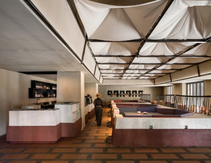
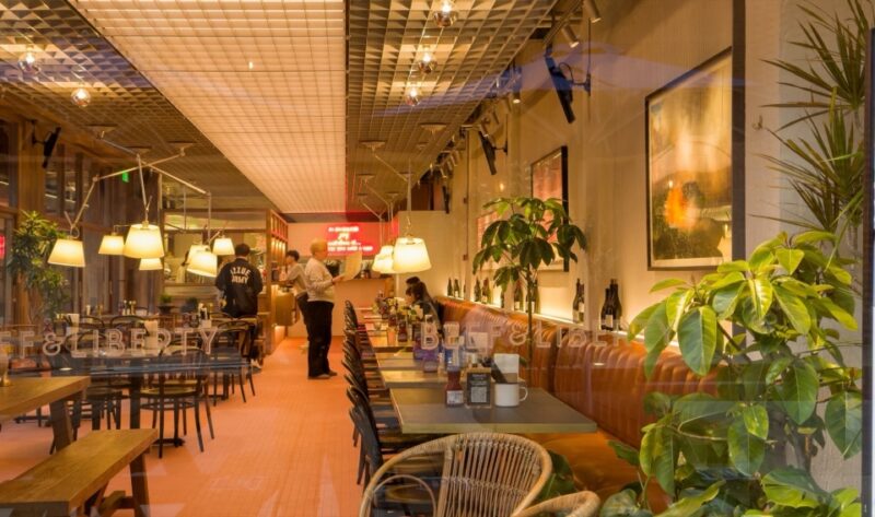
步入店内,四周浅色原木遍布各处,成为家庭温馨的物质载体,让往来食客都可感受到安然气息。体块天花与金属装饰杆靠墙而设,与产品宣传共同营造出旧时广东茶档风格,置身其中,宛如回到了旧时街头。
Upon entering the restaurant, light-colored wooden materials are spread throughout, creating a warm and welcoming atmosphere. Rectangular ceilings and metal decorative rods against the walls, together with product displays, evoke the style of old Guang Dong tea stalls, transporting diners back in time.
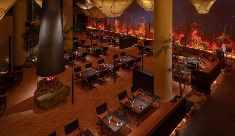
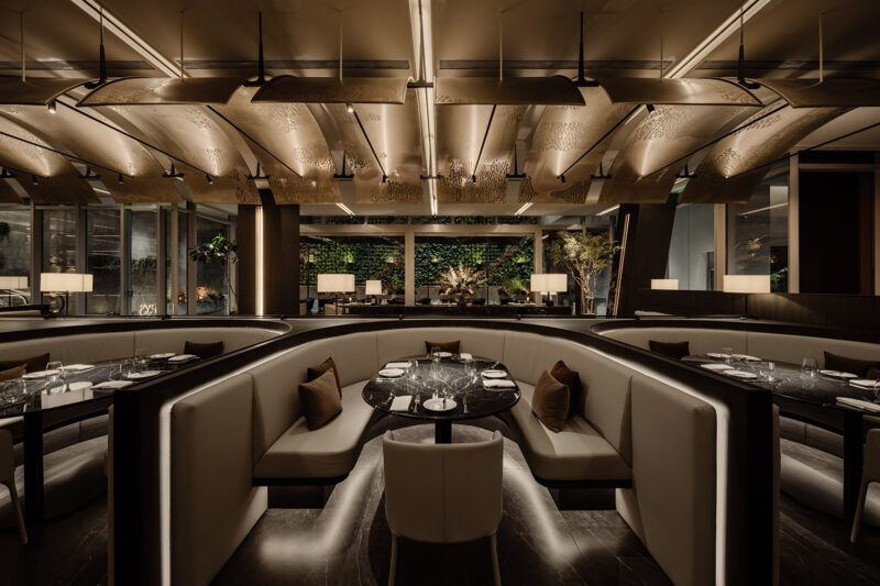
卡座与散座分设两边,以木质与大理石的组合一以贯之,从而构建出空间的变中有序。圆桌散座更是以倒椎桌形,增添更多活泼之气。在方圆座位之上,环形吊灯状似屋形积木串联而成,与横梁立柱的彩色涂鸦交相辉映,天真与自由、童趣与烂漫于细枝末节尽情展露。
The restaurant is divided into booth and free seating areas, with consistent use of wood and marble to maintain orderly spatial variations. Round tables adopt inverted trapezoidal shapes to add a lively atmosphere. Above the seating areas, circular pendant lights resemble house-shaped building blocks, and they complement the colorful graffiti on the beams and columns, expressing innocence, freedom, playfulness, and romance in every detail.
行至深处,出餐档口以红色铁艺聚焦视觉中心,辅以木质格栅柜展示产品特色,与背后的透明玻璃窗共同构筑出洁净而整饬的店面风格,扩展空间的同时,为食客带来信赖与安心。
As you move further inside, the kitchen counter at the serving area takes center stage with its red ironwork, and wooden lattice cabinets display product characteristics. Together with the transparent glass windows behind, they create a clean and orderly storefront style, expanding the space and building trust and reassurance among diners.
堂中立柱成为自助服务台,一面用红色火山岩石打造复古质感,给人以无限遐想;另一面则用深蓝铁艺点缀高低木柜,藉由色彩的碰撞,调和空间的沉稳与活泼。
The central pillar in the dining area becomes a self-service counter. One side is built with red volcanic rock for a retro feel, sparking endless imagination. The other side is decorated with deep blue ironwork accents on high and low wooden cabinets, balancing the space’s stability and liveliness through color contrast.
转角洗手台以内嵌形式成为景观一角,以经典的红黑配色酝酿港风格调,显现出喧嚣之外的旧时华光。顶灯光影间,粗粝壁砖映照出别样质感,此间优雅就在喧嚣与水声中落下,与周围的年轻活力共舞出时刻变换的店中风景。
Corner washbasins are embedded as a scenic corner, featuring classic red and black colors to evoke a nostalgic Hong Kong style, offering a glimpse of the old-time charm amid the hustle and bustle. Amidst the interplay of overhead lights and textured rough wall bricks, elegance unfolds within the bustling atmosphere, dancing with the surrounding youthful energy in this ever-changing restaurant scene.
岁月积淀底蕴,也带来更迭与成长,就如同现在的南枝记,一步一步,走向明确的清晰,以及越来越完整的成熟,这与一个家的建立过程如出一辙。设计师从简单处着笔,以童真的简单浪漫描摹南枝记的“初心”,无论是餐食还是氛围,属于“家”的安然质朴于动静张弛间缓缓透露,让品牌理想与食客体验在和谐温馨的环境中共生共荣。
Years of accumulation bring depth and growth, much like South Branch Sign today. Step by step, it becomes clear and increasingly mature, mirroring the process of building a home. The designers begin with simplicity, capturing the “original intention” of South Branch Sign in its purest form. Whether in food or ambiance, the tranquility and simplicity of “home” gently reveal themselves amid the ebb and flow, allowing brand ideals and diner experiences to thrive in a harmonious and cozy environment.
项目信息
项目名称:南枝记
Project Name: South Branch Sign
项目地址:常熟蛇口招商琴湖花园店
Location: Changshu, China
设计单位:无锡欧阳跳建筑设计有限公司
Design Company: OYTT Design
主案设计师:欧阳跳、蒋越
Chief Designer: Tiao Ouyang,Yue Jiang
落地主案设计师:周丹凤
Landing Designer: Danfeng Zhou
项目面积:285㎡
Area: 285 square meters
制造:无锡莫川装饰、郅飞展柜
Manufacturer: Wuxi Mochuan Decoration, Zhifei Exhibition Cabinet
灯光:无锡米未照明
Lighting: Wuxi Miwei Lighting
主要材料:大理石、不锈钢、防火板、艺术漆、定制砖
Main materials: marble, stainless steel, fireproof board, artistic paint, customized bricks
材料品牌:臻藏时光、墨墨瓷砖
Material Brand: Zhencang Time, MOMO Ceramic Tile
项目摄影/视频:马利仁
Photographer/Video: Liren Ma


