TIZI DESIGN受辛宣科技邀请为其打造位于杭州临平新城,滨耀城的新办公楼,在此设置运营及展示中心,紧邻艺尚小镇与艺尚小镇潮流街区,是时尚企业总部的聚集带,滨耀城位于临平繁华中轴线迎宾路上。辛宣位于滨耀城11#10F,建筑面积约1000㎡,四周环绕着大窗户,自然光线充足,城市全景(艺尚小镇、潮流街区、东湖公园、迎宾公园等)尽收眼底。
TIZI DESIGN was invited by XINXUAN Technology to build a new office building in Binyao City, Linping New City, Hangzhou. It has set up an operation and display center here. It is close to the fashion block of Yishang Town and YISHANG Town. It is the gathering belt of the headquarters of fashion enterprises. Binyao City is located on Yingbin Road, the bustling central axis of LINPING. XINXUAN is located at 11#10F of BINYAO City, with a construction area of about 1000m2, surrounded by large windows, plenty of natural light, and a panoramic view of the city (YISHANG Town, Fashion Block, East Lake Park, YINGBIN Park, etc.).
∇ ©来源于网络
∇ Plan 平面图
空间设有办公区、多功能区、接待室、主理人办公室、茶水空间、展示厅,生活区域。设计师结合区域使用频率及长期主义来规划空间,阳光从东升到西落,东方设置为工作区及主入口,跟着光线行走,其它功能区域沿“中心筒”依次展开,每一位来访者都获得“完整”的空间体验。
The space is equipped with office area, multi-functional area, reception room, manager’s office, tea space, exhibition hall and living area. The designer combines the frequency of regional use and long-termism to plan the space. The sun rises from east to west, and the east is set as the work area and the main entrance. Walking with the light, other functional areas unfold along the “center cylinder” in turn, and each visitor gets a “complete” space experience.
∇ Shooting the building from YINGBIN Road 从迎宾路拍摄下楼宇
整层在夜色下整层散出现代、明亮、和谐的时尚气息。梯子设计回应辛宣科技提出“对外展现品牌品牌化形象,向内体现员工关怀”的诉求,双方共同创造一个面向客户、团队协作、以幸福体验为驱动力的工作场所及展示空间。妥善利用楼层视野,临街界面及周边景观,充分发挥项目的优势,将开放、通透、自然的理念植入,设计思考如何在任一场域都能收获远跳的绝挂景观。达到抬头有景、眼前有韵,办公区设置在场所的东方,中午至下午阳光向西移位,办公区域实现低碳节能,展示区域结合模块化灯光模拟自然光照。
The exterior exudes a modern, bright and harmonious fashion atmosphere in the night. The TIZI design responds to Xinxuan Technology’s appeal of “showing the brand’s brand image externally and reflecting employee care internally”. The two sides jointly create a customer-oriented workplace and display space with teamwork and happy experience as the driving force. Make good use of the floor view, the street interface and the surrounding landscape, give full play to the advantages of the project, implant the concept of openness, transparency and nature, and design and think about how to harvest the unique landscape of the long jump in any area. The office area is set in the east of the place, and the sun is shifted westward from noon to the afternoon. The office area is low-carbon and energy-saving, and the display area is combined with modular lighting to simulate natural light.
∇ Elevator Entrance 电梯入口处
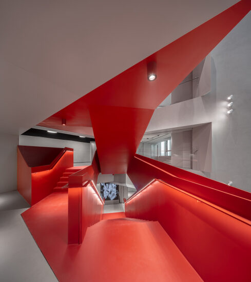
业主给予预算充足,设计才有了大刀阔斧。将原本精装的电梯间全部拆除,从出电梯的这一步到下电梯的前一脚空间调性都保持高度统一,电梯上到10层,明快的色调及动态视觉自动进入眼帘,步入其中,镜面吊装的工艺要求,看上去更加开阔与通透,镜面天花映衬着潮流影像,虚实交错、空间简约、明快、摩登。
The owner gave a sufficient budget to make the design bold. Remove all the original hardcover elevator rooms. From the step of getting out of the elevator to the front of the elevator, the space tone is highly unified. When the elevator goes up to the 10th floor, the bright tones and dynamic vision automatically enter the eyes. When you step into it, the process requirements of mirror lifting look more open and transparent, and the mirror ceiling is reflected. Trendy images, virtual and real staggered, simple space, bright and modern.
∇ Office Entrance 办公室入口
空间的质感基于对细节的把控,TIZI DESIGN选用不同的纹理、不同光感的岩板,平面与富有流动纹理的两种岩板搭配,远看有型,近细有细节。地面、墙面、接待台、均采用岩板制作而成,,接待台的背景与室外保留一簇空间,不规划的入口引导我们进入内部空间,简约主义的美学,充满设计感,LESS IS FUN,简而有型,简而有趣。
The texture of the space is based on the control of details. TIZI DESIGN chooses rock slabs with different textures and different light senses. The plane is matched with two kinds of rock slabs rich in flowing texture. The ground, the wall, and the reception desk are all made of rock slabs. The background of the reception desk and the outside retain a cluster of space. The unplanned entrance guides us into the internal space. The aesthetics of minimalism is full of design. LESS IS FUN, simple and stylish, simple and interesting.
∇ Entrance perspective and DP point 入口视角及DP点
LOGO以投影的方式呈现,顶面黑色回型灯围绕中心筒展开,也是空间环型动线的的引向。由入口看向多功能区,正对面大柱子旁边的“小柱子”是设计师设计上去的,与原结构大柱子结伴,通过展台DP点相连,形成有趣的微妙平衡。
LOGO is presented in the form of projection, and the black return lamp on the top side unfolds around the center cylinder, which is also the direction of the space ring moving line. Looking from the entrance to the multi-functional area, the “small column” next to the large column directly opposite is designed by the designer. It is accompanied by the large column of the original structure and connected through the DP point of the booth to form an interesting and delicate balance.
主理人经由主入口,穿过多功能区域快捷进入。
The manager enters quickly through the multi-functional area through the main entrance.
∇ Multi-functional area 多功能区域
开放、融合式办公室与多功能区通过展台半隔开,开放式休息区运用镜面材质将街道、公园的景色尽收眼底,向外借景,向内延伸。
The open and integrated office and the multi-functional area are half separated by the booth. The open rest area uses mirror material to get a panoramic view of the street and the park, borrowing the scenery from the outside and extending inward.
∇ Open office area开放办公区
敞开式办公空间竞争意识及积极性会受周边人的状态影响,所有人的工作状态都将处于公众的可视范围内,行为规范及秩序性都在伙伴间自我约束中产生,构成乐观与积极的工作氛围,从而无形中促进当下工作表现。
The competitive awareness and enthusiasm of the open office space will be affected by the state of the people around them. The working state of everyone will be within the visual scope of the public. The code of behavior and order are generated in the self-discipline between partners, forming an optimistic and positive working atmosphere, thus invisibly promoting the current work performance.
∇ Meet room 洽谈室
墙面采用毛毡饰面,能够达到降低音效的作用。
The wall is decorated with felt, which can reduce the sound effect.
∇ Water bar水吧
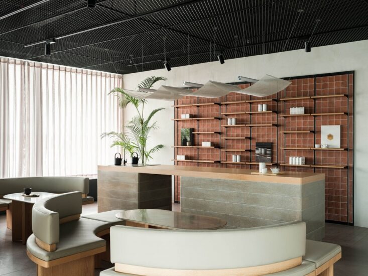
工作区与展厅转角处增设了陈设区,可作为活动水吧及展示区域,发光的层板为转角处增加了亮点,移步易景。紧跟动线来到四个展示区域,简约富有质感而又风格迵异,以回应不同的产品调性。每个展厅都有一个清晰的主题与焦点、展厅IP化。
A display area has been added at the corner of the work area and the exhibition hall, which can be used as an activity water bar and display area. The luminous laminate adds highlights to the corner and moves to the view. Follow the moving line to the four display areas, which are simple, full of texture and different styles, in response to different product tones. Each exhibition hall has a clear theme and focus, and the exhibition hall is IP-based.
∇ BQYR showroom 碧沁伊人展厅
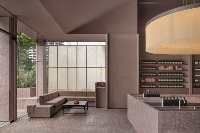
碧沁伊人是韩系、简约的。柔光艺术灰作为整个空间的底色,辅以线性灯光,展厅坐拥两个开放转角视野,顶面以镜钢材质将自然景观引入室内、扩展了空间的视野。开阔的视野在展厅不会显得封闭。
BIQINYIREN are Korean and simple. Soft light art gray is the background color of the whole space, supplemented by linear lighting. The exhibition hall has two open corner visions. The top surface is made of mirror steel to introduce the natural landscape into the interior and expand the view of the space. The broad vision will not appear closed in the exhibition hall.
∇ From passing through to the YITI showroom从过道看向壹题展厅
方有方的直率,圆有圆的特色,“斜”是不被定义,简约富有灵动性。/ 被用作黑白系品牌“壹题”视觉特色。橱窗的半高斜墙,被设计师打趣的称之为“躺赢”,从橱窗到墙面及纵横交错的顶面,统一贯穿,单一的元素重复使用,带来极致的震憾性。
Square and straight, round with the characteristics of round, “slant” is not defined, simple and flexible. / It is used as a visual feature of the black-and-white brand. The half-height slanted wall of the window is called “lie-win” by the designer. From the window to the wall and the crisscrossing top, it runs through, and the single element is reused, bringing the ultimate shock.
大胆又大量的黑色运用增加了视觉力量,在第一眼就抓住顾客的目光,顶面纵横交错,灯具要求与顶面完全嵌入,干净、利落,暗纹的地面给空间带来灵动色彩,黑色均由金属板制作完成,质感与酷感兼俱。
The bold and large use of black increases the visual power. It catches the customer’s eye at the first glance. The top surface is crisscrossed. The lamp is required to be completely embedded with the top surface. It is clean and neat. The dark ground brings flexible color to the space. Black is made of metal plate, and the texture is both cool.
∇ Down jacket of goose down showroom鹅绒服展厅
鹅绒服以纯净、轻盈、质感为设计方向,模块化灯具带来自然光般的光照,智能化灯光控制根据可根据室外天气变化来做调节。
The goose down jacket is designed with purity, lightness and texture. Modular lamps bring natural light, and the intelligent lighting control can be adjusted according to outdoor weather changes.
∇ Material details 材质细部
挂杆被隐藏,只将产品展示出来。墙面金属板提供了丰富而又细腻的质感。
The hanging rod is hidden and only the product is displayed. The wall metal plate provides a rich and delicate texture.
∇ Breakout areas休息空间
员工生活区也被认真设计,优秀的员工是公司的核心资产,员工满意度也是当下企业被衡量价值的一个重要指标。
The employee living area has also been carefully designed. Excellent employees are the core asset of the company, and employee satisfaction is also an important indicator of the measured value of the current enterprise.
∇ Washroom 洗手间
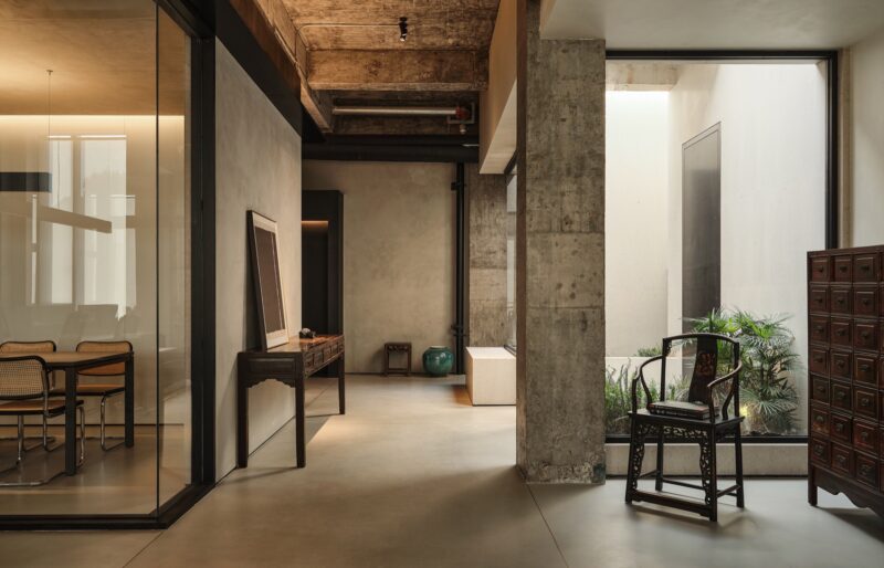
原有洗手间区域被重新规划设计,将入口做了调整,自然当线的引入,达到了节能的效果同时提升了西北角的整个视野。原建筑的一个角落设计成精美的壁龛。轮廓的简约需要细节的支撑,与展示区域形成微小的反差,简而有趣。
The original bathroom area has been redesigned, the entrance has been adjusted, and the natural line has been introduced to achieve energy-saving effect and improve the entire vision of the northwest corner. A corner of the original building was designed as an exquisite niche. The simplicity of the outline requires the support of details, forming a slight contrast with the display area, which is simple and interesting.
项目信息
项目名称:辛宣办公室
Project name:XINXUAN OFFICE
项目类型:室内
Project type:Interior
项目地址:杭州
Project location:hangzhou
完成年份:2024
Completion Year:2024
设计团队:王斌 朱强
Leader designer & Team:WANGBIN,ZHUQIANG
联系邮箱:443936741@qq.com
Contact e-mail:443936741@qq.com
建筑面积:1000㎡
Gross built area: 1000㎡
材料:艺术涂料、微水泥、大理石、钢
Materials:art coatings, micro cement, marble,stainless steel
品牌:杭州辛宣科技有限公司
Brands:Hangzhou xinxuan technology Co., LTD.
杭州梯子室内设计有限公司
梯子设计成立于2024年,是一家创意设计公司,这些年在时装空间、买手店、办公及餐饮空间等多个领域均有不同的实践与成果,提供包托品牌设计、空间设计、创意策划等服务。坚持“设计+服务”为信念来设计每一个项目,最终通过高质量的呈现给客户及客人,倡导以简约的美感及舒服的感官来塑造场所气质。


