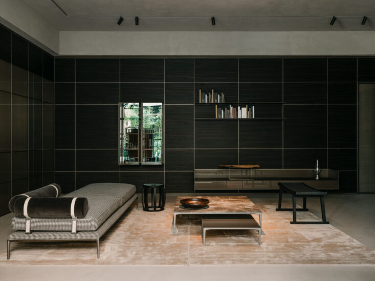
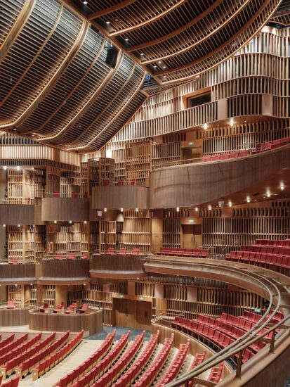
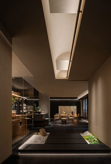
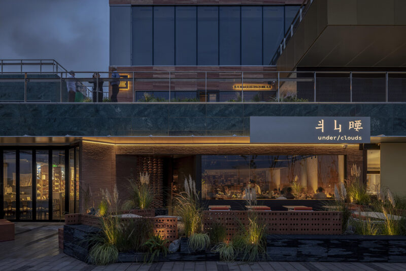
由Sò Studio设计改造的「虹桥天地HUBO」,连接着上海最核心的城市枢纽之一「虹桥交通枢纽」。约为3公里的地下连廊中,分布着庞杂的交通通道、办公中心和服务业态,却宛若一座迷宫。
The HUBO designed and renovated by Sò Studio is connected to the “Hongqiao Transportation Hub”, one of the core urban hubs in Shanghai. The approximately 3KM underground corridor is dotted with numerous traffic passages, office centers, and service offerings, but it looks like a maze.
∇ © 好人古斯 & 汪敏杰
© haorengusi & Wang Minjie
∇ © 好人古斯
© haorengusi
∇ 改造前的通道 © Sò Studio
Before renovation © Sò Studio
空间尺度过大、指向不明、重复性高、照明单一面对诸多待解决的问题,它还有更具想象的可能性吗?如何给来往的商旅人士一个在此停留的理由?空间如何服务于人?我们以设计寻找答案。
The spatial scale is too large, the direction is unclear, the column repeatability is high, and the lighting is unpleasant… Faced with many problems to be solved, is there any more imaginative possibility? How to give business travelers a reason to stay here? How does space serve people? We find answers through design.
01以人为尺度
Space design should be based on human scale
过于庞大的空间,给人方向不明的感受。改造的第一步,是从尺度入手,让通道清晰可观。
The space that is too large gives people the feeling of unclear direction. The first step in the renovation is to start with the scale to make the space clear and visible.
∇ © 好人古斯 & 汪敏杰
© haorengusi & Wang Minjie
∇ 利用柱体结构搭建纵横交叉的结构式舒适空间 © Sò Studio
Articulate the design idea © Sò Studio
设计师在原有空间的基础上重新整合,缩窄过宽的廊柱,并附上醒目的提示栏,改善了原本遮挡视线的问题,更增加空间的趣味性。
The designer reorganized the original space, narrowed the overly wide corridors between columns, and attached eye-catching reminder bars, which improved the original problem of blocking the line of sight and made the space more interesting.
∇ © 汪敏杰
© Wang Minjie
此处内容需要权限查看
会员免费查看


