LOFT中国感谢来自宝岛台湾和和设计HOHO DESIGN的冉冉璞宅案例分享:
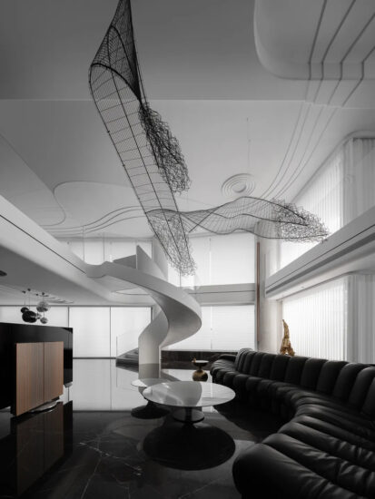
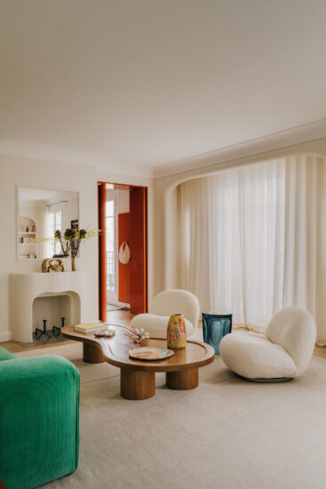
有更扑朔的灰、或有更净洁的白,在此演绎为空间气息时,有如早晨晨光的析透澄亮,柔柔筛过大地伏蛰一整夜的灰蒙,而后,凝炼的灰与白,曳洒一室。
There is a grayer shade or whiter pale. As colors transfigure the aura of space, the clear morning light is filtered through a misty gray that lurks throughout the night. The translucent color fields of gray and white spill over the room.
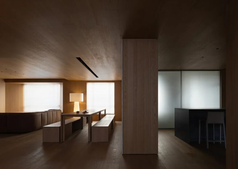
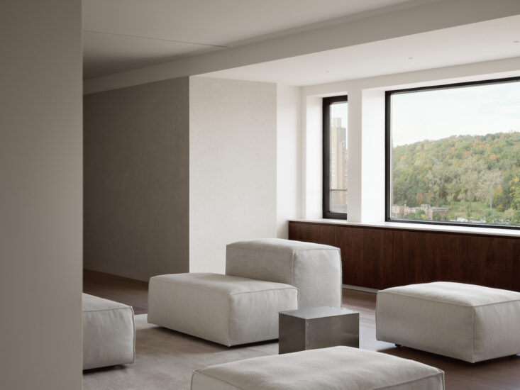
这让动线(线条)的纵横轴,在划分住家空间功能时,有更精确的指标;坐在客厅可以每日欣赏冉冉上升的晨光与夕阳,站立窗缘往下看是绿地公园,环境的洁净度,色彩的纯度,能去除制式围塑的格局,好让自然光影纳进,亦包覆容纳更多的异质元素。天地壁特殊的刷漆与用料,灰中渗白,像是让过渡空间的各种音阶,都附上了升记号,缓缓漫出了愉悦的空气感。
The traversal and longitudinal circulations separate the individual functions of a house into more precisely. In the living room, one enjoys the scenes of dawn and sunset. The window abuts the greenery of a park. The purity of the environment and colors dispel the sense of enclosure and accommodate the natural light and shades as well as other peculiarities. The lighter grey of the ceiling and flooring is a unique paint exudes a sense of pleasure as if a scale transposed a half-note higher.
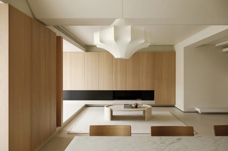
木作与铁件的搭衬,是隐隐的温度与暖意,让生活上的使用介面,如桌椅、收纳与展藏柜,有着体贴人体的接触尺度,至于比例的分割,则是视觉与功能的总和归结,我们总是想让屋主在有限的空间里,感知来自于大自然的美学演绎。
The contrast of wooden and metal components yields a warm temperature, imparting a human scale into the interface of life—the tables, cupboards, and cabinets. The proportional division concludes the visual and functional concerns. Thus the residents are encouraged to perceive the changing aesthetics of Nature in the limited space.
把临窗的部分划给公共空间;客餐厅与书房,让光线自然涌进生活场景,属于私密起居的卧室与卫浴,则划在廊道的另一端,用轻盈的玻璃与木作推拉门,整齐收束立面,让进出/转换成为一种优雅的举止。
The space next to the windows is abundant with light that pours into the shared area of the living room and studies. On the other side of the aisle, the airy glass panels and wooden sliding doors regulate the facade and aestheticize the elegant acts of entrance and exit.
▽ 电视墙立面
▽ 餐厅立面
▽ 书柜立面

项目名称: 冉冉璞宅
设计公司:和和设计-HOHO DESIGN
主创设计:简嘉仪 K CHIEN
所在位置:中国·台湾新北市
项目属性:住宅
主要材料:铁件、木作、波兰特殊漆、特殊波纹大理石、复古玻璃、磐多磨地板
完成时间: 2018
建筑面积:166平方米
版权归属:design © HOHO DESIGN / photos © HOHO DESIGN


