与变化缓慢,口味清淡的西,北欧国家不同,国内的室内设计画风多样且变幻莫测。新中式,美式,日式,北欧,小清新…短短30年间,这些形容词和标签伴随市场开放及媒体传播喷涌而出。
Unlike Western Europe and Nordic countries, who have a stable aesthetic standard, the interior design style in China changes quickly since 90’s. New Chinese, American, Japanese, Nordic… In just 20 years, with the promotion of media, these ‘fashion style’ are quickly sold into the local market one by one without being fully understood or digest.
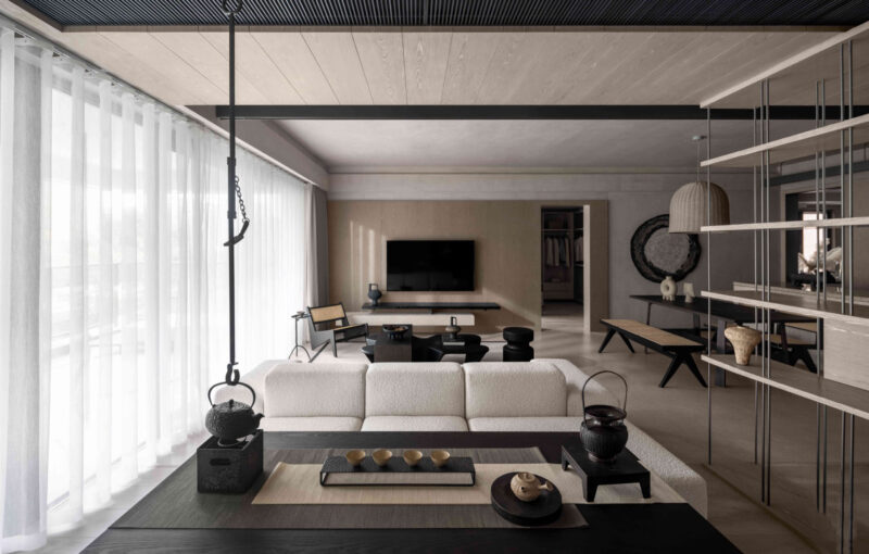
怎样避免落入快消的陷阱,如何让室内设计具有超时性是此项目考虑的重点。设计以白色,灰色,木色此类中性色为主色,并保留了原有地板,对其仅进行简单打磨及翻新。清爽的地板色不但能与室外时时更迭的商业社会拉开距离,也能给予整套公寓安静,甚至类似美术馆的氛围,而这样的设定也符合户主本身特性。
How to avoid falling into the trap of fast consumption? How to make a long lasting design is the main concern of this project. Based on this idea, we picked neutral color such as white, wood for the color board, and repaint the original floor into light grey. The bright background not only create a quiet atmosphere which differs from the city, but also make the whole apartment almost look like galleries. Such setting also suits the clients’ character: young couples who are busy with working during the day and prefer simple life when off work.
由于背景干净类似展厅,家具在此会显得尤为突出,因此精而简成为主要挑选策略。团队挑选了不同品牌的灯具,沙发,餐桌,但其轮廓线条却有着一定相似性。而在更细小的一些日用品上则建议视觉上具有逻辑性且与整体统一的装饰品,并将更多的室内空间留给业主自行打理。
Because the background is clean and tidy, furniture will be particularly prominent here. We selected different brands of lamps, sofas, tables, but all have beautiful outlines and have certain similarity. For smaller decoration, such as painting and pots, the team suggest those with simple shape and calm colors, which is similar to the furniture visual language. By setting the strategy instead of design everything, more space is left to the owners to make their own decision.
完整项目信息
位置:上海
日期:2016
建筑面积:110M²
项目进程:完成
设计公司:〇筑设计丨Office ZHU
设计团队:王卓尔,孙茜,Begoña Masiá
摄影:朱思宇,车佩平


